The Chameleon Benchmark Report 2024
A data-driven look at how companies are creating in-app UX patterns, and how users are responding to them. Compare how your Experiences perform and understand how trends are changing.
Use the arrows above to navigate
Use your keyboard to navigate
The Fifth Chameleon Benchmark Report
Welcome to this deep dive into user onboarding, product adoption, and in-app patterns.
This report is a special one for many reasons. Firstly, it’s been five years of digging into the data. Secondly, this year, we dug deeper than ever into our data to try and uncover “what makes a good in-app experience?”. Beyond the standard completion rates, to give you the "zoom out" bigger picture.
As well as sharing the metrics, our goal is to give you tips along the way to put the numbers into action. So look out for pointers along the way to drive delightful product adoption 💚
About the data
We collect data on anonymous end-user interactions with our customer's in-app experiences. We analyzed data from Jan 1st, 2023 to Dec 31st, 2023 using Mixpanel and manual queries in our database.
Outliers were then eliminated to ensure insights were not skewed, e.g. if one account launched a product tour with a 0% conversion rate to many users, or if another showed a survey to numerous users with a 90% completion rate—these were excluded.
Join the likes of Fivetran, Segment, and Salesloft and launch delightful user onboarding with Chameleon.
Overview of the in-app patterns
This year, we dug into nearly 300 million end-user interactions with Chameleon. That’s ~50 million more data points for long-term benchmark fans than last year.
In addition to the usual in-app suspects, we looked into how users interact with in-app searches through HelpBar and shed more light on “what makes a good in-app experience” with the new Engagement Index.
HelpBar
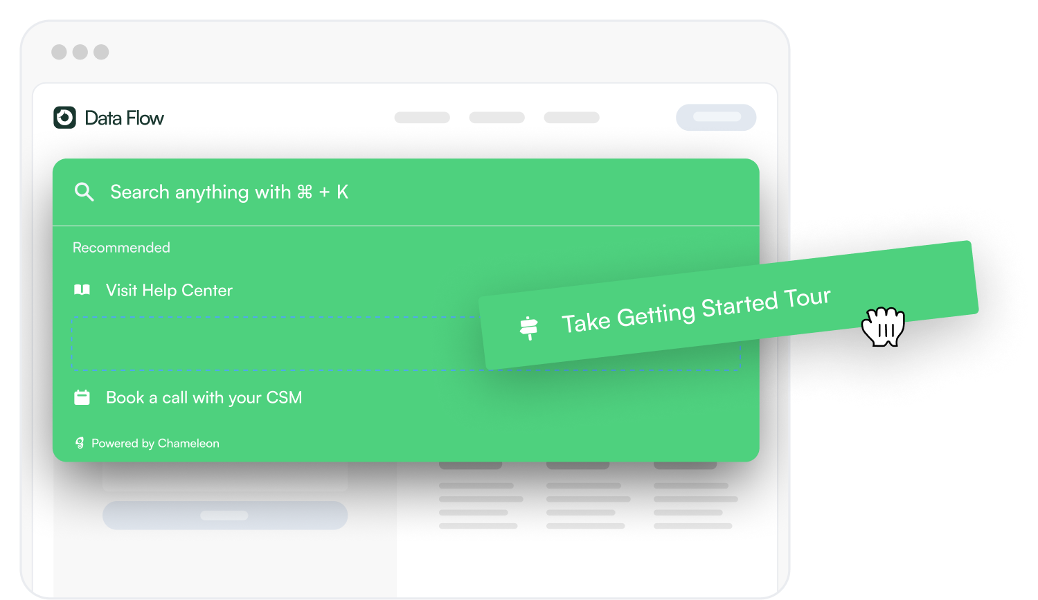
Out of beta and free for all. HelpBar is an in-app “spotlight search” that connects to your help center and offers search, app navigation, and AI answers. Improve your self-serve UX, simplify onboarding, and let power users go full steam ahead with their learning.
Engagement Index
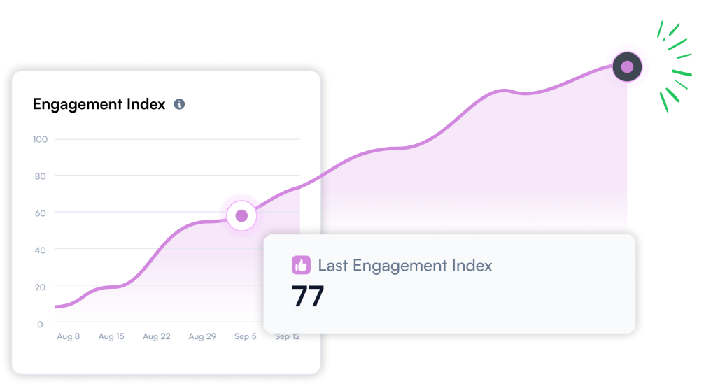
The "Engagement Index" is a score from 0 to 100 that helps you understand how you engage your users. The Index shows the ratio of positive to negative interactions over 6 weeks and looks at dismiss vs. completion and other factors. While it’s still very new, we have some initial insights to share.
Takeaway #1
Product tours are still on the rise
Product tours are trending. While there’s a lot of hate out there for the average product tour—we saw a rise in publication, engagement, and completion across the board for Chameleon-built, user-first product tours.
Short, sweet, and contextual tours led the way 👏
Takeaway #2
The "self-serve" power user is on the rise
Our data showed many dips and peaks this year. But once we investigated what was happening with them all, we saw that in-app guidance started at a user's own pace and outperformed any other triggering by far.
👀 Spot these power users as we dig into tour completion rates, tech used, and even how they navigate your app.
Takeaway #3
In-app is better than ever for feedback collection—as long as you ask contextually
Our data on Microsurveys surprised us the most this year. Overall, the Microsurvey completion rate was down, but there's more to that story.
We saw the dethroning of the CSAT survey as the best template for completion rates, higher average completion rates than ever for the multi-button survey (40%+), and a whopping ~60% of users leaving extra comments on a survey—if you offer the option.
We've never seen results like this before and hope they nudge folks in the right direction of contextual asks, rather than blanket feedback campaigns.
Section one: Product Tours
Hello old friends. Product tours have been at the core of user onboarding and product adoption for years—and they’re our most used pattern by far, with nearly 40 million tours started last year. While we still love them, we’ve had some bumps over the years.
See, product tours can be super effective for driving in-app engagement. But if done wrong… they’re downright annoying 🙃
But we won’t have you creating annoying tours! No way. Take the insights from this section, then go forth and create the most delightful in-app experiences for your users.
# of Chameleon Product Tours seen by year
What’s the average product tour completion rate?
Looking back on the last five years, we’ve seen tour completion rates gradually creep up, and that trend continued in this report. We saw a rise in the average product tour completion rate from 30% to 33.5% 🏆
But, of course, not all product tours are created equal. Every year we see a similar trend. The longer the product tour, the less engaged your users will be, and you’ll see a lower completion rate.
How many steps should a product tour have?
Based on our analysis, we can confidently state that product tours with more than four steps experience a lower completion rate than the average. We've seen this for five years, and we'll always advise you to keep your tours short.
What happens after four steps? We saw five-step tours fall steeply to a 21.6% completion rate, and that data gradually tailed off the more steps added.
The takeaway? Be concise and drip-feed information to your users. It's tempting to show everything under the kitchen sink, but could you save that information for another day, or even better, as part of an onboarding checklist?
Tour completion rate broken down by step count
How long do users spend on product tours?
Over the past five years, the time spent on a Chameleon product tour has consistently increased. In our first report, users engaged for approximately 90 seconds. Last year, that number rose to 132 seconds; this year, it has increased to 154 seconds!
Great, so the longer the tour, the better?
Well, not exactly. We’ve seen these product tour engagement times slowly rise due to a focus on contextual triggering and precise targeting. Keep the previous benchmark of tour completion rates in mind as you build. More eyeballs ≠ more engagement.
What are teams using product tours for?
Here, we looked at product tour names across the board with the goal of finding out "What are the main use cases for product tours?". We pulled keywords from the tour titles and found the top use cases, in order, to be:
User onboarding
Feature adoption
Announcing updates
Asking for feedback
Notify for downtime
This coincides with our Banners product launch in 2023, allowing Chameleon users to show an in-line banner update for "mission critical" announcements.
Get inspired by how the Chili Piper Product team uses Banners to notify, drive awareness, and conversion to upgraded features.
Should I add images or videos to my product tour?
We hear this question all the time. Should you let the words do the talking or add videos and images to engage users?
Our data shows that simplicity leads the way—half of all product tour steps were text only, but tours with an image closely followed that.
We recommend mixing up the media you show in a tour at Chameleon. A friendly GIF can go a long way on an onboarding tour, and a product shot can help tease a new feature on a product launch announcement.
% of product tour steps that contain images, videos, or text only
Is it worth including video walkthroughs in tours?
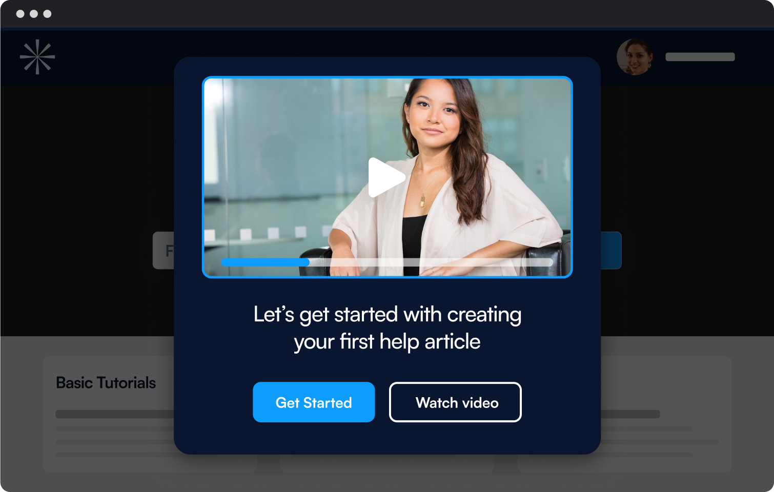
That previous 3% use of video in product tour steps got us thinking. We see videos used in product tours for special occasions, such as big product launches, exciting announcements, or events—it takes more time to produce.
So, what does that conversion rate look like? On the surface—it doesn’t look great. We see a slight drop in completion rate to 29% when a video is added to a product tour. But take this with a pinch of salt...
As we said, those video tours are saved for the big announcements. And usually, that’s what they are—an announcement where watching the video is enough. Instead of measuring the completion rate of a one-step video tour, use Goals to answer questions like "Do users engage with this feature after watching a video announcement?" or even count the views on your video!
How many words should a step have?
We've learned a lot about how long users spend on tours and how many steps perform best—even what those steps should show. But how many words should a product tour step have?
We looked at every tour step published in 2023 and found an average word count (thanks, Chat GPT, for the formulas 😉).
The average Chameleon tour step contains 23 words. That's not much...
"This is an example of a twenty-three-word sentence; it's short, easy to scan, and engaging for your users to learn more about your product"
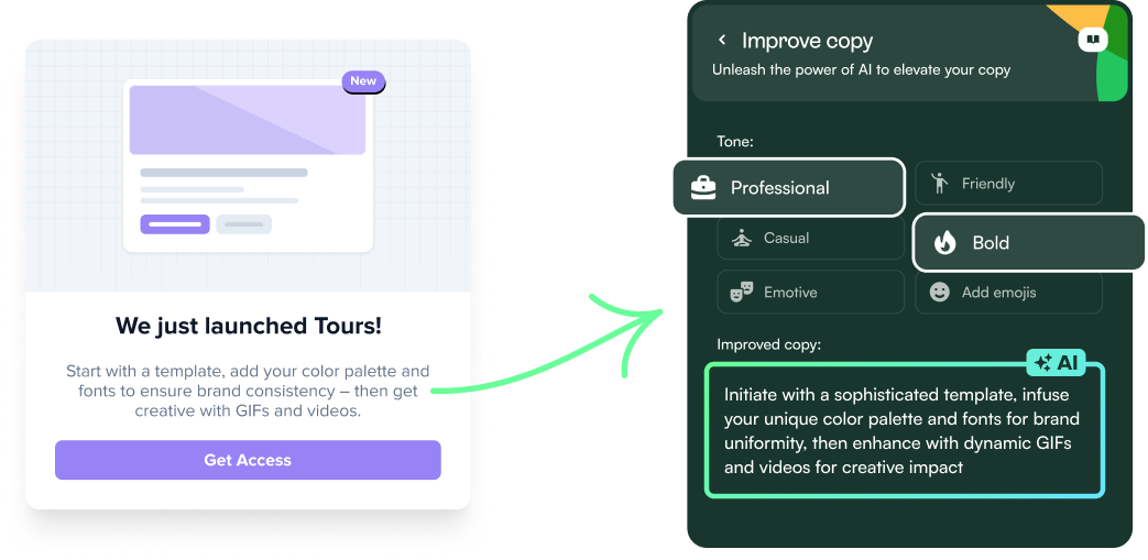
Struggling to chop your copy? With Chameleon, you can AI-ify your copy to make it more in line with your voice, shorter, punchier... really, whatever you like!
Does it matter how Tours are triggered?
Imagine going to a grocery store for sour cream chips and being bombarded with an assistant trying to push their loyalty program. It's just like getting interrupted by product tours when you want to complete a task to help you do your job. Effective in-app tours require careful consideration of context and timing.
We zoomed in on product tours triggered independently, which users chose to take through a Checklist Launcher, and found that they had a 64% conversion rate, up from 61.65% last year—no matter the tour length.
Another win for self-serve learning. Now, where did we put those potato chips…
If users snooze, do you lose?
2.4 million Chameleon tours were snoozed last year; reasons include but are not limited to:
Slippers the dog barking at a squirrel through the window
A last-minute team standup on Slack
Eagerness to get into another part of your product
While Slippers won’t ever catch that squirrel, the good news is you still have a chance to catch your users’ attention with snoozing.
By offering a snooze option on your product tour, you can get 3% of your tour "exiters" to return and complete the tour. It doesn't sound like much, but these users were ready to dismiss said tour. And if it's a prominent feature launch or update, you could potentially engage thousands more users by offering a snooze option.
![]()
How many product tours should you launch?
The average Chameleon customer activates 10 product tours monthly; some busy builders use us!
It's important to note that not all tours will be completely new every month. Some tours may be variations of previous ones, while others might be A/B tests or experimental ones. However, if you segment your users effectively, you will likely have more active tours and better engagement and completion rates.
Is A/B testing your product tours worth it?
In 2023, we worked hard on improving our native in-app A/B testing feature for product tours and banners. Before, it was a bit clunky... but now it feels silky smooth and lets you launch continuous experimentation—Chameleon can even decide when you've got a winner on your hands and roll it out to all users 🪄
This change also gave us new data on how A/B testing impacts product tour completion rate. For tours that were tested, we saw a close to 5% uplift in completion rates across all tests. So throw that wildcard in there next time—you might be surprised!
Section two: self-serve checklist "Launchers"
These in-app menus joined the Chameleon in-app patterns crew in 2019 and just made it onto our first-ever Benchmark Report.
Since we launched this feature, we've seen users get more accustomed to the pattern itself, and we've also seen our customers get more creative with how they're used—we've seen them host release logs, onboarding checklists, helpful support links, and more!
Last year we shared that there had been a boom in "self-paced onboarding" and this year followed in its footsteps. We saw more Launchers launched and more users clicking through the checklists. Let's see what happened under the hood.
# of Checklist Launchers opened by year
More users opening checklists—but are they engaging?
We saw the amount of Launchers opened in 2023 almost triple compared to 2022. But are these opens leading to engagement and users completing user onboarding at their own pace?
Looking at Launcher engagement overall, around 1 in 10 users will explore the content within your Launcher. And of those engaged users; 28% will complete an item e.g. taking a product tour or updating their profile information.
If you’re seeing low completion rates with your automated Tours, try offering users the option to start or retake a Tour from a Launcher and give users the gift of choice.
How power users use Launchers
This year, we identified a prevailing trend across all our patterns; the rise of the "self-serve" power user.
These users want the freedom to onboard at their own pace and don't have time for "out-of-the-blue" tours. Our analysis of the number of Launcher items completed by users highlighted these power user profiles.
On average, a user who opens one Launcher will actually complete, on average, five items within that Launcher checklist.
So while only 1 in 10 users engage with checklists; the ones who use them, really use them.
Section three: in-app Microsurveys
The Microsurvey really does what it says on the tin. It's a short "one-punch" question deployed after a user has done (or not done) something in your product. We launched this in-app pattern in 2019, but unlike Launchers, they didn't make it onto our first-ever Benchmark Report. The data collection starting in July 2019 and we have four years of stats on Microsurveys.
These short but potent patterns are highly versatile and can be employed for a range of applications, including NPS accumulation and onboarding segmentation, beta opt-ins, and cancellation deflection. In this section, we will delve into the most effective techniques for soliciting feedback using the survey templates we offer in Chameleon.
# of Microsurveys started by year
What's the average Microsurvey completion rate?
This one surprised us. For the last four years, Microsurvey completion rates across the board have hovered around 20%.
But this year, we saw a drop in completion rates to 15% 🤨 Something was going on there, and we had to dig further. So we looked into different survey types and compared completion rates.
What type of Microsurvey performs best?
In our last report, NPS performed best for completion rate—and we expected to see the same again. But a few things surprised us.
The multi-button survey did best for completion rates, with a 27.2% completion rate
CSAT surveys halved in completion rates compared to our previous report
Similarly, the NPS completion rate dipped to a 1 in 10 completion
How many options should a survey give?
Multi-button microsurveys were found to be the most effective in terms of survey completion. This raises the question: does having more buttons on a survey lead to higher response rates?
Our research showed that the optimal number of buttons to use for the best completion rate is three. On average, multi-button surveys with three options had a completion rate of 40.2%.
However, if you include more than three options, the completion rate starts to dip. We saw surveys with as few as one button and as many as ten, but the sweet spot was found to be using multi-button surveys with three options.
Completion rate of multi-button surveys broken down by button count
Does asking for extra comments work?
Microsurveys are intended to be short, sweet, and contextual. But of course, we're always hungry for more feedback. We dug into whether users will leave you more feedback if you use a "Comments Step" after the initial question—and 59.7% of survey takers will!
This stat has been on the up since we first started tracking it. In 2019, only around 30% of users were willing to provide additional feedback. We believe this has changed due to a shift in how Chameleon users approach feedback. Instead of asking everyone for feedback, users are now segmenting their audience and targeting those more invested in providing helpful feedback. And the data shows that users enjoy it!
Section four: user engagement and delight
Now we're entering new territory... We have some fresh data on how users navigate through our customers' apps, how engaged they really are, and the happiness of our customers' users.
Here we're zooming in on the Engagement Index and HelpBar, as well as a peek into the average NPS given to our customers (e.g. does using in-app patterns improve the overall user engagement?
Psst. HelpBar is entirely free to use and simple to set up. Add the snippet to your product, connect your help center, and you're ready to go live! Try it here.
The end-users of our customers are really happy
We see something special every year and are happy to report again is that we have some great Chameleon customers and their users are delighted.
Nearly two-thirds of our customers' users are Promoters for said product. That's the magic of in-app patterns and thoughtfully delivered guidance. We like to call it the Chameleon effect ✨
Breakdown of Chameleon customers' NPS score in 2023
What's a good level of in-app engagement?
The Engagement Index is a score that measures the ratio of positive to negative interactions in your in-app patterns over a period of 6 weeks. It takes into account factors such as dismissals versus completions.
We launched this in the final quarter of 2023 and have some initial metrics to share here.
62 is the average score to benchmark against. Not sure what yours is? If you're using Chameleon, it's shown on your Dashboard Homepage. Not using Chameleon? ...why not?! 🤪
➡️ Start a free Chameleon trial and measure your Engagement Index
Are users actually using in-app search patterns?
We launched HelpBar, our free in-app "spotlight search" pattern to the masses in Q4 2023, so like, Engagement Index, the data is still fresh. Since then, we've seen close to 30,000 in-app searches by our customers' users.
It's a valued and popular pattern, so we investigated what users are asking HelpBar about.
The data shows that users treat HelpBar like a contextual help center; the top five phrases and words typed were "how to", "help", "what is", "how do I", and "chat".
Stay tuned for more HelpBar insights over the next year 👀
Section five: What other tools are in the user onboarding stack?
Chameleon has 40+ native integrations, and we're not even including Zapier and the 10000s more connections you can create there.
But what other tools should you have in your stack as you focus on product adoption and your PLG efforts?
We dug into the top integrations by plan to help you find the best connections—and hopefully your new (other) favorite tools.
Overall, what tools are most connected to Chameleon?
Zooming out and ignoring if this integration works as a data-sync, Additional Action (e.g. triggered from a button click), or as an import/search, the top ten integrations amongst Chameleon's customers were...
Typeform
Intercom
HubSpot
Mixpanel
Zendesk
Amplitude
Calendly
Heap
Salesforce
Loom
Are different company stages using other stacks for user onboarding and PLG?
Yes! While Enterprise customers love connecting to Salesforce, smaller companies get scrappier with their customer data with Intercom.
One consistency we saw across all plans was that Typeform is everyone's go-to choice for collecting in-depth feedback! What we love about this integration is that you can launch a typeform within a Chameleon Experience. We call this an "Additional Action". Try it next time you need to ask a few more questions in-app.
Breakdown of integrations connected by Chameleon plan type
Startup Plan | Growth Plan | Enterprise Plan | |
Most used Additional Action | Typeform | Typeform | Typeform |
Most used data integration | Mixpanel | Mixpanel | Amplitude |
Most used CRM | Intercom | HubSpot | Salesforce |
Most used Help Center | Intercom | Zendesk | Intercom |
That's a wrap... for now
What a year! We hope you enjoyed learning about the highs and lows, as well as the trends and twists from 2023. These data points reflect changing user wants and preference, and offer a few ideas for improving your in-app onboarding and engagement strategies.
Let's make 2024 a year full of delightful in-app experiences and patterns!