Welcome to Appcues vs Pendo. These two product adoption heavyweights are among the most popular platforms available. This means this is going to be a heated match-up. A battle of the giants.
We'll compare Appcues and Pendo step by step, looking at whether either tool is better in terms of specific features, customer experience, and overall value. By the end of this article, you'll have a better understanding of which tool is the right fit for your product's onboarding needs.
Appcues vs Pendo Snapshot
Let round one… begin! Pendo and Appcues are well-known and respected in the Digital Adoption space. They both offer a suite of in-app patterns e.g. product tours, in-app widgets, surveys, etc. They were even founded in the same year, 2013 👯
Despite their similarities, Pendo offers a fuller set of analytics functionality. Where Pendo leads on analytics, Appcues rides home with a wider range of in-app patterns. We’ll dig into these points some more.
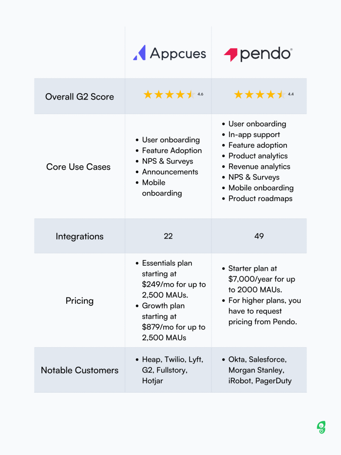
Here is a brief snapshot of the two tools compared side by side.
Comparison by feature
Both look good at a high-level, right? Let’s drill deeper into what’s under the hood. In particular, we’re looking at the UX patterns offered, analytics functionality, technical fit with your stack, and mobile usability.
A note on this one, while Pendo offers a product roadmapping feature; this guide doesn’t cover its strengths and weaknesses as Appcues does not have this set of features.
UX Patterns
There’s nothing worse than planning out a new user onboarding flow, then realizing you don’t have the UX patterns to accommodate your plan. We’re going to zoom in on what patterns you do, and don’t get with Appcues and Pendo.
Both Pendo and Appcues offer an expected range of in-app UX patterns. However, Pendo falls slightly behind Appcues due to its lack of slide-outs. Check out the side-by-side teardown below 👇
Having a variety of versatile UX patterns is crucial to building successful user experiences. Here we’re going to focus on in-app user experiences.
Comparing the two, they have a similar set of UI patterns, but there are discrepancies, such as the lack of slideouts for Pendo, as well as how checklists are built for Pendo as opposed to Appcues.
UI Pattern | Pendo | Appcues |
|---|---|---|
Modals | Yes (Lightbox) | Yes |
Tooltips | Yes | Yes |
Hotspots | Yes | Yes |
Slideouts | No | Yes |
Banners | Yes | Yes |
Checklists | Yes* | Yes |
Self-serve widgets | Yes (Resource Center) | Yes (Launchpad) |
NPS | Yes | Yes |
Surveys | Yes | Yes |
* Pendo’s checklist is available through the onboarding module of the Resource Center.
On this point, Appcues wins for the variety and the ease of use when it comes to UI patterns. For instance, Appcues has a dedicated checklist builder that is separate from its resource center builder in the form of Launchpad.
The different delivery patterns give flexibility and variety to encourage engagement.
However, Pendo combines all of them into one single Resource Center module, which users say is more cumbersome.
The interface is tedious, and it is hard to find things if you are not entirely familiar with the platform, and similarly, guides and the resource center(s) are hard to create and update for new users.
Product analytics
Moving onto analytics, this is where Pendo pulls ahead. It has a more extensive set of analytics capabilities than other Digital Adoption Platforms such as Appcues, Userpilot, or even us over at Chameleon.
Despite Appcues adding more product analytics functionality in recent years, Pendo still trumps here.
Product Analytics Features | Appcues | Pendo |
|---|---|---|
User behavior tracking | ✓ | ✓ |
Event tracking | ✓ | ✓ |
Click tracking | ✓ | ✓ |
Funnel analysis | ✓ | ✓ |
Conversion tracking | ✓ | ✓ |
User segmentation | ✓ | ✓ |
Cohort analysis | ✓ | ✓ |
Retention tracking | ✓ | ✓ |
Revenue tracking | x | ✓ |
Custom metrics | ✓ | ✓ |
Real-time data updates | ✓ | ✓ |
Integration with third-party tools e.g. XYZ | ✓ | ✓ |
Data visualization | ✓ | ✓ |
A/B testing | ✓ | ✓ |
Heat maps | x | ✓ |
Session replay | x | ✓ |
Predictive analytics | x | ✓ |
Pendo tries to do everything, which means it tends to lag behind solutions that focus hard on product analytics. Here are our recommendations:
Mixpanel
Heap
Amplitude
And best of all, they integrate with product adoption platforms like Chameleon.
Integrations
As of May 2023, Appcues has 22 integrations while Pendo has 49 integrations in total. On the surface, it looks like Pendo beats Appcues on its set of integrations.
But when we dig deeper into these integrations and their functionalities, Appcues actually offers two-way integrations. Bidirectional data flow provides a better experience by keeping both systems up-to-date with the latest data. So this is a huge strength for customers looking for a Digital Adoption Platform that will seamlessly integrate with their existing tech stack.
Integration | Appcues | Pendo |
Amplitude | Two-way | N/A |
Mixpanel | Two-way | N/A |
Heap | Two-way | N/A |
Salesforce | Two-way | Two-way |
Hubspot | Two-way | N/A |
Zendesk | Two-way | Two-way |
Marketo | Two-way | N/A |
Segment | Two-way | Two-way |
Zapier | Two-way | N/A |
Workato | N/A | Two-way |
However, it should also be known that some of these two-way integrations by Appcues are premium integrations that only come with the Growth plan. These include:
Salesforce
Marketo
Hubspot
Zendesk
Overall, by sheer numbers, Pendo is more likely to have the integration that you need, but when it comes to two-way integrations, Appcues excels. Honestly, it comes down to what your current tech stack is and what your data requirements are.
Mobile Onboarding
Native mobile onboarding is something that both apps offer. In particular, they’re both known to be the go-to solution whenever products need native onboarding for Android and iOS. But there is some difference between the two of them when it comes to what frameworks are supported.
Mobile Frameworks | Appcues | Pendo |
|---|---|---|
Android | ✓ | ✓ |
iOS | ✓ | ✓ |
React Native | ✓ | ✓ |
Flutter | ✓ | ✓ |
Ionic | ✓ |
For this one, Appcues wins by supporting Ionic.
Comparison by customer experience
Once the contract is signed, how does the post-sale treatment fare? In this section, we’ll examine the level of Customer Success and Support for both Appcues and Pendo.
As we’re not customers of either, we’ll rely on G2 scores and reviews to figure out how the two compare when it comes to customer experience and satisfaction.
First up, let’s take a quick look at the G2 scores for user experiences between Appcues and Pendo
Appcues | Pendo | |
|---|---|---|
Ease of Use | 8.7 | 8.2 |
Ease of Setup | 8.5 | 7.8 |
Quality of Support | 9.2 | 8.5 |
Product Direction | 9.1 | 8.2 |
On average, it is easy to see that Appcues has a better customer experience score than Pendo. But, let’s dive deeper into actual written reviews and examine each category of customer experience.
Setup and Implementation
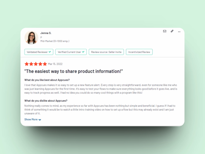
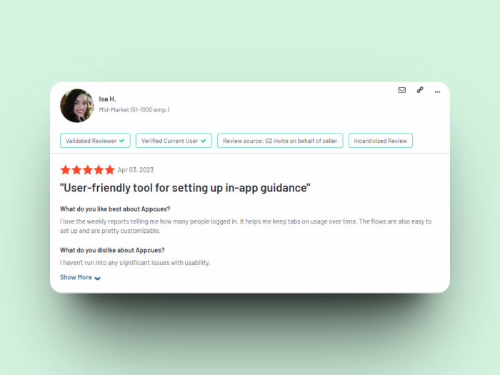
In terms of setup, implementation, and training, Appcues excels by a large margin. Most reviews for Appcues on G2 praised its easy setup and how customers were able to ramp up quickly and start publishing their first Appcues flows within a day or less of signing up, which means faster ROI, like these two reviews below:
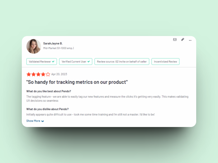
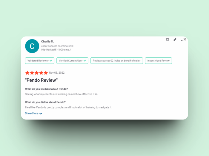
As for Pendo, users tend to find it more difficult to implement. Even when reviews are four or five stars like the ones below, it would mention how the tools were complex and took a lot of training.
Customer Support and Success
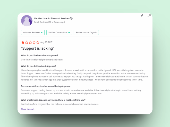
Both services have an adequate level of customer support and success, but on a closer look, Appcues has an edge here. Not only do they have a higher G2 score, when looking at their reviews. there were virtually no extensive complaints on support. We did find this one, from 2017. Surely Appcues has gotten better over time.
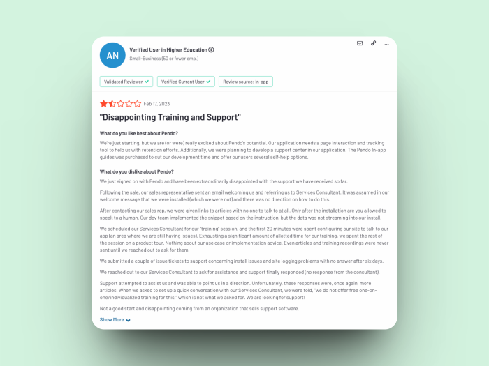
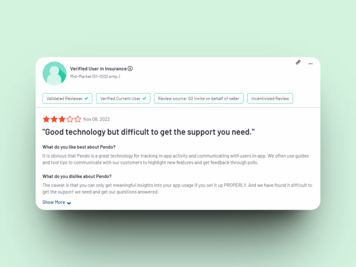
Whereas for Pendo, we were able to see recent reviews like these ones:
Appcues is the one that comes out on top for customer support due to their 9.2/10 scoring for support on G2, compared to Pendo’s 8.5
Product Velocity and Reliability
Product velocity is critical when it comes to outpacing the competition, and in this aspect, Pendo is lagging quite a bit.
On Appcues’ side, a glance through its changelog will show that new releases are happening frequently, with new integrations being added, as well as new builder elements, and improvements on its existing features.
Whereas glancing at Pendo’s product updates forum, the releases are less frequent and less impactful to the user experience.
For instance, there are more mentions of bugs for Pendo than Appcues in the G2 review section. This is fine considering that Pendo has far more reviews than Appcues, but on a closer look, it can be noticed that while for Appcues, bugs are more often minor nuisances and are quickly addressed, for Pendo bugs present critical blockers many more times.
Point for Appcues.
Comparison by Value
Features assessed, support examined – now we’ll dig into the cash money. How much value do you get from each tool, and how much does it cost?
Free plans
Appcues offers a 14-day free trial that provides access to their full suite of product onboarding and user engagement tools. During the trial period, you can create and launch custom in-app experiences and test for technical fit with your product. They do not offer a free plan.
On the other hand, Pendo offers a free plan that gives access to their product analytics, in-app guides, and NPS surveys; although they will be Pendo branded. The free tier accommodates up to 500 MAUs.
Pricing Plans
Appcues has three pricing plans: Essential, Growth, and Enterprise. The Essential plan starts at $249/month for small businesses and startups, while the Growth plan is for mid-sized businesses and starts at $879/month. The Enterprise plan is designed for large businesses with complex needs, and pricing is available “upon request”.
All these plans include access to Appcues' visual editor, onboarding flows, in-app messages, NPS surveys, and analytics dashboard. The level of customization and customer support increases with each plan.
Pendo's paid starter plan starts at $7,000/year, and it includes up to 2,000 MAUs.
One win for Pendo on all plans, including the free tier, includes unlimited seats, as opposed to 3 seats included with Appcues’ Essentials plan.
Something to keep in mind for Pendo is that there are additional fees that can really add up. For example, there can be premium integrations that are not included in your plan, and if you need them, Pendo can tack those fees on top of your invoice. So make sure to check for fees that may add up on top.
In the end, Pendo offers quite a bit more value than Appcues especially when starting out.
Final Verdict
Here’s how the points stack up for Appcues vs Pendo
Appcues | Pendo | |
UX Patterns | 1 | x |
Product analytics | x | 1 |
Integrations | Tie | Tie |
Mobile onboarding | 1 | x |
Setup and Implementation | 1 | x |
Customer Support / Success | 1 | x |
Product Velocity and Reliability | 1 | x |
Value | X | 1 |
Final Score | 5 | 2 |
On the surface, it may look like Appcues has an edge over Pendo, but like all things, it really depends on what you’re looking for.
Here’s our detailed verdict on whether Pendo or Appcues is the better fit for you. The short answer is that it depends on whether you need an analytics capacity. Let’s dive in a bit more.
Use Appcues if you want a robust user onboarding tool
Appcues is a great choice if you already have a product analytics tool and are looking for an onboarding tool to improve user engagement and retention. Appcues offers integrations with popular analytics tools, including Amplitude, Mixpanel, and Google Analytics, allowing you to leverage existing user data to create more personalized onboarding experiences. It also offers a better experience and more options when it comes to building in-app guidance and messaging.
Use Pendo if you don’t have any analytics
While Appcues and Pendo both offer user onboarding and in-app user experience tools, Pendo's focus on product analytics sets it apart as an adequate choice if you need both analytics and user engagement. In addition to their user onboarding and in-app experience builders, Pendo's product analytics solution provides you with deep insights into user behavior and product usage. So if you don’t have an existing analytics tool, Pendo could be the jack-of-all-trades you need to get started.
The best of both worlds: Chameleon and a leading product analytics tool
If you have sophisticated user onboarding needs, and you need a high level of customization for your user experiences, this is where Chameleon comes in.
Chameleon is the best-in-class product adoption tool that offers deeper configuration and control over Pendo and Appcues. Plus, we integrate with leading product analytics solutions like Heap, Mixpanel, Amplitude, and more.
So we highly recommend that you look into Chameleon, whether or not you already have an analytics tool. Because Pendo is definitely not as good as combining two great solutions in one, and while it may cost more than just getting Pendo, the best tools get you better results and ROI.
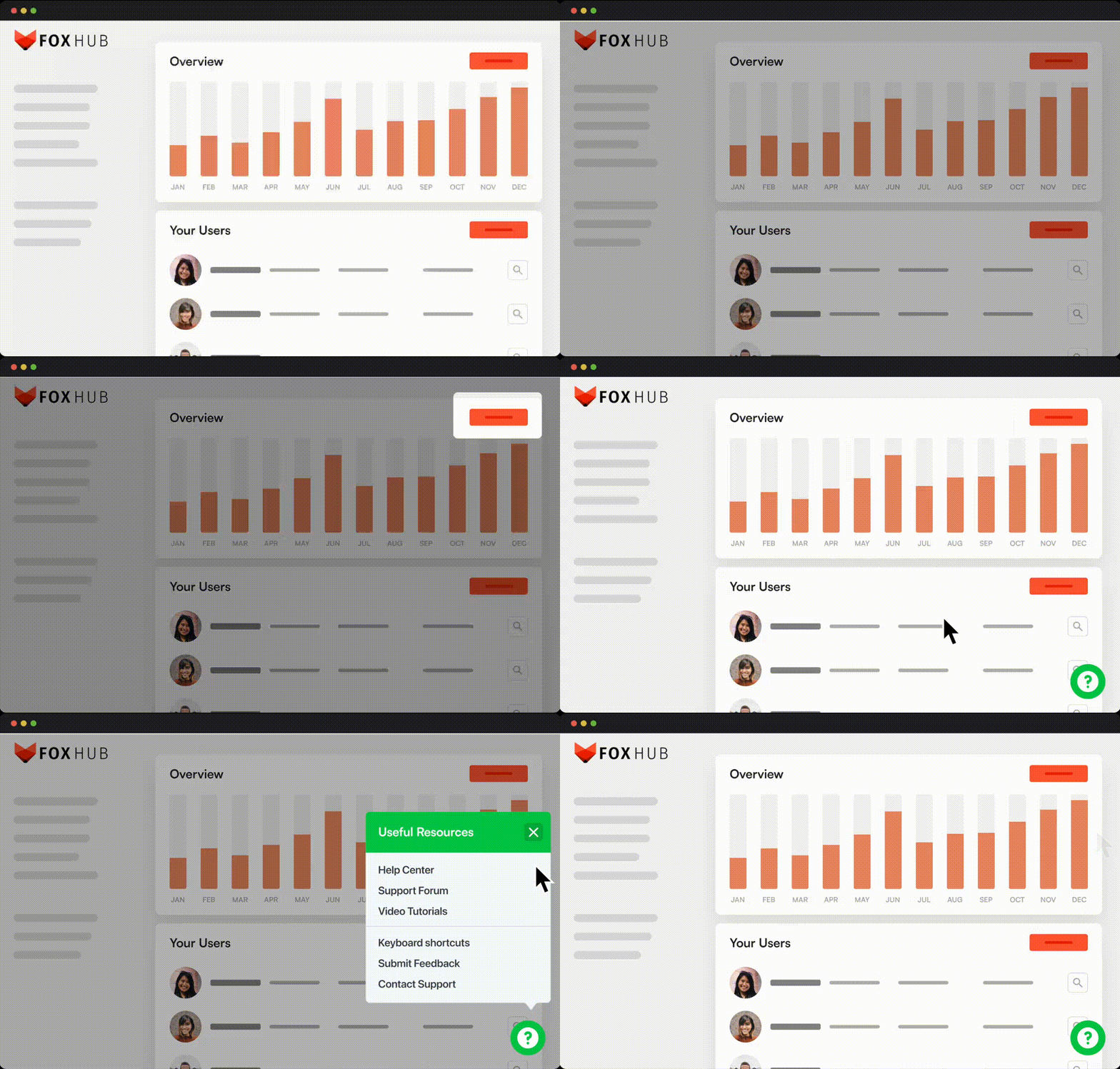
Curious? Take a look at this interactive demo below and see for yourself!
There's no alternative like Chameleon
Try the most versatile and customizable product adoption tool in the market
