Self-serve support is a non-negotiable part of a seamless product experience. Customers want the freedom to solve questions and problems on their own.
In-product help menus are one way your SaaS team can empower customers to do just that. These menus give users a quick avenue to search your knowledge base or chat with a support agent, minus the hassle of raising a ticket or waiting on a call.
In this article, we'll break down the concept of an in-product help menu and share design tips, best practices, and examples to create your in-app widget.
In-product help menus offer users a simple self-serve option to access help docs and navigate your product better
Adding self-serve support brings multiple benefits, from giving users more control over their product experience to maximizing your CS teams’ productivity
Designing good in-app help menus involves many components, including brand styling, visibility, personalization, UI design, and search functionality
When creating your in-app help widgets, pay close attention to your menu placement, trigger, size, links, and content
What is an in-product help menu?
An in-product help menu is a self-serve support module embedded within the product to help users navigate your product through quick access to useful resources. It can include relevant links to your help center, tutorials, top FAQs, the option to contact a support agent, and more.
An in-app help widget aims to offer just-in-time, contextual help to deliver a frictionless user experience. You can also collect feedback to understand customer expectations and better iterate your help menu.
5 reasons why it’s important to offer self-serve help within your product
Self-serve support is an essential component of a seamless user experience. In fact, 32% of users consider self-serve a critical part of their experience with any tool.
Here are five reasons why you need an in-app help menu to let users troubleshoot their queries independently:
Offer self-paced product education: Not all users want to complete lengthy product tours and interactive walkthroughs immediately after signing up for your SaaS. They want to interact with the tool first and learn about its features at their own pace. With self-serve support, you can avoid overwhelming users and create organic learning opportunities within your product.
Share just-in-time training: Besides simplifying how new users interact with your product, help widgets deliver on-demand in-app guidance to remove friction from the customer experience. Users can jump to training resources to find the most relevant information and instantly solve their queries instead of waiting to connect with a customer service rep.
Shorten time-to-value: Help menus let new and existing users navigate your app according to their needs, taking them closer to their aha! moments and reducing the time-to-value. When users can answer their doubts and learn more about different features in a few clicks, they'll quickly understand the interface and realize product value.
Free up your support team’s time: In-product help widgets can reduce support tickets and allow your CS team to give more 1:1 time to customers with more complicated problems. Not just that, Gartner also indicates that query resolution through self-service costs 80-100 times less than a live conversation.
Meet customer expectations: Self-service is more than just a nice-to-have today. Customers increasingly expect SaaS companies to create self-serve resources and give them more control over their own product experience. So, creating an in-app help menu makes a stronger case for you and gives users the convenience they desire.
Put simply, a help menu can maximize customer delight while using your support team to their best capacity. Wondering how to nail your help menu design to maximize convenience and improve productivity for your customers? Take a look at our best tips to get started.
How to design your in-product help menu for maximum impact
Creating a user-centric help menu design isn’t as easy as it sounds. You’ll have to juggle many factors to create an impactful design.
Here are a few of the most critical considerations for making your help menu design stand out and ensuring users find answers effortlessly:
Keep it on brand: Your design widget should blend well with the rest of your product interface. Create a uniform experience with an on-brand help menu design. Choose the right styling options to align your help menu with your branding. This includes a color palette, fonts, custom icons, visuals, and similar styling choices.
Make it easily visible: A help menu loses its purpose if users can’t find the widget in the first place. Strategically choose the menu placement (more on this shortly) and make the widget icon prominent enough for users to instantly recognize it. You can also indicate this widget’s location with a tooltip.
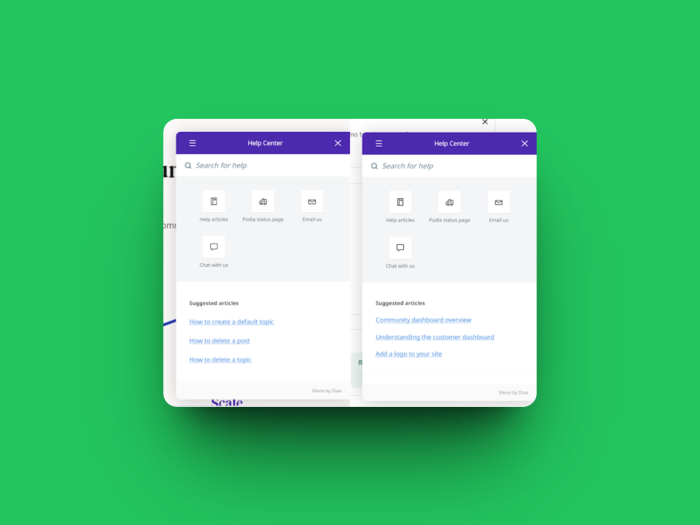
Tailored to user needs: Every user persona will have different concerns and questions. So, customize your help menu’s content according to different personas by curating links to relevant resources. For example, Podia displays different FAQ articles for new and existing users. On the left is the help menu for new users who have just signed up and on the right is the list of suggested articles for existing users.
Personalized in-app guidance: Leverage user journey mapping to understand how different users interact with your product and personalize your help menu right from their onboarding. You can show the most relevant resources based on their recent interactions. For example, if a user recently upgraded to a paid plan, send them resources to best use their paid subscription.
Add a search function: Your goal behind adding a help widget is to make things more convenient for your users. Don't let them skim through tens of help articles to find information. Add a search function to offer easy access to the right guides.
While these design tips will help you create a user-friendly help widget, we’ve curated a set of best practices to make your self-serve support more effective.
6 Help menu best practices to increase the effectiveness of your self-serve support
Here are six help menu best practices to create a solid impact on your customers.
1. Menu placement
Chances are, when users look for a help widget, they’re somewhat frustrated and want quick answers. If your help menu is too difficult to find, it’ll only add fuel to the fire and increase their frustration.
The widget should be easily visible without looking intrusive to the users—it’s a tricky balancing act.
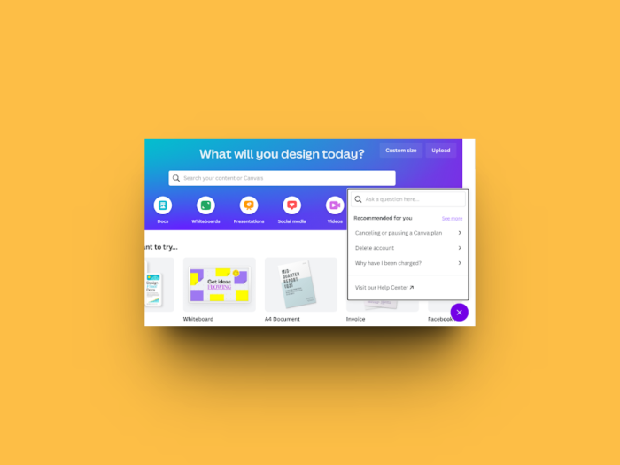
Most products feature the help icon on the page's bottom left or right corner since this menu placement doesn't disrupt the user experience, and aligns with muscle memory from other apps. Make it easy for users to find the widget and resolve queries to remove this friction if you’re not going to place yours in a traditional place.
Check out how Canva places its help menu at the bottom-right corner of the screen without it being too distracting.
2. Menu trigger
The menu trigger is essentially the icon that lets users access your help docs. As a best practice, this trigger should be intuitively recognizable and stand out on any page within your app. A/B test the trigger's size, color, icon, and placement to ensure users can find it quickly.
This trigger can be the widely popular question mark icon or a CTA button for help. For instance, here’s Airmeet’s help menu with a question mark symbol.
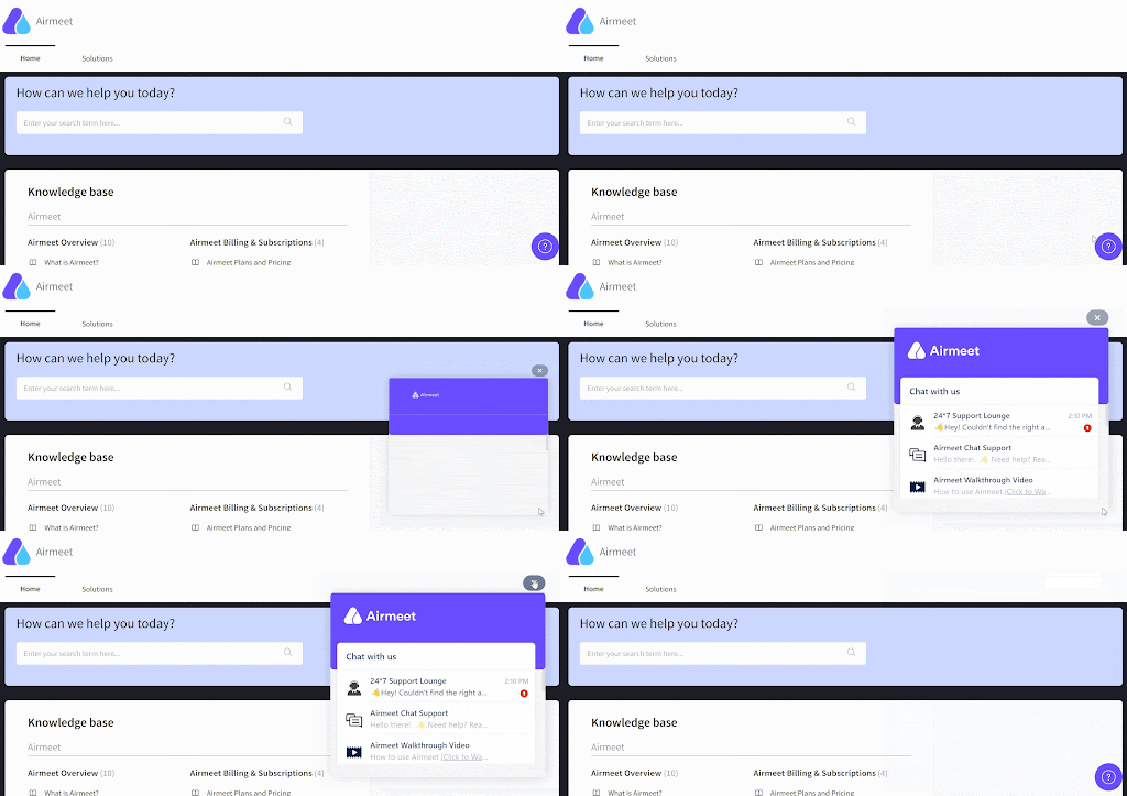
You also have to decide whether the icon is click or hover-triggered. A clickable trigger means users have to click on the icon to view the help widget, while a hover trigger shows the resources when users hover over the icon. This hover functionality is one of the major differences between mobile and desktop apps.
3. Menu size
Another crucial element of designing a help menu is determining its size. A standard help menu opens up in a smaller modal window within the app. So, decide the right size for the menu to ensure it's not too intrusive for users.
You can also customize the menu items to meet the user intent and display only the most important resources within the window.
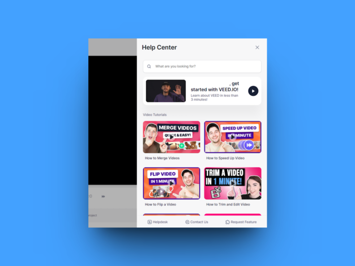
For example, VEED uses a full-size slideout help menu to show its library of video tutorials and searchable knowledge base. Unlike VEED, some SaaS brands show their help menu in a smaller call-out window.
4. Helpful links
Once you've done the legwork to finalize a clean design for your help menu, it's time to consider the content you want to include. You might have a library of product resources, from a knowledge base to video tutorials. However, not everything can fit into a small help widget.
So, select a few essential links you want to include in your menu to better acquaint users with your product. These can be links to the most popular in-app training materials, like FAQs, recent webinars, explainer videos, or live chat. Keep these links contextually relevant to user personas at every stage of their journey.
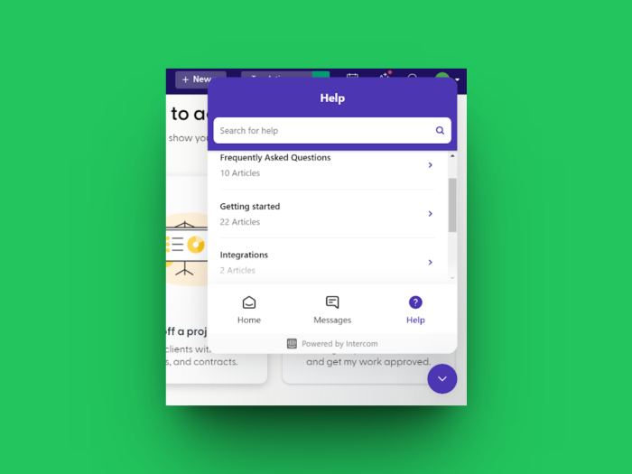
Here’s a great example by Indy. The brand shows three main sections on its help menu:
For searching their entire help center and sharing feedback
For starting a live chat with a support agent
For quickly accessing popular FAQs
5. Media formats
Make your help menu interactive and engaging with multiple media formats—like screenshots, GIFs, and videos.
Don't rely on just textual guides to solve users' concerns. Give them detailed insights and help them find their way around your product with these visuals.
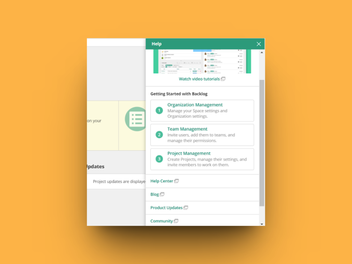
Nulab does this well with a dedicated section on video tutorials. Users can browse videos or read articles with screenshots to understand how the app works.
6. Live interaction
Make your help menu more dynamic with real-time support options like live chat. If users don't find the right information, they can instantly chat with a support agent and resolve their queries.
This alternative solution reduces frustration and saves users the hassle of jumping through hoops to find answers. It’s always a good idea to share the expected response time for live chat to manage users’ expectations better.
Beamer does this well in their in-app help menu. They’ve added an option to chat with a support rep and get a response within an hour.
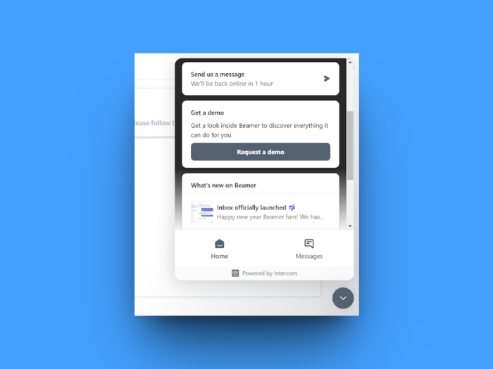
Alternatively, you can add a calendar link to let users book a call with your team. This works best when users want to discuss complex issues or explore your product's functionality further.
4 solid examples of in-app help menus to inspire yours
While these best practices will prepare the groundwork for your in-app help menu design, let’s look at four help menu examples that set a great benchmark for your design.
1. Chameleon’s Launcher
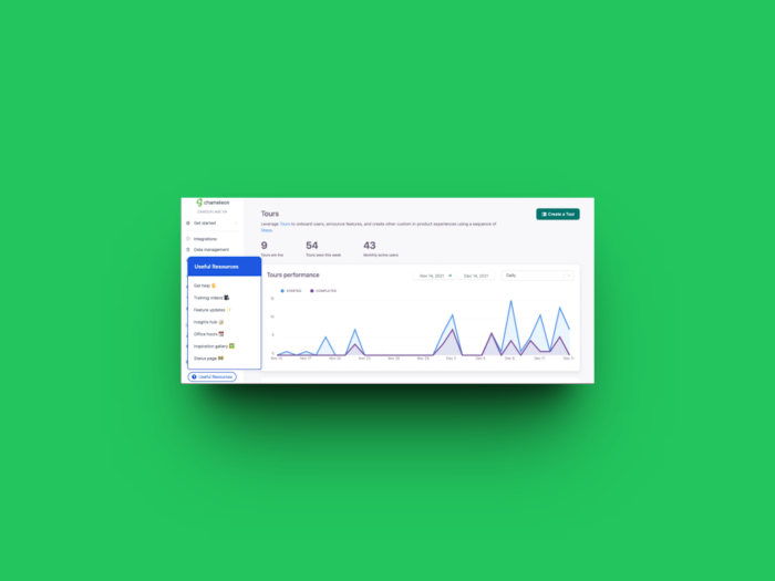
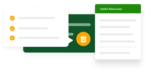
Chameleon's Launcher is neatly placed on the bottom-left corner of the page as a CTA button called "Useful Resources." You can find links to multiple resources, like training videos, feature updates, and other insights from our team. It also includes a ‘Get Help’ button to chat directly with a support agent.
Launcher can help SaaS companies create customizable in-app widgets to match their brand’s look and feel. You can then personalize these resources according to users’ needs, and design a seamless product experience.
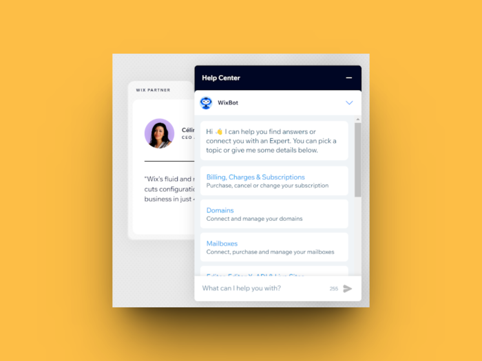
2. Wix’s help menu
Wix's help menu combines the brand's FAQs with a chatbot. Users can directly jump to any categories from their help center or type a few keywords to find the most relevant resources quickly.
This AI-powered chatbot reduces the effort required to search through tens of articles. It doubles as a search engine and shows the most relevant links matching a search query. The chatbot also helps affirm Wix’s brand voice and customer experience with its messaging and language.
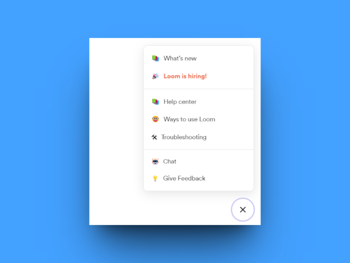
3. Loom’s menu
Loom’s help menu is multi-featured and allows users to access the help center, go through troubleshooting guides, and watch tutorials on different ways to use the app.
On top of these helpful resources, the help menu lets users chat with a support rep or share feedback. It's versatile and enables users to get the best out of the platform while enabling the product team to learn from users’ inputs at the same time.
4. Lemlist’s in-app menu
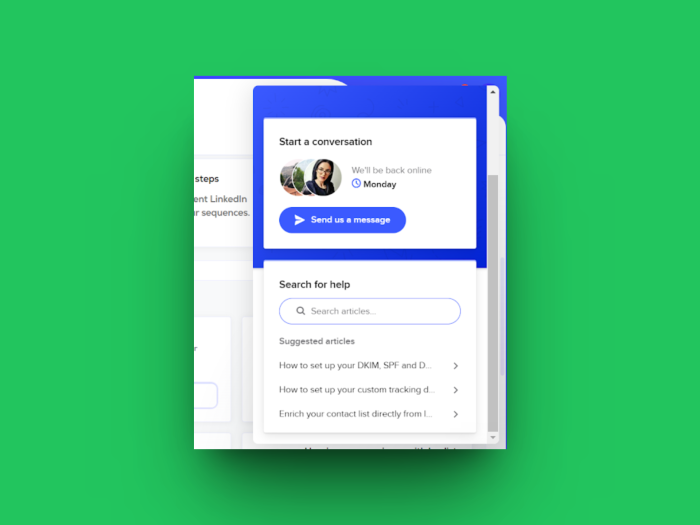
Lemlist's help menu has a chat function and a search bar to find the right resources from the help center. The chat box allows users to instantly submit a ticket when support reps are unavailable.
Besides searching for relevant resources, users can also access the most visited FAQs. The widget is easily recognizable at the bottom-right corner of the page and blends into the product’s interface.
Empower users to do more with in-app help menus
Your approach to delivering help can be a huge differentiator for your brand. Making customers wait to solve their concerns can backfire and spoil their experience. On the flip side, quickly accessible self-serve support builds product stickiness while complicated ticketing processes turn users away.
Add in-product help widgets to give users a one-click option to learn more about your product, answer key questions, and troubleshoot issues—without losing their cool.
Not sure where to start? Try Chameleon’s Launcher to see how you can amp up your user experience with meaningful support.
Design and deploy a help menu in minutes
Build and customize your own help menu with Chameleon's easy-to-use builder


