
User onboarding is an essential process that teaches your users how to be successful with your product. It’s the key to completing the journey between a visitor discovering your product, and a user appreciating the true value your product provides in their life.
Read about key thoughts to consider in your own product’s user onboarding, then be sure to rate your own product through our survey (also linked below). We’ll compile all the responses so you can see how you stack up against other companies.
Importance of keeping your users
Here’s a hypothetical scenario. Let’s assume your customer lifetime value is $300, and your customer acquisition cost is one-third of that — $100. If you neglect to keep 80% of your users when they come on board, that’s $80 you’re outright wasting. All it takes is some very simple changes in your user onboarding to turn this scenario around. You must deliver value as quickly as you can, in a very simple and relevant way.
Now, how can you make sure that you’re doing an absolutely stellar job of this?
10 Things to Ask Yourself About User Onboarding
1. Do you know your target users and their motivation?
You should be able to put yourself in your users’ shoes and view your landing page and onboarding process from their perspective. Identify the type of people that are using your site. Understand what motivates them. What problems do they have that are causing them to use your app?
2. Are you clear about the main benefit your users find from your product?
A company shouldn’t care about being able to collect mounds and mounds of data. Rather, solving customer problems by running the right experiments with that data will make a true impact. You must deliver value as quickly as you can, in a very simple and relevant way. You should be able to rank, in order, the products and features your users find most beneficial.
3. Can you demonstrate value before requesting work from your users?
Think of onboarding like you would the start of a relationship — in essence, it is. Don’t be so forward. Try giving a free demo or offering another form of value (e.g. content) even before your users have to sign up. Give them something before you ask for something.
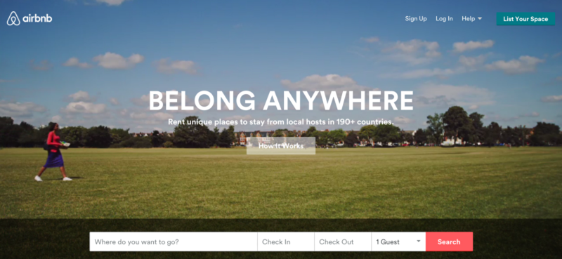
Airbnb’s homepage immediately invites users to search for places to stay.
Take a look at Airbnb’s homepage. It’s refreshing. The background is entirely welcoming, and sets the scene for me to travel somewhere new. I’m not inundated with pop-ups to sign up before I can see any content. I can instantly search for places to stay. It’s just the way to pull at my wanderlust heartstrings!
*Do you have examples of other websites that do a good job of providing value before asking for information? Add a note!
4. Do you request only the most critical information from a user?
Don’t ask for everything all at once. Stagger data requests over time. Make things easier and use a social login. This drives adoption from your users through virality and reduces friction. Moreover, a social login provides you with more data on your users. Also, think about whether it’s necessary to ask for a ton of information at the earliest stages. It probably isn’t necessary for a user to fill out complete profile information right when they sign up; they can do that later.
5. Is there a clear, structured path for users to use your product?
Don’t force users to make decisions about “what’s next” before they fully understand your interface and product. Let them know what the path looks like. Give them an overview and snapshot of the details. Start with showing them how to solve the key problems that brought them to you in the first place.
Consider supplementing your onboarding with a guided product tour for your users from Chameleon.
6. Are you teaching your users without overwhelming or boring them?
Many tools are feature-rich. It can be hard to decide what’s most important to showcase first. Again, place yourself in your users’ shoes, and don’t just assume your UI is intuitive. In doing so, many users will fail to discover key features. If you have key features that apply to different types of users, consider having different homepages to cater to each group.
7. Is your teaching contextual and actionable?
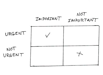
Focus on what’s both urgent and important for value realization from your users’ perspective
People learn best when they are provided information as they need it. They develop habits when they are able to use things soon after learning them. Teach your users about key features in a natural flow. Start with the basics, and build on the learning where and when it makes sense.
8. Do users know what success looks like?
Fill in empty fields with smart default data, use a checklist so users can track their progress, and give positive feedback after successful user actions. Everyone likes to have a little validation that they’re doing a good job!
I just recently signed up for Buffer. This was the very first page I was greeted with after linking my Twitter account.
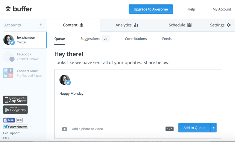
Just after I signed up for Buffer (which was an easy, one-step Twitter sign up), it is obvious what Buffer wants me to do first-schedule an update.
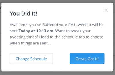
As soon as I click “Add to Queue,” Buffer instantly tells me I did something right. Excellent positive encouragement. It also teaches me the next natural step — how to change my scheduled tweeting times — which is a perfect example of providing relevant and actionable instructions.
9. Do you engage users via other channels?
Send your users a personalized congratulatory / welcome email with a hook to take followup actions. Don’t make this email seem too “marketing-y.”
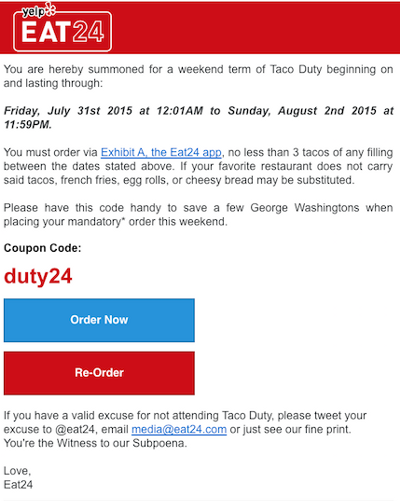
Instead, thank your users for signing up, offer yourself as a resource for help, and suggest some followup actions. Continue to communicate with your users in an engaging way. Be conversational whenever possible. Eat24 is notorious for engaging its customer base through witty, cheeky humor.
Which other companies stick out to you that do a great job of engaging with their customers? Leave a note!
10. Are you refining and optimizing the process?
Think of your user onboarding as a gateway to your overall customer experience. Your onboarding should preclude a negative experience from the very beginning.
Test your variants and conduct user research sessions to identify what is working and what should be improved. Your existing users’ needs will change as they grow with the product, and your new users’ needs will evolve over time. Make sure you are constantly measuring and analyzing ways to optimize your onboarding.
One Step Further
What if you’re thinking, “This all sounds great, but it’s easier said than done,” “I don’t have the resources to engineer this,” or “I wish I had more help to get this right?”
Consider sharing this article with your network & getting feedback on your product’s onboarding. Also be sure to check out Chameleon for more onboarding and design advice.
Your onboarding experience is the very first place where you get to make an impression with your users, so make sure it is nothing but great.
If you liked this article, be sure to recommend it!
Follow Chameleon on Twitter @trychameleon.


