


If your users are feeling lost the moment they interact with your product, you’ve got a problem. The difference between a product that thrives and one that gets abandoned comes down to how quickly and clearly users can grasp its value.
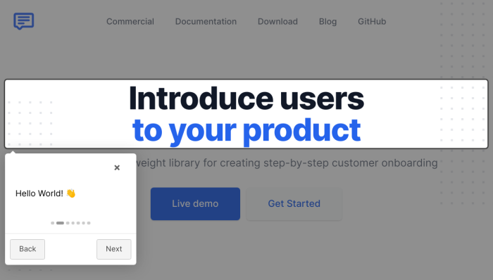
Product tours help guide your users towards their "aha" moment. When you offer contextual guidance baked into product interactions , you point your users in the right direction, help them complete their task, and realize your product’s value ASAP.
So how exactly do you create product tours that are effective at customer onboarding? In this guide we list real examples of successful product tours and tips on how to design them for maximum engagement, so your users feel confident and comfortable from day one.
Here is a quick summary video to tell you what this guide will be about:
Product tours are also known as product walkthroughs, in-app guides, onboarding tours, or product tutorials. Either way, they are a powerful tool for user engagement and product adoption.
What makes a tour successful? To be effective, a tour should be short and non-intrusive, timely and relevant, contextual and informative.
Each tour will have its purpose, whether it’s to onboard new users, walk existing users through a major interface redesign, or showcase new features.
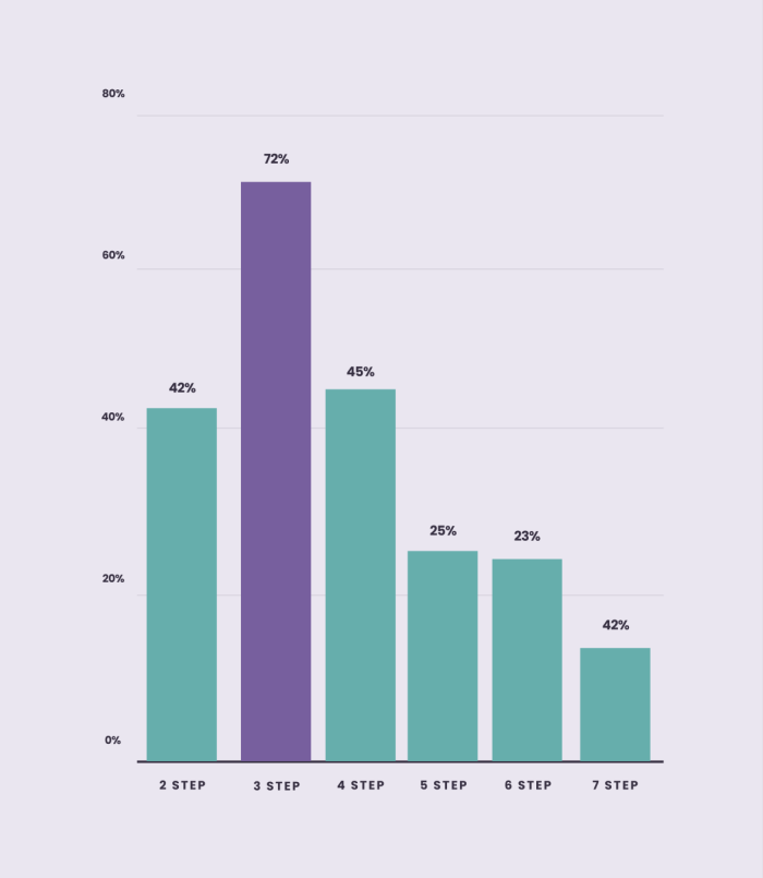
There’s no one-size-fits-all, but keep in mind that our Benchmark Report shows that three-step tours are the most effective, with a completion rate of 72%.
Some of the key guidelines on how to create successful product tours include breaking one long tour into several shorter ones, using clear and concise copy, offering self-serve support, and continuous iteration. We go into details for each guideline below 👇
And, we dissect six best-performing product tour examples for your inspiration.
What are product tours?
Product tours are interactive guides that give s a walkthrough of the product's key features. Their primary goal is to turn new users into active users and drive product adoption, ultimately achieving product-led growth.
On a technical level, product tours are composed of in-app messages that form the onboarding process. They are experiences layered over the product itself and provides an interactive guide while the user is navigating the app.
Product tours are not employee onboarding or product demos. Employee onboarding focuses on training new hires, while product demos are passive presentations. In contrast, product tours are interactive, in-app experiences designed specifically to guide users through a product and drive feature adoption.
When should you use product tours in your onboarding?
Product tours should be front and center when users first interact with your product. This ensures they get the guidance they need right when it matters most.
They’re perfect for various stages of product adoption like:
First-time logins: that first login can feel scary for your users. They’re unfamiliar with the layout, don’t know where to start, and might be unsure about how to use key features. A guided experience at this stage shows them exactly where to go and what to do first, so they can get comfortable quickly.
After major updates: just rolled out new features or big changes? A walkthrough ensures users are up to speed on what’s new without missing a beat.
For complex features: got a feature that’s powerful but not exactly intuitive? Think advanced analytics, multi-step workflows, or integrations with other tools. A guided experience breaks down the steps so users can easily grasp and use these features without getting stuck.
When users show signs of confusion: if analytics indicate users are struggling with specific features (e.g., high drop-off rates), a targeted tour can help clarify those areas
At key milestones: implement tours when users reach important milestones (e.g., completing their profile or finishing a tutorial) to encourage further exploration of advanced features
When users return after a long absence: If a user hasn’t logged in for a while, a brief tour can reacquaint them with the platform and highlight any new features they may have missed
Now that you know when to deploy guided walkthroughs, let’s dive into some real-world examples that get it right.
12 Excellent product tour examples for your inspiration
We gathered some excellent real-life examples to show you how SaaS companies are using product tours effectively. Let's dive in.
Psst... If you want to see more examples, browse our Inspiration Gallery.
1. Heap

Heap’s product isn’t exactly a walk in the park—unless your idea of a stroll involves setting up advanced analytics and tracking conversions. But Heap knows this, and instead of throwing users into the deep end, they’ve designed a product tour that feels more like having a helpful friend by your side.
The onboarding experience is split into two parts: a user onboarding checklist and hotspots that trigger tooltips, showing the user how to complete each checklist task.
The tooltips are the tour guides that breaks down complex actions—like setting up events and tracking conversions—into bite-sized, easy-to-digest steps. It’s like Heap is saying, “We know this is a lot, but we’ve got you.”
What makes Heap a good example?
👉 Checklist-based onboarding makes the process organized and easy to follow
👉 Step-by-step tooltips guide users through tasks without overwhelming them, so they learn by doing.
👉 Context-sensitive help reduces confusion and lets users stay focused on their immediate tasks
2. Typeform
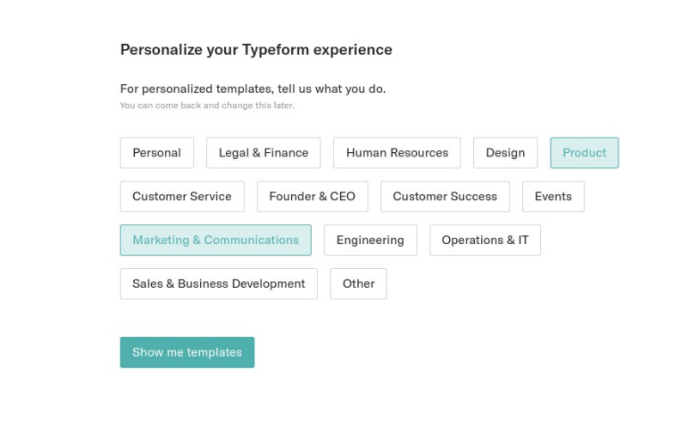
Typeform has a lot going on—from creating lead generation forms to setting up event registrations, or even just making a fun quiz for the office. With so many possibilities, onboarding could easily become overwhelming. But Typeform handles it with finesse.
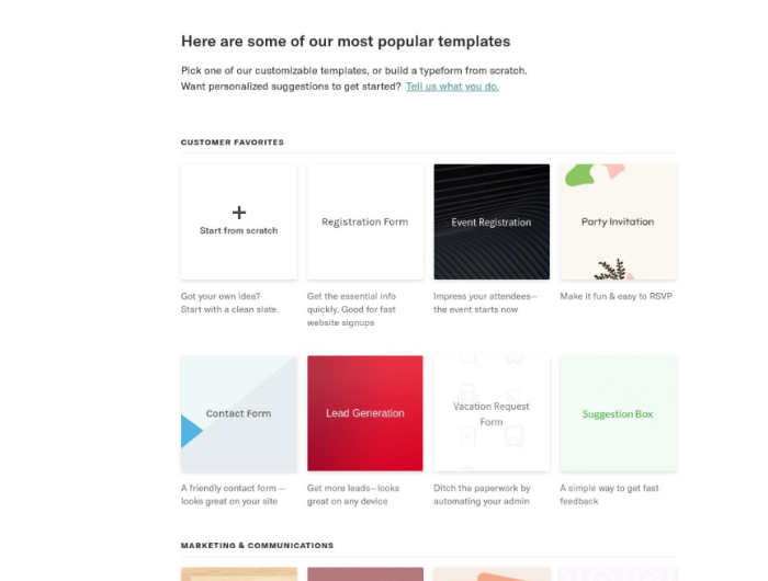
When users start with Typeform, they’re asked a simple question: What do you want to do? This immediately tailors the experience to their needs, whether they’re building something from scratch or tweaking one of Typeform’s pre-made templates.
For Typeform, the pre-made forms themselves act as the product tours – sequential, educational, and driven by tangible examples. This is a great way to drive users to the “aha!” moment quickly.
What makes Typeform a good example?
👉 Personalized onboarding based on what the user wants to achieve, ensuring relevance and immediate value
👉 Template-driven learning teaches best practices while helping users create something useful right away
👉 Seamless guidance directly within the user’s workflow, makes it easy to learn and apply new features without disrupting the creative process
3. Slack
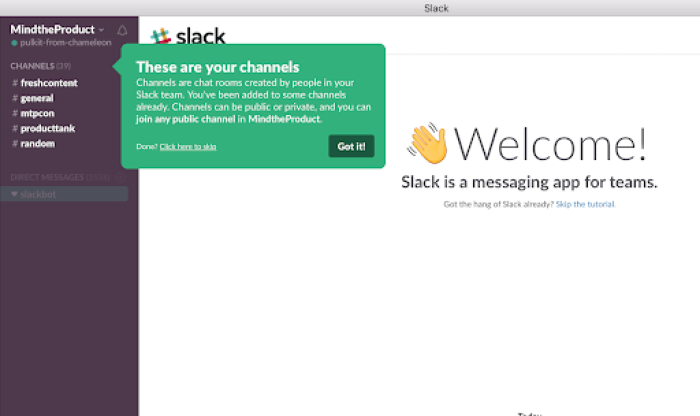
Slack’s onboarding experience stands out for its simplicity and effectiveness. From the start, Slack uses a series of bright, well-placed tooltips tooltips and personable copy in its now-legendary product tour.
The series of tooltips highlight public channels and direct messages to help the user understand the differences, benefits, and product terminology.
A key feature of Slack’s product tour is the use of Slackbot, an in-app bot that guides users through basic tasks. This approach is particularly effective because it teaches users through doing, rather than just telling. Slackbot engages users in real-time, showing them how to use the platform's core functionalities while making the experience feel personalized and hands-on.
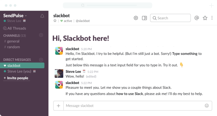
The onboarding also effectively communicates Slack’s brand personality with a laid-back, conversational tone. This makes the learning process less daunting and more intuitive, helping users quickly grasp the differences between public channels, private messages, and other features without feeling overwhelmed.
What makes Slack a good example?
👉 Engaging interaction with Slackbot immediately involves users in a chat and makes learning interactive and fun from the start
👉 Casual, approachable tone aligns with Slack’s brand, making complex features feel more accessible
👉 Focused tooltips are strategically placed to highlight essential features, like channels and direct messages
Want to create a similar tour for your product? Check out the video below to see how to re-create Slack's user onboarding experience with Chameleon 😎
Chameleon Recipes: Recreating Slack's User Onboarding
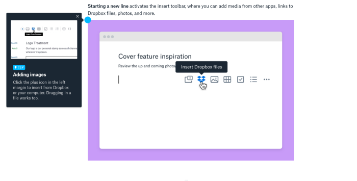
4. Dropbox Paper
Dropbox Paper understands that its users want to create collaborative documents that are easy to share and fun to use. So, its product tour is built into a gorgeous example document – Getting Started with Dropbox Paper.
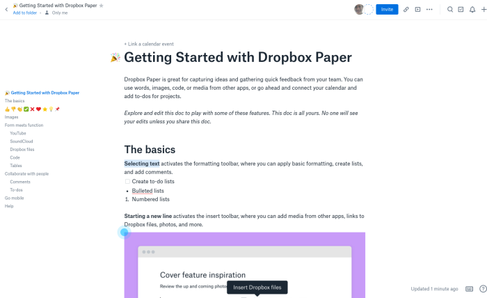
The document is packed with hotspots that show rich video tooltips explaining the core features of Paper: changing formatting, adding files, and – of course – inserting emojis.
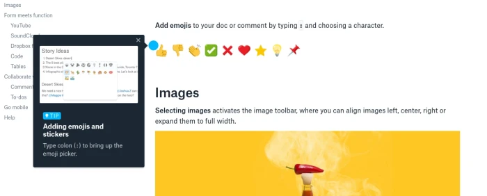
In a fun product aimed at creatives instead of enterprise executives, it makes a lot of sense to sell the benefits of emoji so early; Dropbox shows the feature off even before it explains how to format code or embed files. 🤓
What makes Dropbox Paper a good example?
👉 Dropbox Paper uses modals effectively to grab users' attention at key moments, helping them focus on essential features without getting lost in unnecessary details
👉 The tooltips are well-placed and appear exactly when needed, making sure users aren’t overwhelmed and can easily follow along with the tour.
👉The tour’s design is simple and uncluttered, allowing users to concentrate on learning the core functionalities without distraction.
5. Airtable
It looks delightfully like it was built by Fisher-Price, but Airtable is a very complex product that condenses the power of an SQL database into something as simple as Google Sheets.
To simplify that inherent complexity, Airtable's product tour shows snippets of high-level information and practical gifs on a self-serve basis.
The multicolored row of icons in the bottom right each represents one part of the tour and highlights a specific feature with its core benefit and a call-to-action.
What makes Airtable a good example?
👉 Combination of UI patterns: Airtable uses a mix of modals, tooltips, and slideouts, keeping the product tour engaging and visually appealing. This variety helps maintain user interest and ensures key features are highlighted effectively.
👉 Sequential click-through: The tour progresses in a logical sequence, allowing users to learn step-by-step without feeling overwhelmed. This makes it easier for users to follow along and understand each feature.
👉 On-demand help: Airtable provides users with the flexibility to revisit the tour or access tooltips whenever they need additional guidance
6. Pipefy
With Chameleon Launchers, Pipefy created a self-serve onboarding checklist, which can be toggled on and off. The checklists were designed to highlight quick and actionable items to help guide users through their journey.
It also added a progress bar to keep people on track wherever they are in the onboarding process. The progress bar helped keep users oriented within the onboarding journey, showing them where they were in the process at any given time. This reduced potential confusion and helped users understand the structure of the onboarding.
With this approach, Pipefy increased user retention from a baseline of 7%–12% to an impressive 20%–30% between days 8 and 14. This more than doubling of retention highlights the effectiveness of tailored onboarding in engaging users from the start, ensuring they understand and derive value from the product.
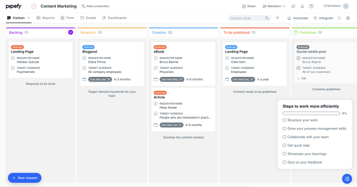
What makes Pipefy a good example?
👉 Clear, step-by-step guidance: Pipefy uses tooltips and hotspots to guide users through essential features, helping them understand complex workflows without feeling overwhelmed
👉 Dual navigation options: the inclusion of both “Next” and “Back” buttons in tooltips allows users to control their learning pace, making the tour more user-friendly and flexible
👉 Minimalist design with focus: Pipefy's tooltips are designed with a darkened, transparent background, which draws attention to the instructions while still keeping the overall interface visible
Why wing it? Start owning your user journey with Chameleon
Get started for free with Chameleon and harness the power of product tours, tooltips, checklists, surveys, and more
7. Salesforce

Salesforce’s product tour takes a hands-on approach with interactive walkthroughs powered by modals—those helpful pop-up windows that show up just when you need them. These modals guide users through essential tasks like setting up dashboards, managing contacts, and integrating apps, making the learning curve a lot less steep.
What makes them stand out? They're short and sweet, offering just enough info to get the job done without overwhelming users. It’s like having a helpful tour guide who shows you the ropes, then steps back so you can dive right in and get the most out of Salesforce from day one
What makes Salesforce a good example?
👉 Contextual guidance: Salesforce provides interactive modals and tooltips that appear right when users need them, helping them navigate complex features without feeling lost
👉 Tailored onboarding: the tour adapts based on the user’s experience level, offering more detailed instructions for beginners while allowing advanced users to dive straight into more complex tasks.
👉 Hands-on learning: by guiding users through real tasks like setting up dashboards and managing contacts, Salesforce ensures that users can immediately apply what they’ve learned
8. Asana
-(2).gif)
Asana’s product tour helps you get started by walking you through creating your first project and tasks. You’ll be guided through essential steps like setting up a team project, assigning tasks, and setting deadlines—practical things you’ll be doing regularly. It’s an interactive way to show how Asana fits seamlessly into your daily workflow.
Asana also uses tooltips that appear at the right moments, offering small, contextual prompts to guide you. For example, when you create a task, a tooltip will show how to set a due date or add a team member, making sure you stay on track without missing a beat.
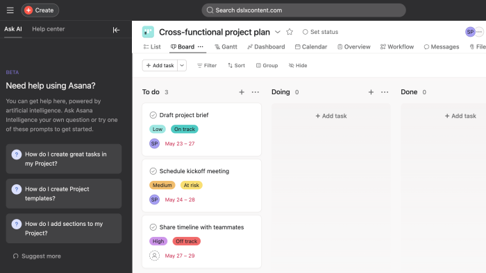
Plus, the “Getting Started” provides ongoing support. This guide is a mix of video tutorials, articles, and in-app tips that keep you moving forward without getting stuck. It’s designed to be there when you need it but stays out of the way when you don’t.
What makes Asana a good example?
👉 Hands-on, real-world setup: Asana’s tour helps users get started by guiding them through setting up actual projects and tasks that are relevant to their work, making the onboarding process immediately practical
👉 Role-specific guidance: the onboarding experience adapts based on the user’s role, whether they’re managing a team or organizing personal tasks, ensuring the tour is tailored to what each user needs
9. Notion
.gif)
Notion stands out for its versatility, letting users organize everything from personal notes to complex team projects. Its product tour combines interactive tooltips with a handy onboarding checklist. The tooltips guide users through key actions like creating a first note, setting up a database, or personalizing their workspace.
Notion also uses empty states effectively. When you first open a new page or database, the empty state isn’t just blank—it’s pre-filled with tips and prompts that guide you on how to use that space. This makes the learning process feel intuitive.
Another standout feature is Notion’s use of micro-videos embedded within the tooltips and checklists. These videos provide quick, visual explanations for more complex tasks, ensuring that users don’t get stuck and can see exactly how a feature works in action.
What makes Notion a good example?
👉 Customizable learning path: Notion’s tour lets users explore features at their own pace, offering a flexible onboarding experience that adapts to different user needs and preferences.
👉 Interactive templates: Notion uses real-time templates in its onboarding, allowing users to experiment with actual content while learning, which makes the experience more practical and relevant.
👉 Embedded micro-videos: the inclusion of short, embedded videos within tooltips gives users quick, visual explanations of complex features
10. Jira
Jira’s onboarding goes beyond basic guidance, offering a tailored experience based on the type of project you're creating. Whether you're managing a software development project or a marketing campaign, Jira provides specific templates and customization options.
The product tour helps you configure workflows that fit your team's exact needs. With detailed, contextual tips embedded throughout, Jira ensures that even complex processes, like assigning tasks or managing sprints, feel intuitive from the start.
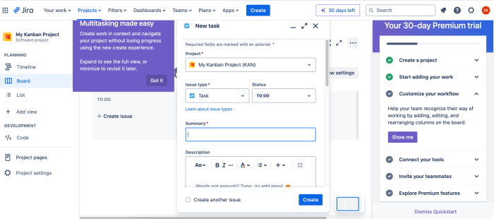
What makes Jira a good example?
👉 Advanced workflow customization: Jira’s tour focuses on helping users configure detailed workflows that match their team’s specific processes
👉 Real-time issue tracking guidance: the tour focuses setting up issue types and tracking, which is crucial for managing tasks in real-time, making it highly relevant for development teams
👉 Flexible exploration: Jira’s tour allows users to skip or dive deeper into features as they choose, providing flexibility that accommodates different levels of expertise
11. Loom
.gif)
Loom uses a short, interactive product tour that focuses on getting users to understand the core functionality of recording and sharing videos. The tour starts by guiding users through the basics of creating their first video, offering clear, simple instructions through a series of pop-up tooltips.
For example, when you first hit the record button, a tooltip might explain how to adjust your recording settings or how to share the video once it’s done. This step-by-step guidance helps users quickly grasp how to use Loom effectively.
What makes Loom a good example?
👉 Instant usability: Loom’s tour focuses on getting users to record their first video quickly, making it easy for users to see immediate value without a steep learning curve
👉 Visual learning with embedded videos: the tour includes short, embedded video guides that show users exactly how to use key features, catering to visual learners and making the onboarding process more engaging
👉 Minimalistic design: Loom’s product tour is designed to be quick and to the point, so that users aren’t bogged down with unnecessary details and can start using the platform right away
12. Grammarly
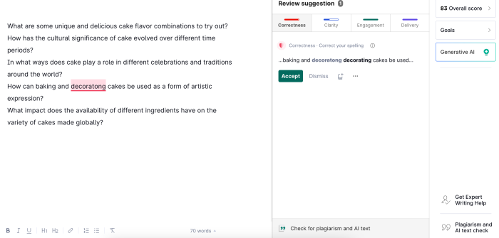
Grammarly has a simple, interactive walkthrough that helps users understand the key features—like checking grammar, spelling, and style in real-time. This helps users immediately see how these features can improve their writing.
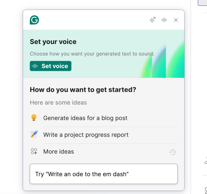
Right from the start, it asks you about your specific writing goals, whether it's crafting professional emails, academic papers, or something casual. This helps Grammarly tailor its suggestions to your needs, ensuring that the feedback you get is relevant and useful from day one. It’s a smart way to make users feel like the tool is truly built for them.
Plus, Grammarly uses micro-interactions—small animations and notifications that reinforce positive behavior (like correctly applying a suggestion), making the learning experience more dynamic and satisfying.
What makes Grammarly a good example?
👉 Real-time feedback: Grammarly’s tour shows users the tool’s impact instantly, helping them see value from the first use
👉 Integrated learning: Suggestions are embedded directly in the writing process, making the learning experience seamless and relevant
👉 Personalized guidance: Grammarly adapts its tips based on the user’s writing style, ensuring that the advice feels tailored and practical
6 essential guidelines for a successful product tour
Now let's talk about what it takes to create successful product tours that convert new users and help existing users deepen their product knowledge.
Each tour you create will have its purpose – to onboard new users, walk existing users through a major redesign, showcase a new feature, guide customers through a product plan upgrade, or something else that is relevant to your product.
Let's look into the most important principles and guidelines that will help you build engaging tours.
1. Don't lecture 🤐
When someone signs up for your product, they are excited to play with it and are often not prepared for long introductory tutorials. Showing a comprehensive tour as soon as they land inside your product for the first time will often be met with resistance – users will immediately seek to close/dismiss it.
In fact, keeping things short has a lot of benefits. We analyzed 58 million Tours made with Chameleon – started within a period of 12 months – and found that top-performing product tours have a clear message with 25 words per step. That's the same length as a Tweet, so each step needs to be concise and instantly understandable. Otherwise, a tour could easily become overwhelming.
Why is this important?
Users typically want to get a "lay of the land" with your product before they are ready for guidance. That's why you need to gradually reveal your tours and offer just the right information at the right time.
Once users understand the basics of your product and how it helps them solve their problems, there will be plenty of time to introduce more advanced functionalities.
Key takeaways:
Ask whether users are interested in a tour as the first step. Offer a “Snooze” button to enable users to come back at their own convenience.
Remember that tours are part of your product marketing, so ensure that the messaging and design are compelling, engaging, and aligned with your brand
Use a less-invasive step design (e.g. don't cover the whole screen), or you could risk annoying users. You can go with slide-outs and modals, or enable users to start a tour by triggering a certain element on the page (e.g. icon or a hotspot).
2. Break up the user journey💔
People learn by doing, so giving users a chance to implement your guidance is critical. Long tours increase anxiety because users worry they have to ingest a lot of information before they can use it. And this is also backed up by psychology.
Miller's Law states that the average person can keep up to around seven items in their working memory. This means that the fewer items your users have to retain, the more successful they will be in learning new information. This is why you should build your Tours in as few steps as possible.
Findings from our 2022 Benchmark Report show that three-step tours are the most effective with a completion rate of 72%, three-step tours are the most effective, hands down. Add one step and the completion rate drops to 45%, while seven-step tours have a completion rate of only 16%.
In other words, people like shorter tours.
Why is this important?
With timely, relevant, and contextual tours, you will navigate users step by step through each action they need to take. This way, you avoid overwhelming them with too much information to comprehend at once. Here is our CEO Pulkit explaining more in detail why this is so important:
Key takeaways:
Don't try to teach everything. Pick a single user action as the goal, and create a 3-step tour to convince a user to take that action.
Create many smaller tours rather than a single long tour. With Chameleon, you can also prioritize and sequence your Tours.
Copy is your #1 lever, make it clear, concise, and benefit-focused. Use copy to encourage users, make them feel comfortable, and put off any doubts they may have.
3. Provide value 💡
Users should feel thankful after seeing your tour. It should not be annoying or draining in any way for them to complete the tour, so don't ask them to undertake lots of work to get value.
Instead, surprise and delight them with additional information that they would not have otherwise gleaned from your interface.
Why is this important?
If users don't find your tours valuable, they will exit and be less open to further teaching in the future – so it's vital that you don't reduce your credibility by building irrelevant tours.
On the other hand, our benchmark data shows that users are 4.5x more likely to complete a second tour if they complete the first instead of dismissing it.
Key takeaways:
Review your tour: Did you enjoy going through it? Ask your teammates, too. And, don't forget to ask your users directly for their feedback.
You can use Customer Effort Score surveys (more specific and actionable than NPS) to measure user satisfaction with key features or UX/UI elements.
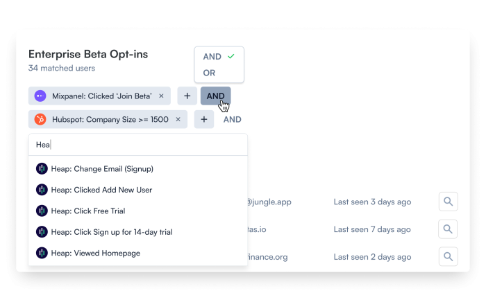
Assess how well your tours are performing – make sure you have connected your product analytics tool to see a bigger picture. For this, if you're using Chameleon, leverage deep integrations with Mixpanel, Heap, Amplitude, and other tools to easily see performance data.
4. Embrace self-discovery 🔦
Although it's natural to want to pull your users through all of the hoops you want them to jump through, using product tours to do this will fail. You simply cannot force a user to use your product, and highlighting everything you want them to do is a bad way to encourage engagement.
For instance, our research shows that enabling users to take a tour at their own pace by providing a “Snooze” button will increase the chance of more users taking the tour and, eventually, completing it. Our 2023 Benchmark Report found that when given the option to snooze, one in five users will come back to the Tour to finish it, which is much better than them skipping it altogether.
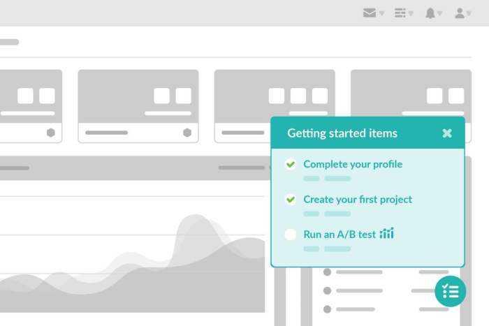
Or consider onboarding checklists. These self-serve widgets allow users to go through the onboarding process at their own pace, and increasingly it is becoming a preferred method of onboarding in contrast to linear product tours.
Don't take our word for it. That's what the users say. Our 2023 Benchmark Report revealed that Tours started from Launchers had a 61.65% completion rate, which is almost double the average.
Why is this important?
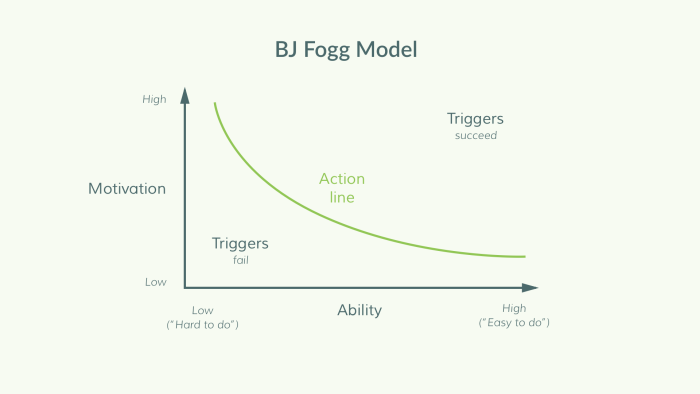
The BJ Fogg Behavior Model explains that people take action when they are motivated, they have the ability, and they are triggered, so you need a combination of these three elements to keep your users engaged. Focus on motivating users to take the action and offer self-serve support to enable users to learn at their own pace.
Key takeaways:
Keep behavioral principles in mind when creating a tour, and make sure your users have the motivation, ability, and the right prompt to take action.
Focus your copy on explaining why a user should take certain actions; what value will they gain from doing so.
Use tours to highlight the most fundamental aspects of your product. For other ancillary features, use single-step tours as signposts.
5. Don't set it and forget it 😴
Traditionally, user onboarding was a set-and-forget project – teams would spend weeks overhauling the onboarding flow, then shift focus away, and repeat after 12 months. This is an inefficient and ineffective way to use product tours. Instead, collect feedback constantly on your product tours and iterate based on user feedback to continuously improve them.
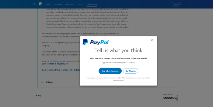
For instance, a simple in-app survey like this one from Paypal below can go a long way in gathering constant feedback:
Why is this important?
To keep up with ever-evolving user needs, apply Agile principles to the tour creation. Once you've built your tour, focus on collecting user feedback, analyzing the performance data, and iterate on until you're satisfied with the outcome.
Key takeaways:
Be outcome-driven, not output-driven. Focus on a key quantitative goal and continue to focus on improving your product tour until you get there.
Set a conversion goal, beyond the completion of the tour. For example, you can use Chameleon for this, as it lets you track goals (such as clicks) without writing any code.
Provide clear accountability to someone on your team to own product tours and be responsible for regular updates.
6. Timing and context are key
Lastly, when it comes to delivering a great product tour, it's important to give users value exactly when and where they need it. For instance, if you have a tour that tells the user about a new feature, it should only launch when that feature is present on the page.
Our data from the 2023 Benchmark Report suggests that Tours positioned relative to on-page triggers have a completion rate of 69.56% which is well over the average, meaning that Tours that are contextually related to what is on-page are much more well-received.
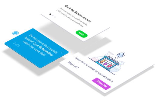
Or better yet, have your Tours trigger only when there is user interest. Such as when users hover over certain icons to find out more or click on an element. Below are some examples of this.
Another way to do this is to target different user segments to see what context is best for optimal engagement. Not all product tours have to be shown to everyone. Show the right ones to the right users.
Why is this important?
If your Tour pops out when it isn't wanted or it isn't related to what is being served, it'll only cause a negative experience for the user.
On the other hand, if your Tour actually helps the user along and educates them, that adds constructively to the experience, which means they're more likely to find value in your product.
Key takeaways:
Be mindful of the context that your tour is being launched under. Is it related to the experience? Is it something the user will find useful? The answer should be nothing but yes.
Think about when you're serving the Tour. Is it actually wanted? Or is it just a nuisance? Your Tours should be gentle nudges, not an intrusion. Try to trigger your Tours when there is a sign of user interest, such as a hover or a click over the element.
Now that we've talked about everything that has to do with product tours, and what you should look for in product tour software, we'll leave you with a simple list of recommendations
1. Chameleon: product adoption platform for better user onboarding and in-app feedback loops
We pinky promise that we say this with no bias. Chameleon is currently the product adoption platform with the deepest configuration and customization options.
From the way you can style your experiences to match your brand, as well as set granular targeting options, Chameleon is what you need if you're looking to create sophisticated product tours.
Pricing starts at $279 a month for up to 2,000 MAUs.
👉 Explore an interactive demo and see how easy it is to build a product Tour with Chameleon, without any code.
2. Appcues: If you need iOS and Android mobile product tours
If you want to create product tours for mobile apps, then Appcues is your answer. Appcues is one of the most popular tools in the product adoption space, but what really sets it apart is native mobile onboarding for iOS and Android applications.
Pricing starts at $249 a month for up to 2,500 MAUs and cost is adjusted depending on how many users you'll be tracking as well as what more features you need.
3. Pendo: For those looking for product tours and onboarding in one
If you're looking for analytics tools in addition to product tours, then Pendo is what you might be looking for. Pendo is a bit of a jack of all trades. Every product tour software comes with some kind of analytics dashboard, but Pendo's analytics solution is more advanced than your typical product tour builder.
So if you want to have both analytics and product tours in one solution instead of paying for two. This is an option. If you have an existing analytics tool, Pendo might be an overkill.
4. UserGuiding: The budget option that is simple and straightforward
If the price tag of the above tools scares you a bit, then there is a cheaper option: UserGuiding. at $89 a month for up to 2,500 MAUs, it essentially has all the basic product tour features you would need to build something with.
Of course, as you get deeper into building more sophisticated product tours, you might want to invest in something better, but if you're budget-conscious, UserGuiding is where you can start.
5. IntroJS: An open-source library for DIY product teams
IntroJS is not exactly a builder. It is a lightweight JavaScript library for creating interactive product tours and user onboarding. For teams with dev resource to spare, IntroJS can be a reasonable option, especially because it involves almost no cost at a one time fee of $9.99 for a commercial license.
Plus, it seems to have more support and frequent updates than other open source JavaScript libraries, which makes sense considering big brands like Amzon and SAP use the library.
What you should look for in a good product tour software
Now that you know how to build great product tours, you might be thinking about getting a product tour tool or in order to create interactive walkthroughs.
There are many options out there and you may be unsure of which is the best product tour software for you. So we want to leave you with essential features that you should have when you get one.
No-code editor
First and foremost, your tool should be code free, so that you could do everything without relying on your engineering team. What makes a product tour software a great solution is that it saves resources, and a big part of that comes from not having to take development support.
Therefore, the tool of your choice should require zero coding knowledge to create an effective interactive product tour.
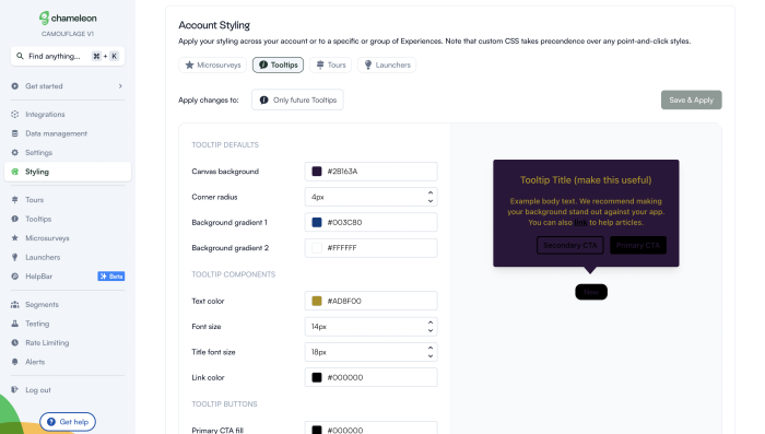
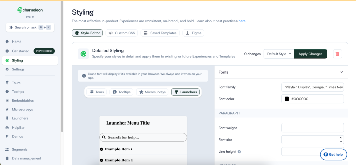
Fully customizable styling
Nothing derails the user journey like an experience that looks way off your brand style. From simple things like fonts, colors, and button shapes to custom CSS, you should be able to tailor every single in-product experience to look 100% on-brand.
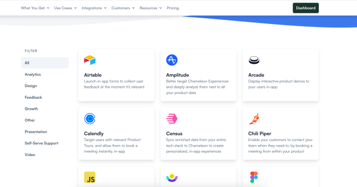
Deep integrations
Your team likely uses a stack of tools for various purposes, whether it's a CRM or an advanced analytics tool. Therefore, for the best results, your product tour software should be able to integrate deeply with a broad range of other SaaS products.
Now you might be thinking, why don't you just get an all-in-one tool rather than a focused and extensive product tour software? This is true, there are few like this, such as Intercom Product Tours, which is a product tour add on to its core offering of customer communication.
The problem with jack-of-all-trades tools is that they're always missing something compared to the next best product tour software alternative, and they also may not accommodate your specific needs from a product tour tool. There is merit to integrating the best tools together to create a stack that is optimally customized to your goals.
Native A/B testing
We talked about why it's important to take feedback and iterate your tours to improve. For that, it's best to experiment and test different versions of your product walkthroughs to know what really works.
Thus, you should be able to set up native A/B testing right from your product tour solution.
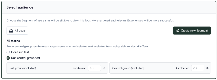
Contextual targeting
A product walkthrough that gives the same experience to every user is not as effective as a hyper-targeted one. Because user behavior may diverge depending on various attributes such as profiles, as well as key actions taken during the user journey.
You can create a much more user friendly product tour by tailoring tours according to different context. For that, you need product tour features that allow you to target and adapt.
For instance, with Chameleon you can create custom audiences and configure environments, as well as decide how certain Tours will trigger.
Thorough Help Documentation
Even if support is top-notch, they can't be there for you 24/7. In fact, the best kind of support is one that solves the problem before you ever have to get in touch with the support team. That's where the help documentation shines.
Great help documentation improves user onboarding, reduces the learning curve, provides consistent and accurate information, enables self-service support, and ensures scalability and accessibility. Overall, it enhances user satisfaction and promotes effective utilization of the tool.
So watch for how effective and thorough the tool's help docs are.
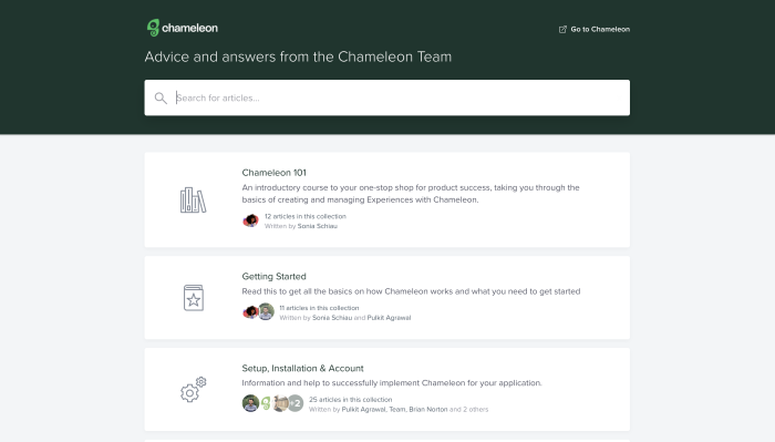
Chameleon's help center provides answers for all kinds of issues and troubles.
Technical reliability
Last, but not least, technical reliability is a must-have. If your product adoption software is slowing your product down overall, or it's making your product less usable, that defeats the purpose.
So make sure to look out for how technically robust the tool is. Try out all sorts of functionalities in various contexts. If your product has a specific requirement, make sure that the requirement is smoothly fulfilled with the tool. These include but are not limited to:
Mobile support
Single Page Application support
iFrame support
Shadow DOM support
100% uptime
If your app is built on one of these frameworks, make sure it's supported by your tool of choice.
5 Product Tour Builders You Should Check Out
Engage more users and drive customer success with masterful product tours
Take away these core guidelines and key principles, create guided tours, and start testing and iterating until perfect. It's time for you to apply these lessons to your own product tour.
Before you know it, you'll be building effective product tours that can drive lots of happiness (and learning!) for your users, as well as increased user engagement for your product.
We're always happy to help – if you'd like to speak with one of our product specialists to learn what product tours you should be building based on your goals, let's talk! You can book a demo below, or start using Chameleon for free to explore by yourself and get a sense of what your next product will look like.
Build in-app guides to retain users
Chameleon makes it easy for product teams to create product tours, tooltips, onboarding checklists, and in-app surveys without code.
