Five easy ways to improve your product's trial experience without needing your engineers
The SaaS free trial is one of the most effective ways to generate leads and convert users into paying customers. However, if you haven't optimized the flow of your free trial conversions, you're leaving easy money on the table. It's not that they're merely trying out the free version. It means they are evaluating to see whether they want to be a paying customer.
So if you don't help them achieve their “Aha!” moment, the point when they understand the benefit of your product and become ready to buy or invest more, you're missing out on this key part of user onboarding.
And this is true no matter how free trials are applied, whether it's an opt-in free trial where a user can try the product without entering payment information or an opt-out free trial that requires credit card details.
But here's a problem. How do you do this without the help of your developers making changes to the in-app experience?
Five tactics to improve your free trial conversion rate with no devs
The key is to focus on what you can actually do to the user experience that doesn't require any coding at all. And there are quite a few.
So here are 5 ways to help get your users to the “Aha!” moment and increase your free trial conversion rate, all without requiring your engineers.
1. Ask your users
It may seem counter-intuitive, but users that don't convert can be as valuable as users who do convert; they are a great source for identifying improvements.
Asking your users for feedback can help pinpoint the "Aha!" moment and where on the path they got stuck. That is where you should focus your experiments. Ask users that become customers and also those that churn -- both will have insights.
The first thing to evaluate is whether a user found your product's value proposition. Knowing if they arrived at “Aha!” will help isolate whether the problem is with fit or discovery.
If they found “aha” -- your value proposition wasn't strong enough.
This might mean you are targeting the wrong audience or that your messaging is attracting the wrong type of user. Take a look at those that didn't convert and see if they match your target audience. You also may want to experiment with different marketing messages to make sure you are hitting the pain points of your target audience.
Alternatively if people say that they like the product but just aren't ready to pay for it, the value probably doesn't resonate deeply at this point in time. Their pain may not be acute, or they may not be ready to make a decision (due to a variety of reasons). You can retain your relationship with these users by building a nurture campaign.
If they didn't find “aha” -- your value proposition wasn't discovered. This may be evident if they mention wishing for features you have, or express frustration about interacting with the interface. Users don't want to learn how to use your product so this problem is equally about improving their motivation, as well as reducing the friction in the interface.
How to get feedback
Ask; a triggered email after a user's free trial ends or if they canceled their free trial and did not purchase.
Make it personal; either follow up individually, or keep automated emails simple - plain-text from the PM or founder - this make it feels more personal and more engaging.
Provide options; in the email you can include a link to a survey (we use and love Typeform), request they schedule a call, or request an open-ended reply.
Incentivize them; a simple $10 Amazon gift card might be enough, and help get some responses.
Always respond; if anyone provides feedback, ensure you respond to them in a kind and thankful manner. This will help build the relationship for the future. You might even explain your plans to remedy their grievances.
Keep the goal in sight; it's to collect feedback NOT to re-sell or re-engage them. Being defensive or trying to sell a user giving feedback is off-putting and will distract from the more valuable goal of fixing your product.
Example: Feedly
Below is a simple example of how Feedly sends a triggered email requesting feedback from every customer that cancels their subscription.
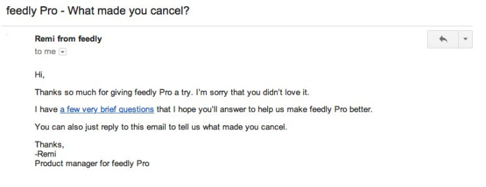
Source: Vero's blog
From our own emails, we found users appreciated being given the option for anonymous feedback via a survey, but were actually more likely to just reply back with their thoughts.
2. Stage your product (like a home)
Selling an empty home is harder than a furnished one, because prospective buyers have to put in the work to imagine what it could become. Similarly empty products are unable to convey their full power or possibility, and users may not be able or willing to imagine the end-state.
This can cause users to churn before they reach "Aha!" especially if your product is complex, or relies on inputs or setup. During a free trial users may be hesitant to invest time, so make it easy for them and fill your empty states with sample data, photos, content - whatever is necessary to show what using your product would actually be like.
Example: MuseScore
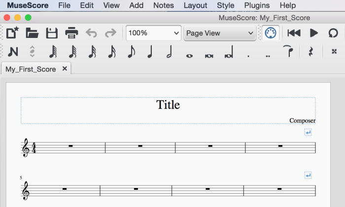
MuseScore's music-writing software opens with a ready-to-use score. Instead of taking a user through the overwhelming process of setting up preferences, choosing instruments, tempo, etc. a first-time user can immediately play around with writing music.
Example: Canva
Another example is Canva, a simple tool to design marketing materials, provides thousands of beautiful pre-built templates, instead of a blank canvas. This better showcases what is possible and helps build motivation for a user to continue.
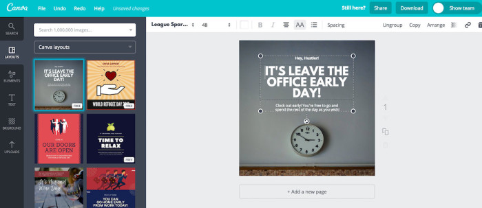
Even if you don't know the specific use case for someone, having something is better than having nothing. Don't let indecision lead to inaction; you can always make your empty states more specific and intelligent over time.
One simple way to do this is with modals containing images or gifs that add context to pages and provide examples. You can build these without writing any code with Chameleon 💪
3. Personalize the trial experience
Users appreciate solutions that are tailored to their needs and personalizing their user experience is a powerful method to improve engagement.
Personalization requires accessibility to user data. We recommend collecting usage data (Heap is a great way to do this without writing code) and supplement it with demographic or firmographic information (we use and love Clearbit).
Here are three ways you can leverage your user data to create a personalized trial experience (we recommend using a combination of these):
Tailor your onboarding emails
Instead of sending users through a generic onboarding email drip campaign 😴 try setting up triggered emails based on behavior. Target a user who has not taken a high value action within your product as a way to re-engage them and drive them back to your product.
If you are a B2B enterprise SaaS company that is evaluating a potential platform, it can be frustrating to only receive a case study referencing a B2C use case. Leverage your user's role or industry data to send relevant customer case studies that hit on their pain points and showcase how other companies similar to them found success with your product.
Create targeted product tours
Small nudges towards specific actions can be the difference between conversion and churn. Help users find value with triggered guidance based on who they are and what they have (or haven't) done. For example:
Provide a tailored tour for each persona, highlighting features that are specific to their unique use case.
Drive feature discovery by targeting users that have not previously interacted with key functionality.
When a user shows signs of getting stuck, trigger a message asking if they may need assistance, or maybe recommend a few helpful docs.
Example: Mixpanel
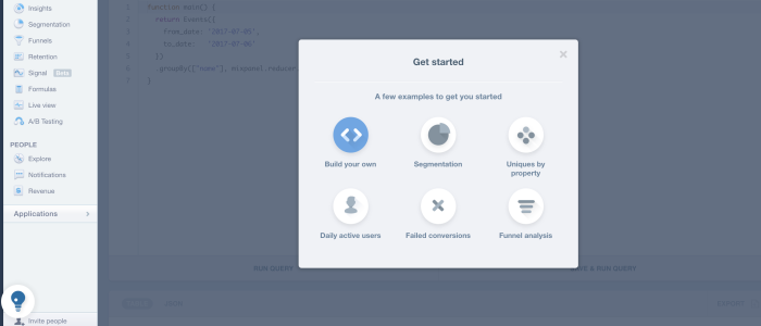
Mixpanel shows options to a new user, who can select what guidance they want to take.
Arm your sales team
Send any valuable user data you are already collecting to a CRM system so your sales team can have more meaningful conversations, demos and follow ups with your potential customers. This will also save your sales reps' time!
4. Optimize trial length
Many companies offer the standard 30-day free trial period, but that's not necessarily the best length for each product. Although this might provide sufficient time to get things started, it's smart to evaluate how people are using that time.

The trial should be long enough for people to see value in the product and get comfortable with your interface, but not so long that they aren't feeling a sense of urgency to explore and uncover value quickly.
One easy way to test sign up length is a simple A/B test, where you offer different length trials to different people, with your current timeline as a control. For example, you might set one group at seven days, one at two weeks, and one at the full 30 days. ProdPad tested a 7-day trial with the option to extend, down from a full 30-day trial, and doubled their conversion rate.
Even if you don't see a significant difference between groups, shortening a free trial may still have benefits for your team, like freeing up customer success people from supporting a lengthier trial period.
5. Use high-touch concierge onboarding
Concierge onboarding is when you personally reach out to new users to talk to them and help them with your product. It's a high-touch interaction that can be an effective way to onboard customers. Especially if you have a product where multiple team members are coordinating, or one that requires more extensive knowledge for setup.
Although concierge onboarding doesn't scale very well, it could be worth investing the time if:
You're a new company with a small number of free trial users. Interacting with users early in your product can help you build a rapport with your early customers, and help you understand how people are using your product at the same time you're boosting your free trial conversion rates
You are trying to attract enterprise customers. Giving enterprise accounts a representative to work with and to help integrate a new product into their workflow can be instrumental in getting them to adopt your product.
You consistently identify well-qualified leads. Offering concierge onboarding to only well-qualified leads can help ensure that you're getting dedicated customers out of your leads, and can cut down on the number of people you have to support with high-touch efforts during a free trial.
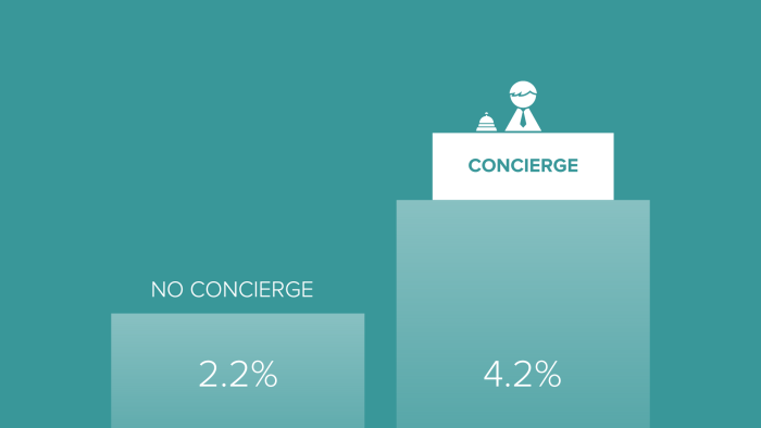
If you do decide to implement concierge onboarding, the return can be high. Customer.io doubled their free trial conversion rate after implementing onboarding, probably in part because their product (marketing automation platform) requires a lot of moving parts to work in tandem.
You can easily automate this process as well, such as integrating a meeting booking tool like Chili Piper into your flows, so that users can go smoothly into sales-touch assistance.
You can also try no-code software
So far we've looked at solutions that absolutely don't require any software involved at all. But what if you could employ software in order to make changes without having to rely on your developers? Let us give you two examples of improving trial conversion with a no-code tool like Chameleon.
Give nudges for upgrades
You can improve your free trial conversion rates by simply reminding your free users that they should upgrade.
This could be in the form of banners that pop up to remind users when their free trial is ending. It could also be a modal that shows up to give users a special discount or an offer in order to entice them into becoming paid customers.
Example: Baremetrics
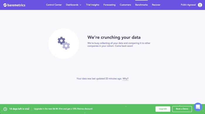
Here, Baremetrics gives a sense of urgency to the user by not only reminding them how many days are left, but letting them know that they have a discount opportunity that has a time limit.
Guide users with onboarding checklists
One way to also make sure that your free trial conversion is more successful is to guide your free users better.
Oftentimes users will start a free trial, and then end up getting confused about where to begin. But with an onboarding checklist, you can keep your users on track so that they get a full experience of the trial before making their decision. This way, you can ensure that users will experience the value you're offering them, as well as motivate them to keep using the product during those initial weeks by showing exactly which steps they must take.
Example: Pipefy
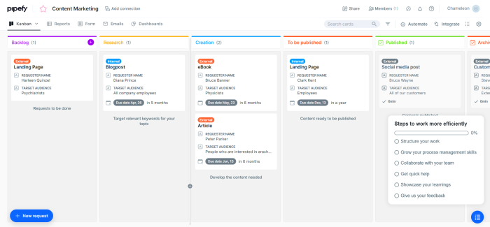
Here we have Pipefy with an onboarding checklist that keeps users in track and shows how much they have progressed.
Try it today ⏰
Improving free trial conversion rates is low-hanging fruit to drive up your MRR, and there are simple ways to do this without needing engineering resources.
Free trial user experience is a good case for user onboarding, and you can actually apply these principles throughout the user lifecycle. Understanding whether your users are discovering "Aha!" is as crucial for the overall product as it is for a new feature that you launch.
You have plenty of opportunity to apply these learnings, and we'd love to hear (comment below) about any successful tactics you have implemented. We will update the blog post and credit anyone that shares something valuable.
Drive your trial users to "Aha!" fast
Improve your free trial conversion rates with easy-to-build in-app experiences. Try for free.

