If you think your product team’s job ends with getting new sign-ups and maximizing the activation rate, here’s the kicker: long-term success depends on so much more than that. You’ll need to continuously ramp up product usage and adoption.
Put simply, you can’t sit back and relax once new users are activated. Instead, you’ll need to constantly show them the value of your product, especially if you’re working on a monthly billing structure—your product’s needs will be assessed every 30 days or so.
Which begs the question, how do you show new and existing users what more they can do with your product? The answer: with effective in-app training.
In-app guidance comes in multiple formats and, in this article, we’ll break down the nuances of this type of customer education to maximize customer retention and win long-term product loyalty.
In-app training guides users through different aspects of a product by delivering useful resources like product tours, onboarding checklists, and more
To provide contextually relevant and meaningful in-app guidance, focus on your users’ journey and identify stages where they’d need a hand
To help users discover value quickly, avoid technical jargon in your tours and guides, write in plain language, and make each lesson/tip actionable
In-app training resources should aim to guide users about your product’s functionality and give them enough space to implement what they’ve learned
What is in-app training?
In-app training educates new and existing users about core and advanced features to help them gain more value from your product.
A SaaS product training framework kicks in from the moment a user signs up for your product. The user onboarding flows include useful in-app messages like help menus and checklists with links to relevant docs and videos, interactive walkthroughs, tooltips, feature guidance, and more.
Once users explore your product more extensively and find their “aha!” moment, in-app training becomes more advanced and spotlights key features that may further benefit users.
These product education resources primarily aim to enhance the user experience, introduce new features, and gain customers’ trust—like this example from Sentient.
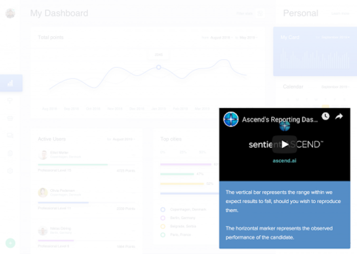
Source: Sentient
In the example above, Sentient needed to double down on customer education to introduce product changes and minimize user confusion. They added product tours, video tutorials, and a help widget for just-in-time support. Bonus: these self-serve resources saved their customer success teams hours of repetitive calls too.
Now that we’ve uncovered what in-app training means, let’s explore the eight training techniques you can use to win over your users.
Top 8 in-app training formats to increase user engagement
For starters, keep in mind this: user activation ≠ user loyalty.
Retaining activated users for the long term means converting them into power users. Power users are the more advanced users who use your tool longer than others, upping the customer lifetime value (LTV) and naturally referring new users to your product.
Let’s take a look at eight in-app training formats to educate and engage more users into becoming power users.
1. Interactive walkthroughs
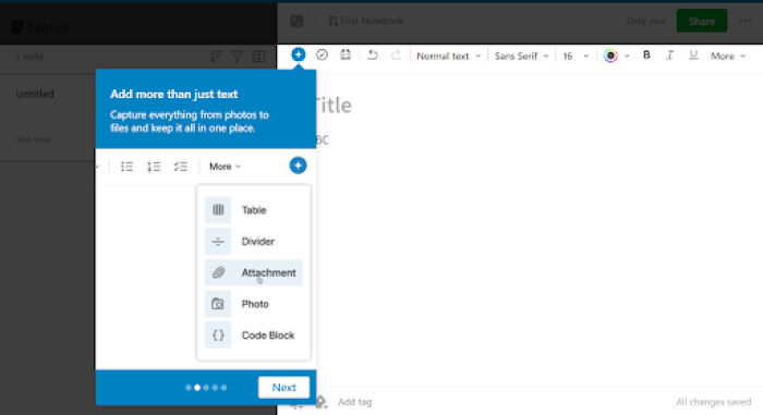
An interactive walkthrough is a step-by-step product demo to guide users through core product functionalities. These can be in the form of tooltips with specific action points explaining what you can do with different elements in the user interface.
Unlike product tours, interactive walkthroughs are more hands-on and they boost customer engagement once users start exploring the product. These walkthroughs empower users to learn by doing rather than just reading or watching.
Real-life example: Evernote's interactive walkthrough. Once you sign up for the app, you'll be greeted with a series of tooltips that offer additional information on what you need to know. This step-by-step series will teach you how to navigate the app and get started.
Source: Evernote
2. Onboarding checklists
Signing up for a new product can feel a lot like joining a new company—a little intimidating and overwhelming because of all the information being thrown at you. This holds users back from fully exploring the product and what it can do for them.
You can create actionable onboarding checklists to save your users from this experience and make a solid first impression. By ticking off items, users can get a better hang of your tool while being satisfied they’re making progress.
In fact, a psychology professor and researcher, E. J. Masicampo, explains how checklists help users feel productive. A checklist reminds you of all the tasks you need to accomplish and ticking off these tasks gives you a happy feeling that you’re getting things done. That feeling encourages users to do more tasks and explore your app more.
You can take things a step further and create a personalized onboarding checklist for each user journey. This will include personalization based on:
Activation milestones
User persona goals
Value propositions
Specific features
Knowledge level
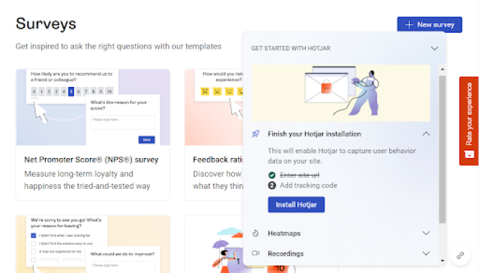
Real-life example: Hotjar onboards new users with a feature-wise checklist. The checklist is divided into multiple sections, each focusing on the product’s core features.
Source: Hotjar
3. Video tutorials
Visual resources and explanations can improve learning, irrespective of how complicated a topic might be. Meaning, video tutorials can enhance your product education efforts and educate users more meaningfully.
You’ll find a video knowledge base for many of your favorite tools, like this one from Chameleon. Besides uploading these tutorials in a playlist, you can also embed them within your app in a form of in-app stories, use full-screen modal pop-ups, or add slideouts with a video lesson for interested users.
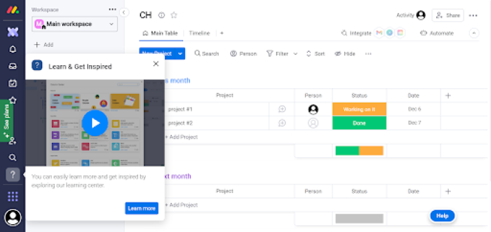
Real-life example: Monday.com does a great job using videos for its in-app guidance. You’ll get quick video lessons for specific features or product upgrades.
Source: Monday
4. Self-serve help menus
Self-serve support is one of the best ways to empower and equip customers to solve their problems on their own. Self-serve help docs—like a searchable knowledge base—offer a low-touch customer success model to let users find relevant answers and troubleshoot any problem independently.
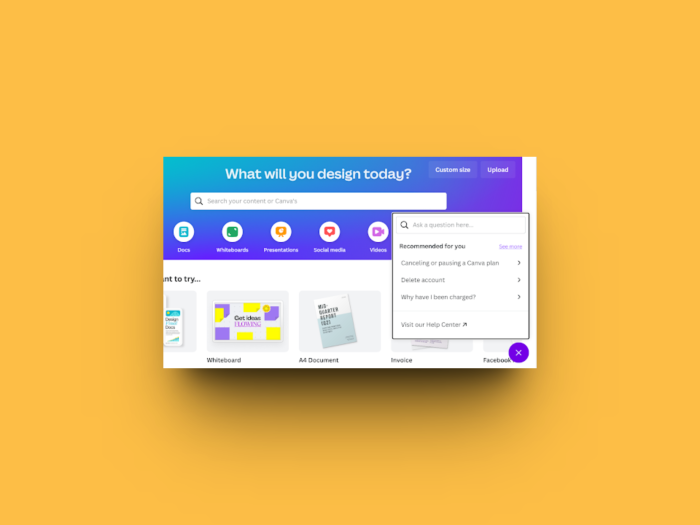
Most SaaS teams add an in-app help widget to give instant access to their entire software documentation library, like Canva.
Real-life example: Canva's knowledge base is easily accessible with the click of a button. You can also search for relevant keywords to find quick answers or go to the FAQ page to dive deeper into the subject.
Source: Canva
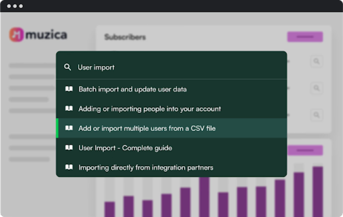
You can level up your self-serve resources and deliver on-demand answers from anywhere within your knowledge base, blog posts, help videos, or more with HelpBar. Analyze users’ search behavior, optimize your help docs to match this search intent, and give users exactly what they want when they need it the most.
5. Contextual tooltips
Tooltips are short messages or in-line tips that guide users through specific product features. They are contextually placed to provide quick, focused, and action-oriented guidance to improve the user experience.
For example, if you notice users get stuck at the same point of your interface repeatedly, you can eliminate friction and offer help with a relevant tooltip.
While tooltips work great for user onboarding flows, you can get the best out of them to deliver more advanced training.
Use tooltips to:
Inform users about specific features they haven’t tried before
Answer questions users might have about a feature/UI element
Deliver trigger-based guidance depending on their actions
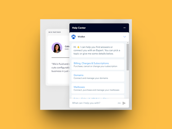
Real-life example: Wix informs users about different product features with contextual tooltips. These tooltips are embedded into an icon, and the message pops up when you hover the mouse over the icon.
Source: Wix
6. Pop-ups and slideouts
Pop-ups and slideouts are two design elements you can use to deliver product education via in-app messages. Both these elements quickly grab users’ attention and motivate them to take action.
You can create pop-ups and slideouts to share an essential tip, make an announcement, or redirect users to another resource.
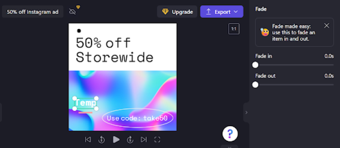
Real-life example: Clipchamp uses pop-ups to give users a quick glimpse of what a feature can do. This pop-up offers a crisp and to-the-point message to avoid any confusion for the users.
Source: Clipchamp
7. Product courses
Product courses offer a more nuanced and in-depth approach to product education. This is ideal for companies with a solid brand reputation and customers with a desire to invest their time in learning more about the product.
Besides, most companies launching product courses tackle a technical and advanced subject.
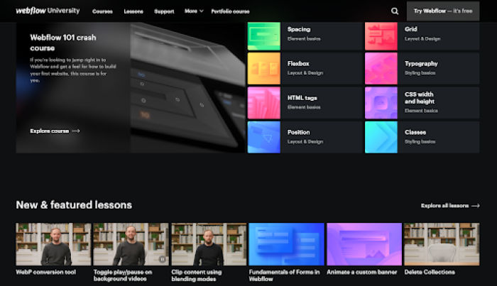
Real-life example #1: Webflow has an advanced training platform called Webflow University. This library of product-related courses teaches users the nitty-gritty of web design and more concepts.
Source: Webflow
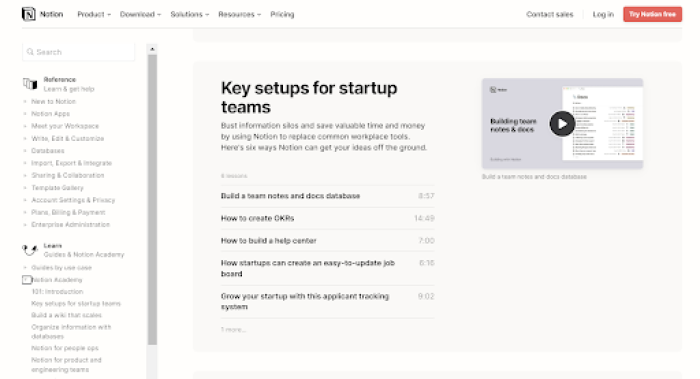
Real-life example #2: Notion presents another excellent case in point for product courses. With its fully-fledged Notion Academy, the tool educates its users about project management and information systems in more detail. These courses are also customized for professional teams and personal usage.
Source: Notion
8. Live product demos
Product demos are more than just a sales tool. A meaningful and comprehensive product demo can also activate users once they sign up, help them explore more the product functionality, and increase your retention rate.
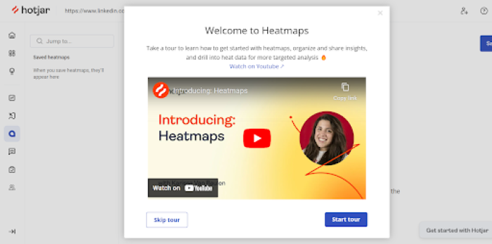
However, here's the catch: not every company would have the resources to offer a live demo as per users' requests. Instead, they can embed product demo videos or playlists within an app, like Hotjar.
Real-life example: Hotjar shows a modal pop-up with an introductory video for new users. The tool highlights more advanced demo videos for specific features or use cases.
Source: Hotjar
How to run successful customer in-product training
While you know how to deliver in-app product training that ultimately boosts retention, let’s look at three best practices to hit the right mark with your training efforts and in-app stories.
1. Understand the path of each user journey
Before drawing out your plan to offer product education, you need to know how each persona understands and uses your product after signing up. This can make your training resources more personal to each user segment, motivating them to explore your product at a deeper level.
User journey mapping reveals the actions and milestones a user will complete once they sign up. Study these journey maps to decide where users can benefit from some extra help.
2. Remove friction (but not all of it)
In-app training should make life easy for your users, reinforce your product's value, and boost feature stickiness. While you do all that, remember to give users a chance to execute what they learn and try new things with your tool instead of simply following the training instructions.
Completing different action items and trying new features can give them a feeling of accomplishment and motivate them to come back to your tool again. This would also reduce the number of support tickets coming to your CS teams.
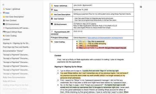
Remember, not all of the friction is good. Make sure to remove any unnecessary friction points to offer a seamless user experience. The best way to recognize what might be causing your users to drop off is by using the friction logging technique. Download a template right here 👇
Download your free friction log template
No email needed—just make a copy of the template and get started with your friction log in Google Docs.
3. Make sure your users understand you
Nothing feels worse than reading complicated instructions that take hours to decode—as if it were the map to a lost treasure. Your users would share this feeling if your in-app training resources were difficult to follow and written in complex language.
Your resources will prove counterproductive if users can’t understand them on the first read.
Remember to:
Add product shots, GIFs, and other visuals to support what you’re saying
Consider different user cohorts’ knowledge levels when writing
Avoid technical jargon and cut all filler or fluff content
Use simple, direct, and action-oriented language
Break down any resource into smaller steps
Keep your customers at the core of your in-app training strategy. Test and iterate your design and information architecture to ensure users can understand their training as quickly as possible.
Turn customers into power users with in-app training
Winning customer trust and building product advocacy can be the biggest differentiator for your brand in an aggressively competitive SaaS market. In-app training is the key to unlocking these goals while scaling your product's success.
A strong in-app guidance strategy can enable your users to explore and understand your product better. This, in turn, lets them customize the tool for their job to be done and maximize the value they derive from it.
When building your strategy, don’t focus solely on user activation. You don’t want to forget about your users once activated. Think long-term and aim for higher product adoption and customer retention with in-app training.
Create In-App Guidance That Delights Users
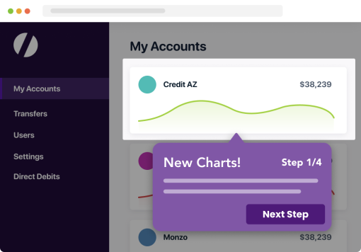
Chameleon offers no-code tools to easily build in-app experiences that look native to your product's styling.
