Imagine this: It's 2026, and the SaaS market is worth over $300 billion. As the market grows bigger than ever, driving conversions through sales reps and marketing campaigns can't be your only channel for growth. You have to offer immediate value to users with an instant customer experience. Start today. No need to wait for the future to come.
A product-led growth (PLG) strategy puts the onus on bringing in new users, retaining existing ones, and boosting the bottom line of the product itself.
A seamless customer experience simplifies the product functionality and empowers users to get maximum value. This article will explore how delivering value quickly impacts product-led growth and how you can design a fail-proof, instant customer experience.
Customer experience affects user activation rates, engagement, and churn.
Offering self-serve support is an effective way for PLG companies to unlock higher growth numbers and better ROI.
This also simplifies product interactions, empowering users to find their way around your product without relying on a support rep to solve their queries.
Creating an instant customer experience can boost product-led growth by unlocking higher adoption rates, quicker activation, and maximum customer delight.
Why is instant customer experience important for PLG
In the new era of PLG, as recognized by OpenView, instant customer experience is one of the new guiding PLG principles.
“Users now expect help to be available at their fingertips and in the moment of need. Yes, this can still mean human interactions with sales or customer support. But it can also mean in-product guides, in-app chat, bots, documentation, help libraries, or community forums.”
– A New Era for PLG, OpenView
This endorses the equation that self-service = instant gratification. When users can instantly satisfy their needs and are not tied to customer success team wait times, for example, they’re more likely to continue using your product.
So, how does instant customer experience fit into the product-led growth model?
It is closely tied to the user's interactions with the product. It's about creating frictionless product experiences by guiding users at every step of their journey and being reactive to the in-app decisions they make.
Nowadays, as product teams have real ownership of revenue, they take the lead to:
Understand user needs and design custom flows for different user personas to fulfill those needs
Identify where users drop off in the onboarding process and cover these gaps to reduce the time-to-value and churn
Collect user feedback to bring product changes aligned with users’ goals and expectations
The more help you offer users to simplify the product, the more adoption and engagement you can expect.
How does this impact your PLG strategy?
Instant customer experience delivered through contextual in-product guidance and self-serve support can accelerate your product growth and help you:
Increase product adoption rates
Maximize customer delight and engagement
Accelerate user activation and boost retention
Offer round-the-clock, hassle-free support
Ensure faster resolution time to improve the usability
Build a scalable customer onboarding strategy
Put simply, self-serve customer experience is one of the most cost-effective and well-rounded PLG tactics for SaaS businesses.
How to quickly deliver a seamless experience
In an ideal world, your users would have no complaints and never leave your product. In reality, over half of the users would willingly switch products after as little as two poor experiences.
Delivering a seamless experience is the key to helping users get the best value from your product and stop churning in its tracks.
Here are five best practices that can ultimately boost your bottom line.
Point users in the right direction with in-app guides
In-app guides show users the most effective ways of operating a product. Contextual guides packed with actionable insights can deliver instant product value. Make them available at all the relevant touchpoints in your user journey to streamline your user experience.
These interactive guides also personalize every user’s in-app experience, giving them more control over the product to complete their jobs to be done.
Let’s look at a few ways you can create in-app guidance to provide instant customer satisfaction.
Onboarding flows
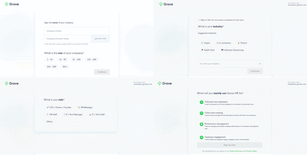
Optimize the onboarding experience to create the best first impression on new users and guide them to their "aha!" moment as quickly as possible. Use relevant questions, UI patterns, and modal windows to seamlessly onboard new users.
For example, Grove HR onboards new users with a few prompts to personalize their product interface.
Contextual tooltips
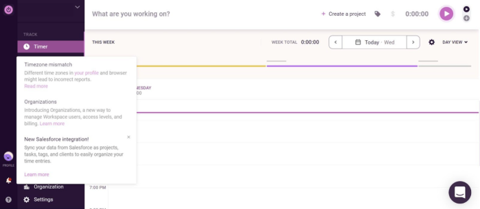
Tooltips offer contextual information to help new (and existing) users figure out different product features and functions. Include short and crisp information in a tooltip pop-up, guiding people to use a feature immediately or learn more about it.
Here’s a great example of how Toggl does it. This brief tooltip tells users about three cool features in the app that they’ll find handy.
Product walkthroughs
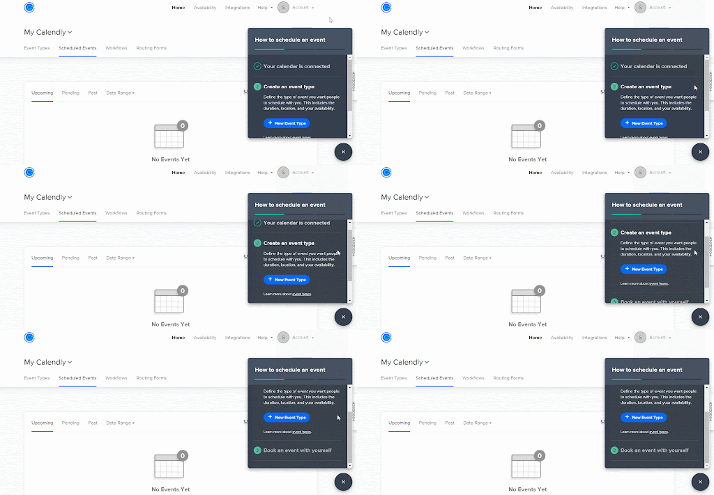
Design interactive tours and walkthroughs to seamlessly guide new users through your product. Instead of dumping all information on a user in one go with a product demo, let them interact with the tool at their own pace. Offer guidance at common points of friction that tends to hamper progress to nudge users along on their product journey.
Calendly does it well with its in-app widgets guiding users through different features once they land on these features. Here’s a great example of how the app shows a quick step-by-step guide to create and schedule a new event.
This walkthrough also uses a progress bar to show the completion rate. And our latest Benchmark Report highlights that product tours with four or fewer steps have a higher completion rate than longer ones—keep that in mind!
Help documentation
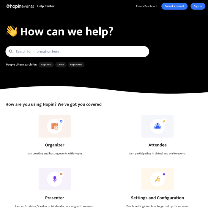
Product documentation can help users learn more about your app, troubleshoot their concerns, and maximize engagement. Customizing this documentation for specific user needs can maximize the product’s functional value.
Hopin's knowledge center does this well, with all its FAQs categorized for the primary users. These user-specific documents make knowledge more accessible and improve user engagement.
New feature showcase
Announcing new features within the app lets you re-engage existing users and deliver the right guidance to improve feature adoption. You can use a landing page, a blog, an email, a welcome modal, a top banner, or anything else to announce new features.
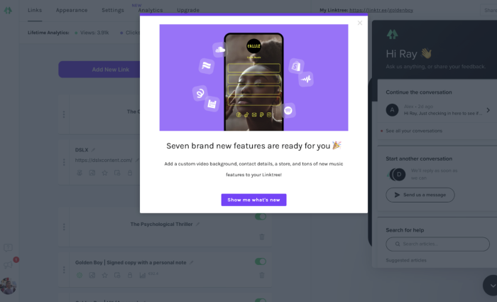
Here’s how Linktree announced seven new features with an in-app modal. This minimal banner hints at the new features and redirects users to see these new features on a separate page. It also gives users the option to click out, you don’t want to block and aggravate users if they’ve got something that needs doing fast.
Overall, in-app guides help you stay one step ahead of the users to solve their queries and concerns without friction. They also nudge users toward activation quicker and maximize retention.
Onboard users with ease by adding in-app checklists
“I love reading lengthy how-to guides and detailed videos that explain different product features” — said nobody, ever.
Users don’t want to hunt through heaps of documents to understand your product’s functionality. Instead, they want to learn while in the flow of using the app. In-app checklists can be a game-changer to simplify product education for new users, reduce time-to-value, and decrease churn.
Use the onboarding process to give first-time users an exciting look into what’s in store for them ahead. Create a sense of intrigue and promise to keep them coming back for more.
Here are quick guidelines on designing self-serve checklists to optimize onboarding.
- Identify value metrics: Understand what each user expects from the product. Value metrics will define the activation point for different users, helping you create accurate user journeys from onboarding to activation.
- Design journey maps: Map the journey from a starting point to the “aha!” moment for every user persona. List the steps and features a user would take to reach their activation point.
- Create stepwise checklists: Add a set of steps in a checklist for a new user to follow and complete once they’re onboarded to the product. Establish different milestones to measure product adoption and engagement rates.
- Design a user-friendly interface: The welcome interface plays a huge role in whether users stick to your product or give up. Use mental models to recreate key UI elements, like CTA buttons, search bars, and progress meters. This way, you create a lightweight onboarding interface that feels natural to users as they recognize it from other in-app experiences.
Offer in-line help with tooltips when users need it most
Tooltips are like road signs that share clear and simple instructions on moving ahead on the read. These in-app messages guide readers about certain features within the app.
Product teams use tooltips to minimize confusion or errors at specific areas within the product—like a hotspot where users tend to make a mistake. Besides, tooltips also add context for different icons or fields.
Tooltips come in handy in many aspects, including the following.
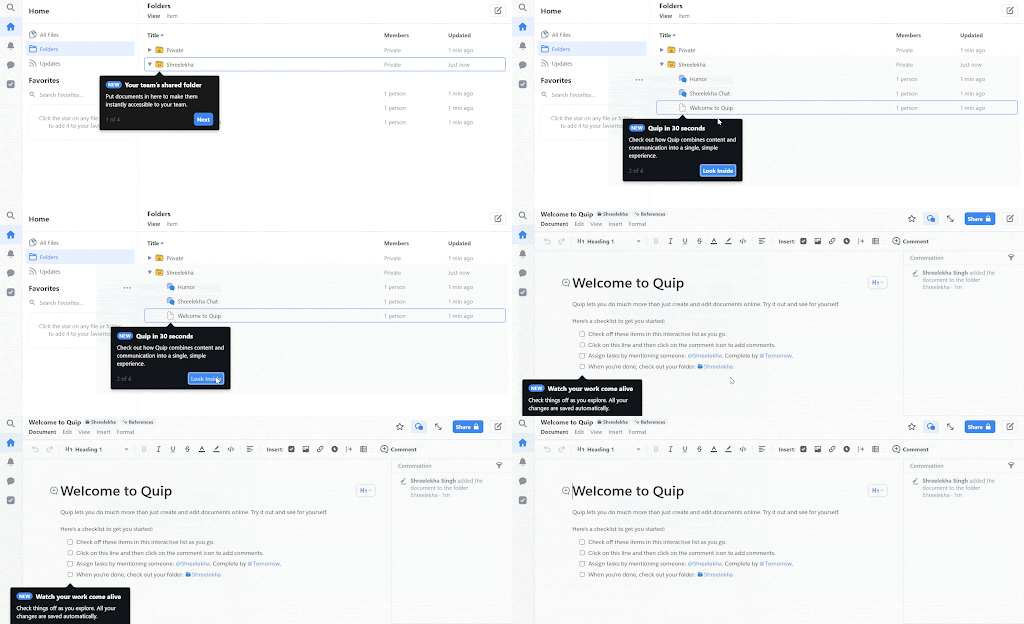
User onboarding: Include message cues in the onboarding flow for users to get a quick demo of the product’s basic functionality. For example, Quip has a set of step-by-step tooltips to give new users an overview of how the tool works
Updates and reminders: Add tooltips to share new feature updates with existing users. You can also use these in-app messages to remind users about upcoming events, like a subscription renewal date or free trial ending date.
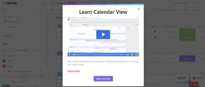
Process walkthroughs: Tooltips can also come in handy for showing process walkthroughs within the app. Add a tip directing users to read a guide or watch a video to learn more about a function. Here’s a great example by ClickUp, where users can learn more about the calendar view through the video tutorial in the message.
Field validation: Tooltips can also help users fill up forms. They explain what goes into which field, allowing users to enter the correct information.
Contextual nudges: Tooltips can also build context around certain features for new and existing users. A small message can give more information about an icon, a button, or other design elements. For example, Trello shows this contextual tooltip to remind users how they can track their tasks and timelines.

In essence, tooltips make a product easier to navigate and understand. It answers users’ questions beforehand to avoid confusion and provide better value.
Create a self-serve learning path with valuable resources
Waiting hours to solve a problem or find a piece of information would inevitably frustrate your users. The key to keeping them happy and satisfied always lies in self-serve learning paths within the app.
One of the most popular PLG tactics for SaaS companies is empowering users to find (most) answers quickly without relying on customer success teams. Using in-app widgets to offer self-service support can work wonders, eventually creating user delight and boosting engagement.
In-app widgets help users navigate a product better without too much information or complexities. They also enable self-serve learning to reduce—or eliminate—the need to raise tickets and solve any doubts through interactive guidance.
We've created a list of in-app widgets you can use to develop self-serve learning pathways:
Live chat: This is a no-brainer—give users easy access to live chat via a widget in the corner of the screen
Announcement notification: Use widgets to announce company updates, like a new round of funding, a new feature launch, or any relevant news
Feature walkthroughs: Add a widget to guide users through tricky features where most people face friction
Video tutorials: Add video tutorials in the form of widgets to show users how to operate a specific feature or solve a query
Feedback surveys: Collect user feedback with contextual in-app Microsurveys to understand user preferences
Help users quickly find the answers they’re looking for
If your users have to go down the rabbit hole of a confusing knowledge base to find answers to their doubts and queries, it's a recipe for disaster.
Knowledge discovery and query resolution are two crucial aspects of instant customer experience. As per PLG principles, you can keep customers happy by giving them easy and quick access to relevant product-related information—in the form of a knowledge base or help center.
To ensure users can access this information and troubleshoot problems quickly, your knowledge base should have:
A sleek and on-brand design
Powerful search functionality with indexed articles
A library of content in multiple formats, like guides, tutorials, and videos
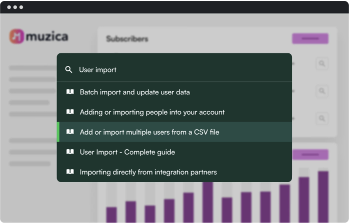
Besides building a user-friendly knowledge base, you can simplify knowledge discovery with an intuitive widget like Chameleon's HelpBar. It’s an extension of your help center, allowing users to search for any question anywhere in the app.
Drive product-led growth with frictionless experience
The key to delivering a frictionless customer experience lies in giving users more control over the product through self-serve learning pathways. Guide users through different features and functions of the product through in-app guides, checklists, tooltips, and quick-to-access resources.
Let users learn their way through your product and design experiences they are already familiar with. Draw out the path for them to move forward, nudge them along the way, and help them jump over any friction-heavy bumps with instant in-app messaging.
Users will soon find their way, feel like they’ve achieved a win on their own, and go on to embed your product in their regular workflow. Winners all ‘round!
Boost Product-Led Growth 🚀
Convert users with targeted experiences, built without engineering


