


The year is 2005 and all the cool kids are sporting their Nokia 3310 (aka the Brick Phone), flashing their built-in flashlights and battling for the highest score on the snake game.
Fast-forward to 2024 and these are now low-tier features. There's a mobile app out there for every need, and we increasingly rely on them to consume products, information, social interactions, entertainment, and virtually anything.
According to Airship, the in-app experience platform for mobile apps, 33% of digital consumers are using mobile apps more often now than just one year ago. For SaaS product managers, this means that special attention needs to go into mobile user experience; where attention spans are shorter and TTV (time-to-value) has to be top of mind.
In this article, we'll show you the best practices for mobile user onboarding, so you can effectively guide mobile-first users. But keep your knowledge of web-based onboarding on hand, we'll need it towards the end!
What is mobile user onboarding?
Mobile app onboarding is the practice of welcoming first-time users to a mobile app, walking them through its features, and helping them find value within their first interactions with the product.
It also involves reminding existing users of new feature updates, as well as nudging them towards parts of the app they may not use as often.
With modern and complex applications that are capable of doing a lot more than moving a snake around the screen, the mobile onboarding process is essential to ensure user activation and retention.
Going back to that study on mobile app experiences done by Airship, they found that 57% of consumers use an app only once or twice before deciding to delete it. This means that a user's first interaction with your mobile product is critical to determine if they're going to stick around. This is what makes mobile app onboarding important. It sets the first impression of your app to your users.
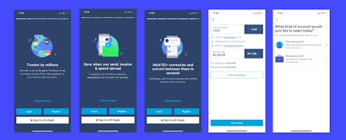
Effective mobile onboarding considers user behavior patterns that are exclusive to the mobile experience. Shorter attention spans and less screen real-estate are part of that mix. Understanding how mobile users behave will ensure that you deliver user-friendly, intuitive, and engaging in-app guidance, providing clear instructions and visual cues to help users navigate the app.
There are also different types of mobile user onboarding:
Quickstart onboarding: speed is the name of the game. The goal is to get users running through the app as quickly as possible with minimal steps and walkthroughs. This approach is perfect for intuitive apps where users can learn how to use it through direct interaction. Here, you’re aiming to create flows that match user’s mental models to make onboarding intuitive
Self-select onboarding: not everyone goes through the same journey. A self-select onboarding gives users different options from the start, allowing them to choose their onboarding based on their intentions or knowledge levels. This method is about engaging the user directly and personalizing their experience.
Top user benefits onboarding: you won’t see in-depth explanations of product functionalities with this approach. Instead, top user benefits onboarding highlights value through demonstrating how the app solves problems.
Key functions onboarding: you might be building a complex app with tons of features and functionalities andovering them all would take forever! Instead, key functions onboarding allows you to provide in-app tooltips, checklists, and product tours for important features users are more likely to use.
So let's dig into how mobile users behave and how they differ from your traditional web-based customers.

Build up your tech stack for stellar first impressions
Creating a jaw-dropping onboarding flow starts with choosing the right tools for the job. We have just the thing—33 of them.
Best practices & examples to improve mobile app onboarding
Now we can get to the good stuff. Let’s explore some UX principles that you can incorporate in your user onboarding to deliver a mobile app-optimized experience.
1. Micro-interactions
Micro-interactions are juxtapositions to how long that word is. They are short interactions you have with your users, where you signpost actions that you want them to take. These can be trigger-feedback interactions where a simple action performed by the user (like clicking an icon) triggers a feedback response from your product (like showing a tooltip).
For mobile user onboarding, you want to hit users with short and direct messages like 'click here to do this' or 'do this if you want to achieve that'. You don’t need to be loud like the MyFitnessPal example below.
🎯The goal: Onboarding users to the new UX
😵💫The outcome: Driving overwhelmed annoyed users away
Instead, they could’ve used tooltips to walk users through the main changes, and let them explore the rest on their own. Mobile app users love self-discovery.
Bumble: User onboarding one step at a time
Dating apps are built upon micro-interactions, and I don’t mean the syllabic conversations people have with their matches. When you download Bumble, you go through clear onboarding steps to set up your profile before you can see your suitors. Each step includes clear instructions to complete a task that is evidently important to ensure that you have the best user experience.
Bumble’s user experience continues through micro-interactions beyond onboarding. You swipe right for yes, and left for a no. If it's a match, the chat will be triggered (but only after you celebrate your achievement).
2. Gamification
Gamification is a UX strategy that makes user onboarding experiences more interactive and engaging. The goal of gamification is to motivate users with encouragement and rewards for progress and achievements.
You can gamify your mobile onboarding UX with:
Progress bars that show how close users are to completion
Rewards for completing onboarding milestones, can be as simple as a confetti animation
In-app messages framed as goals or challenges that get tasks completed
Levels that unlock more features as users make progress
Duolingo: Gamified mobile app user onboarding
Duolingo is the most classic example of a gamified user experience. The language learning app motivates users to move along their learning journey by turning lessons into challenges, rewarding task completion, and inspiring competition.
They're masters of using The Hero's Journey framework to tell their user onboarding tale. The hero (user) goes through a series of trial-like in-app challenges alongside an ally (the Duolingo mascot) who helps them along the way, so that they can finally hit their "aha!" moment and feel ready to tackle their job-to-be-done.
3. Self-discovery
The fast pace of mobile interactions means that your app's onboarding flow should be quick and easy. One proven-and-approved way to go is to actively guide users 3 to 4 onboarding steps (maybe even less) and then encourage self-discovery.
Enabling users to explore your mobile app on their own doesn't mean you should completely leave them to their own devices (pun intended). Instead, you should:
Allow users to skip or snooze onboarding steps
Show additional steps if users meet certain criteria
Create good friction if users are skipping critical actions
Offer them an activation incentive like a discount code
Doordash: 3-Step user onboarding flow
Doordash is a food delivery app, a type of app we're very familiar with nowadays. On the B2C side, the user onboarding process is very simple and only has 3 steps: sign up with your email, add and confirm your phone number, then set your delivery address. Once that’s done, you’re ready to self-explore the list of restaurants that deliver in your area.
Because Doordash’s UI is pretty intuitive and standard for food delivery apps, they don't waste time showing you how it works. Instead, they offer an incentive for your first order (aka your first activation milestone): a coupon for 40% off. It's a pretty good deal. So good that they've had to take measures to avoid people creating multiple accounts for multiple discounts.
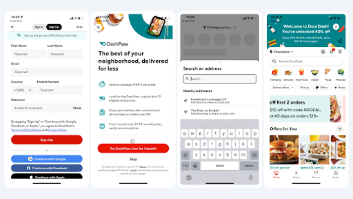
(One not-great thing that Doordash does in their onboarding process is immediately hit you with a pop-up to upgrade to their paid subscription. It's disruptive and happens way too early in the user journey. But hey, at least there's a skip button. 🤷 That brings us to our next best practice.)
4. Offer a skip button
Some users want guidance to complete a task as smoothly as possible. Others prefer figuring it out on their own. That’s why your mobile onboarding process should offer a “skip” option.
Sure, it’s good practice to highlight features your users will no doubt use. But making your onboarding a compulsory course can make users feel as if they’re trapped in a stuffy classroom. Trust us, not everyone wants that flashback. The result is a frustrated user who might just exit the app and seek more straightforward alternatives.
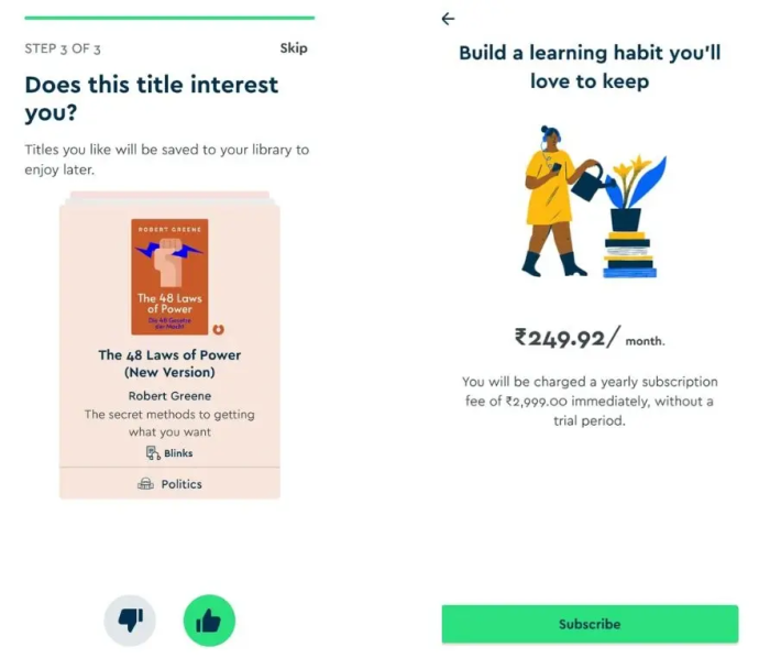
Blinklist: Personalized onboarding (but only if you want it)
We’ve all dreamed of a time when we could transfer knowledge from books to our heads and be done with it. Blinklist does the next best thing by providing users with key explainers of important concepts in non-fiction books.
While Blinklist has a tour, you almost always have the option to skip through recommended titles the app usually saves for personalization purposes. With a skip button, Blinklist ensures it doesn’t push its users between the lines of a dense volume they don’t like. Instead, they’re free to explore the app as they please and learning becomes enjoyable, just as it should be.
5. Emphasizing key features and processes for users
Your users want to complete a task as smoothly as possible. No hassle, no drawn out processes, and especially no extended explainers on some obscure feature they’ll likely never use. Try and explain everything at once, and you'll lose them.
Instead, only focus on showing users the steps they need to effortlessly navigate your app. Once they get the basics down, you can introduce tooltips that appear only when users tap on their less-used features. By highlighting the important stuff, you’re ensuring users can effectively complete main tasks with your app while keeping it low-key and non-invasive.
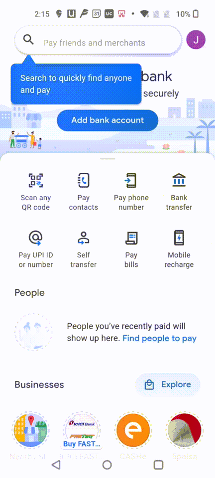
Google Pay: Two tooltips to value
Google Pay shows users how to do two main actions upon sign up:
How to pay contacts
How to pay through a QR code
Are there other things the app can do? Absolutely. But, Google Pay’s value proposition centers around making payment convenient (and avoiding awkwardly rummaging through your never-ending tote bag while everyone’s huffing and puffing behind you in the check-out line.)
The Google Pay onboarding process features tool-tips and in-app messaging for this core action, ultimately reducing time-to-value. Through highlighting the main two features, Google Pay maximizes education while still keeping the app useful.
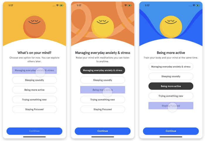
6. Ask questions during onboarding to personalize user experience
To ensure users get maximum value during onboarding, you can ask for their preferences. After getting answers to relevant questions, you can use the data to deliver tailored content to your users and improve their overall app experience.
Consider asking why users downloaded the app, what do they intend to use it for, and what they’re hoping to achieve. Doing so not only helps you personalize content, but helps users understand that you care while engaging them directly.
Headspace: In asking the important questions for a personalized meditation practice
Headspace sets the stage by asking the big questions first. It outlines specific problems users may be encountering such as lack of focus, heightened stress, and low sleep quality.
Once you answer, Headspace launches a product tour, guiding you through personalized meditations best suited to solve whatever ails you. It’s easy, it’s thoughtful, and it provides users with a personalized experience right from the get-go.
7. Simplify sign-up
Imagine downloading an app only to be met with countless information fields for sign up. So far, no value. Yet there you are creating a brand new password containing a capital letter, number, symbol, a rune from an ancient language, and three lines of JavaScript.
Such a lengthy process can cool down even the most passionate of new users. Instead, aim to make sign-ups as fast as possible. Users shouldn’t need to spend valuable time and effort before they see the real value of your app. You can ask for key demographic information to personalize your onboarding and otherwise offer users the option to sign up through just their email account and password.
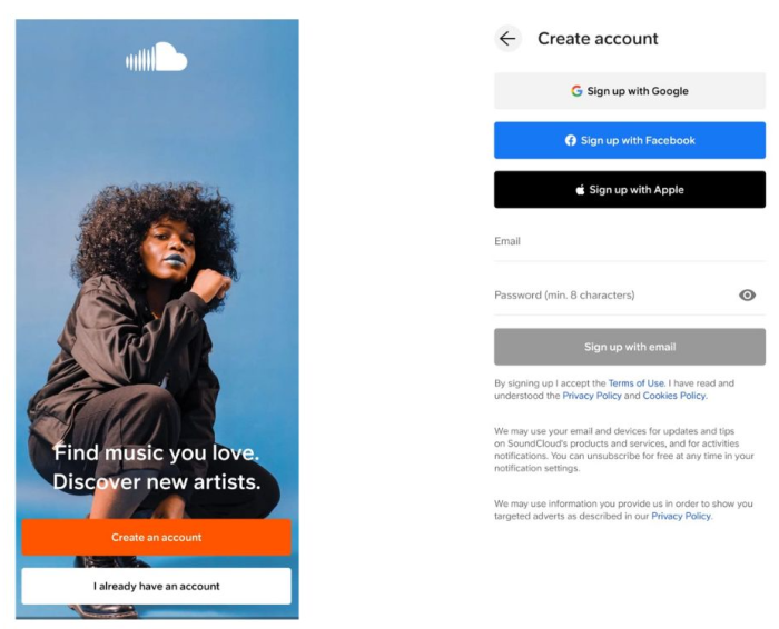
Soundcloud: quick and easy profile creation
Soundcloud guides users through their onboarding and sign-up questions as quickly as possible to deliver value as fast as possible. The app helps users collect and stream music and get personalized recommendations.
Upon download, users can log-in through Google, Facebook, or Apple. Then, they answer a few short demographic questions for personalization before they’re off to the main interface to stream their favorite tracks.

Make user onboarding easy with the right tool
Sure, a tool like UserGuiding can get the job done. But it wont fit the bill if you need advanced onboarding that fits in your tech stack and wows your users.
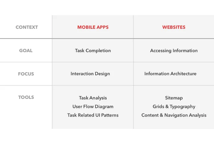
Mobile vs web users: Are they really different?
Back in the Brick Phone days, we still relied on our desktops for most of our digital needs. We spent hours in front of our computers having conversations on MSN and poking friends on Facebook.
Mobile app experiences, on the contrary, are short and transactional. The abundance of information available online has forced us into consuming and delivering digital experiences faster. We could see signs of this even before we had mobile apps, especially with social media.
Effective mobile app user onboarding starts from these two principles: how mobile users behave and what is mobile-first UI design.
Shorter attention spans impact key product metrics
Mobile users are skimmers and task-oriented; they want to find what they're looking for in just a few steps and will move on immediately if that doesn't happen. Desktop users, on the other hand, are more information-oriented; they're willing to put more time and effort to understand information and explore multiple resources.
These nuances are critical in a user onboarding flow. A first-time user will likely bounce if they're overwhelmed or don't find what they're looking for in their initial interactions, as the average bounce rate on mobile is 67.4%, compared to 32% for web applications.
Mobile users need for better UI design
Mobile apps are built with a jobs-to-be-done approach that focuses on task completion. Tasks should be simple in their nature and discoverability of extra features should be easy, with straightforward navigation where no secrets are hidden behind icons. Mobile app onboarding screens have to keep things super easy to follow, with small steps and less complex UI.
Web apps, on the other hand, are built to present information; the UI can be a bit busier as long as you have a clear navigation system that can guide users across pages.
What can feel like a funny brain lapse, is actually a signal of our consumer patterns. Portability and ease of use are the main reasons that we tend towards mobile experiences. Scrolling and tapping simple UIs is a more enjoyable experience than browsing a busy desktop web page.
How to make your web and mobile onboarding work together
If your product has both a mobile app and a desktop version, you need to optimize your user onboarding experience to each interface. Simply replicating the same flow won't cut it, so you need to adapt your messaging and the UX design of your flows.
The best user onboarding experiences are personalized. You can use attributes like in what stage of their user journey they are in, what actions they have already completed, or what their favorite features are to customize in-app experiences.
When you have users using your product on both the mobile and web applications, you need to make sure that they are talking to each other. That means, any data being tracked on either side is being sent across so that you can ensure that your in-app experiences stay contextual and personalized.
With Chameleon, for example, you can ensure that your mobile and desktop onboarding are working together by following the guidelines below.
Connecting your data across platforms
All data from your user interactions should be stored in a data warehouse or Customer Data Platform (CDP) that will be your one source of truth for all user data, telling you where users have been and what they have done.
With our Segment integration, you can leverage data from interactions on your mobile app to ensure that the in-app messages users see on the desktop app are true to their experience.
For example, a first-time user completes their onboarding process from a mobile app, but their next session is on the web application. It’s their first time with this version of a product and there are some differences in the UI. Instead of showing them the same exact onboarding flow from the app, you can only highlight some of the things that might be different or more difficult for them to find in the web version.
Segmenting your users
Based on the data you bring into Chameleon, you can create custom user segments to target user groups based on various attributes and criteria. You can then guide and interact with users based on what you know.
For example, when you onboard new users whose first contact with your product is on a web browser on their phone, you can target them with an in-app experience like a modal prompting them to download the mobile app.
Mobile apps have much higher engagement rates than mobile-optimized websites or desktop web viewing, and 100-300% higher conversion rates.
Adjusting the messaging
Different onboarding flows call for different messaging. Adjust the copy in your mobile in-app messages following the best practices from earlier: micro-interactions, gamification, and helping users self-discover. Your text will have to be shorter and simplified to fit the limited space of phone screens and engage easily distracted users.
You will also have to make these adjustments the other way around, adapting your mobile-first flows to your web application. If you need to add a little bit more context to your messages or change the format from a bullet list to a paragraph, you can use Chameleon’s AI copywriter to help.
Adjusting design for mobile
Different interfaces call for different designs. Just as above, adjust the design of your mobile experiences to fit into mobile screens. We're talking about adjusting the size of the UX patterns to be compatible with the smaller screens, calibrating the positioning to your mobile UI, and shortening your text.
When previewing your Experiences as you build them, use your browser's Developer Tools to toggle between devices and see how they would display on a desktop versus a mobile screen.
The best tools to improve your mobile onboarding flows
Now that we know all about delivering the best onboarding experiences on mobile apps, it’s time to learn how to create them. Luckily, product managers and engineers can celebrate the existence of Product Adoption Platforms (also known as Digital Adoption Platforms), tools that allow you to create UX patterns for user onboarding and in-app messages with little to no code.
We’ll wrap our guide to mobile user onboarding with a list of tools you can use to create your in-app experiences and connect them to your web applications to drive user retention.
1. Airship
Examples of Airship's in-app messaging
Airship is a mobile engagement platform that helps businesses engage and retain their mobile app users. The platform allows you to create and send personalized push notifications, in-app messages, and other mobile messaging to your app users, as well as collect data and analytics on user behavior and preferences. Airship also has a spot on our list of Intercom alternatives because of its ability to help create seamless mobile user onboarding experiences.
Airship also offers features such as mobile wallet passes, location-based messaging, and automation capabilities to help businesses streamline their mobile marketing efforts.
💰Pricing: Enterprise plan starts at $25,000 per year, and pricing for other plans is available upon request
2. Appcues
Appcues offers a range of features like customizable in-app flows, user segmentation and targeting, and analytics and reporting tools, that help you create personalized and engaging onboarding experiences for your app users. The platform also works well with web-based applications, making it easier for you to connect the dots between your apps.
💰Pricing: Plans start at $249/month
3. Braze
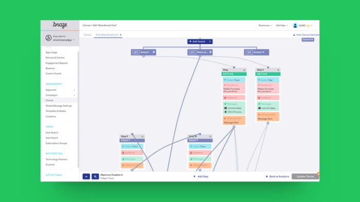
Example of Braze in action
Braze is a highly recommended tool for mobile app user onboarding because of its advanced personalization and segmentation capabilities, as well as its range of other features and tools that can help you create effective and engaging onboarding experiences.
In addition to personalization, Braze offers deep linking, a feature that allows you to direct and redirect users across parts of your app, and user feedback tools, which can help you understand how users are interacting with the app and identify areas for improvement.
💰Pricing: Undisclosed
4. Chameleon
Even though Chameleon is built for browser-based web applications and cannot be applied to mobile native apps, we couldn’t leave ourselves out.
Chameleon currently supports mobile web products and web apps “wrapped” as apps (e.g. Ionic, Cordova etc.). Even if you don’t have a mobile app, your users are very likely to access your application from a mobile browser, and in that case, Chameleon a the perfect onboarding solution.
Our platform relies on JavaScript to show Experiences, so it can fully support many web application frameworks 👇
Supported Frameworks | Including | Exceptions (Notes) |
|---|---|---|
|
| |
|
| |
|
| |
Shadow DOM | N-level deep Shadow DOM is supported |
Learn more about how we work with hybrid/Cordova apps here and how to enable Chameleon for mobile web here.
5. Pendo
Pendo for Mobile, Pendo’s digital adoption solution for mobile apps, also allows you to create a connected digital experience across your mobile and web products. You can leverage Pendo’s features to analyze how your users interact with your solution on all platforms and understand how they move across them to tailor your in-app guidance based on their devices and the insights you harnessed throughout the product journey.
With Pendo’s Visual Design Studio for Mobile, you can build lightboxes, tooltips, and multi-step walkthrough guides. It supports Native iOS & Android applications, Xamarin for iOS and Xamarin for Android, Xamarin Forms 5, Swift UI
React Native for iOS and React Native for Android, and more frameworks.
💰Pricing:: Plans start at $7,000/year
It’s time to craft intuitive mobile user onboarding flows
If you care about delivering great user onboarding experiences, you definitely care about what your customers feel (and do, and need, and want). So you can’t ignore what the stats are telling us: people love doing things from their phones and will continue looking for solutions that make that possible.
Your mobile app user onboarding experience should highlight how your product fits what users are looking for: convenience, ease of use, and time-saving solutions.
Will Chameleon support your mobile app?
Reach out to our Product Experts to learn how Chameleon can work with your tech.


