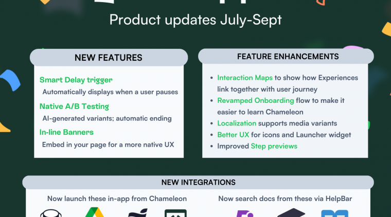
We're excited to recap some of our most impactful product updates from the past quarter! This one was all about helping our customers deliver more engaging in-app patterns and have better visibility over their efforts. We improved some of our core products and features to ensure you can gather more insightful user feedback, achieve a branded style with your embedded announcements, and easily review or create new target audiences.
Better user feedback, more control, and confidence to go live
Let's dive into the past three months at Chameleon, from highly requested features to enhancements that speed up building and testing.
Gather more insights from users with Multi-Question Microsurveys
Delighting end-users has always been a priority for us. Our Microsurveys have been successful because of the "micro" format, so we were cautious about adding too many questions and risk causing users to drop off.
We heard our customers loud and clear: sometimes, you must get deeper to uncover more insights. Now, we allow you to mix and match up to three questions of any type (rating, multi-button, input, dropdown). Depending on users' responses, you can control what question pops up next, so it's easy for users to share relevant and authentic feedback. They’re still micro but enable you to go deeper into users’ needs and impressions.
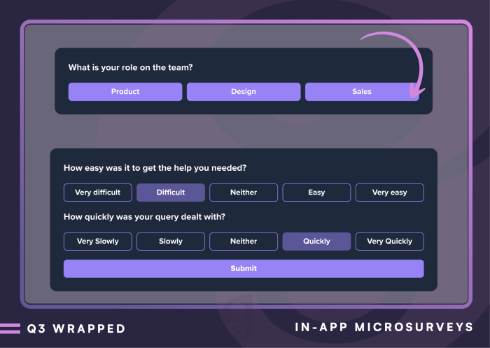
To facilitate feedback reviews, we improved our Dashboard analytics and added new filters (based on Microsurvey answers). You can review the average response or score, for example, in the case of NPS or a CSAT Microsurvey.
👇 Explore an interactive demo of creating a multi-button Microsurvey with Chameleon.
Create custom embedded layouts with Cards
Embedded patterns have become increasingly popular among adoption drivers and end-users. To no surprise, interruptions to users' usual flows often lead to a quick dismissal, and prompting an in-app pattern at the right time can be hard to nail.
This year, we released Embeddables, and our customers are using Cards for various use cases, from onboarding to product discovery and upselling. Cards are embedded blocks that can sit anywhere in your UI and launch other Tours, pages, or connected integrations.
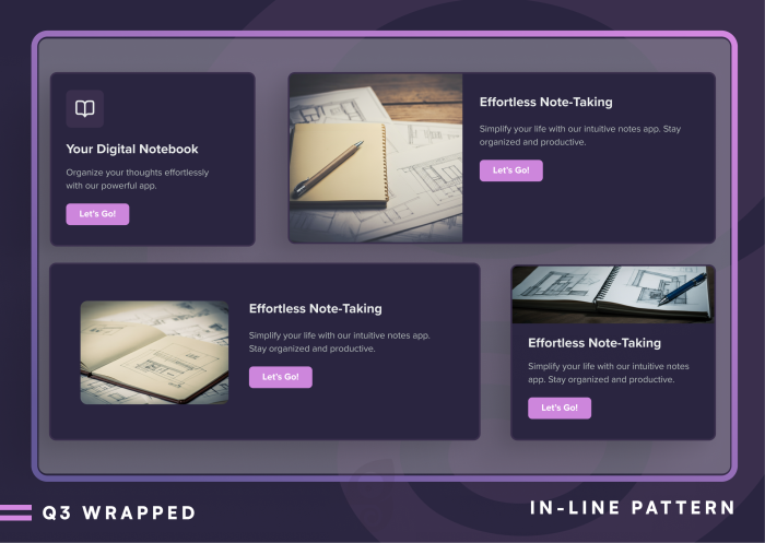
Now, you can adjust the size of each Card in a set to create unique, custom layouts that fit your UI. We also added more options to position images or videos, unlocking more creative flexibility to achieve an on-brand style and create more delightful end-user experiences. Cards make it easier than ever to stay on-brand and deliver delightful in-app experiences that don’t disrupt users’ flow 🎉
👇 Learn how to create Embeddable Cards from this interactive demo.
Go live with confidence and easily connect with end-users
In Chameleon you can combine multiple Segments when deciding which target audience should see each in-app pattern. So, sometimes, it can be hard to know who's part of a wider audience. We’re saying goodbye to last-minute launch nerves!
We added new slide-overs to our Dashboard where you can review all the users and criteria that make up any audience in Chameleon. It makes it easier to know who is part of each audience or what other in-app patterns users see. You can also review the audience count for any combination of Segments you choose to be part of a target audience.
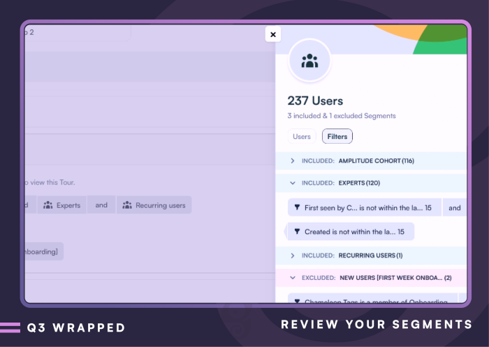
To make it even easier to connect with end-users, you can tag, for example, users who are not seeing any Chameleon patterns or specific Microsurvey respondents from the same slide-overs.
👇 See how easy it is to target users in Chameleon.
Spotlight on enhancements and a peek at what’s next
Next, we’re all about speeding up your workflows and giving you more control over what you’re building. Here are some product enhancements that pave the way for more exciting upcoming updates: Style Themes, Element Detection, and a more complex Debugger view in the Dashboard ✨
We want style tweaking with Custom CSS to be accessible to everyone, so we added a Cheat Sheet with all the selectors in Chameleon that you can use to grab selectors before making style changes.
Element selection is a big component of ensuring in-app patterns appear where they should. We integrated ARIA labels and improved how we detect on-page elements and how you can select them on the page.
Troubleshooting in-app patterns can be tricky as a lot goes into showing the right one, at the right time, to the right users. We want you to know what can cause an in-app pattern to not be displayed, so we’ve made our Debugger easily accessible via our Chrome Extension.
Need a partner to help you drive your product’s adoption?
Chameleon is an advanced, specialized product adoption solution that's easy to use and sits comfortably in your stack. Unlike all-in-one solutions, we focus purely on in-app patterns, unlocking deeper functionality and faster innovation. Chameleon is the platform for modern product teams prioritizing great user experiences.
🚀 Book a demo to explore how Chameleon can drive your product's success!
If you need help deciding, check out our Buyers' Guide, which includes tips on running a successful evaluation and all the templates to help you make the right choice ✨
Explore our Buyer's Guide
Explore the DAP category and tips on finding the best match to help you drive your product's adoption


