User friction is bad, right?
It’s the barrier that stops your users from reaching their aha! moment, completing their jobs-to-be-done, and, ultimately, making the most of your product.
The above is entirely right—but it’s not the full story. There’s such a thing as good user friction.
If you’ve only ever thought of user friction as a bad thing, this is going to take a little coming around to. Take a breath and find your happy place—because we’re about to challenge everything you thought you knew about user friction.
The good kind, that is. Ready?
User friction is anything that stops users from achieving their goals in your product.
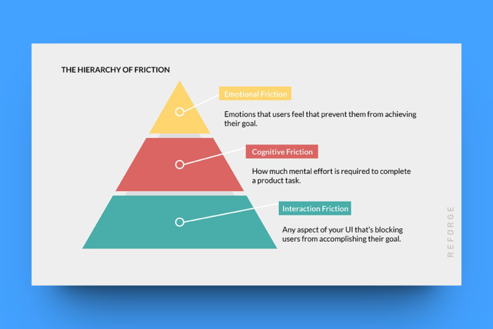
There are three types of user friction: emotional, cognitive, and interaction.
Good user friction slows users down temporarily to help them speed up in the future.
Good user friction can help with onboarding and increase product adoption.
There are five ways to optimize user friction: go all-in on self-service support, gamify the progress, personalize the user experience, place user guidance in the right places, and engage the user with great in-product content.
Read below to learn more about what good user friction is!
What is user friction?
User friction is anything that stops users from achieving their goals in your product—whatever those goals might be. User friction is to software what speed bumps are to cars; they slow you down and, depending on your suspension (or tech proficiency, in our case), can stop you in your tracks.
So, how could this possibly be a good thing?
First, we need to cover the three types of user friction.
3 Types of user friction slowing down your users
1. Emotional friction
Emotional friction is the trickiest of the three types of user friction to understand and account for. It looks at how the user’s emotions affect their ability—and willingness—to get jobs done within your product.
A great example of a business that solved an emotional friction point is Tinder. Before Tinder, most dating websites required users to ‘shoot their shot’ in the dark—there was no way of knowing if the other person was interested. It was an intimidating and potentially discouraging process. Tinder’s introduction of swiping left vs swiping right—matching mutually interested users—solved this pain point, and made online dating a whole lot easier.
2. Cognitive friction
Cognitive friction basically looks at how much effort is required to complete a task or objective. If a task is too challenging—if it involves too much cognitive load—users will, put simply, give up.
An example of minimizing cognitive friction is how Uber gets people from A to B with significantly less effort than traditional transport. What used to be booking taxis and calling back for updated arrival times or planning out routes on public transport, is now inputting your destination and tracking your driver from the minute they accept your trip.
3. Interaction friction
The last type of friction is interaction friction. This refers to the difficulties users encounter as a result of your user interface design. Put simply, this type of friction occurs when your users just don’t know how to perform a certain action in your product—often resulting in them exiting your product.
Apple’s iPhones are a wonderful example of how reduced interaction friction hugely increases user adoption. The simplistic, minimalist, user-centric design ethos at Apple—pioneered by Steve Jobs—provides one of the most intuitive smartphone experiences on the market. Interaction friction is minimal—likely thanks to ample navigation and usability testing—and a core part of why their mobile devices are so successful.
Detecting user friction with qualitative and quantitative data
So, how do you identify user friction?
Some user friction is harder to identify than others—but a combination of qualitative and quantitative research typically uncovers user frustration signals. Here’s what we mean:
Qualitative data comes from user interviews, usability testing, surveys, customer feedback, sales calls, and more.
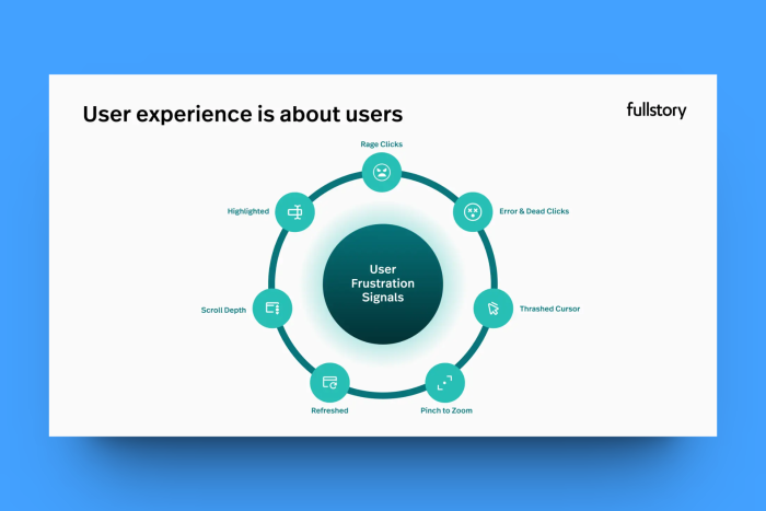
Quantitative data comes from product analytics, and includes things like rage clicks, error clicks, cursor thrashing, pinch to zoom, and more.
Different types of data are better at uncovering different types of friction. For example, qualitative data is a lot more useful for uncovering emotional friction. When Tinder did its initial research on dating app users, it uncovered and discussed the incredibly human fear of rejection—and how it affected peoples’ willingness to send messages in time before swiping to match.
Quantitative data, on the other hand, is better at uncovering interaction friction. If your product analytics tool—like FullStory or Hotjar, for example—identifies a whole bunch of users rage-clicking an element on your website, you know there’s an issue with your UI design that’s causing friction. This is an opportunity to engage users with an in-product solution to their problem.
It’s not a clear-cut do this to identify that—sometimes you identify a problem and need to work backward to find the cause. What initially might look like interaction friction could actually end up being cognitive or emotional friction.
As always, a double-pronged approach to user research is the way to go: qualitative and quantitative. One thing's for sure, though: detecting and logging user friction is the first step to eliminating user friction—the bad kind, that is.
How good user friction can help your onboarding
Let’s circle back to when we told you about bad user friction and good user friction.
Bad user friction gets in the way of your user experience—it makes it harder for users to reach their goals and gain value from your product.
Good user friction does the opposite—while it may slow users down, it helps them make the most of your product. It’s friction that helps slow users down enough to ensure they’re absorbing the information you’re providing.
There are very few places in the user journey where this is more important than during the user onboarding flow. This is where you highlight the value of your product and guide your users to their aha! moment—the element of your product that makes them think: “I can't live without this.”
Friction (the good kind) helps ensure your users are paying enough attention to the onboarding experience. If they're not, they can easily miss things—things that could improve their use of your product dramatically. Requiring users to engage with your onboarding experience ensures that users interact with your product and features—instead of clicking through without a second thought.
Friction is also great because of a cognitive bias known as the IKEA effect. The IKEA effect dictates that people tend to place a higher value on things they have a hand in building. In the context of user onboarding, this looks like inserting tasks and activities—such as performing a basic product-specific action—into the user onboarding flow. It helps engage users and makes them feel more involved in their own user experiences—take a look at how Canva use this to their advantage.
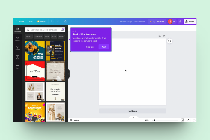
User friction at any stage of the user experience isn’t inherently bad, it depends on the purpose of the friction and its impact on your PLG flywheel. If there is no purpose, then sure—it’s likely bad friction that does little more than frustrate users.
If there is a purpose? Well, that’s another story entirely—one we’re about to tell.
5 ways to optimize user friction for increased product adoption
Do you need another breath break? It’s a lot to wrap you’re head around, that’s for sure.
Optimizing user friction involves slowing users down temporarily, to help them speed up in the future. Here are some of the ways you can insert user friction points to improve the user experience.
1. Go all-in on self-service support
Self-serve is in. Big time.
Users increasingly appreciate the opportunity to solve their own problems when using your product. This can often mean adding friction to the user experience, but it's necessary and beneficial friction.
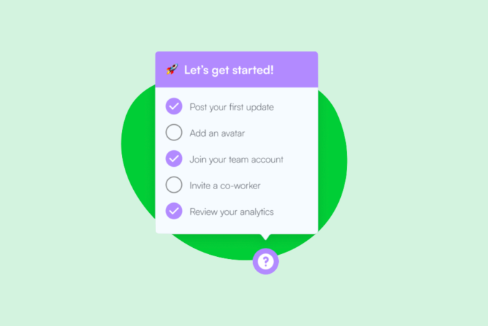
For example, one of the ways you can provide self-service support to users is with our in-product launchers. These highly-customizable, in-product widgets enable you to provide guidance to users interacting with your product—whether that's to help unblock them or introduce new features. For example, a launcher could be used to create a checklist for users to engage with during user onboarding.
2. Gamify the progress
Another good type of user experience friction is gamification. Those tough levels in your favorite game? That's friction—and it makes the game a lot more fun to play.
The same goes for product experiences—although they'll likely never be quite as fun as Candy Crush. The point is: gamification that causes friction—when done right—is good. Check out Uxcel's UX design leaderboard, for example:
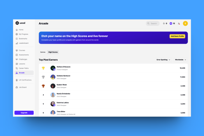
There are ample ways you can gamify your product experience, it's not just a leaderboard and high scores. More subtle gamification could look like adding confetti and fun visual elements to signify onboarding tour completion or providing incentives for completing tasks and tutorials. There's no single right way to do gamification—it's whatever works best for your product.
3. Personalize the user experience
Users love personalization—and for good reason. It provides a better product experience from the get-go—one that focuses on teaching users the info that they need, and avoiding what they don't.
It's also a great example of good user friction.
You see, in order to personalize user journeys, you first need to collect user data. How can you personalize for someone you know nothing about, after all?
You typically collect this data during the sign-up process. For example, take a look at this question that Semrush asks users during sign-up.
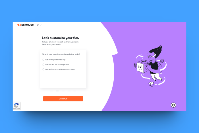
This extra step in the sign-up process adds friction. Instead of just adding their name and email, users are asked to provide additional information to customize their flow. However, it's good friction that helps provide an optimal user experience further on.
4. Place user guidance in the right places
This one is all about replacing bad friction with good friction.
Let's say your in-depth user interviews uncover that users struggle with a popular feature within your product—we'll call it Feature X. They can find the feature within your product, but they struggle to actually use it. This is bad friction.
As a result of your research, you decide to add in-product guidance to support the adoption of Feature X. The guidance is triggered by a user engaging with the feature and involves a series of perfectly-placed tips to help teach them how Feature X works—and how it can benefit them.
This guidance still constitutes friction, but it's good user friction. Plus, with Chameleon, users can be given the option to snooze tours and guidance—meaning if they're not initially interested, they can always come back to it once they recognize it's the antidote to bad friction.
5. Engage the user with great in-product content
Finally, let's talk about high-quality content, the value it brings to your users, and how its strategic placement helps reduce user friction. Adding in-product content constitutes friction, but ensuring it's helpful, concise, and contextual makes sure it's the good kind.
In-product content includes the likes of tooltips, knowledge hubs, video explainers, and more. Essentially, anything that helps give the user a stronger understanding of how to use your product. They add friction because they require attention from the user, but it's good friction because it supports their success on your platform.
Consider adding in-product content to your product experience to mitigate bad friction.
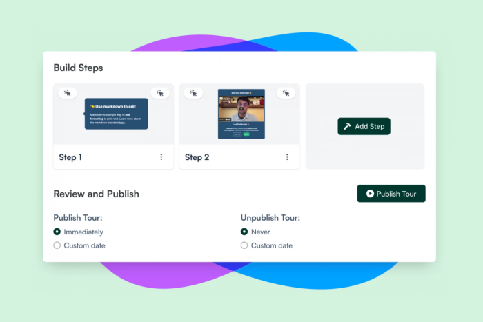
Reducing user friction by increasing user friction in your product experience
Product experiences should be joyful; bad friction has no place in wonderful products or user journeys.
Good friction, though? More than welcome. It can help your users better adopt, understand, and engage with your product. Chameleon provides all the tools you need to place helpful, contextual guidance across your product's interface—sign up free today.
What are you waiting for? Go optimize your friction!
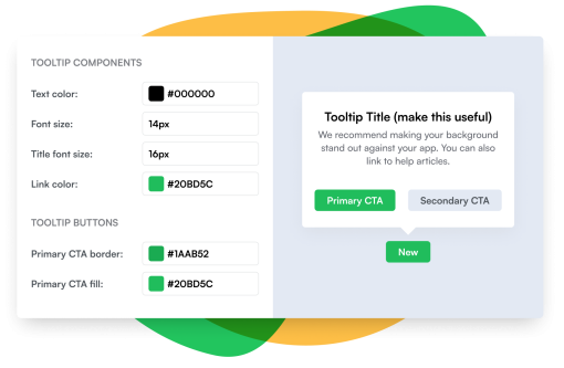
Optimize user friction quickly and easily
Build with Chameleon's intuitive builder to create and test user flows in minutes


