Without effective, strategic user onboarding, here’s what happens:
Spend thousands on user acquisition
Get new customers
Lose those customers
Repeat
Ouch – what a waste! And yet, it's true. It's all too easy to treat building a great product and getting new customers to adopt it as separate processes – primarily since those goals are handled by different teams.
Product, Growth. Product Marketing, and Customer Success teams are often working in a silo, each looking into its own metrics. But it shouldn’t be this way. That's where user onboarding comes in. It acts as the bridge between acquiring new users and turning them into highly engaged customers.
Think of user onboarding as the conversion funnel between new signups and long-term paying customers. Here, we’ll cover user onboarding best practices to guide you in impressing and retaining your users.
To build successful onboarding flows, do your research and understand your customers – who they are, what they want, what their pain points are, which tasks they’re looking to complete, and more.
Remove barriers to the "aha!" moment – that moment of sudden realization when users internalize the value and become willing to spend money on your product.
Keep your onboarding flows on-brand. Follow your brand style guidelines and make in-product guides blend in yet stand out enough to guide users in an unobtrusive way.
Create a multichannel onboarding experience. In-product guides will still be your main channel, but don’t forget to also tailor the onboarding email sequences and include help docs, tutorials, webinars, product workshops, and other educational content along the way.
Customize onboarding to individual users or user segments to meet their needs and make it as seamless as possible.
Measure the success of your onboarding and improve where needed. For this, metrics like activation rate, time-to-value, feature adoption rate, churn rate, retention rate, and user behavior data can help you get a better understanding.
Remember, user onboarding is the glue that holds everything together. Commit to intelligent, intuitive, and helpful user onboarding, and you'll see the results quickly.
User Onboarding Handbook: Craft Exceptional Flows
It's your go-to guide to user onboarding – backed by behavioral science and packed with tips, tools, and tactics you can use to level up your onboarding game. We'll send the eBook straight to your inbox.
User onboarding definition to beat them all
Before we dive into the best practices, let's quickly recap what user onboarding really is. It's not just one single product tour, not only an intuitive interface design, and certainly not a 20-page user manual thrown at users from the moment they sign up.
User onboarding is the system of actively guiding users to find new value in your product.
Let’s unpack it.
It’s the system: User onboarding can take many forms. It can be a series of product tours, help documents, email sequences, onboarding checklists, in-app tutorials, tooltips, training courses, feature walkthrough videos, etc. Or, more likely, it’s a strategic mixture of all these components.
It’s actively guiding users towards new value: The purpose of user onboarding is to actively guide each and every user towards greater and greater value until they fully adopt your product and can't imagine their life without it.
The journey of a successful user, supported by great onboarding, looks like this.
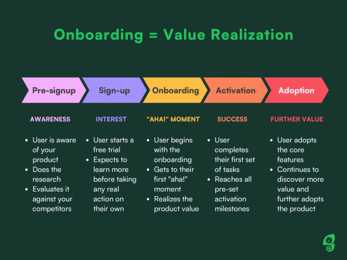
This journey is often not so linear, though. Each step of the way, there's a hidden risk of users churning, and never coming back. In fact, Intercom has found that churn happens between 40 and 60% of the time, meaning that out of 100% of new users only 40% might be logging in for the second time.
Churn is rightfully known as the SaaS killer! 😨 Luckily, it's what we're here to help with.
User onboarding best practices to engage your users from the start
To help you achieve the goal of turning new users into fully engaged customers who’ve adopted your product into their lives, we’ve put together six best practices for user onboarding. Let's get into more details for each.
1. Do your research and understand user needs
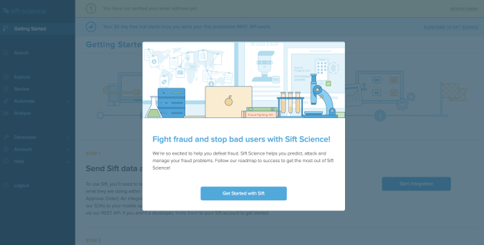
In the example above, we see that Sift Science has identified its ideal user's two biggest motivations: fighting fraud and stopping bad users. This onboarding modal reassures the user that they're in the right place, and reminds them of the product's value.
This is the moment to ask yourself: Why do our users need our product?
If you don't know the big “why” for your potential and existing customers, then you can't offer meaningful onboarding to them. User research is crucial at this point. Depending on your goal, you can choose different research methods – from user interviews and focus groups to usability testing and in-product surveys.
To understand what customers really get from the product, and build your user onboarding experience around that value, you need to know:
Who your users are (e.g. their role)
What they want (e.g. the metrics they care about)
What pain they're experiencing that your product solves (e.g. why now)
What tasks do they need to complete (e.g. how they can quickly realize the value)
What would stop them from using your product (e.g. what they consider risks)
Why do any users who churn end up churning (e.g. where they got stuck)
Once you've got a grasp on these critical (but easy to overlook) details, you can begin to treat the user onboarding process like a jigsaw puzzle, rather than a guessing game.
2. Remove barriers to the "aha!" moment
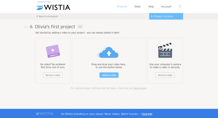
For a platform that thrives on user content, an empty account equals an unsuccessful user. As we see in the example above, Wistia lowers the barrier to entry by giving users three easy options to get started.
“Aha! I totally get it. I need this.” This's what you want your users to think as quickly as possible. The "aha!" moment is when users internalize the value of your product and become willing to spend money on it.
Tips for removing barriers and getting users to real value more quickly:
Don't require account creation before trying the product
Offer only the most relevant information to help users get started
Tailor the onboarding flows to different user personas and their journeys
If you don't offer a free trial, use your marketing site to lead potential users to the "aha!" moment (include testimonials or highly relevant screenshot GIFs)
Ultimately, you need to discover what is keeping people from getting to the "aha!" moment. Is it a problem with the signup? Is it a problem with bringing them to their first in-app action after signing up? Find the friction and remove it!
🦎Tip: Want to see onboarding done right? Check out our curated onboarding examples and discover what makes users stick around!
3. Keep your onboarding flows on-brand
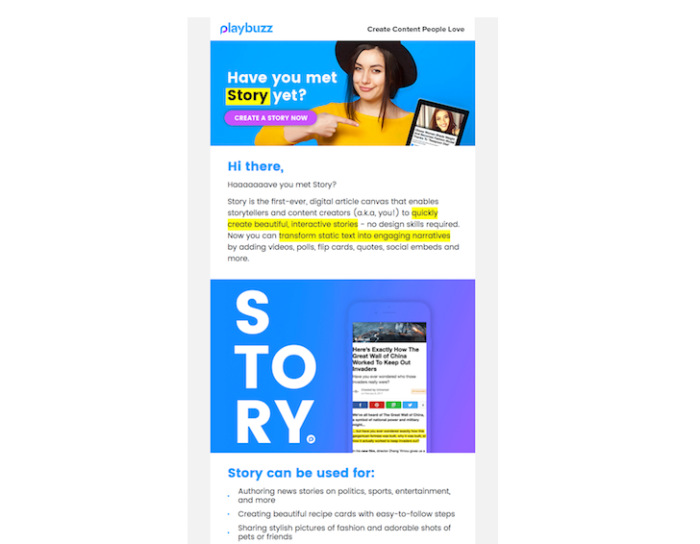
In this example, Playbuzz's user onboarding email makes its brand obvious, with bold colors, playful copy, and pop culture references.
“Branding demands commitment; commitment to continual re-invention; striking chords with people to stir their emotions; and commitment to imagination. It is easy to be cynical about such things, much harder to be successful.”
Just like branding can be the thing that makes your product stand out to your ideal target audience and gets your users to sign up in the first place, it can also be the factor that keeps them on board. Product teams can sometimes forget about the brand experience, and when they do, they risk losing users.
What does this mean in practice for your onboarding?
It means that – just like your emails – your onboarding tours, walkthroughs, checklists, help menus, tooltips, and other in-product experiences need to be on-brand and blend in with your product interface look and feel. However, you still need to make them distinctive enough for users to notice them and discover the information they need.
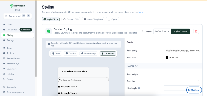
How to do it? With an onboarding tool like Chameleon, for example, you have full control of the experiences’ styling and customization. Add your brand colors and fonts, create templates to match your style guidelines, and help everyone on your team quickly adjust them to reach their goals.
Here’s what the Styling configuration looks like in Chameleon.
👉 You can start for free in Chameleon Playground to explore the varieties and functionalities before you’re ready to go live with your in-product guides.
The best practice for user onboarding is to go all-in on branding and bring that brand to life immediately. Value isn't just about checking a task off your to-do list, so devote time and creative intensity to bringing your product's full value to life.
Would Mailchimp have as many diehard users without the Freddie high five that appears after every new campaign gets scheduled? Likely not.
We're human, after all. We don't want to just achieve things, we want to feel good while doing it. We want our software products to be like our favorite work friends, totally productive and astoundingly brilliant, but also chill, funny, relatable, or whatever else adjectives apply to your brand.
4. Create a multichannel onboarding experience
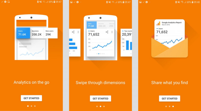
Google knows who's using its Analytics app on mobile. It's not users who want to sign up for a new account, it's users who already have Analytics access and want to know how the experience translates to mobile.
To increase engagement and retention, you've got to make use of multiple channels, because users now consume information in many places, and have different preferences for learning styles.
How to design a multichannel onboarding experience
Ideally, the multichannel user onboarding experience should be as consistent and synchronized as possible. To do this, architect your users' journeys and evaluate what information you need to provide at which point, and what the best channel for this is.
Will they start with a video and then go through walkthrough steps? Will they read a quick start guide and later watch a webinar? Will they use tooltips in-app and receive emails with links to more resources? What do they need to know immediately? What resources do they need in a few weeks or months?
Map out the user journey and identify the main onboarding touchpoints. In-app guides will still be your main channel of onboarding guidance – and the most effective one since users are in the context of using your product – but that doesn’t mean that you don’t need your onboarding strategy to include email sequences, training courses, community workshops, onboarding checklists, help documentation, and other formats of customer education content.
🎥 Webinar: How to launch engaging in-product experiences
Learn how to craft optimal in-product experiences throughout the user journey to increase activation, adoption, and retention.
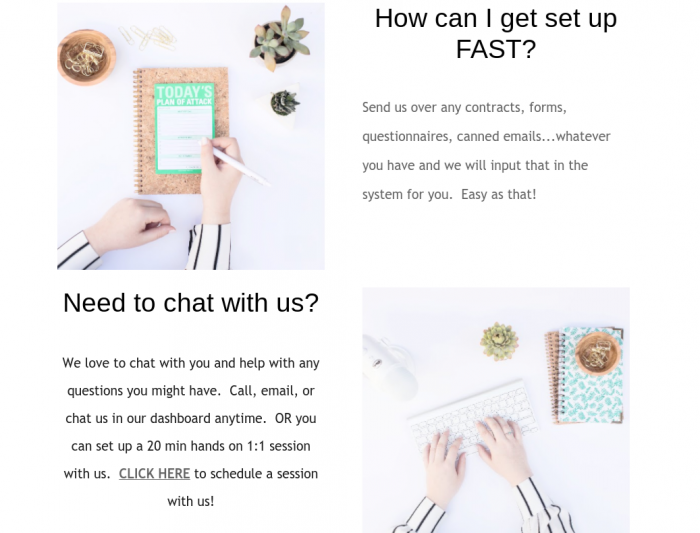
In the example below, check out the middle section of a welcome email from Dubsado, a business management platform for entrepreneurs. After a warm welcome, the email points new users towards personalized help.
There are many different channels that you can use to create the user onboarding experience. Let's go deeper into a few ideas.
Videos for quick product introductions
Videos are great resources for user onboarding. They can be used as a 1-2 minute introduction in place of a walkthrough or in a list of resources.
The more videos the better. Data from our latest Benchmark Report shows that adding a video to a Tour step adds half a minute to the time spent on that Tour. The average time spent with a video is 156 seconds, and without a video – it’s 119 seconds.
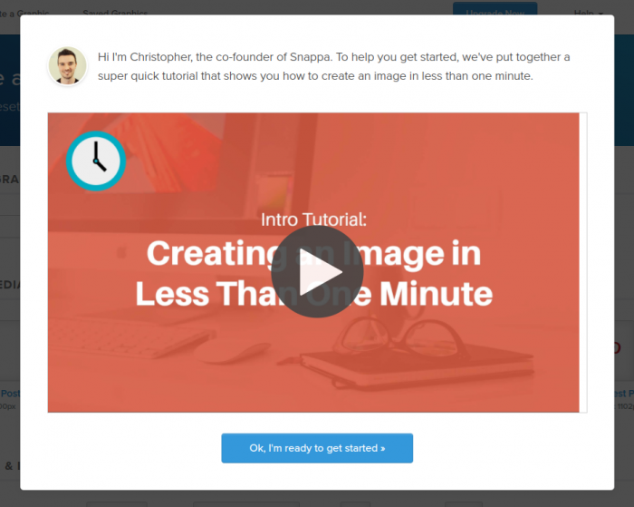
Why does this happen? If a user sees someone else quickly get to the "aha!" moment, they will remember it. For example, Snappa shows a one-minute blog header image tutorial so that users instantly see how valuable the tool is.
Product tours to point out the key features
Product guidance is essential. You want to pull users towards creating their first project or achieving their first task. Bear in mind that users sometimes perceive product tours and tooltips as popups and find them annoying, so gear your product guidance towards your users' needs and make sure you don't overwhelm users along the way.
Are users very tech-savvy? They might just need to be shown where critical features live. Are they pressed for time? They might just want a 3-step tour and not a 12-step tour. The best practice here is to survey your customers and optimize over time.
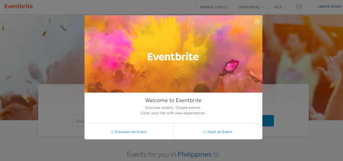
💡 The Eventbrite user onboarding modal above was built with Chameleon. Watch our Recipe video to find out how to recreate it in your own product.
In-app chat for answering questions
User onboarding isn't just something that happens in the first 10 minutes or an hour of usage. Providing users with a way to ask questions (whenever they have them, be it immediately or 13 days into their 14-day trial) is critical to increasing retention.
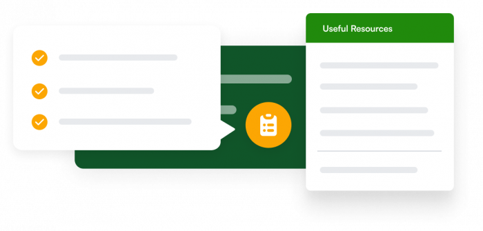
One of the best ways to do this is to enable a chat window to open right from the onboarding checklist or a help menu with useful resources that are always available in your product and can be opened by a click or hovering over an icon.
Here’s a mock-up example of what this could look like when built with Chameleon.
Webinars to help users master the tool
SEMrush has really mastered its user onboarding webinars. Their “101” webinars help new users understand how to use the platform, while their high-level SEO webinars increase user engagement over time, enforce their brand authority, and help push out content that brings in new users looking for professional development content.
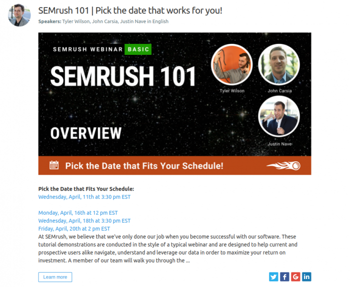
There are very few companies that do this well, but every single SaaS platform has the opportunity to create beginning tutorials and professional development content geared toward their unique users.
At Chameleon, for example, we run monthly Product Spotlight webinars, each with a specific topic to help answer our customers’ questions and guide them to discover more value. Plus, we have the Chameleon 101 video course, too 😊
Personalized training to help users succeed
Demo request, anyone? Especially for complicated B2B products, many users won't take the time to move their business processes over without a personalized demo showing them exactly why they should.
If any of your users are confused or if your "aha!" moment takes more than a couple of hours to discover, you absolutely need to offer 1:1 training to help prospective customers how exactly your product solves their problems, fits into their tech stack, and helps them reach their goals quickly.
Help documentation for self-serve support
Only highly motivated new users will pour through your training docs to learn how to use your platform. But remember, user onboarding is a long-term process, and written documentation and help centers are very valuable for experienced, engaged users.
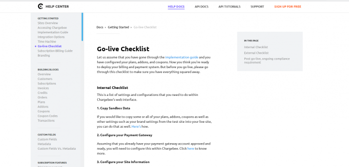
Comprehensive documentation can also help reduce user anxiety. This example below from Chargebee demonstrates a powerful piece of onboarding content that clearly outlines the steps a user needs to take to succeed.
5. Tailor the experience to each users’ journey
Behavior-based user onboarding is incredibly valuable. Let's say user A and user B both sign up at the same time. User A needs your solution right away, so they immediately spend two hours completing a task. User B however, has signed up with the intent to explore your product later.
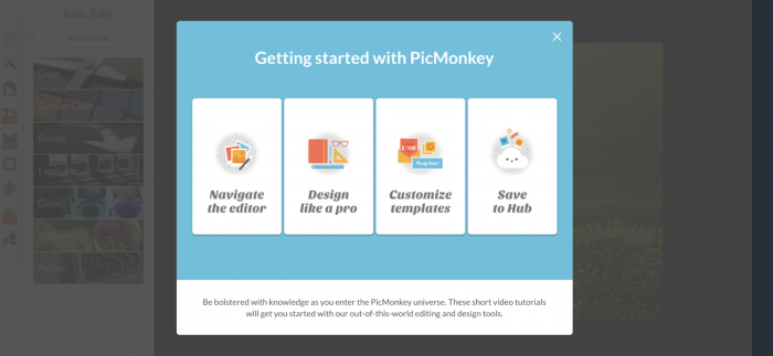
How can you cater to such different needs? Ask users what they'd like to do like PicMonkey did, so you can tailor the flow to different expectations easily. PicMonkey's choose-your-own-adventure user onboarding flow helps the user choose the most relevant tutorial.
Tailoring the onboarding journey doesn't stop there. After the initial welcome email series, send emails based on behaviors like time spent in-app or task completion so you can guide experienced users towards further value (additional and advanced features) and inexperienced users towards their first "aha!" moment.
Consider a trial that is project-based or task-based instead of time-based so you don't lose out on users who might be a great fit (just not right now).
Where in a user's journey are they most likely to upgrade to a premium plan? The answer will be different for highly engaged users versus users who still need to make use of the product. The insights you gain from behavioral analytics will help you create impactful upsell and cross-sell campaigns inside your product.
Automate your upselling and cross-selling by identifying the right subsets of users and presenting them with more product options. When you tailor the experience and sell the right product add-ons to the right customers, you increase your revenue while increasing the customers' satisfaction and delivering greater value.
6. Measure success and treat user onboarding like an ongoing project
One of the essential steps is to measure your user onboarding performance. For example, if you build product Tours with Chameleon as your Product Adoption Platform, you can measure their success inside the Chameleon Dashboard. There, you can track how many users engage with your product's onboarding, and get the insight you need to drive new user adoption.
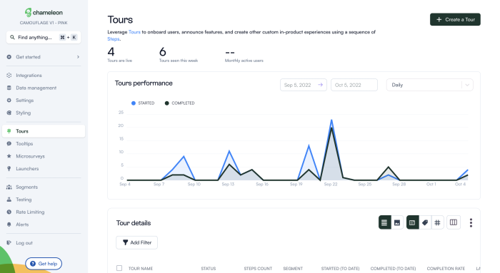
Not only is user onboarding an ongoing process for your users (as they become more acquainted with all of the features), but it's also an ongoing opportunity for you to increase product adoption.
It's definitely not one-and-done. User onboarding requires that you set and analyze goal metrics, track conversions and churn, discover any issues or drop-offs, and commit to regular reviews and updates.
You can do this with user onboarding software. And keep in mind that good user onboarding flow means that users understand the value of your product and progress through their journey more easily.
Key takeaways: Improve your user onboarding process with these tips
To sum up, think of user onboarding as a bridge between acquiring new users and turning them into power users. It’s a system, process, and guidance that leads users to the value of your product.
These best practices will help you track user onboarding more successfully:
To build successful onboarding flows, do your research and understand your customers. This includes who they are, what they want, what their pain points are, which tasks they’re looking to complete, what their perceived risks are, and why they might churn.
Remove barriers to the "aha!" moment – that moment of sudden realization when users understand the value and become willing to spend money on your product. There will likely be more than one “aha!” at different stages of the users’ journey.
Go all-in on your brand. Follow your style guidelines and customize your onboarding tours and feature walkthroughs to be fully on-brand. Make them blend in yet stand out enough to guide users in an unobtrusive way.
Create a multichannel onboarding experience. Users now consume information in many places, and they have different preferences for learning styles. In-product will still be your main channel, but don’t forget to also tailor the onboarding email sequences and include help docs, training tutorials, and other relevant customer education content at every touchpoint.
Customize onboarding to individual users or user segments to meet their needs and make it as seamless as possible. Remember, friction can sometimes be good to motivate users to continue, but don’t make the onboarding hard or overwhelming.
Measure the success of your onboarding and improve where needed. For this, metrics like activation rate, time-to-value, feature adoption rate, churn rate, retention rate, and user behavior data can help you get a better understanding.
Remember, user onboarding is the glue that holds everything together. Without it, your promise and your offering can easily fall apart. Commit to intelligent, intuitive, and helpful user onboarding, and you'll quickly see the results for yourself.
You can start building effective onboarding flows with Chameleon today, no code needed. Or you can book a personalized demo to get on a call with one of our product experts who will guide you through how Chameleon can help you address specific challenges you have.
Create impactful welcome flows with Chameleon
Get started free and build a welcome page that inspires users to take their next steps
