As you might remember from Psychology 101 back in college or from binge-watching Criminal Minds (just me?), psychology is the study of the human mind and psyche. It investigates how our thoughts, feelings, and actions inform who we are and how we fit into society.
What triggers human beings to particular events? Why are some human behaviors on auto-pilot while others take an effort? What factors contribute to how you act? Cognitive and behavioral psychology plays a major role in almost every field, including the SaaS environment. There is even a research subject called human computer interaction, which looks at how humans interact with technology.
Every SaaS product team can benefit from understanding human psychology and applying its principles to their user base. From product marketing to engineering teams, user psychology can help build a user-centric product, where users' thoughts and behaviors can determine their experience.
In this article, we'll unpack some ux psychology principles like motivation, triggers, and cognitive load, explaining how you can harness them towards increasing product adoption. Plus, we’ll explore 15 cognitive biases that you should consider when developing UI design and in-product UX flows.
User psychology is a part of user research that studies how users interact with a products based on beharioval patterns and cognitive biases that can shape the user's experience.
Product teams and UX designers use behavioral and cognitive psychology to analyze user data and boost product adoption rates by building user-centric products.
Motivation, ability, and triggers - three variable of BJ Fogg's Behavioral Model - can determine how users experience a product and whether they get hooked to it.
Cognitive biases are patterns of thinking that can be either part of our human nature or formed by our experiences. There are hundreds of cognitive biases that can impact how users behave with a product.
We've elected 15 examples of cognitive biases that can be used to drive higher product adoption, so if you want to get straight to it 👉 here.
What is user psychology
User psychology attempts to understand how users interact with a product based on their behaviors, actions, and responses. Behavioral psychology, which draws insights from human behavior to determine psychological patterns, is a valuable tool for product teams to identify the strengths and weaknesses of their product and how they can better serve customers and end-users.
“The principles of behavioural psychology can be harnessed by a product team to understand potential strengths and flaws of a product idea and ultimately create something impactful and desirable for their customers.” – Rajat Harlalka for Product Coalition
How can we anticipate user action or behavior? What triggers can we use to keep users motivated and engaged? One way to begin approaching these questions is by using BJ Fogg's behavioral model.
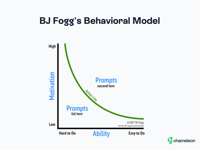
Dr. BJ Foggs, founder of the Behavior Design Lab at Stanford University, developed this model to illustrate the variables that culminate in a behavior: motivation, ability, and triggers.
As the modal shows, the harder a task is to complete (low ability), the less motivated will be the person trying to complete it. Hence, any triggers used to influence action at this stage will likely fail.
In order to stay above the action curve, where motivation is high and complexity is low, we have to dig deeper into each of the variables in this model (motivation, ability, and triggers).
Variable #1: Motivation
Motivation is that subconscious push-and-pull that fuels the drive towards or against some action or behavior.
What motivates you to get out of bed and go to work every day? Maybe you're motivated by feeling like you're part of building something or part of a community, or perhaps it's the paycheck at the end of the month that gets you going. These, while different types of motivation, are equally valuable psychological principles that any employer would consider when trying to boost morale and keep their teams motivated.
The same goes for user psychology. Understanding user motivation allows you to create products that harness whatever subconscious pull draws users to your product.
Motivators can be extrinsic or intrinsic; the former being those associated with something external like a paycheck, and the latter being internal manifestations like the feeling of belonging.
Let's say you're rolling out a new product feature. Chances are that this update will require users to change or adapt their behavior when using your product. What are some extrinsic and intrinsic motivators that can be harnessed toward increasing feature adoption?
Extrinsic motivation: Return on Investment (ROI)
Let's think of ROI here not only as a metric for revenue but also in terms of other resources like time and effort. Reducing the amount of mental effort required for a user in order to reach success is critical for product adoption. Our minds tend to reject complexity but welcome any behavioral change that will simplify our experience with a product or get us to success more quickly.
Sunk cost is both an economics and decision-making principle that refers to an investment made that cannot be recovered. Time is a major investment that users choose to make in your product, so an effective product adoption strategy should motivate the customer to spend time with the new feature despite the reduction in effort.
A great way to do this is to offer opportunities for self-serve discoverability. Creating a short tour that introduces the new feature and welcomes users to explore it on their own can boost adoption rates as the time invested in the exploration will become a sunk cost.
Check out how Highspot introduced a new feature and inspired users to explore it with a Tour built with Chameleon.
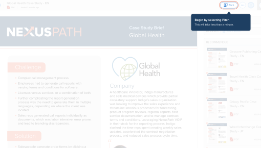
Highspot Feature Adoption Tour
Intrinsic motivation: Intuitive design
Intuition is a psychological phenomenon that has a major influence on product and UX design. There are many behaviors that we perform intuitively, like going to the bathroom, drinking water, or driving home in the middle of the night when the streets are empty. You made very little conscious effort to get from point A to point B, your brain is programmed to follow the route like a GPS.
This happens because humans are great at acquiring procedural knowledge: the ability to understand and perform sequential actions with ease and repeatedly. Intuitive design relies on it to build products that we can navigate with little-to-none mental strain.
"Intuition is not a feature of design—instead, intuitive use is a characteristic of the interaction process between a specific user and the design. So, if we are to evaluate whether a design is intuitive, we must also think about who will use the design." – Interaction Design Foundation
Designing intuitive interfaces isn't about creating design patterns that users can learn and memorize, but rather using design axioms – a set of design rules informed by user research that become the most accepted way of doing things. Collecting data from behavioral analytics can help product teams improve user experience by drawing insights from user interactions.
Variable #2: Ability (a.k.a. Cognitive load)
Ability is often acquired by investing a significant amount of time learning how to perform an action successfully. With the process of developing a new ability, comes the frustration of navigating the learning curve, where if the curve is too steep, you're likely to give up or lose progress.
There are a number of cognitive principles that impact how people can process new abilities and we'll cover some of those in detail in a bit. For now, let's focus on the general gist of things: tasks need to be simple enough that users do not have to strain their minds to get through them, but with enough complexity to make their value evident.
The key to keeping the cognitive load in balance is to know what information is valuable to users at particular times. One way to do this is by using product adoption software like Chameleon that offers deep targeting and advanced user segmentation features, so you can deliver in-product guidance that is particular to your user's behavior.
.gif)
Choose the best product adoption platform
Building a successful product is hard; make it easier by using the deepest solution to drive feature usage
Variable #3: Triggers
The book Hooked: How to Build Habit-Forming Products by Nir Eyal and Ryan Hoover is a “fantastic resource for SaaS product teams looking to leverage user psychology towards product adoption. In it, Eyal takes us through his Hooked Model, which he describes as a "four-phase process companies use to form habits."
"Through consecutive hook cycles, successful products reach their ultimate goal of unprompted user engagement, bringing users back repeatedly, without depending on costly advertising or aggressive messaging."
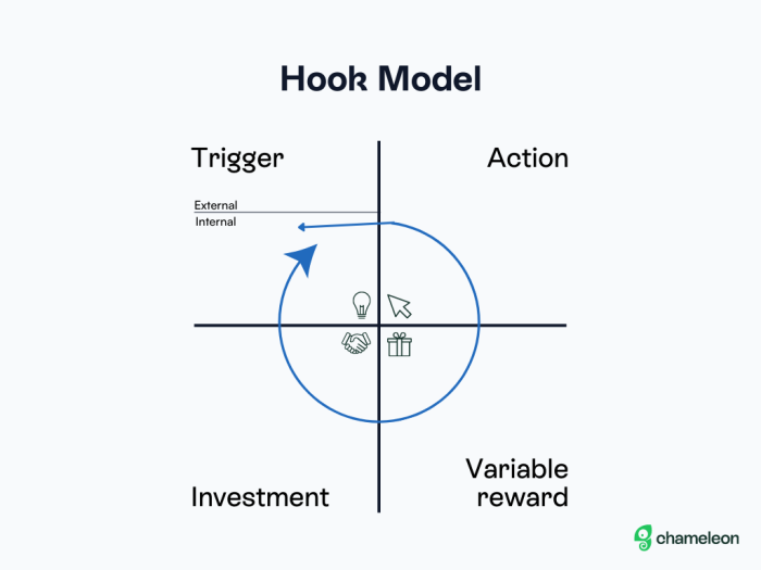
Triggers, as defined in the book, are similar to motivators: they are the spark that gets users hooked on your product and can be either external or internal.
External triggers are manifested by product teams in efforts to catch the user's attention, be that with a notification, email, or in-app message. Internal triggers, on the other hand, are manifested by the users themselves, but it's important to understand what triggers and motivates users to be able to catch their attention effectively.
"After uncovering the triggers that prompt user actions and deciding which actions you want to turn into habits, you can increase motivation and ability to spark the likelihood of your users taking a desired behavior." - Nir Eyal on Hooked: How to Build Habit-Forming Products
In order to be effective, triggers need to be well-timed, actionable, and intriguing.
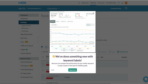
Moz Feature Announcement
In this example of a feature announcement that Moz made with Chameleon, a modal is used to prompt users to explore changes made to an existing feature. The messaging is informative and intriguing, as it alludes to an update but doesn't immediately reveal it, and users are prompted to check the feature out by clicking on a button that triggers a tooltip with more details.
Cognitive biases and product adoption: How are they connected?
Cognitive biases are thought patterns that our brains form to interpret the world around us based on our personal experiences, and are considered a psychological fallacy or systematic error by psychology experts. Do not worry, though – falling victim to cognitive biases is inherent to our human condition.
Our brains are beautiful well-oiled machines capable of processing loads of information incredibly quickly. The thing is, the interpretation of these cognitive inputs isn't purely logical and based on immediate context – many of our actions, reactions, and decisions are based on pre-existing biases that our brains quickly pull as references for how it will interpret experiences.
These cognitive shortcuts are also called heuristics, and a number of them can be leveraged by product teams to increase the likelihood of a desired outcome.
15 types of cognitive biases you should be aware of
1) Miller’s Law
The average person can only keep ~7 items in their working memory at one time.
Imagine you're out of milk, eggs, and peanut butter, and decide to go to the grocery store to stock up. You probably won't need to make a list since it's pretty easy to remember only three items (even easier when they're somewhat related).
Now imagine new users interacting with your product for the first time. If you show them a multi-step tour followed by several tooltips that showcase everything they need to know all at once, it's likely they won't be able to remember all of that.
Keeping the user onboarding process simple can help retain those new users. If creating a product onboarding tour, for example, feature only the most relevant items to get users started. After analyzing millions of user interactions with product tours for our latest Benchmark Report, we found that 3-step tours have the highest completion rate of 72%, much higher than longer ones.
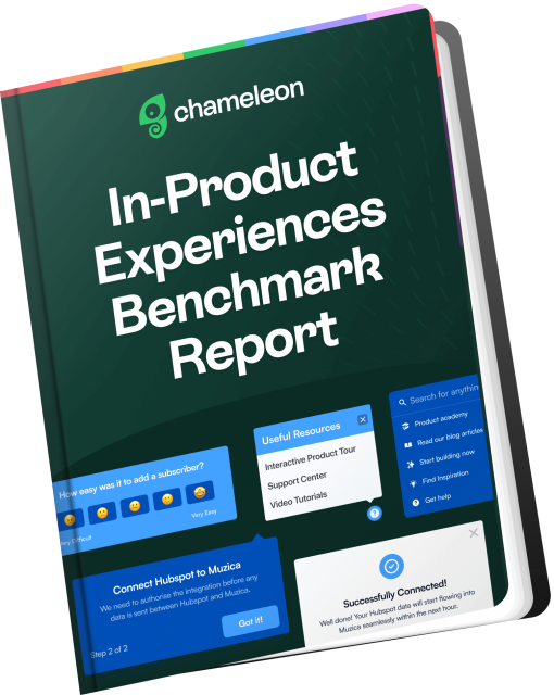
Download the In-Product Experiences Benchmark Report
Improve your in-app messaging and scale self-serve success with data and insights from 300 million user interactions with Chameleon Experiences. We'll send the Report to your inbox!
2) Hick’s Law
People will take longer to decide if they have more choices.
Keeping things simple can do wonders for product adoption. As we shared earlier, lowering the mental effort for a task will help users adopt it, and decision-making counts as such.
As Rajar Harlalka explains in the aforementioned Product Collective article, “minimal user cognitive load also implies users don’t have to strain their minds to understand the product and navigation. They just start using the product effortlessly."
3) Weber’s Law
Users adapt better to small incremental changes.
SaaS and change are almost synonymous but behave like antagonists. SaaS products are always evolving and changing, but users aren't fanatical about change. So if you're rolling out a new product update, consider deploying changes over a number of versions.
Besides making adaptation easier, making incremental changes also gives users less new information to learn, which going back to Miller's Law, is always preferred. Using visual in-app elements like tooltips, you can alert users to what's new without overwhelming them with information, and let them discover the rest on their own with self-serve exploration.
4) Progressive disclosure
Users are less overwhelmed if complex information is progressively introduced.
If you're learning how to do air flips, you might want to start with a simple cartwheel.
Similar to this, you cannot push users to explore new functionality or to learn the value of your product quickly by introducing complex information all at once.
Remember cognitive load and minimal effort? Those two are at play here, meaning that users will learn or adapt better to change if the information is introduced progressively by order of complexity.
5) Visual anchors
Familiar visual elements used to guide the user’s eyes.
Visual anchors may sound like a design tool, but they also qualify as cognitive biases because they can trigger user responses. For example, if you see a little red dot or a number over an app widget on your phone, you know that this means that you have unread notifications or messages coming from that app, which prompts you to open it.
Using design axioms like this in product design can have a major impact on product adoption, as you're using visual elements that users are already familiar with.
Tooltips can also be used as visual anchors that are triggered by and respond to certain users' actions. A very familiar example would be the Google Hangouts microphone tooltip, which is triggered when the platform detects sounds coming from your end when the microphone is turned off and suggests you might want to turn it on.
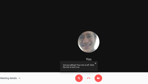
Google Hangouts Microphone Tooltip
6) Nudge
Subtle hints can affect users’ decisions.
Nudges are similar to visual anchors, but trigger users with a little more subtlety. While visual anchors can be more "in-your-face", nudges work like gentle taps on the shoulder.
For example, a nudge can come in the form of a help widget that sits on the corner of your page and nudges users towards help whenever they're stuck. Or it can be more of a design choice like using different colors for buttons to influence user behavior.
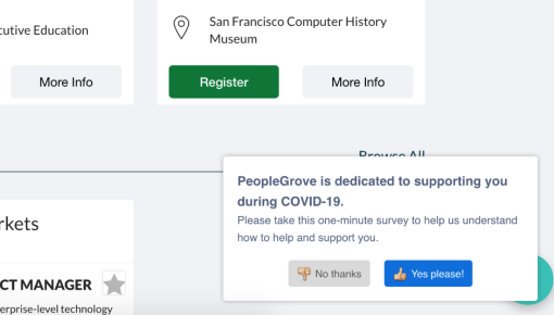
PeopleGrove Emergency Feedback Survey
In this example from PeopleGrove, they're trying to push users to complete a survey by nudging them with the brightly colored button with a positive thumbs-up emoji on it. Subtle, but effective 👍
7) Feedback loop
When users take action, feedback communicates what happened.
In the context of cognitive biases, feedback loop is mostly about messaging – letting users know what just happened, what will happen next, or how to fix a mistake, by adding confirmation messages, error messages, success messages, and similar.
This can have a huge impact on preventing users from churning, especially if your product has a steep learning curve.
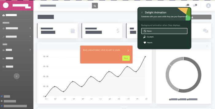
Besides ensuring users are not confused by anything that happens inside your product, you can also use feedback loops to celebrate user success. With Chameleon, for example, you can add delight animations like confetti to indicate a successful completion of a task.
8) Goal gradient effect
Motivation increases as users get closer to their goal.
Users like to feel that their missions have been accomplished, and will be more drawn towards completing them the closer they get to it. As a product manager, designer, or marketer, you can harness this cognitive bias to get them to success faster.
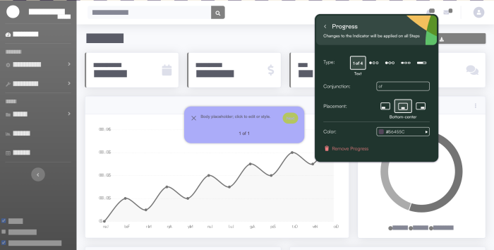
You can keep user activation afloat by letting users know they're close to success during an onboarding experience with in-app messages like "You're almost there! Only 1 more step to go!", or by adding progress bars to in-app experiences like Tours or Microsuverys.
9) Curiosity gap
Users have a desire to seek out missing information.
The curiosity gap is a cognitive principle that supports the idea that users prefer to navigate through your product in self-serving models. Actually, 70% of customers now expect a company’s website to include a self-service application.
You don't need to overload users with information to get them hooked. Instead, give them just enough to spark their curiosity and push them to continue exploring functionality on their own.
10) Self-serving bias
People tend to take credit for positive events and blame others for negative.
We may not like to admit it, but we're all guilty of self-serving bias, and sadly it can hurt product adoption if left unchecked. Users who have a hard time adapting to a new feature or adopting a product are likely to blame the product itself for that failure, which will lead to churn.
Therefore, making sure users see the value of your product and reach success quickly is imperative for product adoption. You can do that by using different design patterns and UX design patterns that guide users towards the right features for them. Segment users into cohorts that you can target directly with in-app communication.
For example, AvidXchangewas able to deflect 20,000 support tickets in one year by introducing Chameleon-built Tours and Tooltips to alert users of any issues that could be causing friction and quickly inform them of product updates.

"We can pass information from our software over to Chameleon to create targeted segments. It could be based on permission sets, the browser they're using, or certain access that they have. When we receive the data that a user saw the message about the error, we then target them again to show the resolution message. This has been a huge help in terms of not bombarding our whole customer base with unnecessary messages."

11) Curse of knowledge
Not realizing that people don’t have the same level of knowledge.
Do you offer all users the same level of guidance? Big mistake. Users at different stages of their journey within your product will most likely have different experience levels. Even users at the same stage but with different past experiences may differ in how much of guidance they need.
That's why being able to segment different user groups and target relevant product guidance to each group is so important for product adoption.
You can determine a user's level of experience or knowledge about your product either by asking them directly (in a "How easy was this for you?" Microsurvey, for example), or by associating different behaviors with knowledge levels, and using that information to create specific events that can trigger product guidance.
12) Default bias
Users tend not to change an established behavior.
Getting users to adapt to a new feature can already be a challenge.And if it's a feature that completely changes how they interact with your product, good luck navigating that!
Default bias is here to remind us that product adoption is highly dependent on how much you're trying to change your user's established behaviors, and that change management is an important part of rolling out updates that set that expectation.
13) Commitment and Consistency
Users tend to be consistent with their previous actions
This cognitive bias goes hand-in-hand with progressive disclosure.
When you introduce new information or a task to the user, their immediate reaction is to reject it. That's why introducing tasks in bits, starting with easier tasks and building up to bigger ones, can be beneficial for product adoption. Human brain likes to be consistent to previous actions and commits to progress as long as it's not pushed too hard all at once.
That's why multi-step forms can perform up to 271% better than a big single-step form, like in this Tinder case study that evaluates how the dating app splits its sign-up process into six single-question steps to harness users’ commitment bias.
14) Reactance
Users are less likely to adopt a behavior when they feel forced.
It's like trying to force-feed a child a spoon full of spinach. They will most likely fight against it, but if you blend the spinach in with mashed potatoes or pretend that it's the hair coming out of the dinosaur chicken nugget, they'll gladly accept it.
In other words, subtlety in how you approach change is critical for product adoption.
The other cognitive biases we covered in this list – like nudging or visual anchors – work perfectly well with reactance because they can influence a new behavior without disrupting or interrupting the user experience.
15) Discoverability
The ease with which users can discover features directly influences their actions.
It's a lot easier to find value in a product that is easy to discover and explore. Discoverability inspires action, so high discoverability means that users will most likely find success quickly, because features are easy to identify, test, and get results from.
User psychology unpacked: Key takeaways
We've covered a lot of ground here to show that if you're working towards higher feature and product adoption rates, understanding user psychology can provide you with clear insights about user behavior and how you can leverage action.
From the 15 cognitive biases that we covered in this article, we can extract a few key product adoption strategies that relate to user psychology:
Ease of use: reducing the cognitive load of navigating a product will make adoption easier and make it more likely for a user to get hooked.
Self-serve discoverability: empowering people with autonomy and confidence to explore a product's functionality on their own can motivate them to adopt it, as the time spent discovering it will be seen as an investment.
Audience segmentation: people have different ways of thinking and reacting; successful products are able to identify behavioral patterns and target user cohorts based on this data.
Change management: introduce changes or new information with subtlety, without disrupting user experience and expecting immediate adoption. Using in-product messaging personalized to your user personas can make change more easily digestible.
With a product adoption tool like Chameleon, your team can easily control how users experience your product and score higher adoption rates by creating in-app messages that are highly customizable.
Leverage Product Adoption to Survive the SaaS Winter
Create experience that delights users and boosts your revenue

