WalkMe burst onto the SaaS scene in 2011, revolutionizing digital adoption like how HubSpot changed the game of marketing.
Fast forward to today, and it's a powerhouse of features and functionalities, great for employee onboarding and training on internal systems. But hey, the times are a-changing! As WalkMe grew, its product releases slowed down and the tool became more focused on internal team onboarding, rather than end-user onboarding.
That's why we're diving into the world of WalkMe alternatives—each with its unique take and philosophy—to find the perfect fit for those seeking a more intuitive, modern approach. Let's explore these options together!
WalkMe alternatives and competitors to start testing
We're going to zoom in on thirteen WalkMe alternatives. While 13 is unlucky for some, we're confident you'll find the right fit to help you drive product adoption and user onboarding this year. Here are our top WalkMe competitors to choose from:
Chameleon
Appcues
Pendo
Userpilot
UserGuiding
Inline Manual
Intro.JS
Apty
Whatfix
Stonly
Userlane
Gainsight PX
Toonimo
Top 10 WalkMe alternatives (starting with the three best competitors)
Looking for a new Product Adoption Platform to help you increase product usage metrics or a new digital adoption solution with more intuitive employee onboarding options? We’ll walk you through the top three WalkMe alternatives for product adoption, best budget solutions, and best alternatives for internal usage—each with a TL;DR to get you to the good stuff quickly.
First up, here are our top three WalkMe alternatives we recommend you sign up for today and evaluate; Appcues, Pendo, and Chameleon.
Need to make a decision ASAP? Here's a quick overview of the key differentiators for our top picks.
Chameleon | Appcues | Pendo | |
|---|---|---|---|
Product tours | ✅ | ✅ | ✅ |
Microsurveys | ✅ | ✅ | 🟠 On "Feedback" plan |
Checklists | ✅ | 🟠 On Growth plan | ✅ Called "Guides" |
A/B Testing | ✅ | ✅ | ✅ |
Employee onboarding | ❌ | ❌ | ✅ |
Free plan? | ✅ | ❌ | ✅ |
Pricing | Starts at $299/month | Starts at $299/month | On request |
Product analytics | ❌ | 🟠 Click-tracking | ✅ |
G2 Review Score | 4.6/5 | 4.4/5 | |
Desktop compatibility | ✅ | 🟠 Struggles with iFrames, SPAs, Shadow DOMs, etc. | 🟠 Struggles with iFrames, SPAs, Shadow DOMs, etc. |
Mobile app compatibility | 🟠 Supports web-wrapped apps, not native apps | ✅ | ✅ |
General ease-of-use | ⭐️⭐️⭐️⭐️⭐️ | ⭐️⭐️⭐️⭐️ | ⭐️⭐️⭐️ |
1. Chameleon: For native-feeling in-app UX that delights users 💚
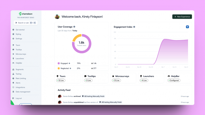
All of Chameleon’s plans come with five fully customizable, no-code products. Let’s look at them in some more detail:
Tours are powerful flows for in-product guidance and new feature launches. Use banners, modals, hotspots, and more to announce changes or guide users.
Microsurveys are contextual and targeted in-product surveys that are triggered based upon user actions – they enable you to build continuous feedback into your product throughout the user lifecycle
Launchers are highly customizable in-product widgets that you can use as checklists or help menus to deepen user engagement and feature discovery
Tooltips provide in-line help to unblock users and are dynamically deployed wherever you discover users need more info
HelpBar makes your whole knowledge base easily searchable from within your product and allows users to quickly find answers in your help content, blog articles, or developer docs when they need them the most.
WalkMe vs Chameleon: The TL;DR
WalkMe | Chameleon |
|
|
Where Chameleon is a good fit
✅ You need complete control over the design and placement of your in-product experiences. Chameleon is built to blend in and look 100% native, and you have precise targeting of where they appear included on all plans – you choose when and where experiences are seen—based on user actions, or what people see on the page.
✅ You've built up a solid product-led tech stack already and need robust integrations. With Chameleon, 20+ integrations are included; every plan includes Mixpanel, Heap, Amplitude, FullStory, and Slack integrations (to name a handful!).
✅ You need an easier-to-use, WalkMe alternative. Chameleon releases new features biweekly to improve their user experience and has a wealth of resources, webinars, and guides to help you get started quickly.
Where Chameleon may not be the best fit
🤨 Your analytics set-up is limited – consider Pendo as a solution if you're not ready to commit to a solution such as Mixpanel or Amplitude yet.
🤨 You want to run messaging on external applications e.g. Salesforce. We can't show Experiences on domains you don't own. Pendo's "Adopt" product is what you're looking for.
🤨 You need to run your in-product messaging on a native mobile app. You can still send usage data from your mobile apps to Chameleon, to allow you to target web users based on their mobile activity, or launch Experiences in mobile apps that are wrapped versions of a web app. Try Pendo, Braze, or Airship.
➡️ Unsure if Chameleon will work with your stack? Let's talk.

"We've been really successful with Chameleon because it actually enables us to be more omnichannel and trigger further automation"
Why Chameleon is the #1 WalkMe Alternative
Chameleon’s focus purely on in-app experiences unlocks deeper functionality and faster innovation, making it the platform of choice for modern product teams that prioritize great user experiences.
The prior generation of all-in-one solutions are clunky, unreliable, and underwhelming, and users don’t love their in-app experiences. But we change that. Some of the "superpowers" that Chameleon offers are:
Native A/B testing: Run control or A/B testing with Chameleon handling sampling and targeting
Snoozing: End-users can delay/pause/defer an experience without exiting completely, so they can exercise choice on when to engage
Rate Limiting: Limit the maximum frequency/cadence of experiences (by type of experience and group of users) to prevent overloading end-users
In-app “Additional Actions”: Bring functionality from other tools into your in-product Experiences
Default templates: Leverage our range of templates, automatically styled based on your brand
Engagement Index: Quickly see and benchmark how your experiences are performing, and know where to improve
Try it for free—you get an "all you can test" 14–day free trial. Or book a demo with our product experts to dig into the ins and outs before you sign up.
2. Appcues: Excels at user onboarding and NPS
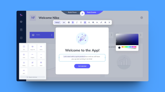
With Appcues, their product is split into four categories:
Flows: these are used for onboarding and feature announcements. Flows are comprised of modals, slideouts, tooltips, and hotspots
Checklists: pop-out widgets where you can add “to-dos” for users. Each checklist item can launch a URL or a “Flow” (Growth Plan only)
Surveys: in-app Net Promoter Score surveys are Appcues’ main survey feature
Events Explorer: Appcues recently launched click-tracking as an add-on, so that non-technical teams can define events from the Appcues app, and enable event tracking which can be used to trigger Flows and Checklists.
They've done an excellent job at making the product easy to use and they have a wide range of resources to help you get started and find further inspiration for your use cases, kudos!
WalkMe vs Appcues: The TL;DR
WalkMe | Appcues |
|
|
Where Appcues is a good fit
✅ You need event tracking included as you look for a WalkMe alternative. Appcues is a great tool if your analytics suite is limited e.g. you only have Google Analytics.
✅ You need a wide variety of UX patterns. While Appcues has its three main products; they are broken down into many other elements like tooltips, modals, and lightboxes. Their templates are easy to get started with.
✅ Your focus is on "first-party product adoption". You don't want a tool to onboard your employees—you've got your eyes set on product-led growth.
Where Appcues may not be the best fit
🤨 You need robust A/B testing and plan to experiment with your in-product experiences. Appcues have a version of A/B testing, but it is on the more basic side. This is something both Pendo and Chameleon offer natively.
🤨 Your product is built in a Single Page Application (SPA). Third-party reviews speak of issues surrounding identifying elements within a SPA; AngularJS in particular. Give Chameleon a go.
🤨 You have plans for more than just collecting Net Promoter Score (NPS) from your customers. Appcues is a strong choice if NPS is important to you, but if you want more customization from your surveys e.g. CSAT, CES, and variable endings (e.g. if someone is unhappy, launch a Calendly booking form from your survey thank you step), then try Chameleon or Pendo.
3. Pendo: All-in-one product adoption and analytics
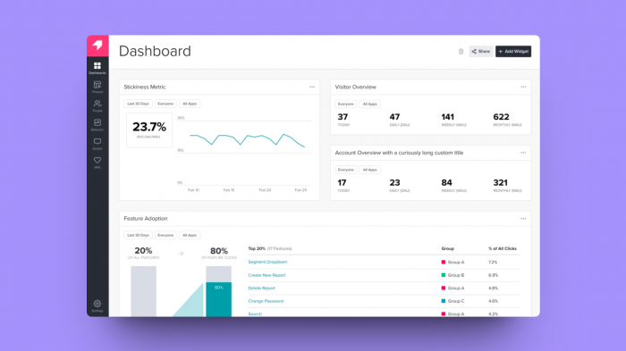
Pendo comes with a set of in-product experiences to help you communicate product updates with your users or employees and gather feedback. With Pendo, you can:
Create product tours, known as “in-app guides”, that can be triggered based on user behavior
Gather feedback from users—Pendo has a wealth of in-app surveys largely focused on gathering product feedback to fuel your roadmap or to measure customer satisfaction through NPS-style surveys
Analyze user behavior with their analytics features and build up a Product Engagement Score (PES)
Plan your product roadmap based on feedback from your users—keep key stakeholders informed, and loop your customers in on your next big release
View session replays of users in your product and understand where the friction lies (add-on)
WalkMe vs Pendo: The TL;DR
WalkMe | Pendo |
|
|
Where Pendo is a good fit
✅ You want a modern product adoption solution that integrates well with both web and mobile apps.
✅ You need to educate both your users and employees on how to use software. Pendo is the closest WalkMe alternative here on that front.
✅ You want one tool for your analytics and in-product experiences. Pendo does well blending the two if your current analytics setup is limited.
Where Pendo may not be the best fit
🤨 You have a product analytics solution like Mixpanel or Amplitude already—you’d be duplicating your efforts. Try a tool like Chameleon that has two-way integrations with your favorite tools.
🤨 You need more flexibility with your in-product experiences and how users engage with them. Appcues and Chameleon offer more UX patterns such as banners.
🤨 Pendo's pricing is a tricky one and it can get very expensive quickly. Third-party reviewers complain about pricing, that it's too high and increases steeply. Appcues and Chameleon both offer "startup-style" plans.
Best budget WalkMe alternatives
Not able to afford the price tag of WalkMe or the next best alternatives? We’ve got you covered.
4. Userpilot: A wide variety of UI patterns at less cost
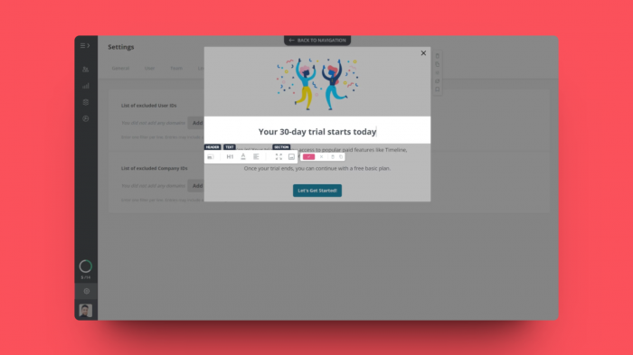
Userpilot is a no-code solution for creating customizable user onboarding flows.
Userpilot offers a wider range of UI elements than WalkMe.
Userpilot is less costly than WalkMe and other alternatives, with its Growth plan running at $499 per month
If you’re crunched for budget, Userpilot is probably the best value tool there is. For what is a considerable savings, Userpilot is still able to deliver adequate user experience building. Userpilot’s main features consist of the following:
Create user onboarding flows with various UI elements such as tooltips, modals, slideouts, checklists and banners.
Product analytics tools for tracking user behavior are included, but they are not as advanced as other tools that solely commit to product analytics.
In-app surveys for collecting user feedback on NPS and various other metrics and instances of user experience.
Where Userpilot is a good fit
✅ You need a tool that gives you a wider variety of UI patterns for user onboarding than WalkMe.
✅ You want a no-code tool you can use without any technical background or a development team to support you.
✅ You want a less costly option that can get the basics of user onboarding done.
Where Userpilot may not be the best fit
🤨 Your product is built in a Single Page Application (SPA). Userpilot depends on page reloads or page refreshes to update and trigger new flows. Since a single-page application doesn’t reload after a URL change, Userpilot’s support for SPA is very limited.
🤨 You want strong integrations with other products. Userpilot’s integrations are only one-way and they have a limited set of tools they can integrate with.
🤨 You have a native mobile app. Userpilot doesn’t run on native iOS/Android mobile apps.
5. UserGuiding: The low-price no-code solution that packs a punch
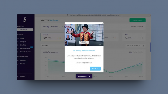
UserGuiding is a no-code tool for creating in-product experiences and onboarding flows With a built-in analytics feature, although it seems to be the weakest part of its offering.
UserGuiding has core features such as onboarding tours, checklists, modals, banners, tooltips, and in-app surveys, but the level of configuration available is very basic.
The big plus for UserGuiding is its price. With a basic plan at $69 per month, it is much cheaper than other alternatives.
Even among the budget options, UserGuiding’s pricing stands out. At $69 per month, UserGuiding provides a solution for growing teams whose resources may be more constrained. And for the price, they get a pretty good deal with the following features:
Resource Center: in-app widgets where resources like blog posts, webinars, and help center articles are always accessible.
NPS Surveys: in-app surveys for collecting NPS feedback from users.
Onboarding Checklist: a checklist that guides users throughout the onboarding process.
Hotspots: static info-boxes for giving users feature tips.
Where UserGuiding is a good fit
✅ You need a no-code solution at a lower budget which still gives good value.
✅ You want to deploy fast and also have robust support.
✅ You are looking for a more basic onboarding solution without much need for depth.
Where UserGuiding may not be the best fit
🤨 You need advanced UI patterns for a wider variety of use cases.
🤨 You are looking for a tool that integrates broadly with other products. UserGuiding’s integrations are currently limited to only eight
🤨 You are looking for a tool that is more technically reliable and doesn’t affect your product’s performance.
6. Inline Manual: A cheaper alternative for the basics
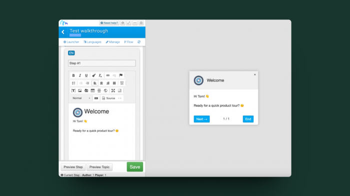
Inline Manual is an employee training and onboarding software with basic features to create walkthroughs and self-serve help.
It has simple and affordable pricing at $158 a month.
It does lack integrations, as well as mobile onboarding when compared to WalkMe.
If you're looking to get the basics down without all the bells and whistles that come with WalkMe, then Inline Manual could be your alternative.
It comes with various features for creating employee onboarding and training such as walkthroughs, modals, and help centers. It also allows you to create in-app surveys as well.
Best of all, compared to WalkMe, Inline Manual is quite affordable, starting at $158 a month with pretty much all the core features accessible.
Where Inline Manual is a good fit:
✅ You want a tool for creating interactive walkthroughs and self-service support.
✅ You want a no-code tool that you can easily customize.
✅ You want a product with a clearer sales process.
✅ You want something more affordable.
Where Inline Manual may not be the best fit:
🤨 You want a mobile training and onboarding tool.
🤨 You want a tool that provides detailed analytics and reporting.
🤨 You want more extensive integrations with popular internal software like Salesforce.
7. Intro.js: An open-source DIY solution
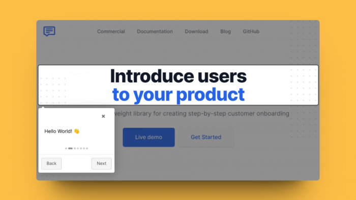
Intro.js is a JavaScript library for creating customer onboarding tours, so you need to have code proficiency to use it, particularly with JS and JS-based frameworks.
The pricing is super low, with a lifetime commercial license starting from $9.99 for a starter plan capped at one project and going up to $299.99 for unlimited projects.
Being an open-source project, the personal license is free, so you can try it out before purchasing a commercial license.
As it is a DIY solution, you’re supposed to rely mainly on the documentation. Don’t expect stellar support.
This is a great solution for small, nimble teams with dev resources to spare.
For teams that can play a lot more with code, there is Intro.js. This is the super-budget DIY option because the catch is that you need a developer to install this. For the doubtful, you can rest assured—it is trusted by well-established companies like Amazon, SAP, and Nestle.
Intro.js does provide everything you need to get going, such as step-by-step guides, JavaScript tours, and feature introductions, but it lacks various other essential UI features for onboarding like checklists and help menus. It’s a middle ground between coding your own solution and using a no-code tool.
Where Intro.js is a good fit
✅ You have dev resources available for building onboarding experiences, as well as maintaining them.
✅ You want a super low-cost with options that can be deployed quickly (provided you have developers to do this).
✅ You’re a small team only looking for basic use cases fo your user onboarding.
Where Intro.js may not be the best fit
🤨 You are looking for a no-code tool to allow teams with no coding skills to create user flows on their own.
🤨 You need advanced UI patterns that you won’t have to code yourself.
🤨 You’re a large organization with a complex product looking to deploy reliably for thousands of MTUs.
Best WalkMe alternatives for internal training and CS teams
Are you looking for a tool strictly for internal usage and not really for user growth via product adoption? While WalkMe is a good tool for digital adoption for your team, as well as training for your employees, it is quite dated and there are other better, fresher alternatives out there.
8. Apty: The no-code tool for employee onboarding
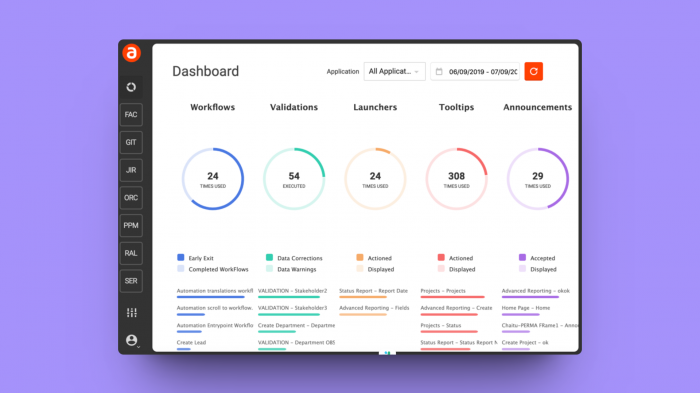
Apty is a digital adoption tool for boosting productivity among employees, more suited for enterprise customers.
With Apty you can create guides, in-app announcements, tooltips, and onboarding flows.
If you’re looking for feedback collection, keep in mind that Apty lacks in-app survey features.
Apty doesn’t list its pricing structure, but a free trial is available.
Apty is a digital adoption software that can help you build employee onboarding and training processes. Apty’s look and feel are much more modern than that of WalkMe’s, and it is much easier to use. Just a simple extension installation, and Apty layers over the product.
It is also much less costly than WalkMe, though pricing is still custom and you’ll need to talk to their team. However, a big plus is that Apty has a free trial available, and not only that, it lets you use the software for 45 days for free to evaluate whether it’s right for you.
Where Apty is a good fit
✅ You want a tool for employee onboarding that can get more value than WalkMe at a lower price.
✅ You want a tool that also brings in good analytics and segmentation capacity.
✅ You want a no-code solution that requires no technical knowledge for implementation, and offers a wider variety of integrations than WalkMe.
Where Apty may not be the best fit
🤨 You want to collect user feedback. Apty does not offer in-app surveys, which means you won’t be able to get feedback in order to iterate and improve the user experience.
🤨 You have native mobile apps. Unlike WalkMe, Apty doesn’t support mobile apps on iOS and Android.
🤨 You want something that’s very customizable. Despite WalkMe’s requirement for technical knowledge, it also offers deeper customization of experiences than Apty’s no-code platform.
9. Whatfix: An easier, more modern version of WalkMe
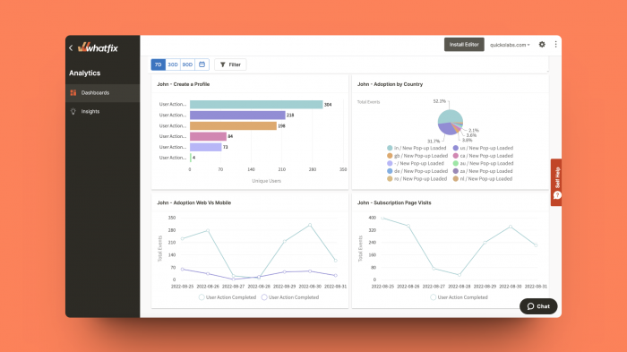
Whatfix is a good enterprise alternative for employee onboarding and training that is easier to use than WalkMe.
Whatfix offers a wide range of functionalities, such as product tours, checklists, and resource centers.
Unlike WalkMe, there is a free trial available, though its pricing is not public.
On the surface, WalkMe and Whatfix may look similar. They both cater to large enterprise-grade companies with digital adoption needs. They can both be used to set up user onboarding and employee training.
But where they differ is in the details. Whatfix is more intuitive and easy to use than WalkMe, and it integrates better and more broadly with other tools.
In a nutshell, Whatfix is a great WalkMe alternative if you’re looking for a tool for internal usage.
Where Whatfix is a good fit
✅ You are a large company looking for a digital adoption platform focused on internal usage that is easier to use and understand than WalkMe.
✅ You want something less technically challenging than WalkMe, and you also want top-tier support. Whatfix’s G2 score on quality of support is 9.8 compared to WalkMe’s 8.8. That is a considerable difference.
✅ You need to integrate with many different tools. Whatfix has a more robust integration capacity with tools such as analytics, LMSs, and support tools than WalkMe.
Where Whatfix may not be the best fit
🤨 If you need analytics features, Whatfix is very much lacking in that area. If you want something more in-depth you’ll have better luck going to best-in-class product analytics tools like Mixpanel and Heap.
🤨 If you need advanced contextual onboarding that personalizes user experience. Whatfix does offer this, but it is very limited.
🤨 You want custom branding options without a need for coding. Whatfix’s styling is limited, and it relies heavily on CSS. So if you don’t know CSS, you’ll likely find it frustrating to match the experiences to your style.
10. Stonly: An interactive guide builder for customer support and training
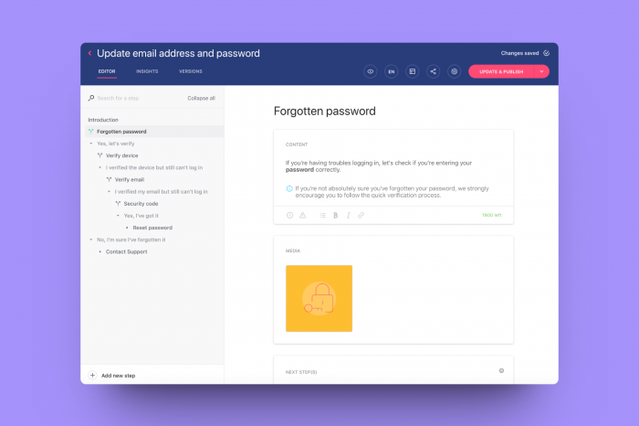
Stonly is an interactive guides builder that allows you to create step-by-step guides for customer support and training purposes.
It's much more specialized for building educational guides.
If you're looking for a much cheaper tool that gets the job done for internal training, then Stonly is your answer.
If you want a tool more centered around building interactive guides for internal education, then Stonly may be your answer.
Stonly is easy to use, customizable to a good degree, and integrates with several important platforms such as Zendesk, Salesforce and Intercom.
Best of all, it comes at a low price tag of $99 per month, so if affordability and internal training are both on your mind, then Stonly could be your answer.
Where Stonly is a good fit:
✅ You want a tool for creating step-by-step guides for customer support and training purposes.
✅ You want a user-friendly interface that requires no coding knowledge.
✅ You want to create knowledge bases.
✅ You want something more affordable.
Where Stonly may not be the best fit:
🤨 You need advanced analytics and reporting capabilities.
🤨 You want mobile guides.
🤨 You want advanced customization and targeting capacities
11. Userlane: The "no fuss" tool for employee software training
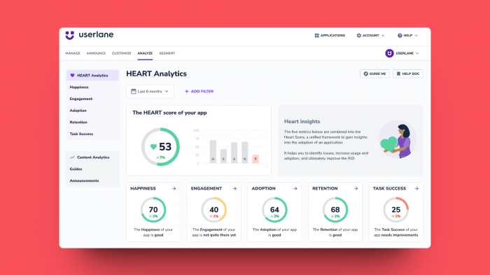
Userlane is a dynamic digital adoption solution, primarily aimed at making software training efficient and user-friendly, especially for enterprise-level applications.
With Userlane, you can develop interactive guides, tooltips, and step-by-step walkthroughs, simplifying the user training process significantly.
However, if you’re looking for robust analytics capabilities, Userlane may not be the top choice as its analytics features are somewhat basic.
Userlane’s pricing information is not publicly listed, but they do offer a demo to get a custom quote.
Userlane distinguishes itself with a focus on an intuitive user interface, making it more user-friendly than WalkMe. It's straightforward to set up, requiring just a simple plugin installation to integrate with your software.
While it may not be as cost-intensive as WalkMe, the exact pricing details are custom and require direct communication with their team. Userlane provides a demo to understand its value proposition better, though there isn’t a standard free trial period like some competitors offer.
Userlane is an ideal WalkMe alternative for straightforward software training needs.
Where Userlane is a good fit:
✅ Ideal for businesses seeking a simple, no-fuss solution for guiding users through software training
✅ Beneficial for organizations looking for a digital adoption tool with an intuitive interface and easy setup
✅ Great for companies that prefer a solution offering basic integrations without requiring extensive technical knowledge
Where Userlane may not be the best fit:
🤨 If in-depth, comprehensive analytics are a priority for your user training and onboarding processes
🤨 For those who need a digital adoption solution for native mobile apps, as Userlane’s focus is more on web-based applications
🤨 If your requirement is for a highly customizable digital adoption platform. While Userlane offers ease of use, it might not match the customization depth that WalkMe offers with its technical capabilities.
12. Toonimo: A fun and flexible way to boost software adoption
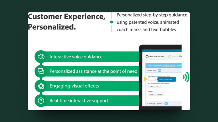
Toonimo offers a unique spin on digital adoption with its focus on using voice and animation to guide users through web applications. This platform is particularly effective for businesses looking to enhance user engagement with a more interactive approach.
Key features include customizable, voice-guided walkthroughs, which can significantly enhance the user experience for complex software. However, Toonimo’s unique animated approach may not be suitable for all business environments.
Toonimo’s pricing information isn’t publicly available, but they offer demos to provide customized pricing plans.
Standing apart with its animated guidance, Toonimo is an innovative and fun alternative to WalkMe for those seeking a more engaging, interactive way to onboard and train users. The setup is user-friendly, and the platform adds a creative touch to standard digital adoption processes.
Toonimo can be a breath of fresh air for organizations looking to make their user training more engaging and less conventional.
Toonimo is an excellent choice for businesses aiming for an interactive and engaging digital adoption experience
Where Toonimo is a good fit:
✅ Ideal for companies seeking an engaging, interactive way to guide users through their web applications.
✅ Suitable for organizations that value creative approaches to user onboarding and training.
✅ A great option for businesses looking for an alternative to traditional, text-heavy digital adoption tools.
Where Toonimo may not be the best fit:
🤨 If your organization prefers a more conventional, less animated approach to digital adoption.
🤨 For businesses that require in-depth analytics and feedback capabilities alongside digital adoption features.
🤨 If you’re looking for a solution to onboard users in mobile applications, as Toonimo primarily focuses on web-based guidance.
13: Gainsight PX: Bonus alternative for large enterprises
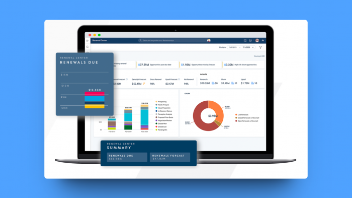
Gainsight PX is a sophisticated digital adoption and product experience platform, particularly favored by organizations looking to gather deep insights and enhance user engagement
Key features include comprehensive analytics, in-app guidance, feedback collection, and personalized user experiences. It's well-equipped to handle complex use cases and offers robust data collection and analysis tools
However, Gainsight PX might be more complex to implement than some of its competitors, and its pricing, while not publicly listed, is known to cater to mid to large-sized enterprises.
Gainsight PX is recognized for its strong emphasis on analytics and user feedback, making it an advanced alternative to WalkMe. The setup might require more involvement, but it offers a holistic view of the product experience, making it worth the effort for businesses seeking deep user insights.
While it doesn’t offer a standard free trial, Gainsight PX does provide demos and custom quotations.
Gainsight PX is a solid choice for businesses prioritizing in-depth user insights and engagement.
Where Gainsight PX is a good fit:
✅ Perfect for companies that require detailed analytics and user feedback to drive product strategy.
✅ Ideal for businesses needing a comprehensive suite of tools for personalized user engagement and product experience.
✅ Suited for organizations that are looking for a robust platform to support complex digital adoption and product experience needs.
Where Gainsight PX may not be the best fit:
🤨 If you're looking for a straightforward, no-code digital adoption solution with minimal setup requirements.
🤨 For those who require a more cost-effective solution with transparent, upfront pricing.
🤨 If the primary need is for a basic digital adoption tool without the extensive analytics and user insight capabilities that Gainsight PX offers.
Do you need a WalkMe alternative?
So that's it, our top thirteen WalkMe competitors. Still here? Maybe you're still debating if you really need a WalkMe alternative—or maybe we gave you too many options 😅
Hey, WalkMe can still be a good choice—here's the pros and cons:
When WalkMe can be a good fit
✅ Internal training on custom-built versions of enterprise applications (Salesforce, Workday, SuccessFactors, etc.)
✅ On-premise deployments (for products not yet fully in the cloud) or companies that don’t typically use third-party cloud providers
✅ Great for companies outside of the technology or SaaS industry (e.g. manufacturing businesses with “digitization” teams or IT departments) who are unaware of alternatives
✅ Enterprise customers with low (but highly valuable) monthly active user bases that are moving from in-person or face-to-face training into more interactive training
When you might need a WalkMe alternative
🤨 You need a platform that fits in with your product-led growth stack and strategy. WalkMe’s integration package lacks FullStory, Mixpanel, and Amplitude – to name a few.
🤨 Your company is scaling and you need a flexible yet affordable pricing plan that grows with you. WalkMe’s entry-level plan starts at $9,000 a year and you’ll need to commit to an annual plan before you see the benefits.
🤨 If you’re moving fast and need multiple team members to create in-product announcements – WalkMe may not be the best fit. Third-party reviews complain about the steep learning curve and feel the UI is outdated.
Know exactly what your needs are to find the best WalkMe competitor for you
At the end of the day, before you even consider a WalkMe alternative—you need to know what needs aren’t being fulfilled by WalkMe. So make sure to understand everything you would like for a product adoption or a digital adoption tool in the future—your own wish list.
Do you need something for internal use or something for user growth?
Are you looking for something that fits better with your budget?
Do you want a tool that does a bit of everything, or one that goes deep in one area?
Once you know all these details, the right alternative will surface. And of course…we'd love it to be Chameleon 😉
➡️ Sign up for free for Chameleon (no credit card needed)
📞 Book a personalized demo with our team
The information provided in this article is for general informational purposes only. We strive to keep the information up-to-date and accurate. Still, we make no representations or warranties of any kind, express or implied, about the completeness, accuracy, reliability, suitability, or availability of the products or services mentioned. Product features, capabilities, and pricing may have changed since the last update of this article in December 2023.


