Tooltips are terrible—most of the time. But it's not tooltips' fault. Why do they have such a bad reputation, and what are examples of good and not-so-good ones?
Let's look at how you can make tooltips better and more relevant for your users.
Bad tooltip design presents tooltips as redundant and distracting, making them lose all credibility among users.
What else gives tooltips a bad rep? When they point to what is already obvious and easy to understand. If it doesn’t provide any new value, a tooltip only becomes annoying.
On the other hand, good tooltip design can have a big influence on whether users understand the features and achieve success with your product.
An effective tooltip is interesting, relevant, valuable, and helpful.
The main goal is to help users discover and learn something useful that they possibly wouldn’t have gleaned by themselves.
For the best results, make sure to segment your users to show relevant tooltips at the right time for the right users.
Don’t have time to read the whole article now? Jump straight to watching a video summary of the what, why, and how of successful tooltips.
What are tooltips?
Tooltips are short messages related to specific UI elements that provide additional explanations and guide users towards taking specific actions.
They're triggered when a user hovers over an on-page item or when they click on an icon, a hotspot, or another active element. Tooltips give users extra information that paves the way for product success.
An example of a terrible tooltip
Recently when helping a company improve their product’s user onboarding; I saw the tooltip design below—a "terrible tooltip" which gives tooltips a bad rep! 😱
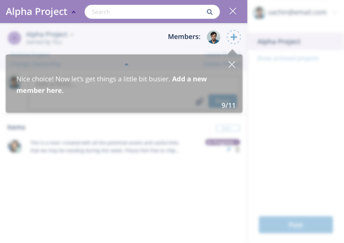
Why is this tooltip bad? Because it's clear from the design that the + icon is there to add new people.
The tooltip here is being used as a shortcut to prompt users to do what the product manager wants (users to send invites). Unfortunately, it's not as easy as that—you cannot simply just add tooltips to create engaged users.
This tooltip doesn't provide any new value; the interface element is already easy to understand, making the tooltip redundant and annoying.
Users take action because they are motivated, have the ability, and are prompted by a trigger, which means tooltips will only succeed when the user understands the value proposition and the interface is intuitive.
💡 The psychology behind this is from the BJ Fogg’s Behavior Model which analyzes three core elements of user behavior – motivation, sufficient ability, and relevant prompts.
When thinking about optimal user experience, good tooltip design can have a big influence on users understanding your functionality and eventually succeeding. Conversely, bad tooltip design presents tooltips as irritants and they lose all credibility.
🎥 Video summary: the What, Why and How of Tooltips
Prefer to watch a video? Here's a quick take on what makes tooltips terrible and how you can avoid these mistakes to make yours truly great!
Don't blame tooltips!
The problem isn’t the tooltip — it’s what the tooltip contains and, more importantly, when and to whom it is shown. Below is a stellar example:
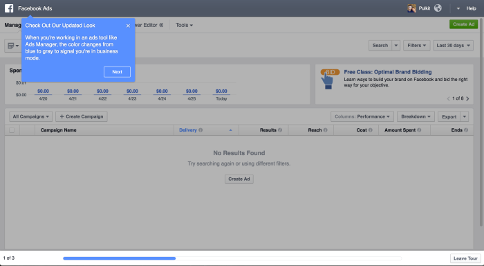
An example of a great tooltip from the Facebook Ads team
This tooltip greeted me when I logged into the Facebook Ads platform after a long time, and it was:
(a) Interesting
(b) Relevant
(c) Valuable
(d) Helpful
I learned something useful that I wouldn’t have gleaned by myself. And now that I’ve been shown this once, I’ll remember it—I don’t need to be told again!
Here is what the rest of this onboarding flow looked like.
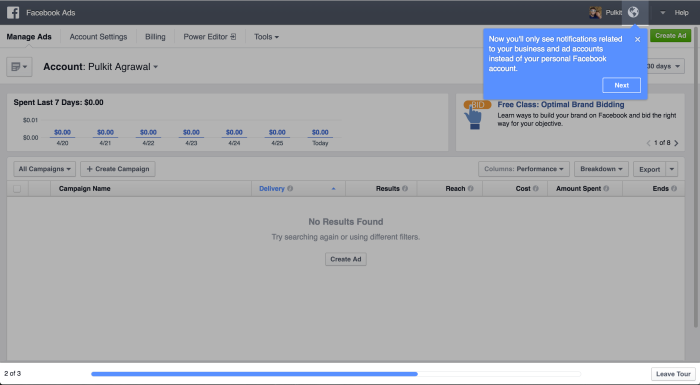
The second part of Facebook Ads' user onboarding tour
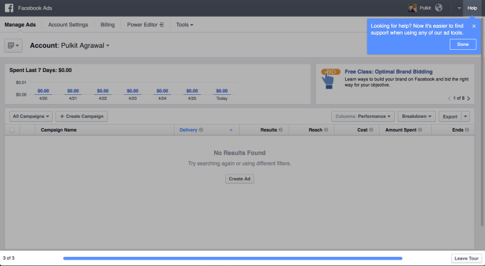
The third part of Facebook Ads' user onboarding tour
This was great user onboarding from Facebook—short and punchy, overarching yet focussed. It did not insult my intelligence and quickly got out of the way to allow me to explore at my own pace.
Facebook, Google, Pinterest, and many other companies have great copy in their tips, which makes them effective. One big part of this is that large engineering teams can run experiments and empirically find what works best.
Unfortunately, even though A/B testing, feature-gating, and user research are hallmarks of good product development, most teams do not apply them for their user onboarding. First versions of any design are often wide off the mark and so without iteration, users are left with a sub-par UX. This is what makes tooltips terrible.
How to create an effective tooltip? Make it relevant
Tooltips should be shown only when relevant—when your users need the help and when they can use the help. Otherwise, they're not ready for them and they will try to dismiss them as hindrances to what they actually want to be doing.
Here's another example I recently came across, this time it's from Typeform.
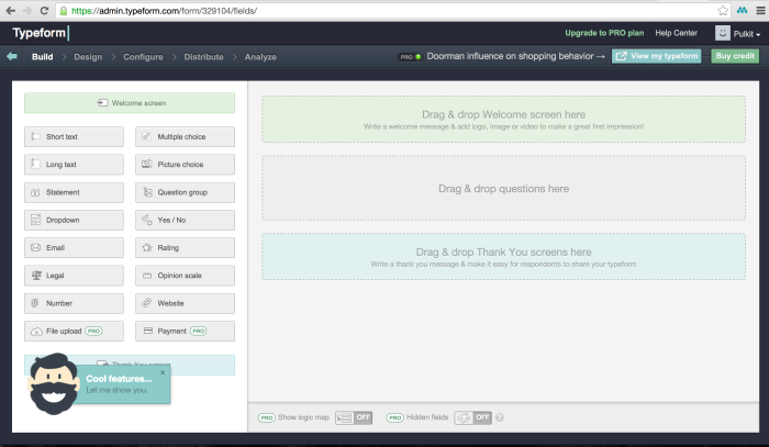
In the bottom-left corner, I was prompted to see new “Cool features…”.
I love Typeform but the prompt above could have appeared at a more appropriate time. in the view above, I’m within the form builder and my goal is to produce a survey.
Anything that prevents me from achieving my goal is an obstruction, so instead of being receptive to checking out their new features, I develop an aversion to them. Unfortunately, it’s not easy to trigger prompts when the user is most ready for them. This is what makes tooltips terrible.
But tooltips can be used very effectively, as a means to provide interactive messages within dynamic interfaces. Some of the most common use cases for tooltips include user onboarding, feature discovery, and taxonomy explanation.
One-time user experiences are hard to design, build, and test, but tooltips allow you to present contextual and relevant information to users that they only need to see once, so make them count.
There are examples of where teams have done this natively—Slack’s quick switcher icon disappears after a few clicks (when you’ve understood what it does)—but not many. Tooltips or other in-product notifications are an excellent method for guiding users—if done well.
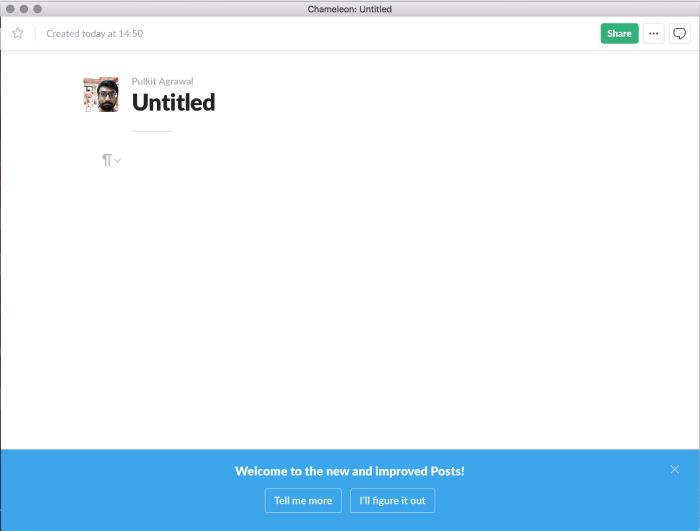
An example from Slack: A notification bar that asks a user if they want to learn more, clearly endorsing the option for self-discovery.
Don’t make tooltips terrible with these 5 simple rules
To create effective tooltips that offer real value and relevant guidance to your users, follow these five simple rules:
Consider each tooltip as friction. You are asking your users to read something, so make sure they get immediate value from that info. Be mindful of copy, too. Make it clear, concise, and relevant for each of the steps in a user journey.
Explain only things that are not discernible from the interface design. Remember, using a tooltip to emphasize what’s already obvious will only make them annoying.
Make tooltips as contextual as possible. Trigger them based on user actions and show them to the most receptive group of users. Also, make sure they are accessible to users who navigate your website using a keyboard and a screen reader.
Show one tooltip at a time. Also, don’t show more than 3–4 in a row. Users get fatigued quickly and need time to digest and act on what you have taught.
Test your tooltips, analyze their performance, and improve. You can use A/B testing, rate limiting, user segmentation, and other tactics to get the data you need and iterate until your tooltips are fully optimized for your users.
Using a tool like Chameleon you can create custom tooltips pretty easily, without coding. But you can also build your own in-house infrastructure. If you’re not sure whether to build in-house or purchase a SaaS solution for your in-app messages, read our Build vs. Buy guide. You’ll find templates and frameworks inside that will help you make an informed decision.
👉 Check out this interactive demo and see how easy it is to deliver in-app value with Chameleon Tooltips.
If you want to try Chameleon out and save time, get started for free and enter the Chameleon Playground where you can play with different tooltip UI designs and see how they will look in your product 👇

Don't waste time building Tooltips from scratch
Chameleon lets you design and change tooltips on the fly, without code.
Great tooltip design examples for your inspiration
Before we go into examples, keep in mind these key tooltip design best practices:
Tooltip UI design best practices: Make sure there’s enough color contrast to make your tooltips distinctive, align them with your brand style, and choose the right type of on-page triggers to prompt them (icons, pointers, hotspots, etc.)
Tooltip UX design best practices: Make your tooltips timely, relevant, and contextual, keep the copy clear and concise, and offer the right kind of help when and where your users need it.
Now, to make this article's points visually, let's take a look at three examples of great tooltip design that come from our library of product marketing examples.
Example #1: LinkedIn's design change tooltip
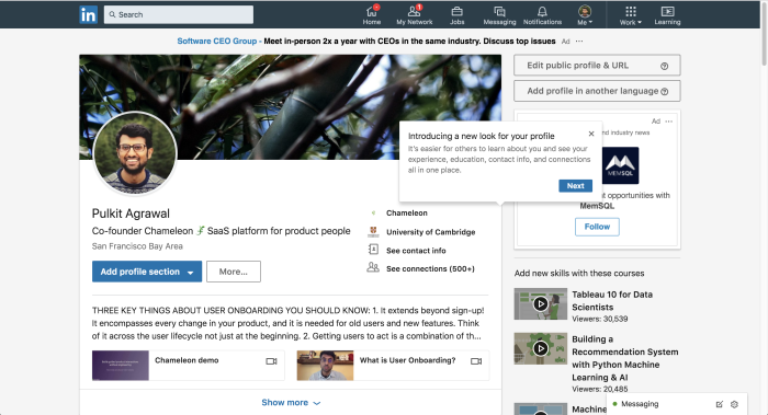
Interface aesthetics can drastically impact a user's perception of the product and how they feel about using it. So, when a product changes the way it looks, it's good practice to alleviate some of the initial user astonishment by explaining the benefits of the redesign clearly.
Here, LinkedIn does this with a tooltip tour that starts by enticingly communicating what the design change will do for the user.
Example #2: Google Drive's feature discovery tooltip
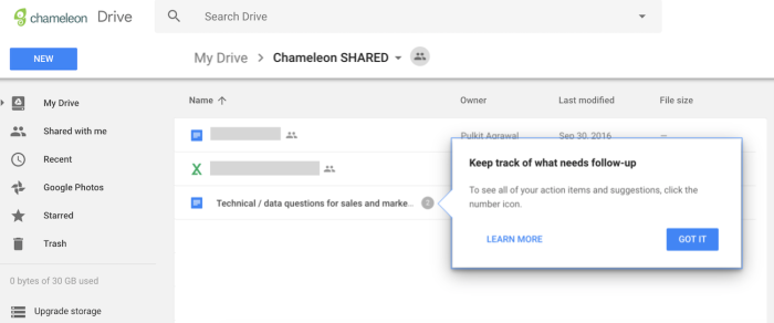
Sometimes one feature can be the gateway to discovering even more valuable functionality that goes deeper than the user's current habits and workflows.
For example, the fact that you can collaborate in Google Drive documents with action items and suggestions becomes obvious when another user assigns you an action item. To help users discover that this collection of features is easily accessible at the document menu level, Google Drive uses this subtle, contextual tooltip.
Example #3: Segment's product terminology tooltip
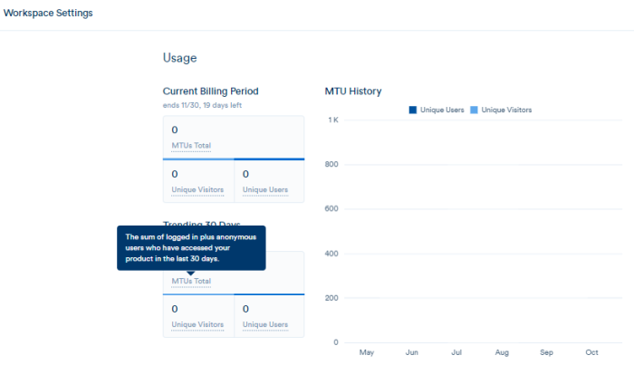
Learning a new product can mean getting involved with a whole new field of study. For example, using an SEO tool might teach you what backlinks are, or an analytics platform might educate you on bounce rates.
To be mindful of your users' different levels of expertise, make help on complex, technical, or unique concepts easily available with a tooltip, just like Segment did in this example.
Final thoughts
If more product teams apply these tooltip best practices, UI/UX design principles, and simple rules, we can have products that are easier to understand (more effective) and less annoying (more engaging) at the same time 😋
So, don’t make your tooltips terrible. Pave the way to product success with interesting, relevant, valuable, and helpful tooltips.
To start creating custom, on-brand tooltips for your product – without code – get the Chameleon demo to learn how it can help you provide contextual in-app messages to your users.
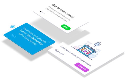
Create in-app experiences that retain and convert users
Chameleon makes it easy for product marketers to create tooltips, modals, and product tours without code


