🤔 Challenge: How can a B2B product analytics solution improve their user experience for new users and existing customers while avoiding friction and customer frustration?
💡 Solution: Contextual and timely Tours, Tooltips, and Embeddables, that reiterate value for users and don’t disrupt their flows
🏆 Outcome: Improved conversion rate by 25% and doubled cross-sells, streamlined product adoption initiatives internally, enhanced monetization opportunities
PetScreening is a pioneering platform revolutionizing the pet-friendly housing market. They help streamline the process for property managers and landlords to efficiently screen tenants with pets, ensuring a seamless experience for everyone. They support two distinctly different audiences: Pet Owners (people looking to rent), and Property Managers (partners for PetScreening) who can effectively manage pet policies, facilitate processes, and maintain compliance with relevant regulations.
Why did PetScreening turn to Chameleon?
PetScreening wanted to go live with modals and tooltips—without asking for engineering help. In the past, they’d had bad experiences with other product adoption platforms. They found that they didn’t get enough technical support, nor could they accurately target their users. A delightful user experience was paramount for the PetScreening team.
They tried building in-house but with little success in engaging users. They needed to move faster, without shoulder-tapping their dev team. So PetScreening decided to go for a dedicated adoption solution. They found Chameleon extremely easy to use, but complex enough to allow more sophisticated targeting and control over how in-apps appear to their users.

Chameleon is very flexible, dynamic to our application, and it looks native.
💡 Chameleon Tip: If in-app experiences look disconnected from your UI, or pop up at the wrong time, it will damage the reputation and credibility of a product in its users’ eyes. Native styling and contextual display are key components for a delightful user experience.
Moving to Chameleon to find flexibility and deeper control
PetScreening turned to Chameleon to move fast and maximize business value. They wanted to create native modals and engage specific users at key moments during sign-up. PetScreening bypassed internal processes and quickly onboarded team members to drive success.
Their first goal – to enhance user adoption and drive conversion for their legacy application, and get product updates in the hands of the marketing and product teammates so devs could work on improving the application and they could focus on growing their business.
Chameleon offered them the flexibility to experiment with more subtle announcements that were quick to highlight the value for users. The PetScreening team leveraged existing data from Snowflake, their data warehouse that enables the team to store, analyze, and share data across multiple apps.

Each person who used Chameleon drove some wins within the first couple of weeks of using it.
The team targeted their Pet Owners audience, users who are relocating and have to ensure compliance with new Property Managers. They see success soon after launching their first in-apps and find new opportunities that drive even more business value.

It's very easy to learn, so anyone can pick it up. Just about anyone without any marketing or technical prowess can come in and use the tool, which has been very valuable for us.
They leveraged on-page elements and Chameleon’s URL rules to control where each in-app appeared and avoid any confusion or disruption to users’ flows. This ensured users were seeing helpful messages, instead of modals that were disconnected from their journey.
Gentle reminders have a big impact: Here’s how PetScreening won with “just-at-the-right-time” nudges
Let's dive into how PetScreening championed a delightful user experience with gentle nudges, into driving revenue and finding unexpected opportunities. They amped up their team and business value by showing subtle prompts to specific users just in time.
Step 1: Syncing warehouse data to Chameleon for precise targeting
The PetScreening data activation team knew they were standing on a “data goldmine” in their Snowflake warehouse that they could utilize better to grow their business. With them already analyzing their data in Snowflake and Amplitude, they could easily identify who to start engaging, Pet Owners who could benefit more from filling in their profile information and pet application at the right time.
The PetScreening team leveraged Webhooks to send user data to Chameleon from Snowflake. With new user properties in Chameleon, they could target Pet Owners looking to rent, in specific areas, who didn’t opt in for any services, and so on.
👇 Explore an interactive demo and see how to send data from Snowflake and use it to segment your audience in Chameleon.
Chameleon integrates seamlessly with various data (CDPs, ETL, reverse ETL) and analytics tools, but also offers a RESTful API and a group of Webhooks for easy data syncs. You can export data from the Dashboard at any time too.
Step 2: Building Embeddable Banners for omnipresent nudges
The PetScreening team tried in the past the more intrusive approach of engaging users and saw little change in profile conversion rates. However, they quickly realized the potential of Chameleon in driving smaller conversion metrics with non-intrusive reminders that require minimum effort from users. So, they tried to drive smaller user actions that would lead to more cross-sells and stronger long-term adoption.
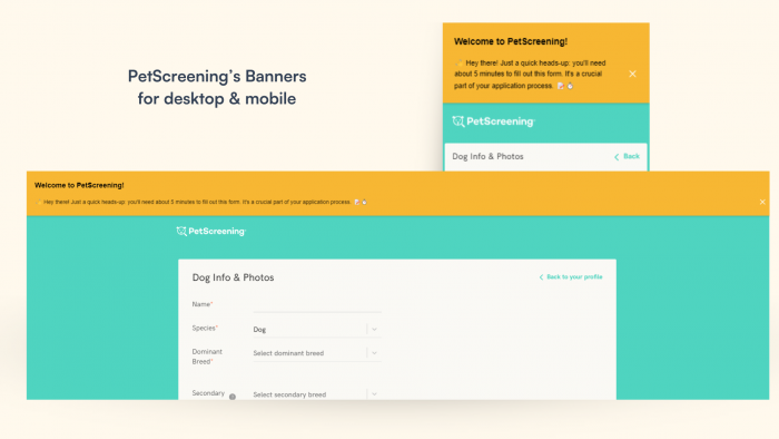
First, PetScreening welcomes pet owners with a friendly in-line Banner and promotes the multiple points of value in their service. In the past, users would be easily confused about how to access the full breadth of benefits that the PetScreening services provide - this helps solve that.
Now, their embedded homepage Banner constantly reminds users of the availability and value without crowding their screens. PetScreening doesn’t want to interrupt users but rather make them aware of the beneficial services available - which they know make a lot of sense for people applying for leases.

They saw their first success then: a 25% increase in users accessing incremental value in their initial visit, with their first Chameleon test. The flexibility to control in-apps’ placement and targeting inspired the PetScreening team to take it further.
Step 3: Layering Tours and Tooltips into the in-app strategy
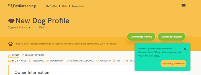
PetScreening leveraged non-intrusive reminders to draw attention to various steps of the sign-up process, as well as highlight other compatible services for users. They created a series of Tours and Tooltips (simple modals, anchored to key moments). They didn’t interrupt or ask users for anything to “Complete” the Tour, but they made sure to reiterate the value for users.

They used Chameleon’s Display Rules to ensure a subtle placement - using on-page elements to control where to appear on the page, and URL rules to specify which page it should display on. This, combined with a segmented audience brought more success and new monetization opportunities. Their nudges doubled the number of users taking advantage of available pet insurance and wellness offerings that were otherwise missed, making cross-pollination of value increasingly effective in their adoption strategy

👇 Explore an interactive demo of configuring Element and URL Rules in Chameleon to control where in-apps display.
💡 Chameleon Tip: With contextual modals, make sure to highlight a clear, concise benefit, and not block users from taking a different action.

These wins paid for Chameleon right there, within our first couple of weeks of using it.
The PetScreening data activation team was hungry for more - their soft reminders were effective, with a constant positive engagement rate. With these results, they were confident to explore other use cases for Chameleon.

We've been surprised that there's a relatively strong success with each test we launch and we haven't really needed to do too many optimizations for what's out there.
Step 4 - Creating segmented “in-app ads”
While looking at their data, they uncovered a new opportunity to personalize the Pet Owners' experience. Creating, in turn, more consumer satisfaction and value for PetScreening and their partners. They created different audiences and paired those with relevant content for users enabling them direct access to even more benefits.

We can give hyper-segmented offers to our consumers. Rather than sending users follow-up emails, which we know they will ignore, we can capture them when they're still in our applications, still active, and simply drive them to our partner sites.
The PetScreening team ensures these are useful and appealing to users by targeting specific users based on location thanks to their Snowflake data stream, and always showing local offers based on partners' availability in the area. The button "Actions” in Chameleon, enables them to pick where the user should land after leaving PetScreening.
With these dynamic “in-app ads” PetScreening could introduce and educate users on the variety of components of their service and the right partner (s) to work with, in their new home. This personalized, smart approach helps build trust and ensures a more delightful user experience.

Being able to deliver value to our users while they're on our application and condense the amount of time it takes to deliver more value to them, has been a huge perk of this.
What’s next for PetScreening?
After streamlining growth initiatives, and allowing developers to focus on core tasks, the PetScreening team is going after more wins.

We’re very value-driven with a lot of the things we’re doing and that’s a theme with us. We want to be able to quickly prove the ROI and add more value for our consumers and providers.
Now that they managed to prove value and take on more adoption needs, they decided to improve the user experience even more.

We see a good win and then we go after another big fish and with relatively limited resources on our end, it’s been a blessing that the first versions worked so well and we could keep going after new projects.
How to ensure they always show relevant content to users? By asking them what they prefer and following up with a personalized experience. They will soon launch Microsurveys to assess users’ interest in different content. They apply the same non-intrusive strategy here: showing the Microsurvey as users fill in the application, asking if they are interested.
This enables them to follow up with other offers that fit users’ preferences more. They use the Chameleon segmentation filter to engage users who opted in for specific items, via their Microsurvey.
👇 Explore an interactive demo and learn how to target users based on Microsurvey data in Chameleon.
Unlock seamless in-app engagement with Chameleon's patterns
Book a personalized call with our product experts and learn how you can improve the user experience and boost your product adoption
