🤔 Challenge: How can a UX team help users understand product changes without engineering help?
💡 Solution: By creating in-app Tours and Tooltips that explain the change and highlight the value for users.
🏆 Results: A reduction in the number of support tickets and successfully validated UI redesign.
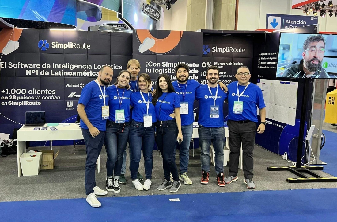
SimpliRoute is a leading logistics software provider across Latin America that focuses on making delivery and transportation operations more efficient. They offer a suite of modules such as tracking, routing, live tracking, and comprehensive dashboards that help businesses plan the best routes for their vehicles. This ensures deliveries are made on time while reducing travel distance and fuel costs.
The need for a product adoption platform
SimpliRoute is a complex platform, and its modules are constantly evolving to provide more value for users. With enhancements often added to the SimpliRoute dashboard, the team could not allocate engineering resources to announce updates in-app and help their user base efficiently navigate the changes. As a result, SimpliRoute received many support tickets from users trying to understand the reasons behind the change or share dissatisfaction with the update.

Our software is complex. And we were launching new features, but we weren’t explaining them to our users. Explaining them requires a lot of time from our developers and we don’t have that.
The team needed a dedicated product adoption solution to communicate with users in-app and reduce confusion and frustration, without involving their engineering team in creating and maintaining in-app patterns.
Without a dedicated product adoption platform, SimpliRoute:
Was struggling to announce product changes to users, causing dissatisfaction and loading their support inbox.
Could not communicate the value of updates to users and help them understand how their flows will be improved.
Had no way of understanding if users really liked or disliked their updates.
SimpliRoute found in Chameleon complete support for their single-page application (SPA), smooth integration with their stack, and most importantly, the speed to build native-looking in-app patterns without requiring any developer involvement.
Here’s how SimpliRoute used in-app announcements to reduce support tickets and validate a significant UI redesign.
Tours and Tooltips were essential to help users find value in product updates
After implementing Chameleon, the SimpliRoute team created Tours and Tooltips to communicate updates and announce new features to their users. The first step was to effectively explain product changes so users could confidently continue using the platform.
The UX team used Tours to create a combination of Hotspots and Lightboxes that drew attention to recent updates and Tooltips to provide contextual tips. The team used these patterns to explain how a feature has changed, where options have moved in their menu, or how to leverage new functionality. With a simple design and concise copy, these in-apps were all positioned on specific feature pages, anchored to on-page elements that helped users learn more about the changes as they were using the SimpliRoute platform.
👇 Explore an interactive demo of creating a Hotspot with Chameleon.
For UI changes, the team used Lightboxes to draw attention to the updates. Although intrusive, users could easily acknowledge the change by clicking a CTA or engage directly with the specific element in the SimpliRoute dashboard to “complete” the in-app Tour. The team could easily achieve this by using a “Click to Complete” option, that counts when users engage with elements in their UI.
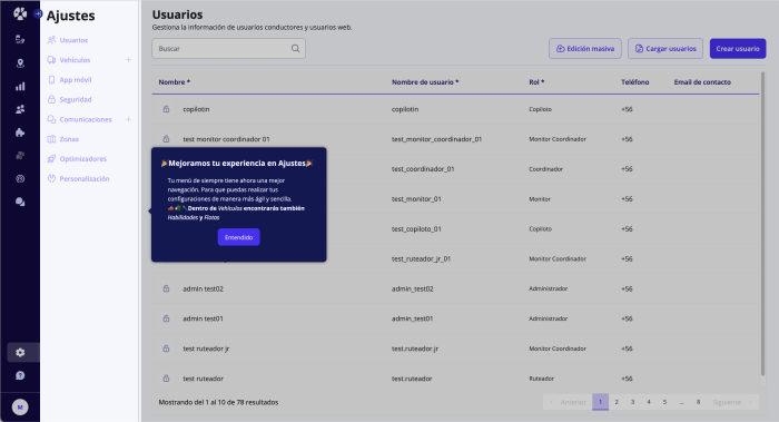
👇 Explore an interactive demo of creating a Lightbox with Chameleon.
The UX team at SimpliRoute launched Modals to introduce feature enhancements to users and help drive adoption. The team used “URL Rules” to show them on the specific product page and “Element Rules” to ensure they popped up in places where these features were present. The team also added catchy media that showed the feature in action or a before-and-after visualization to help users understand at a glance how their flows improved.
SimpliRoute used Tooltips to provide quick explanations or tips for users exploring their different modules. The team used a combination of “Icon” and “Element hover” Triggers to display their Tooltips as users explored the SimpliRoute platform, providing education and helping users succeed.
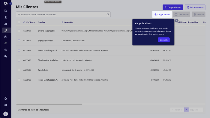
👇 Explore an interactive demo of creating Tooltips with Chameleon.
All these efforts proved effective in helping users navigate product changes and continue to find value in the SimpliRoute app. Some of their best-performing Tours have a 95% completion rate and the team saw a significant reduction in support tickets. Explaining and highlighting changes made users less likely to contact the support team with questions about new features or altered functionalities. They could now keep up with the changes in the SimpliRoute app and understand how to adjust their flows with the latest updates. As a result, SimpliRoute's support team could focus on more complex issues, improving overall efficiency.

We weren’t seeing users asking about the small stuff anymore, like ‘where is this setting’ or ‘why has this changed’. Small stuff that they would write about before wasn’t showing up in support conversations after implementing Chameleon.
SimpliRoute used the Heap integration to sync audiences that they could target with Chameleon in-apps, such as “active users,” “admins” of the platform, or “trialing users.”
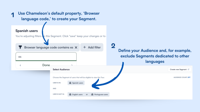
The platform has an international user base, so it has different language versions for its Tours and Tooltips. So, Spanish, English, and Portuguese speakers can quickly benefit from the in-app announcement in a more personalized way. The team uses the browser language property in Chameleon to create Segments for different languages and simply targets the right Segment with the right language version.
💡 Chameleon Tip: Translating the in-app message in multiple languages helps break down language and cultural barriers, making the announcement and platform more accessible, relevant, and appealing to users, improving engagement and product adoption. You can use Localization or create specific Segments for each language.
Their Tooltips had another surprising outcome that shifted the mindset of the UX team at SimpliRoute. Seeing how users better understood the functionality from the clear and concise Tooltip explanations and were no longer reaching out to their support team, made the team realize that they needed to simplify their product language as well.
Although speaking to users with diverse backgrounds, the team is focused on finding the right verbiage to name, describe, and explain their upcoming features and enhancements so all users can instantly understand where the value lies.

Because we reduced the number of people asking the simple stuff, inside our team, we now understand that it’s necessary to ensure stuff is self-explanatory and we need to use a very simple language. Now we see that users stopped asking ‘how to’ questions, but they also stopped questioning why we make certain changes.
Validating product enhancements with Microsurveys
Now that the team could provide in-app education about product changes, they were also eager to gauge user feedback. As the team started optimizing the menu space for more features and robust modules, they received negative feedback about the new layout in the platform’s sidebar. So, SimpliRoute created a Rating Microsurvey to assess user feedback.
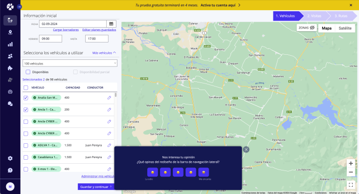
The results showed that only 9% of the users were dissatisfied with the update, while most appreciated the reorganization. Chameleon’s AI summaries option for Microsurveys helped the UX team quickly assess users’ satisfaction and report back to the Customer Success team to help alleviate customer confusion.

With Microsurveys, we could validate that it was just a small group that was unsatisfied and that the negative feedback was not really the general opinion of our users. That was very useful for us.
This insight allowed SimpliRoute to validate decisions without overreacting to a vocal minority, ensuring their updates were well-received. The team also used Chameleon’s button “Actions” to tag each group of respondents so they could easily follow up with in-app announcements and help guide them through updates.
👇 Explore an interactive demo of creating a multi-button Microsurvey with Chameleon.
Reflecting on SimpliRoute’s wins
Chameleon was crucial in helping SimpliRoute improve in-app education for their complex logistics software by simplifying feature announcements and reducing support loads. Through the strategic use of Tours, Tooltips, and Microsurveys, SimpliRoute successfully communicated updates and validated changes, ultimately enhancing their users' experience and satisfaction.

Having Chameleon was really helpful, not only because it allowed us to launch in-apps without our developers every time we needed to explain something, but also because we were reducing the number of tickets that our support team got.
Looking to reduce support tickets and effectively announce updates?
Book a call with our product experts and explore how Chameleon can help increase feature adoption and reduce confusion
