CloudPhone is a widely-used product for SMBs
Founded in 2006 as Telcentris, Inc., Voxox is a leader in cloud communication services, helping people control how they connect their numerous communication networks and devices.
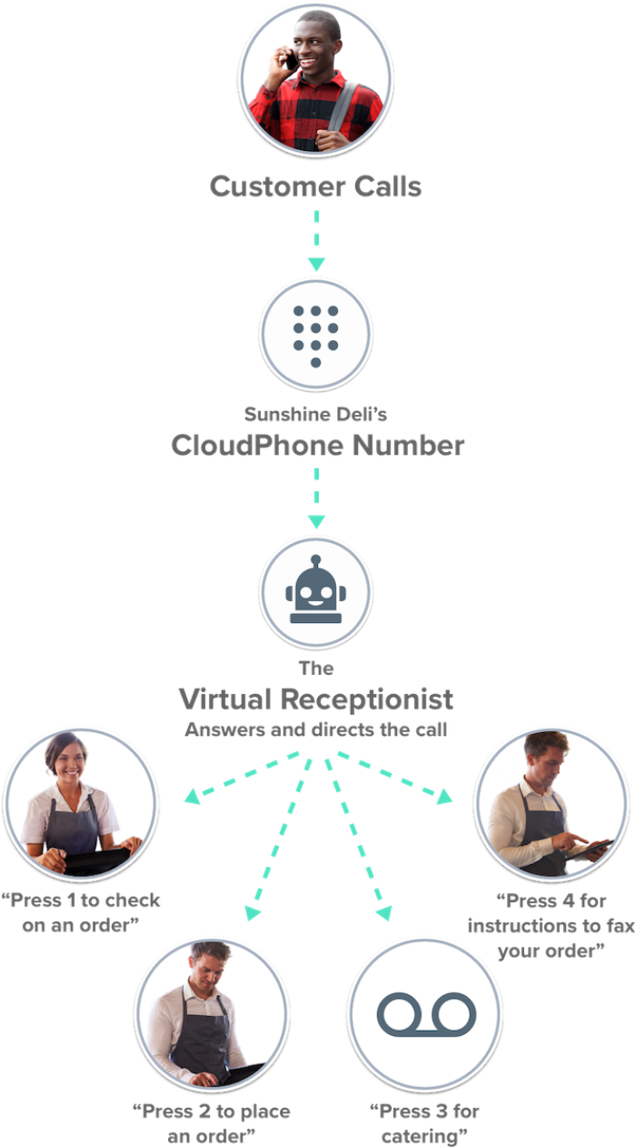
Voxox built CloudPhone for small businesses, making it easier, less costly and more efficient to communicate than ever before. Today, hundreds of small businesses use CloudPhone in calling businesses.

A common challenge: user activation
Prior to using Chameleon, Voxox’s biggest challenge was user activation. The marketing team would spend time, energy and money acquiring sign-ups, but only a small proportion of these became active users.
This is a common problem across many SaaS solutions that don’t invest in user onboarding.
Voxox realized user activation was an important lever in driving revenue, and so became one of the most important metrics for the business.
The product team had already made Voxox’s setup experience as simple as possible -- a 30 second flow that automatically configured phone numbers with the business’ voicemail. However this didn’t lead to the activation target; new customers weren’t able to appreciate the value the product could provide them. It was time to dig deeper and understand why.
Slowing down the new user experience
Looking to address this challenge, Ed Mallory, Voxox’s VP of Product and Growth and Tyler Howorth, Voxox’s Product Designer, teamed up to improve their customers’ onboarding journey.
Finding the right solution
The choices to address better user activation were to either use an out-of-the-box solution, or build in-house.
Unready to take up their precious engineering cycles away from their software, and recognizing Tyler’s need for flexibility to adjust and re-design the experience as necessary, it became clear to them they needed to find a SaaS vendor for product walkthroughs.

It was clear we needed Chameleon -- It would have taken two engineering sprints across three engineers to build out a less flexible solution.
Ed & Tyler first evaluated Appcues, but unfortunately after about a month investing in that platform, tours were not displaying correctly for users.
They went on the hunt for a different solution, and after trying everything from simple Javascript libraries to clunky enterprise software, Tyler landed on Chameleon.

As a designer, I really loved the Chameleon interface, and appreciated the attention that I got. With others I felt brushed aside, but Chameleon really wanted us to be successful.
Dissecting the User Journey
With a product in hand, Ed & Tyler’s turned to improving their key metric: activation. They became active in learning about the CloudPhone user experience, conducting A/B tests, and measuring status quo.
They first surveyed their paying customers, asking them “If CloudPhone went away, which of these would you miss? Why?”
They quickly found that customers were most satisfied with a specific feature that saved them a lot of time. The lack of activation, it turned out, was less to do with their overall product functionality and more to do with the discoverability of this key feature.
Improving Onboarding through Friction
They watched customers through the 30 second onboarding flow and found that, because everything was configured for them, customers never interacted with the most important feature CloudPhone had to offer.
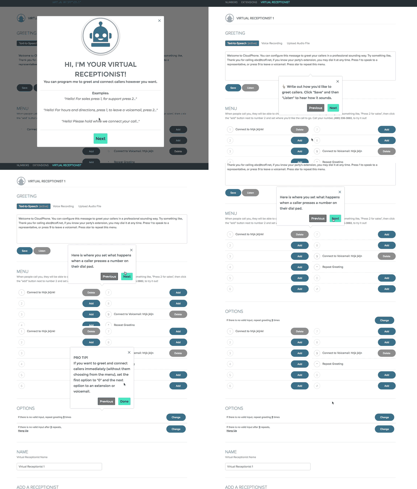
Therefore Ed used Chameleon to build a few product walkthroughs for new users, highlighting this key feature. This slowed a user’s progress in completing setup but ensured they were aware of this important functionality.

Between this and adjusting the onboarding flow using Chameleon, Ed & Tyler discovered that adding friction to the onboarding flow counter-intuitively resulted in significantly increased retention.
Increasing activation and halving churn
Concentrating on the initial CloudPhone user experience and iterating quickly led to more than a 50% reduction in churn and a 20% increase in user activation! This was tremendous return on solving the activation problem.
Ed says, "I’d definitely recommend partnering with a vendor rather than building out onboarding in-house, unless circumstances prevent it. At any company, making changes takes time. Our experience is that integrating Chameleon saves us a great deal of time back to optimize other things.”
Not only that, but Ed estimates that the cost of building just their current onboarding flow would have been ~$50k, which they now count as savings.
Going beyond user onboarding
Today, the CloudPhone team uses Chameleon for onboarding, new product introductions and one-off updates to clients. Ed & Tyler continue to measure results and have found that seeing the analytics behind their Chameleon tours helps customers get the most out of the CloudPhone product.
One key thing they’ve learned through the data is that they have two kinds of users:
- Users that want to go through a specific onboarding path and seek out training
- Users that simply prefer navigating around the software themselves, before seeking training.
Therefore Ed & Tyler cater to both types of users by offering folks an opt out early on in their Chameleon tours and resurfacing tours down the road. Learn more about Chameleon's step opt-out options here.

I would recommend Chameleon (the best user onboarding solution we found) to anyone that has web-based software and wants to help their users succeed.
Learn more about how to improve activation and reduce churn
It’s important to understand what customers value the most and use onboarding to direct them there. Learn how to discover your key aha moments here.
Sometimes adding friction to the onboarding flow increase user activation! Discover a better methodology for user onboarding here.
Improving the initial customer experience led to 50+% reduction in churn and a 20% increase in user activation. Talk to us today to explore how Chameleon can help you drive results.
