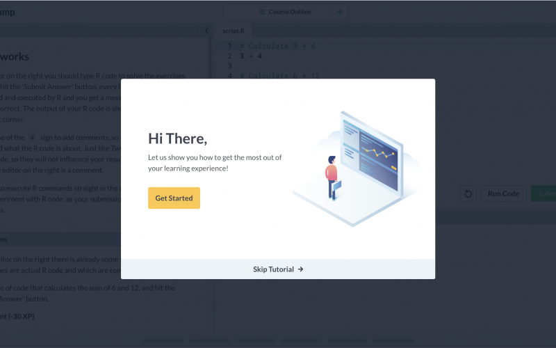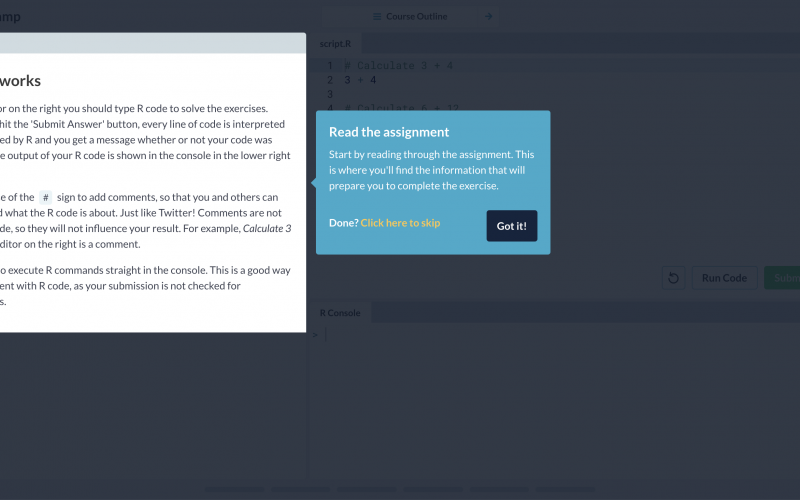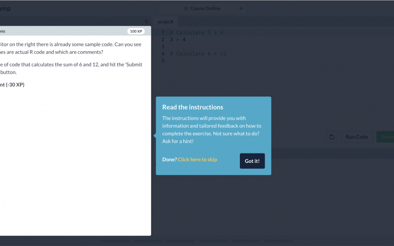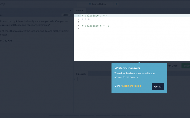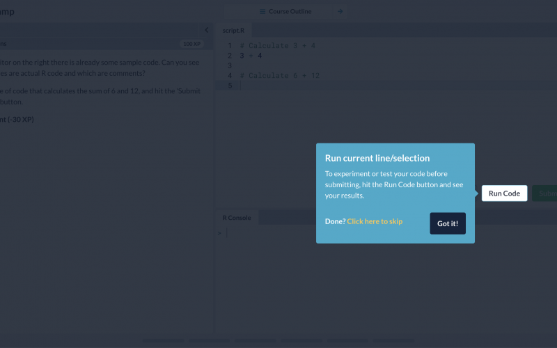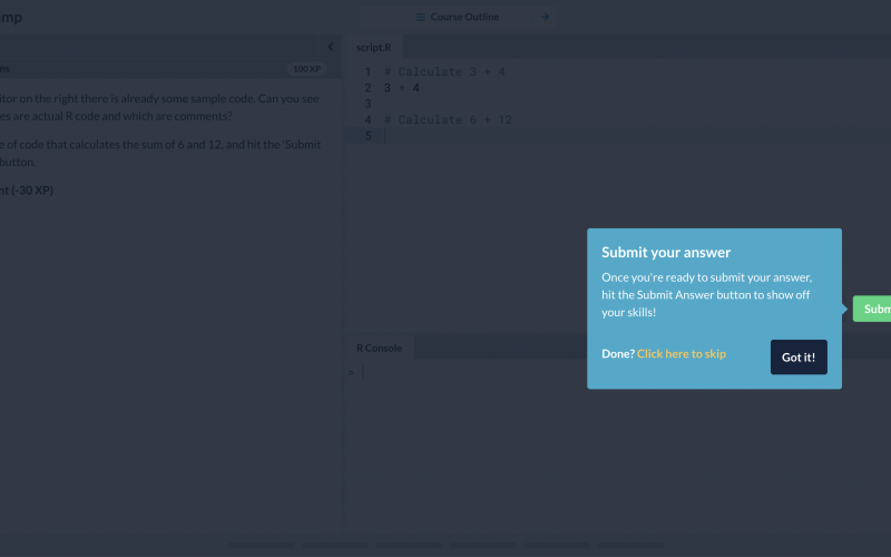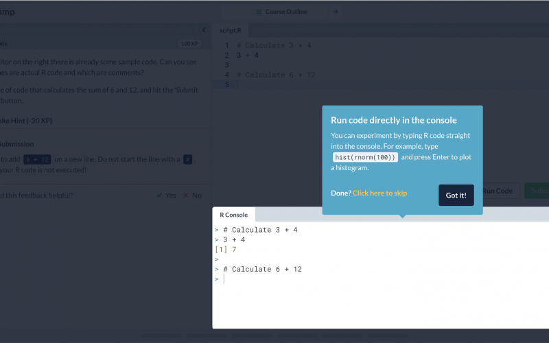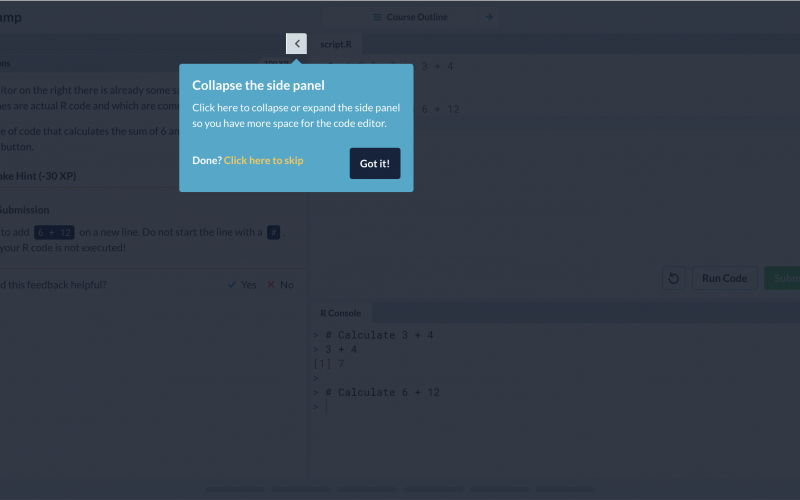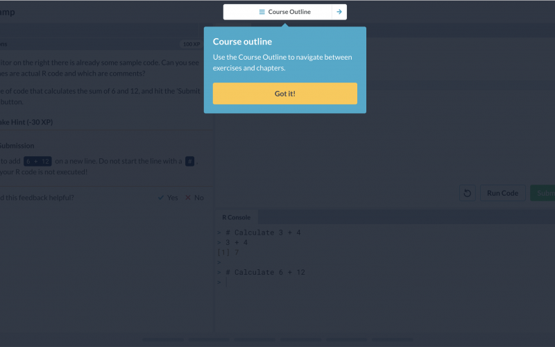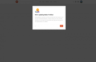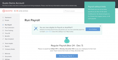
DataCamp User Onboarding Tour
A stepped-out Tour from DataCamp that introduces new users to the app’s interface. Uses a Lightbox and clear CTAs to direct users to valuable actions.


Why is it a good user experience?
👏 Introducing the app interface along with the learning flow and enabling new users to reach aha moments faster.
Usability
It’s clear to users what this is about and they can see how much they have to invest to complete the Tour; it's also easy to move through and review the information.
Intention
New users get a good overview of the app and how they can use it and jumpstart their own flow.
Autonomy
Allows users to skip or complete the Tour; although shrouded, they don't feel blocked.
Want to replicate this?
Here’s how to build in Chameleon
Use Tours: As long as it has a pointer it’s a contextual Tooltip; with Tours, you can create a stepped-out Walkthrough.
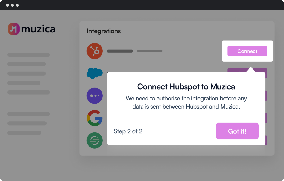
Lightbox & Pointer
Attract attention to key new features while providing more insight
Progress bar
Meet your users with clear expectations and show them how much they have to invest in your Tour
Dismiss
Allow users to exit or snooze your Tour; some of them will want to explore on their own and launch it later
More Tour, & User Onboarding examples


SimpliRoute's Menu Update Lightbox

Asana

Canva

ChatGPT

