PayPal NPS & CES Survey
Prompted when a user reads the PayPal help documentation


What this user experience is
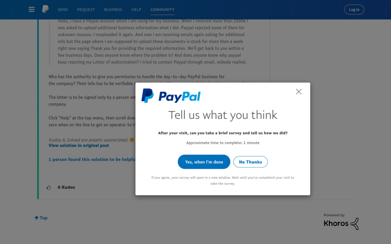
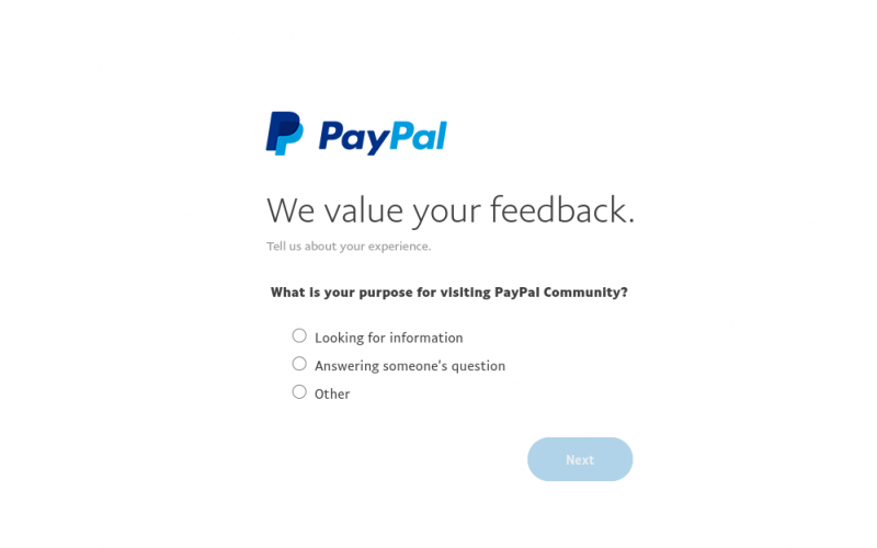
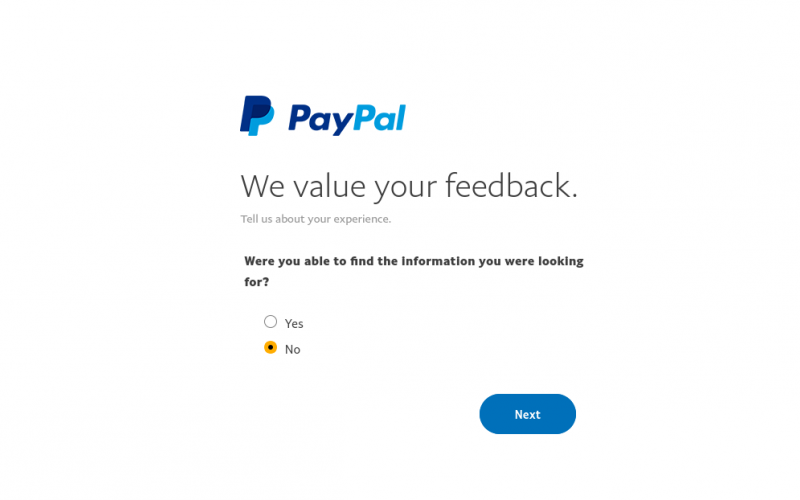
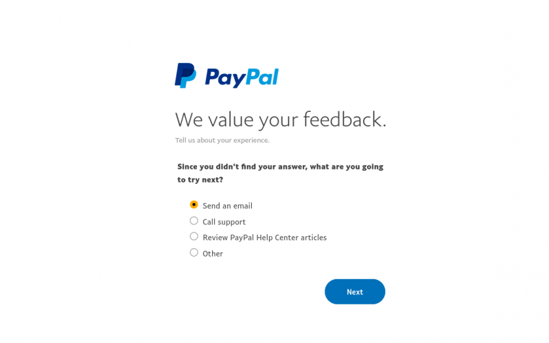
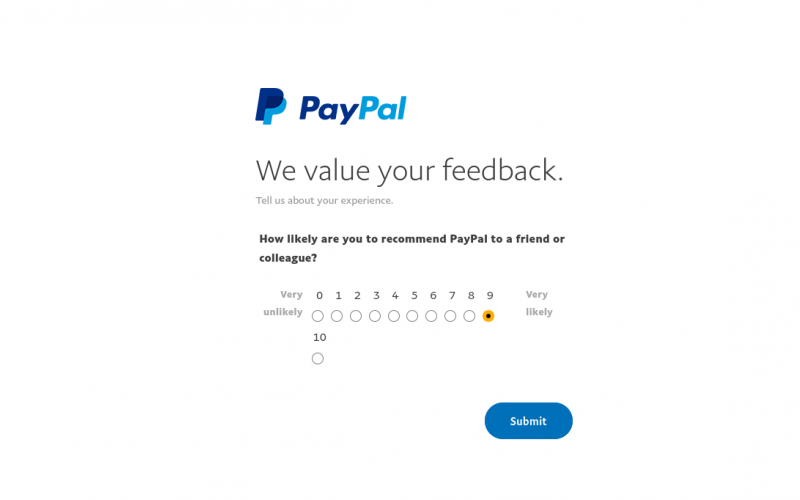
A modal that asks the user if they would take a survey when a user reads PayPal’s help documentation + a feedback survey.
Experience Type
Modal + Survey
What it's trying to achieve
It is trying to inform users of a recent update that moved Segment to a new location.
Why is it a good user experience?
Aesthetics
The modal is branded with the logo, and the colors as well as the fonts align with the rest of the website.
Autonomy
The survey is completely optional and it.
Usability
The copy is brief, but informative. It also tells the user how long the survey will take.
Simplicity
The copy keeps things concise and gets to the point quickly.
How to build this experience with Chameleon
Here's how you can replicate the modal part of the experience with the Chameleon Builder using the Tour feature.
- Create an Announcement Tour
- Add a Step and configure it in the Builder
- Set its position
- Decide how it will be triggered
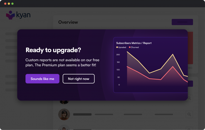
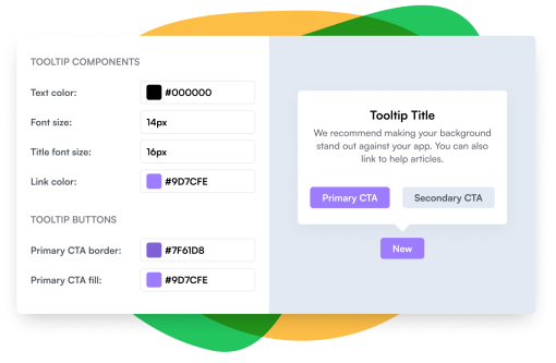
Create an on-brand modal like Paypal
Build a completely on-brand modal with Chameleon's intuitive customization


Figma's Microsurvey

Google Calendar's Microsurvey

Intercom

Intercom's NPS Survey

