Segment Notification Banner
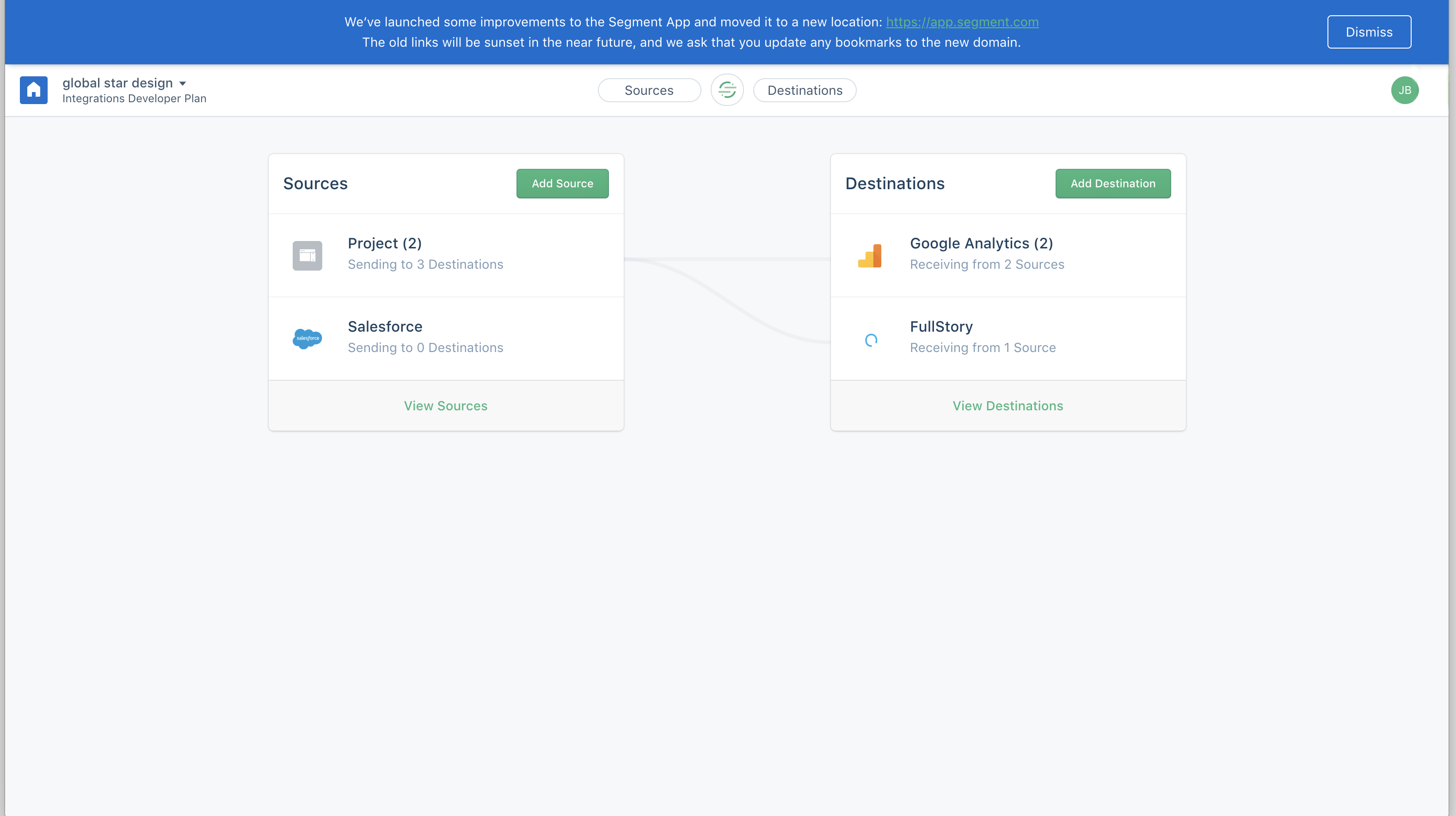
Top banner to notify users about important changes to their app
What this user experience is
A top banner that tells users about an improvement made to the app.
Experience Type
Top banner
What it's trying to achieve
It is trying to inform users of a recent update that moved Segment to a new location.
Why is it a good user experience?
Autonomy
There is a dismiss button that allows for an easy exit.
Usability
The banner is just enough to tell the user what they need to know and it is minimally intrusive to the user experience.
Simplicity
The copy keeps things concise and gets to the point quickly.
How to build this experience with Chameleon
Here's how you can replicate this with the Chameleon Builder using the Tour feature.
- Create a Banner Tour
- Configure the banner
- Set a position
- Configure the CTA
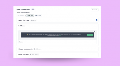
Build a top banner in minutes
Use Chameleon's builder to easily create a banner just like Segment's
More Banner examples


Wistia's Performance "Heads-Up" Banner
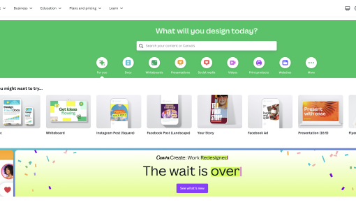
Canva's Product Launch In-Line Banner

1Password's Redesign "Sneak Peek" Banner

Squaredance's Feature Update Banner
