Spotify's New Playlist Modal
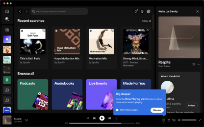
Spotify takes a less-is-more approach in this modal, introducing a new, customized playlist called Daylist. However, they don't give that information to the user. In fact, they deliberately avoid explaining anything about Daylist to create intrigue and boost the adoption of the playlist.
This works for Spotify: they can employ creative copywriting because their tool isn't mission-critical for most people's work. They also know that once the user gets to their Daylist, they'll be able to understand what it is without much explanation.
So, should you shroud your new features in mystery to get users to click on your modals? In most cases, probably not, but if you ship something small meant to delight users, this could be a creative way to lead them to it.

More Modal, Feature Adoption, & Launch examples


Canva

ChatGPT

Figma

Google Meet's Tooltip


