Zendesk User Onboarding Checklist
Tooltip to prompt the user to go through a checklist that drives activation through completing account setup

What this user experience is
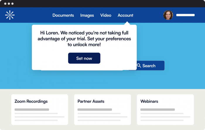
A tooltip that shows you where the user onboarding checklist is.
Experience Type
Tooltip
What it's trying to achieve
Zendesk is trying to capture the user’s attention to where the checklist is and get them to go through the checklist in order to complete their account setup, increasing user activation.
Why is it a good user experience?
Intention
For a new user it helps to go through an onboarding process. A modal that points out where the checklist is makes it easier for the user to take the first steps and find out more about the product.
Autonomy
The modal does not force the user into the onboarding checklist, but simply states that it is there. The user can start the onboarding checklist whenever they want.
Usability
The CTA acts as an exit button for this modal, and the copy is straightforward.
How to build this experience with Chameleon
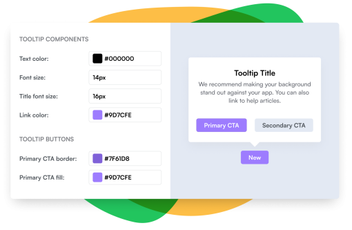
Here's how you can replicate this with the Chameleon Builder using the Tour feature.
- Create an Announcement Tour
- Add a Step and configure it in the Builder
- Set its position anchored to an element
- Add a pointer to indicate where it is being applied
- Add an on-page trigger


Make a Tooltip like Zendesk in minutes
Easily build Zendesk's user onboarding flow with Chameleon's no-code platform.
More Tooltip, & User Onboarding examples


Asana

Google Meet's Tooltip

HubSpot

Intercom


