


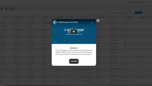
AvidXchange Video Modal
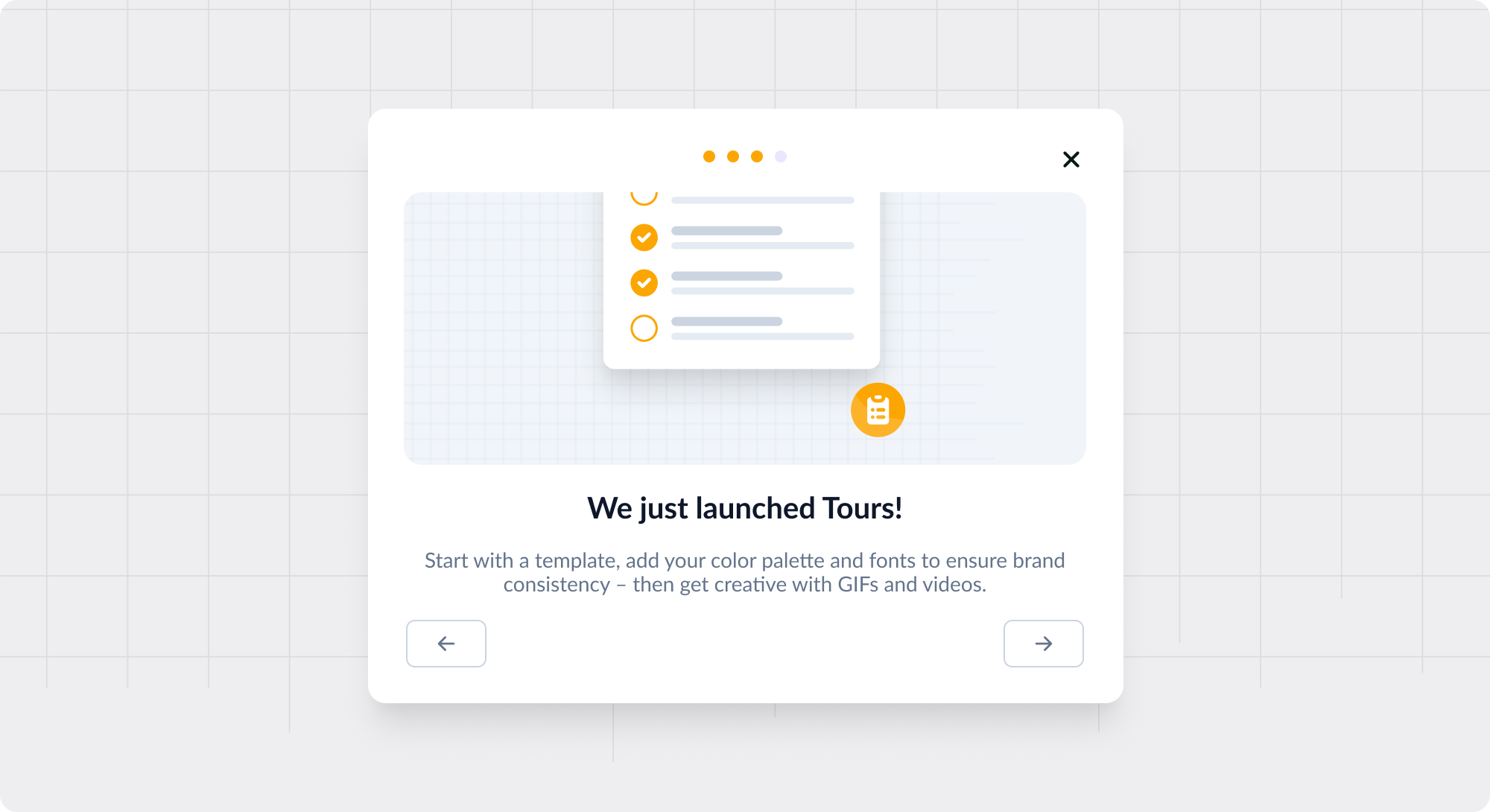
A simple tour modal with an informative video embedded within it.
Existing customer? Sign in
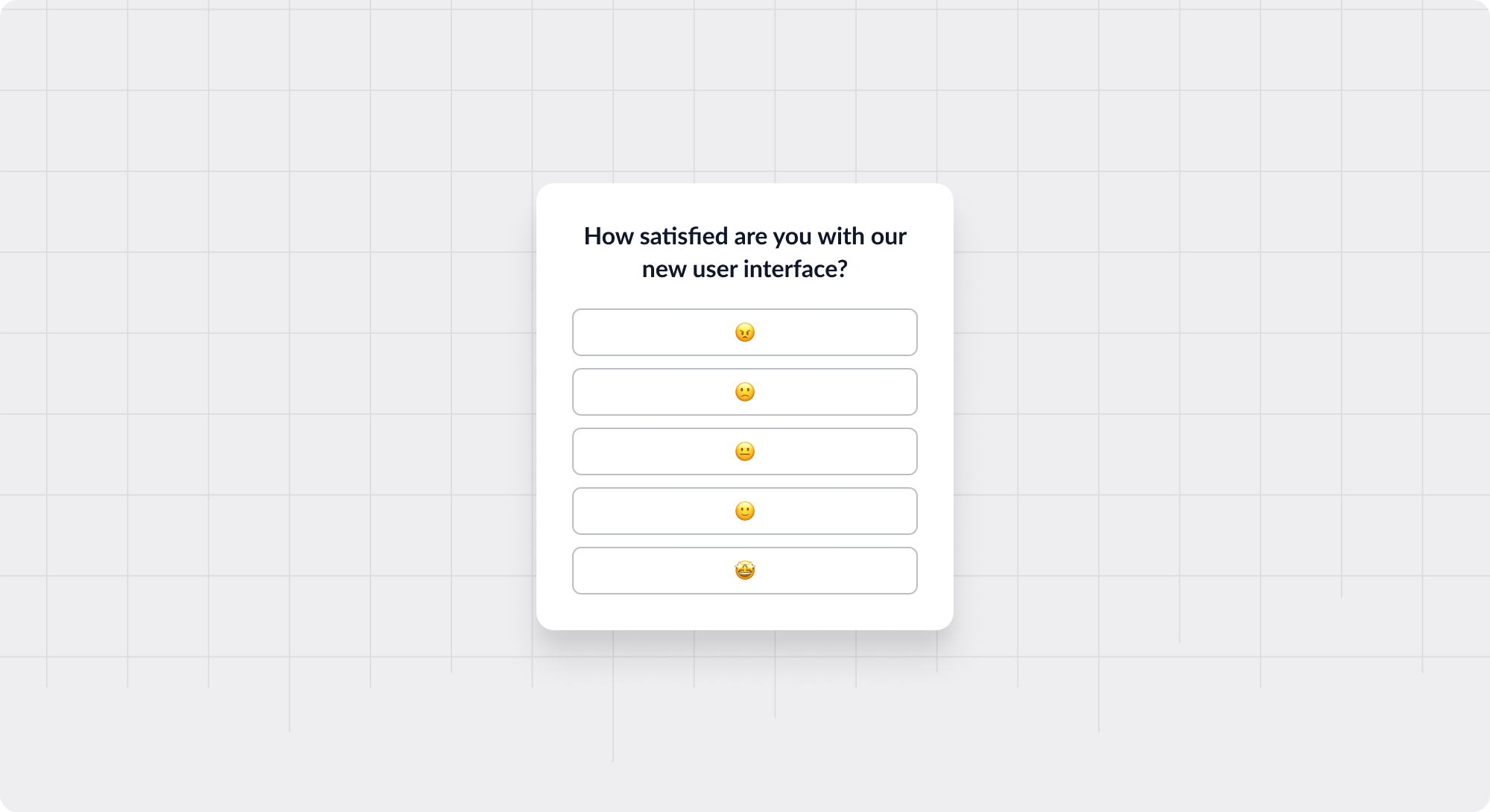
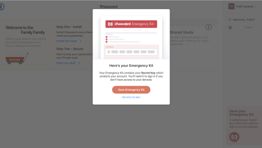
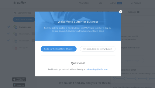
Pop-up overlays within a product that catch attention and give important information
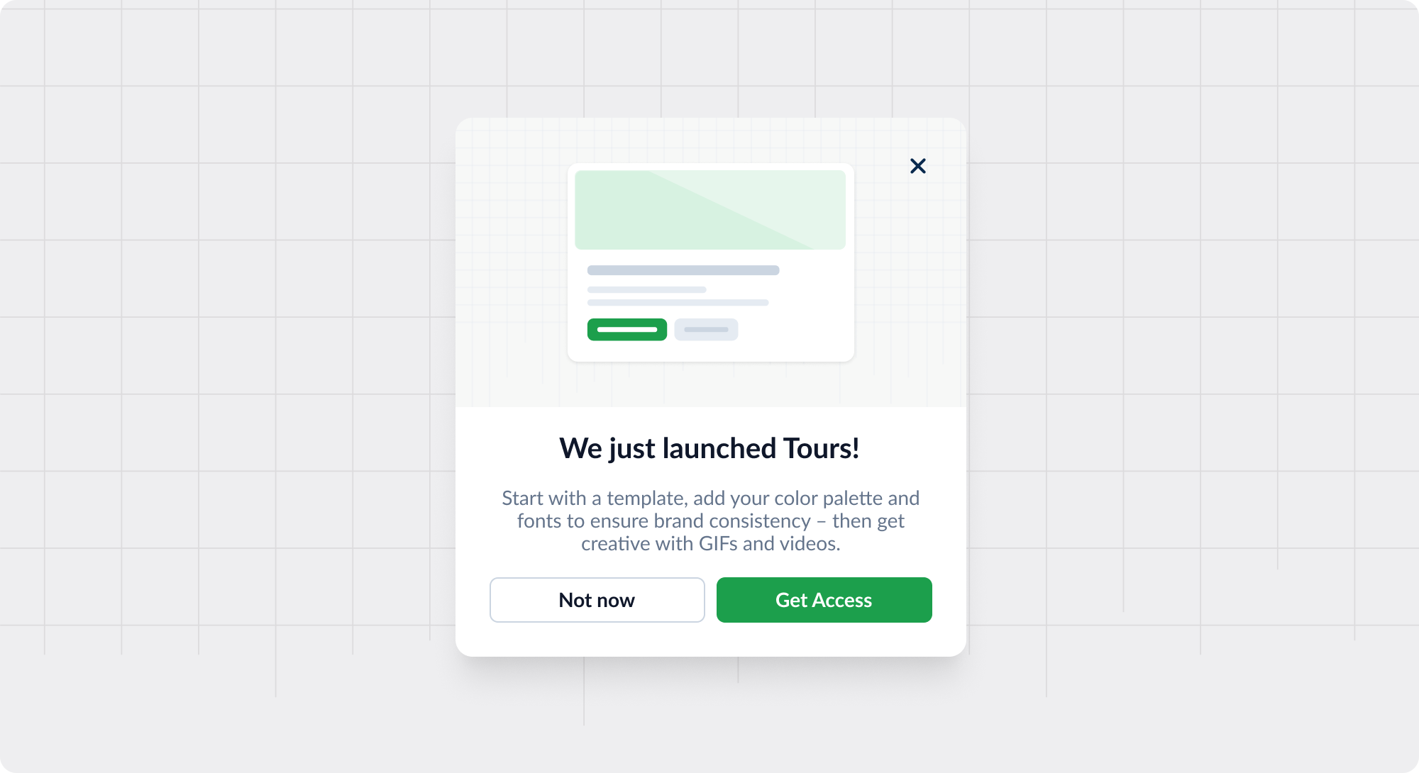
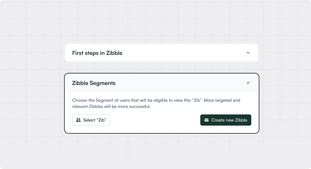
Modals are UI components, typically rectangular boxes—like a pop-up—that overlay on top of an application to get a user to pay attention and take action. Modals disable the main application but keep it partially visible, ensuring users focus on the content within the modal.
These patterns almost always contain at least one button and might be exited by clicking a “dismiss” or “X” button, or by clicking outside the modal and into the main application.
Welcome screens: a simple notice to welcome new users into a product
Confirmation state: especially for critical actions like deletions
Announcements: such as sales (for eCommerce), company news, new product launches, etc.
Blocking states: e.g., to force a user to take an action before proceeding with using the underlying product (such as accepting privacy terms or updating billing information)
Videos/prototypes: embedded within the modal to provide a clean and distraction-free viewing experience
Unlike error messages or loading indicators, which may be better served by less intrusive UI elements like banners or icons, modals are designed for direct user engagement with critical information or choices.


Get started free in our sandbox or book a personalized call with our product experts