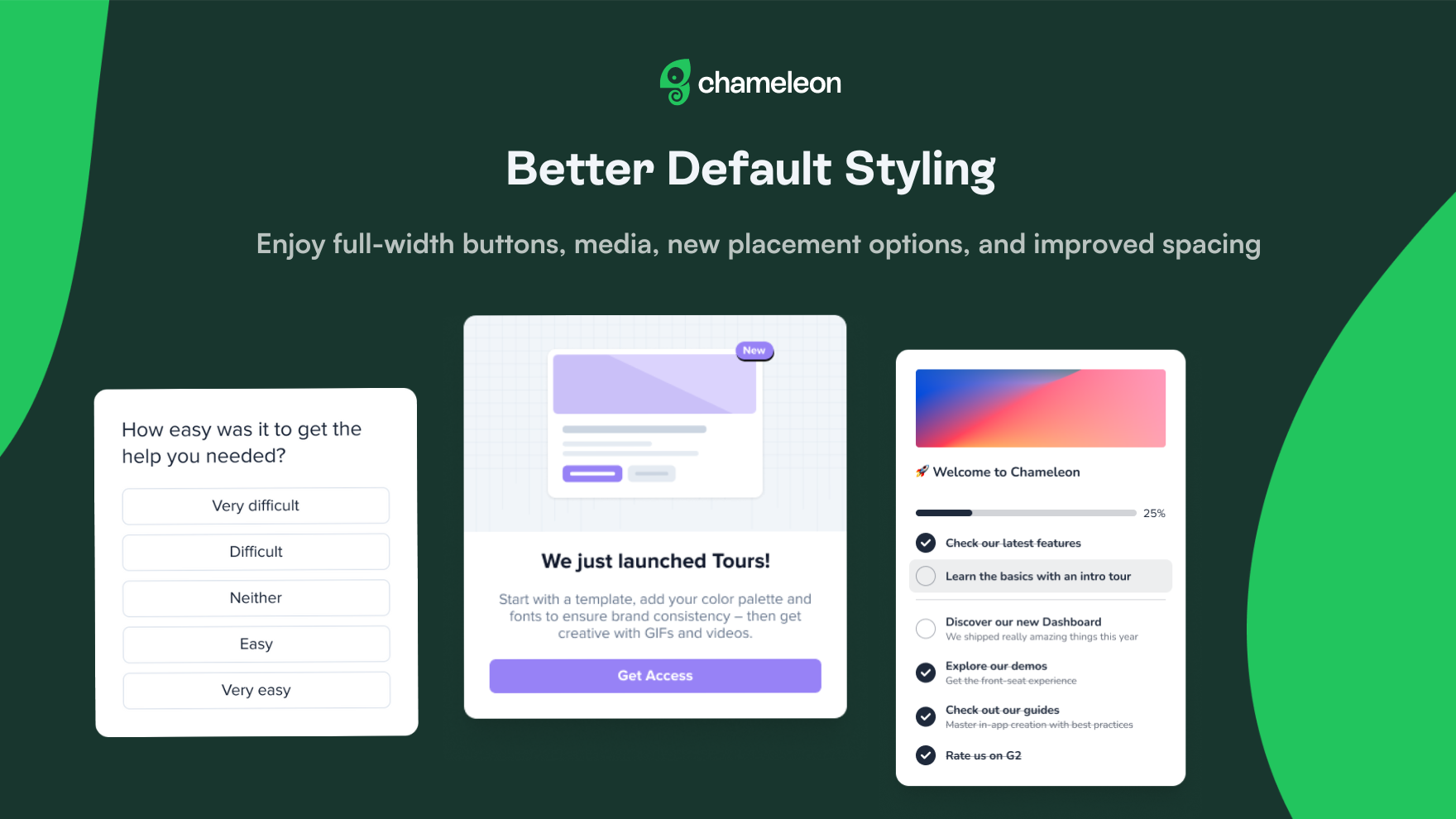
✨ Updated Default Styling
To help you achieve a more polished look with more ease and create a better user experience, we've made some styling changes across all Experience types. We improved individual components and added new options to make customization smoother. Here are some of the most exciting updates:
Full-width option for buttons (on all Experience types)
Full-width option for media (on all Experience types)
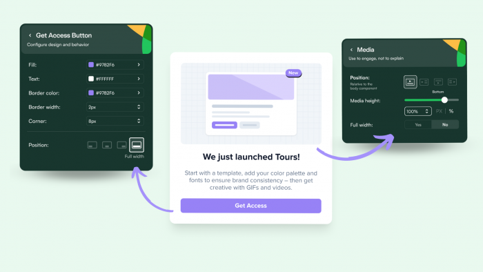
👉 Find the full-width option on all "Primary" and "Secondary" buttons, Microsurvey "Submit" buttons, and the button on the Launcher "Welcome State".
🖼️ If you don't use the full-width media option, you can now adjust the corners of your media component.
Vertical option for Microsurvey buttons (Rating & Multi-button)
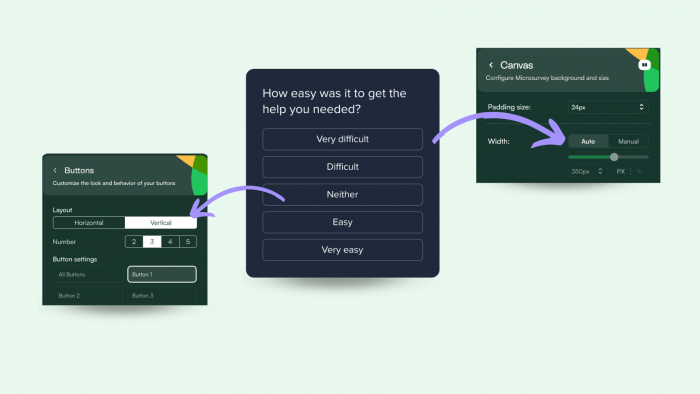
👉 You can also leverage an "Auto" option for your canvas width. When set to auto, the canvas size will adapt to fit the buttons in your Microsurvey.
New "Under Title" media option
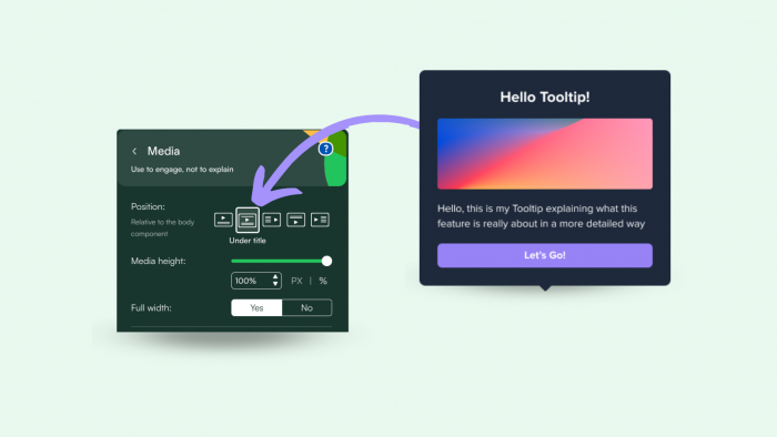
👉 Find this option whenever you add a title and a media component.
Launchers makeover: improved checklist, search, progress bar, and widget
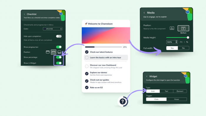
👉 To show the Progress bar percentage in your Launcher Widget, select an icon Widget.
Aside from these ready-to-use options, we've also updated the default spacing, padding, and margins on all Experiences for the perfect result, no matter how you combine the different components.
📩 These options are available for newly created accounts by default, but feel free to request an update on your account if you want to leverage these options too!
👉 Learn more about Styling in Chameleon.
⌨️ To improve selection, navigation, and configuration via your keyboard in the Dashboard, we've also made big accessibility improvements to our configuration sections, tables, dropdowns, and much more! Use "Tab" to move through configurations and "Enter" to make various selections.
