I co-founded Chameleon in 2015 to address common user onboarding problems.
After 8 years, the original issues are largely solved, software facing new challenges for high activation rates.
Current challenges: "Impersonalization", "Frontloading", "Interruptions".
Leading companies adopting trends: AI-powered setup, warehouse-driven personalization, cross-functional ownership.
As SaaS shifts to usage-based pricing and product-led growth, user onboarding must evolve.
Evolving user onboarding is crucial to stay competitive in the dynamic SaaS market.
99 problems and user onboarding is one of them
When we were exploring the idea of Chameleon back in 2015, we conducted numerous interviews with founders and product people to better understand their challenges around user onboarding and new user retention, and found three main complaints:
Free-to-paid conversion wasn’t high enough: companies were investing in user acquisition, but these users failed to find the “aha!” moment, causing low retention rates. Companies were not satisfied with their activation rates or their user onboarding.
The cost to improve onboarding was too high: user onboarding would be revamped periodically via large cross-team efforts that would require significant time and investment, especially from engineering teams—it was a distraction from core product work. This meant it happened infrequently and in a more traditional “waterfall” manner.
There was no go-to onboarding tool: while SaaS tools were making software much easier to build and distribute, there wasn’t a go-to solution to drive feature discovery and product engagement for new users or to allow iterative improvements to the new user experience.
Now, almost 8 years on, we’ve made some significant progress: companies are optimizing their activation funnel continually and using low-code solutions (like Chameleon) to remove the burden on engineering teams.
Teams are no longer debating build vs. buy for product adoption platforms; it’s clear that building is insufficient. Although the first version might be quick to build and deploy, the critical limitation comes around maintaining, iterating, and quickly adjusting any in-house built patterns. Updates to user onboarding get deprioritized or are limited to basic flows and tooltips, with no analytics, testing, or personalization.
Instead, teams are using product adoption solutions to deliver contextual prompts, nudges, signposts, walkthroughs, checklists, etc. to help users navigate the steep learning curves and limited patience when evaluating new software.
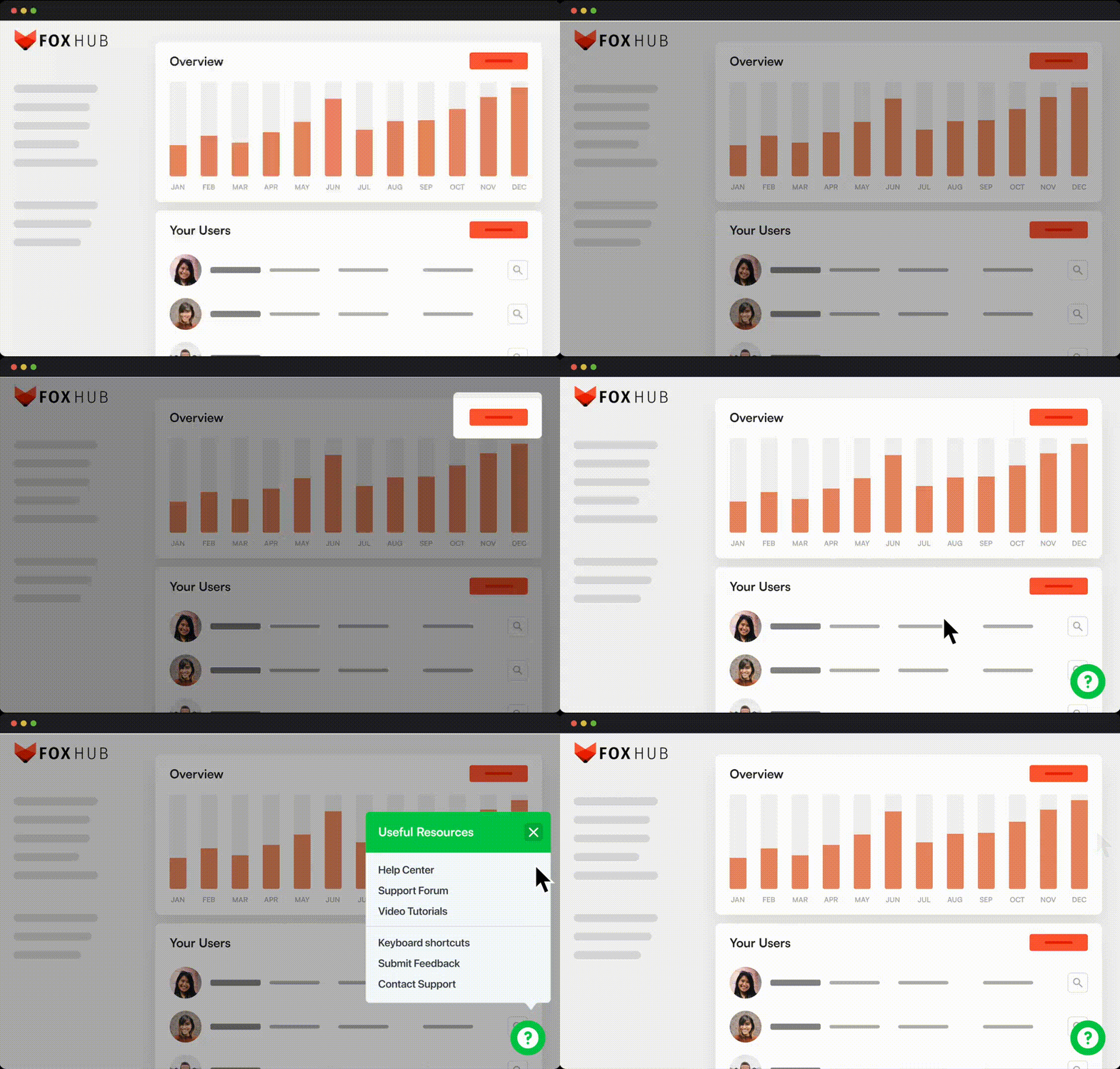
In-app Microsurvey, Tours and Launcher built with Chameleon
In theory, this should have solved the problems we encountered when first exploring Chameleon. To a degree it has, but founders, CEOs, and product leaders are still dissatisfied with the state of their user onboarding and activation rates… why?
It’s because we’re now encountering new challenges to effective user onboarding and in some ways mirroring the time from 2015 by using outdated approaches. User expectations have moved much faster than product teams and so the user onboarding problems of 2023 are:
Impersonalization
Frontloading
Interruptions
User onboarding problem 1: “Impersonalization”
In most tools today, user onboarding is either not personalized or has very limited personalization. Regardless of the user's intent, know-how, and skill level, most are greeted with the same views, prompts, and empty states.
This isn’t just ineffective, but frustrating for users. It’s akin to getting on a sales call and hearing scripted questions and follow-ups that don’t take into account your answers. If you’ve experienced that in a poor sales process, then you’ll know how off-putting and trust-destroying that is… yet that is the norm in software.
It may seem hard to create dynamic, personalized UX, but the first step is personalized in-app prompts and guides based on user data, including questions collected as part of the account setup process.
From our own experience at Chameleon, we know there are some significant differences in the personas of new sign-ups; users exploring the platform need very different onboarding than those currently evaluating their options.
Here at Chameleon, we show different onboarding experiences and videos based on how users respond to the questions
User onboarding problem 2: “Frontloading”
In so many tools, we still see the dreaded “Welcome Tour” that takes users through a long sequence of highlights showing off all the features of a product. These do not work effectively for users with high intent, as they have a key goal/job and little patience for an overview. In a poll that we ran, 92% of users claimed they would dismiss these Welcome Tours on the first step!
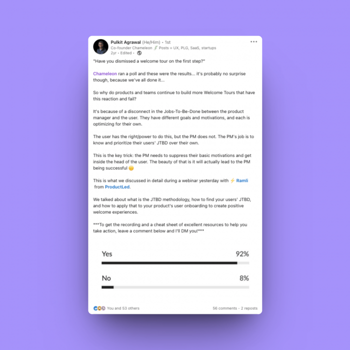
💡 Follow Pulkit on LinkedIn for more insights.
When users first gain access to new software, there is excitement, curiosity, and anticipation. All of this is dampened if the user is first required to undertake unwanted “work” to read without the joy of play and discovery. People learn by doing and don’t want a constrained linear path to discovery, so forcing them through an overview as a first step is counter-productive and lazy, akin to providing an instruction manual for all users to first read before they start playing and learning by doing.
We’ve also seen the continual adoption of “Just-in-time teaching” (JiTT) as an educational approach, and a similar strategy should be applied to onboarding. Users should be given instructions when they need them, when they can act on them, and when they would value them.
If certain users do want a general overview of your product (likely those less experienced or aware of your software/category and in a “discovery” phase) then this (a Welcome Tour) should be signposted and optional. We know from Chameleon’s data that when users start a product tour manually (vs. being thrown into one) they are far more likely to complete it.
Get more in-app benchmark stats
See how other companies are creating in-app experiences and benchmark your way to product adoption success. Read Chameleon's Benchmark Report.
User onboarding problem 3: “Interruptions”
We’ve all experienced that random modal that pops up as we’re trying to quickly get something done in a tool we use regularly. I’ve dismissed these modals without even checking what they reference or whether they are relevant.
Let’s take a real-world example: people who solicit donations to charities (a great cause) but do so by blocking your path when you’re walking on the street (a terrible approach). It immediately puts people on the defensive and raises their guard; while this brute-force approach does work in getting attention and collecting donations, the overall sentiment becomes to avoid these folks on the street, to steer clear of these “charity muggers”.
The same is true of interruptive in-app experiences; if you create intrusive announcements, or shrouds that hide part of the UI, you force a user to pay attention regardless of their interest or motivation. This can lead to some short-term wins but is ultimately bad UX and will reduce the effectiveness of your in-app experiences over time.
The underlying problem here is the lack of design and UX thinking and high-quality copywriting that goes into creating in-app prompts. It’s usually because creating these experiences isn’t part of the core design process and so does not get the scrutiny and expertise needed to be successful. In addition, most product adoption platforms have not provided sufficient tools and configuration options to avoid these interruptive experiences.
This is why Chameleon released a Figma file with all in-app components, so designers can better incorporate these during the design phase, without needing engineering to undertake the work of building/implementing (because anyone can build these experiences in Chameleon without coding).
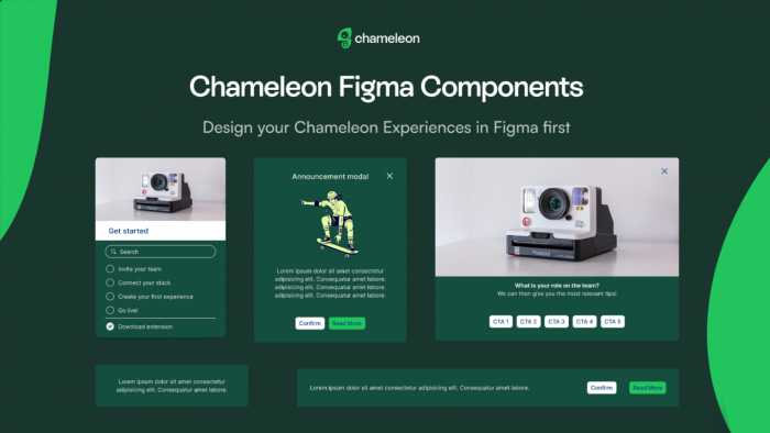
How Chameleon is trying to help customers tackle these problems
As a product adoption and user onboarding platform, Chameleon’s goal is to enable more teams to create delightful and effective in-product experiences to help users find “aha!” moments, and to enable products to be more successful in their missions.
We care about the end-user experience and know it’s our job to be opinionated about what is effective so we enable and coach our customers to create the most effective and valued in-app experiences that are welcomed by their users.
Here are some highlights from the past year, and a sneak peek into what’s coming up next to help with the problems identified above:
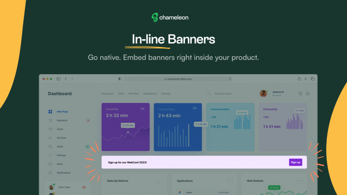
Embedded in-line banners
To reduce the risk of interrupting users, we shipped the ability to place a banner or callout within the underlying page so it sits alongside other elements/existing content. This all happens without any code adjustments, so non-technical customers can create these, and allow users to engage whenever they are ready.
Warehouse integrations
To better connect in-app experiences with the real-time state of the user, we shipped our Fivetran, Census, and Hightouch integrations (to add to our existing two-way Segment integration). This means that interactions with Chameleon experiences can easily be added to your data warehouse to help inform other communication or analysis—and that Chameleon experiences can be triggered based on any other data in your systems.
Branching
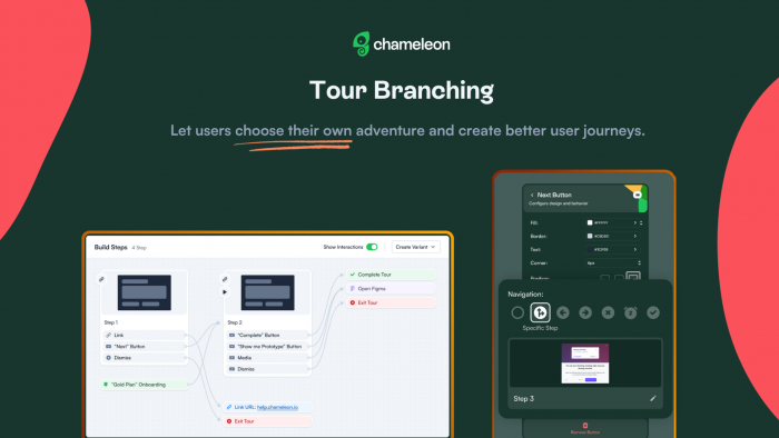
We shipped “Interaction Maps” to showcase how your Experiences interact with each other, and also the ability to let users jump from one Step to another Step (non-linearly) across a Product Tour. This can enable “Choose-your-own-adventure” flows and gives users more control over what they want to learn and do.
Smarter triggers
Now you can configure a Chameleon Experience to display based on custom JS triggers (e.g. using a logic condition based on the state of the user on the page), keyboard inputs, or one of my favorites: based on intelligently detecting a pause. This “Smart Delay” trigger prevents an Experience showing when the user may be in the middle of an action (like navigating, typing, clicking, etc.) but only displays the Experience when we detect the user has paused, reducing the chances of an interruption, and increasing the likelihood of engagement.
Engagement Index
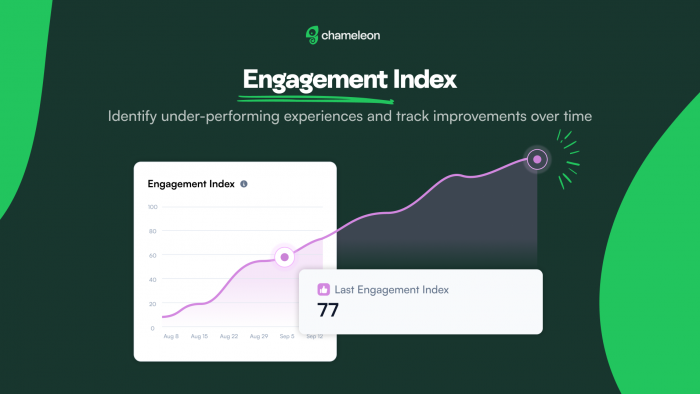
Many of our customers have wanted some way to benchmark their Experiences vs. others or best-in-class standards. This is extremely hard to do using “Completion” or “Goals” because Experiences vary so much in their content, length, targeting, use case, etc. Therefore we have created a “quality score” index that assesses the positive to negative interactions with an Experience. This is rolled up to an Account level and shows the trends so customers can see how well-received their Experiences are, how this is changing, and which Experiences need improving.
In 2024 we will improve our core product and make some bets
Our roadmap for this year includes some core improvements to analytics (revamp shipping soon), Microsurveys (more options, multi-question), Launchers (included embedded), and more.
But we’re also innovating and taking some bets on how in-app UX will change over time.
What’s next for user onboarding? 6 key trends for 2024 and beyond
As software continues to eat the world and we come out of the SaaS recession of 2023, user onboarding and new user activation will remain a critical phase to drive revenue. More business models now rely on usage-based pricing and freemium/free trials for evaluation; in a product-led world, self-serve user onboarding is one of the most important levers to achieving success.
So what’s going to change with user onboarding in 2024 and beyond? Here are my 6 predictions/forecasts on trends that will shape user onboarding:

Tea Leaves and Tech
Explore what the Product and PLG pros think 2024 has in store for the SaaS industry
User Onboarding Trend 1: AI-powered “chat UI”
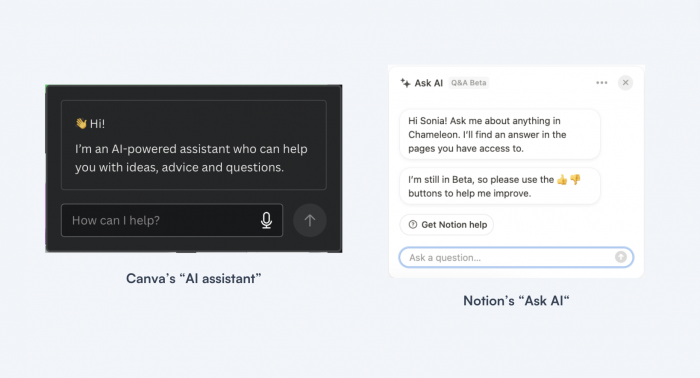
We’ll see more products leverage chat to help users get set up and potentially personalize their user onboarding journeys. We’ve already seen some examples of this and I’d expect many more products to incorporate chat to ask users what they want to accomplish.
User Onboarding Trend 2: Choose your own adventure
Either via AI-powered chat or otherwise, we’ll see more products offer options for users to choose how to onboard, which will help overcome the ‘one-size-fits-all’ problem. This might come from a variety of patterns such as questions/microsurveys during onboarding and setup, self-serve lists of items, and other ways for users to choose.
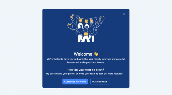
Example of CYOA Tour built with Chameleon
User Onboarding Trend 3: Warehouse-driven personalization
Now that data warehouses and lakes have become the centralized source of truth for user data, we’ll see more cases of companies leveraging this to offer real-time personalization of in-product messaging and prompts. This goes beyond the current best practices of using behavioral analytics tools (e.g. Mixpanel, Heap, Amplitude) to define cohorts for targeting.
We’ll see more usage of Reverse ETL tools (like Hightouch and Census) to sync user attribute data from the warehouse with product adoption tools to conditionally trigger the right experience.
User Onboarding Trend 4: Get Started pages
We’ve already seen these become more popular in 2023 and we’ll see more companies and products create dedicated “Getting Started” pages with a common accordion pattern for tasks that need to be completed.
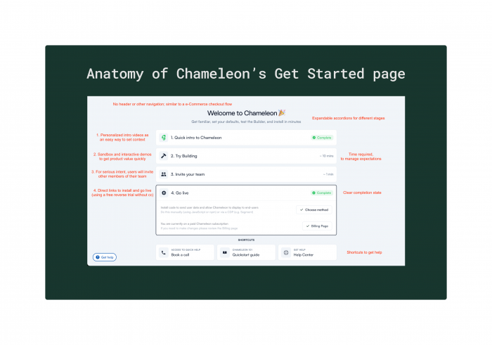
Deconstructing Chameleon's Get Started page
User Onboarding Trend 5: Embedded prompts
Instead of interrupting users with popups, we’ll see more embedded calls to action that are dynamic, personalized, and contextual. Historically these have required changing the core product and therefore have been difficult to implement with stretched engineering resources, but we’re now seeing the capability to build these in a low-code manner.
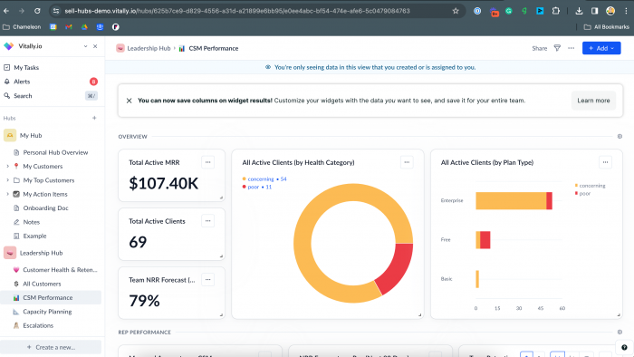
Example of an embedded banner built with Chameleon by Vitally
User Onboarding Trend 6: Cross-functional ownership
Over 2023 we saw the dissolution of the fictitious product-led vs. sales-led divide; we know that it’s about using a combination of tech-touch and human-assisted approaches to winning customers. With this, product-led sales is becoming more common, and so revenue orgs. are more aware of, interested in, and involved in how first-time users are onboarded and educated. This will lead to more cross-functional teams/pods (including Sales, Customer Success, RevOps, etc.) being involved in designing, creating, analyzing, and optimizing user onboarding experiences.
Take control of your user onboarding
User onboarding is critical in driving revenue for all companies; most teams are dissatisfied with their activation rates, which can be hindered by impersonalized UX, frontloaded learning, and interruptive in-app experiences.
The best teams will adapt to the key trends shaping best-in-class user onboarding, including more data-driven personalization (using behavioral user data), more self-serve choices for users to learn, more AI-enabled setup, and more cross-functional ownership of the first time user experience.
This can be made easier using a dedicated product adoption platform, like Chameleon, that offers the necessary patterns, analytics, and integrations to implement best-in-class user onboarding to iteratively drive increased conversion rates.
As a next step, I’d recommend you do the following:
Assess whether your product and users face the problems listed above, and if so, identify a plan of action to address them
Consider which one of the key trends is something you can most easily adopt or embrace and factor that into your roadmap discussions
Review your stack; do you have the tools to create data-driven UX that you can quickly iterate on? If you’re using a product adoption tool today is it fulfilling the promise sufficiently to stick with it, or is it worth reviewing an alternative?
I know that the promise of better user onboarding has not been effectively fulfilled by digital adoption platforms, but at Chameleon we’re striving to change that paradigm.
You should be able to create beautiful, native in-app experiences that your users love, reliably and without frustration or technical complexity.
You should expect your product adoption platform to help you drive material changes in user engagement and conversion, and it should be amongst the most well-loved solutions in your stack.
That’s what we are aiming for and we want to work with customers who have similar expectations.


