Leading designers and product thinkers agree that first-time user experience is the most critical component of a product’s flow.
Julie Zhuo, Design Director at Facebook, says: "No one cares about the thing you’ve designed until they get past the beginning." And Scott Belsky, Founder of Behance and Partner at Benchmark, says: “The first mile of a product experience is increasingly neglected over time despite becoming more important over time.”
“The beginning,” “first mile of product,” and “first-user experience” relate to what a new user experiences after signing up. This is commonly known as user onboarding.
“User onboarding is the process of increasing the likelihood that new users become successful when adopting your product.”
So, how can you improve the chance that your users will be successful?
1. Decide who’s responsible
Do not let the responsibility for user onboarding fall through the cracks. Without ownership, your product’s onboarding will be an uninspired afterthought.
Teams assign accountability depending on their size and maturity. For early-stage startups, it might be one of the founders. For mid-stage teams, it could be a product manager, marketing team member, customer success rep, designer, or someone else. Later-stage teams may have a dedicated team.
Ideally, the same person or team works on all aspects of onboarding. This includes the first experience after signup and for new features or redesigns etc. This will ensure a consistent experience for users and better alignment with company objectives.
Data from our 2023 Benchmark Report shows that the teams using Chameleon to build onboarding flows like product tours the most are:
✅ Product management
✅ Product marketing
✅ Engineers
✅ Customer Support
2. Understand behavior requires motivation, ability, and triggers
Whoever designs the onboarding needs to understand some fundamental user psychology. BJ Fogg is a behavioral scientist who founded the Persuasive Technology lab at Stanford University. He explains that behaviors are a consequence of three factors:
- 1 Necessary motivation (that makes a user want to achieve a desired result)
- 2 Suitable ability (for the user to achieve that result)
- 3 Effective triggers (to prompt the user to undertake actions to achieve it)
There is a relationship between these 3 components that results in behavior occurring. Here is how that translates more directly for products.
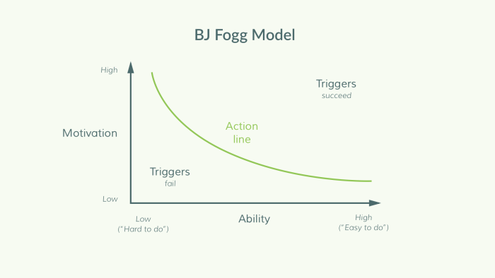
Here value proposition proxies motivation, interface proxies ability, and prompts proxy triggers. When there is high motivation, then users will act with prompts, even if the interface is confusing. If there is low motivation then users will not act, even if the interface is intuitive.
It’s important to understand this relationship so that all the focus is not on creating an "intuitive" interface. Users are still assessing the benefits of your product after signing-up. So you need to convey the value proposition (the WHY) before explaining features (the HOW). Read more about this here.
3. Figure out your “aha” moment
The “aha” moment is the time when a user internalizes the value your product provides. It’s the moment when they are ready to buy (especially if on a free trial) or deepen their relationship with the product (become a fan/share with friends/give access to more data/etc.)
Getting to “aha” should be the goal of your user onboarding. This applies to both product onboarding and also feature or redesign onboarding.
You may not be able to articulate the “aha” moment today, so the first step is to generate a hypothesis and test it. Identify the main value proposition or differentiator of your product. You may consider the most-used feature or what fans get most excited about. Test your hypothesis using surveys or user tests.
Once you're confident, map out the steps users need to get there and how long this typically takes. Then consider the following 2 questions:
- 1 Is this the right path? Are there steps that are not necessary on this path? Which steps lead to the greatest fall-off? What would be the shortest path to wow?
- 2 Do users know how to get there? Is there a clear direction on what to do next (and why)? What do users need (motivation, ability, triggers) to get to the next step?
The first question is about improving the design of your product. The second part is about building a user onboarding flow. You can see examples of both in this list of teardowns.
4. Use a combination of channels
There are 3 main techniques used for onboarding new users: email, in-app messages, and product tours. Use a combination of these channels to motivate, teach, and engage your users. Check out this post for greater depth.
Emails are great for transactional messages and re-engagement
For example, signup success or newsletters and announcements. Email is the only way to access inactive users, so don’t overload it in case they unsubscribe. However, it’s out of context: Users may read your email on a different platform or on the move, so it’s hard to prompt specific actions. Instead, focus on developing motivation and explaining benefits.
In-app messages are essentially emails with context, for active users
Use these to deepen your understanding of the product and for important announcements or updates. They don't prompt product actions easily, so stimulate conversation and self-discovery. Ensure the content is easy to digest in text and media format.
Examples of in-app messages that highlight important features:
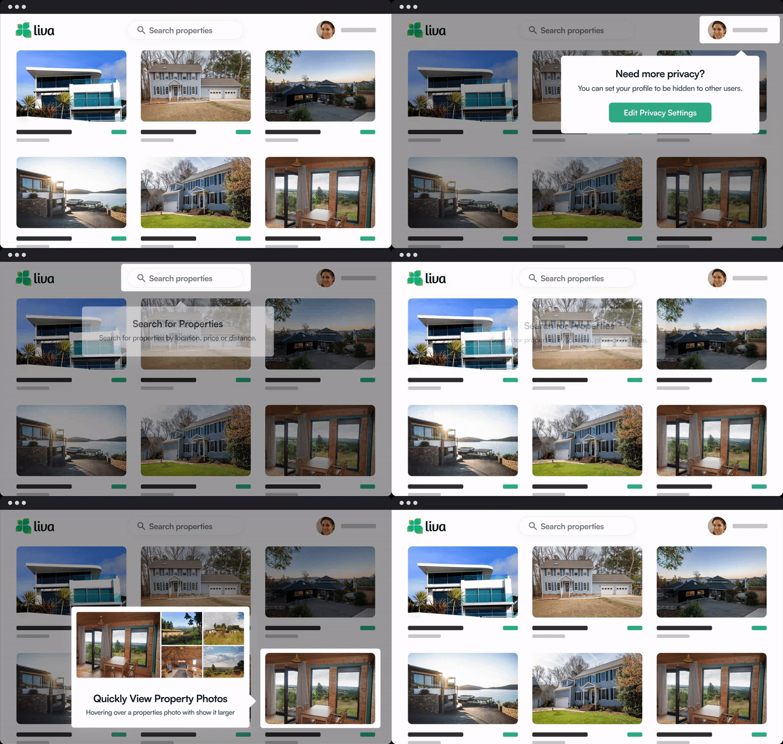
Product tours consist of a variety of in-product prompts
This can include takeovers, modals, hotspots, tooltips, notification bars, etc. Use these to highlight parts of the interface and encourage users to act. They are often designed poorly which leads to a bad reputation. Users should find product tours compelling, valuable, and enjoyable. They should help users achieve their goals, not your goals.
Example of a short product tour helping users activate a feature:

If you don’t have the engineering capacity to build these in-house, use one of these tools. Or just go with Chameleon 🤓
5. Analyze and iterate quickly
It’s incorrect to think of user onboarding as a set-and-forget flow. User onboarding isn’t something that you can build once and then revisit in 6 months. Consider it a feature that needs fine-tuning to increase engagement or a function (e.g. marketing) that needs new experiments. You’ve set a goal and now you (or whoever is responsible) should measure and test variations.
Don’t be overwhelmed—you can identify your goal, sketch out flows, figure out points of engagement, and build a flow within a day. Be lean and build a first draft ready that you can then test and iterate. Continual improvement is necessary to get an optimized user activation rate.
Originally published on the InVision blog here.
🎬 Webinar: Using Jobs to be Done to Improve User Onboarding
Learn how to customize onboarding experiences at scale, and help steer users to key "aha!" moments.
