Churn is often overlooked as an issue for startups because they are focused on growth rather than retention. Brian Balfour, a former Growth Lead at HubSpot, even repeatedly suggested that companies should prioritize retention growth.
However, an estimated 30%+ of SaaS providers have an unacceptable 10%+ churn. This can kill a business, so it’s important to urgently search for ways to improve retention.
There is a key secret that can help - one that connects churn and a strong user onboarding to deliver higher retention: the "aha!" moment. This moment, or the lack of it, is one of the major factors of a leaky product adoption funnel.
What is the "aha!" moment?
The "aha!" moment is the first time the user recognizes and internalizes the value of a product or feature. A moment of sudden realization, inspiration, insight, recognition, or comprehension that, in SaaS, applies to a specific software tool and its usefulness.
Other terms and metrics related to this are the Wow moment, Time to Wow, and Time to First Value. These all give a clue to how quickly users recognize the value and how they feel when they meet the "aha!" moment.
Why is the "aha!" moment so important?
Users will only continue to invest in a product if they find it useful. We all have a limited attention span and within this period, your product must deliver value to the user. People want quick results and refuse to waste time looking for what should be obvious in a product.
Since there are several options (i.e. your competitors) available to solve the same problems, your product needs to prove its value quickly after sign-up, before new users move on to the next option.
On top of this, users lost early in the relationship are very unlikely to return. Actually, KickOffLabs found that:
Improvements in a user's first 5 minutes can drive a 50% increase in lifetime value.
That's why focusing on user onboarding is of the utmost importance. You must onboard users in a delightful way to show them how successful they can be with your product. Then, you should continue to provide increased value to give users a reason to come back.
In this post, we'll address the first key "aha!" moment in user onboarding, the first main one after sign-up, but it’s important to note there are several "aha!" moments over a user’s lifecycle. Successfully submitting a form and seeing your product interface is also an example of an "aha!" moment, and so is getting a response to a support ticket. As a user deepens their engagement with your product, it’s important to constantly drive them to find new value in your product.
How to find your product's "aha!" moment
So the next question is: "What is my product’s "aha!" moment?".
It depends on the product UX, value proposition, user persona, and other factors, but it can be found by following a hypothesis-driven approach – identify the most likely "aha!" moment and then test it. If it's not the right one, then identify a different one and test again.
The first hypothesis should be based on your product’s stated value proposition. This will be a benefits statement on your website or the mission you're working towards. You can try to validate this in the following ways.
Ask current customers
Your current customers most likely found the "aha!" moment, which helped them stick around, so they are a great source of ideas.
Focus on relatively new customers (e.g. within the last 1-3 months) and use an in-product Microsurvey to get quick-fire responses to your most needed questions. Here are some example questions you could use:
When did you decide to stick with / pay for [product]?
What feature do you get most excited about?
Did you immediately see the value of [product]?
Did you ever feel lost or not know what to do when you started with [product]?
Were you able to quickly succeed with [product]?
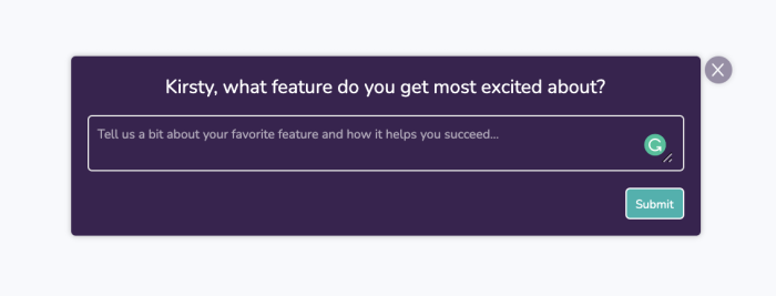
Once you’ve collected responses, read through each response and look for themes – either where they faced problems (e.g. points of confusion or where they sought help) or where they found success and delight quickly.
As noted above, "aha!" moments will vary by user type, especially for products with larger markets and multiple personas. When analyzing customer survey data, it’s important to group the data by persona to see if certain user segments struggle or get excited about similar parts of the product. That way we can use the information to tailor their user onboarding differently if needed.
Conduct user testing
If you aren't able to find a clear "aha!" moment from asking current customers, you can review how prospects behave when they sign-up for your product and go through the onboarding flow. You can either review this live (using a product like FullStory) or proxy this with test users (using a product like UserTesting).
You can also set up some tests independently, and simply use Google Hangouts or Zoom to watch both what users are doing AND how they are reacting. It's important to note where they ask questions, and where they progress quickly. You'll be able to ascertain times where they are pleased and delighted by their facial reactions, and you can ask further questions about these points in a follow-up conversation.
Look to your competitors
You can also gain some ideas by watching what your competitors are doing. They're likely also trying to identify their key "aha!" moments and clearly explain their value on their website, so you could utilize a similar theme if it's relevant to your product.
You can find competitors on Product Hunt, Siftery, or Capterra and sign up for free trials to experience it yourself too!
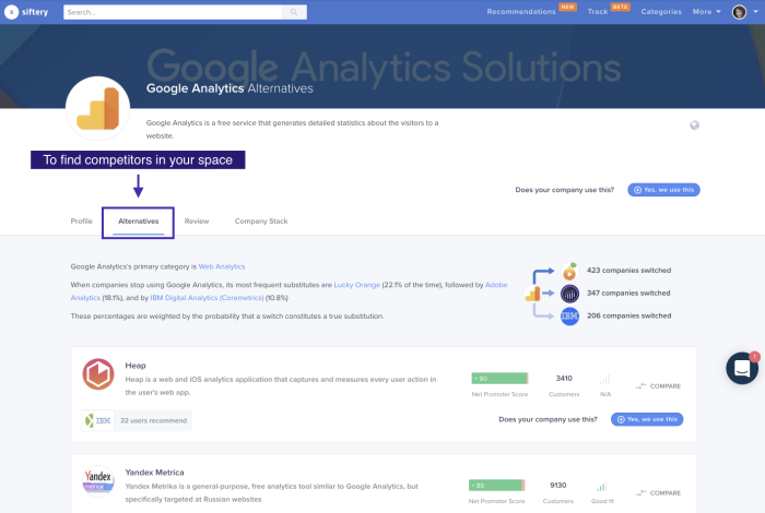
You’ll want to check in once or twice a year with competitors to see if they’ve made changes. Ideally, though, you should have a good handle on your product's "aha!" moment(s) long before needing to check on them again.
Put your "aha!" moment theories to the test
Once you've found a likely "aha!" moment, you should test it to determine whether it really does correlate (and cause) long-term user engagement. Sometimes what users express in an interview may differ from how they actually behave, so testing with data is an important component to truly understanding what your UX goal should be.
Firstly, you'll want to establish a correlation – does reaching this "aha!" moment link to users being more engaged? Then you'll want to establish causation – does reaching this "aha!" moment make them more engaged? If you succeed with this, then you have the secret sauce to reduce churn! 🍾
Establish correlation between the "aha!" moment and user retention
To do this, review your retention data on whether users return after meeting the "aha!" moment, and how this compares to your overall retention figures. However, for this, you'll need to already be tracking the "aha!" moment as a product event within your analytics tool.
You'll then be able to set up a retention chart such as the one below from Amplitude. Our friends there have also written some great content on analyzing retention – check those resources out for more ideas.
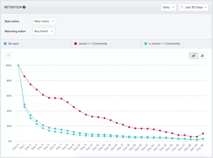
This chart shows retention of new users by all users, those who joined a "Community", and those who didn't. You can create a similar chart with groups of users that completed your "aha!" moment and those that didn't. If you notice a clear difference, as above, then it's clear that the "aha!" moment product event is linked to better retention! 🎉
If you aren't already tracking the "aha!" moment...
If you aren't already collecting data on the "aha!" moment product event, you won't be able to conduct this analysis. In this case, you have two options:
Instrument your product to collect this data and wait to assess this
Skip this step and go straight to the causation analysis 👇
Establish causation between the "aha!" moment and user retention
Correlation doesn't mean that users who complete that event will necessarily be more engaged. The driver of both the "aha!" moment and retention may be some other action or event, so trying to lead more users to "aha!" will not help app retention. Therefore we have to test for causation.
To do this, you need to run a live A/B test where you change something in the product and assess it against a control group.
Note: if you are unfamiliar with A/B testing or don't have enough traffic, then you can do a serial test, where you change one thing and then measure the results and compare them against the previous period. This is not as reliable as comparing two sets of results within the same period, as with an A/B test, but is an acceptable second-place option.
Try to drive a group of users towards the true value of your product with an experiment and review how that impacts their retention. The best way to do this is with in-product user guidance.
How to nudge users toward "aha!" moments
If retention increased with the test group, this proves that your hypothesized "aha!" moment does indeed drive user retention! If not, keep trying and experimenting with other ideas. Once you have proved your hypothesis, you know what your goal is and you can try much harder to drive all your users towards this key "aha!" moment.
Segment your users
Different users will have varied "aha!" moments. Take Productboard as an example. An "aha!" moment for a Product Manager might be creating their first product roadmap. But for a Product Director, seeing tasks completed and understanding progress is their "aha!" moment. As you plan your onboarding path, consider using enriched data to take different users on different onboarding flows.
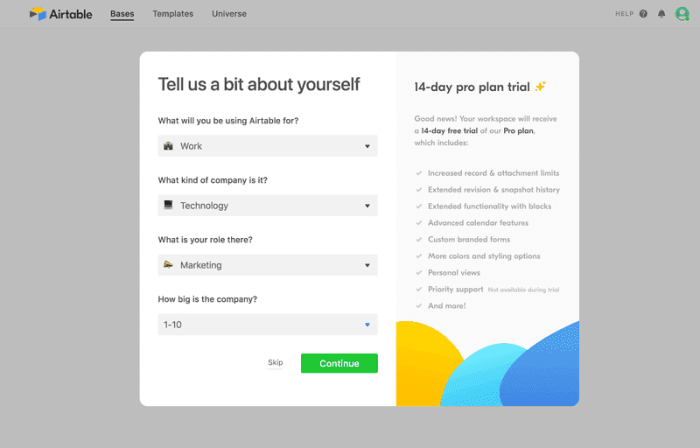
Knowing these moments will help you provide users a clearer path to value – increasing both adoption and retention rates. To do this, you can either repopulate your user onboarding with known data, e.g. from Clearbit – or you can ask users to self-select their roles, goals, and use cases, like what Airtable does. By doing this, you can reduce users' time to value and steer them toward features and templates that make them go "aha!" ✨
Use short product tours
Here, emphasis is on the short. In our Benchmark Report, we found that three-step Tours have a completion rate of 72%, while only 16% of Tours with seven steps get completed! Fight the temptation to show users everything under the kitchen sink and instead, be pragmatic about what you show. Take your research into "aha!" moments and apply it in your tours.
If you know that interacting with one feature increases user retention, experiment with guiding users toward that feature. Even better, use known information about users to incentivize them to take action. For example, this can be something like: "Product Marketing Managers love feature X – give it a try!"
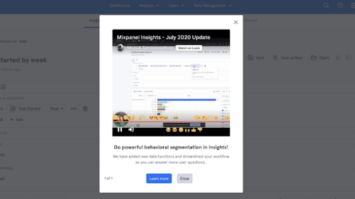
You can even try adding video to your product tours to increase engagement and convey benefits succinctly – like what Mixpanel does.
🎬 Webinar: Using Jobs to be Done to Improve User Onboarding
Learn how to customize onboarding experiences at scale, and help steer users to key "aha!" moments.
Encourage self-serve discovery
We ran a survey at Chameleon and found that 92% of people have closed a welcome tour straight away. Yikes! But that doesn't mean that all welcome tours are bad news – there's a lot at play. For me, it's seeing "step 1 of 10" that makes me click escape 😴
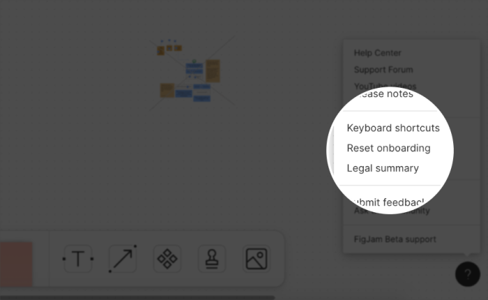
No matter how great your welcome tours are, it's best practice to allow users to revisit these tours at their own pace – that's where Launchers come in. These in-app widgets are an on-demand way of discovering "aha!" moments. For example, Figma uses Launchers as a way of restarting the onboarding flow and redirecting users to "aha!" moments after they find their way around.
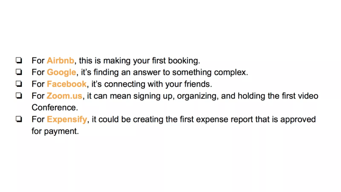
Great "aha!" moments examples
So many products, so many "aha!" moments! We've rounded up a few of our favorites to give you inspiration as you look for yours.
(Source)
An "aha!" moment example from Trello
Trello is a project management platform whose value proposition is to enable users to quickly organize and prioritize everyday projects. Upon landing on their app, Trello helps users quickly grasp their core value with a templated example Welcome Board.
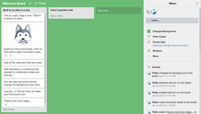
Trello uses the Welcome Board to quickly showcase how the product works by encouraging the user to interact with it. They recognized that the true value is gained when a user is able to add tasks and move them across lists. So the first item on the “Stuff to try” list is to drag a card to the “Tried It” list. In doing so, the user quickly understands how easy it is to organize their projects – part of Trello’s core value.
Trello is a great example of how you can use your own product to onboard new users, and guide your users quickly to discover your product's value.
An "aha!" moment example from Buffer
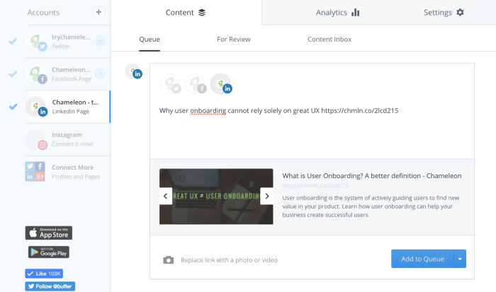
Buffer is a social media management tool, that lets you easily schedule social posts into the future. Buffer makes this value quick to internalize by prompting users with the "Add to queue" button by default (over instantly publishing a post) to help them reach "aha!".
An "aha!" moment example from Close.io
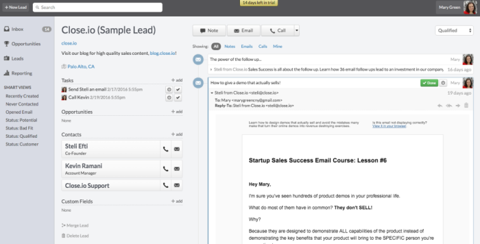
Close.io is a CRM solution (to help manage sales prospects and opportunities), which claims that it reduces data entry to help you be more productive. It keeps track of all your activities automatically, and so after signing up, the user is immediately led to a contact screen. Here, they would see all the information about their historical interaction with that contact, but because they are new, sample data (such as a conversation) has been used. In this way, Close.io is helping users find the "aha!" moment even if all the necessary data isn't yet available.
Empty states can be a sad cause of an underwhelmed user because they cannot (or don't want to) visualize the product in its full glory. However, you can convert this risk into an opportunity with these strategies to leverage empty states for better user onboarding.
Wrapping up "aha!" moments
Knowing your "aha!" moment is the secret to having successful user onboarding and better user retention. It provides the framework for the goals you set for your product team and is a systematic methodology to drive product adoption. It can and should be applied not just for new users, but for each stage in your user lifecycle and for all your product and feature adoption goals.
If you'd like to adopt this methodology, share this post with your team. Or, get a demo if you'd like to know how Chameleon could help you get your users to the "aha!" moment more quickly.

Weekly advice to make your product stick 💌
Be the first to get the latest product best practices and resources


