How to apply Nir Eyal's Hook Model to your user onboarding flows
Nir Eyal's 2013 book Hooked completely changed the way people think about creating viral technology and products.
The apps that won, Eyal said, did so because they tapped into something deep in the brain. Facebook, Farmville, Angry Bird, Foursquare—like hit songs, these apps wormed their way into our heads. They made us come back again and again. These companies were all successful at one thing; creating a hook that formed strong user habits.
Eyal defines a hook as an experience that is designed to create a habit. The more often the user runs through this hook, the more likely they will form the habit.
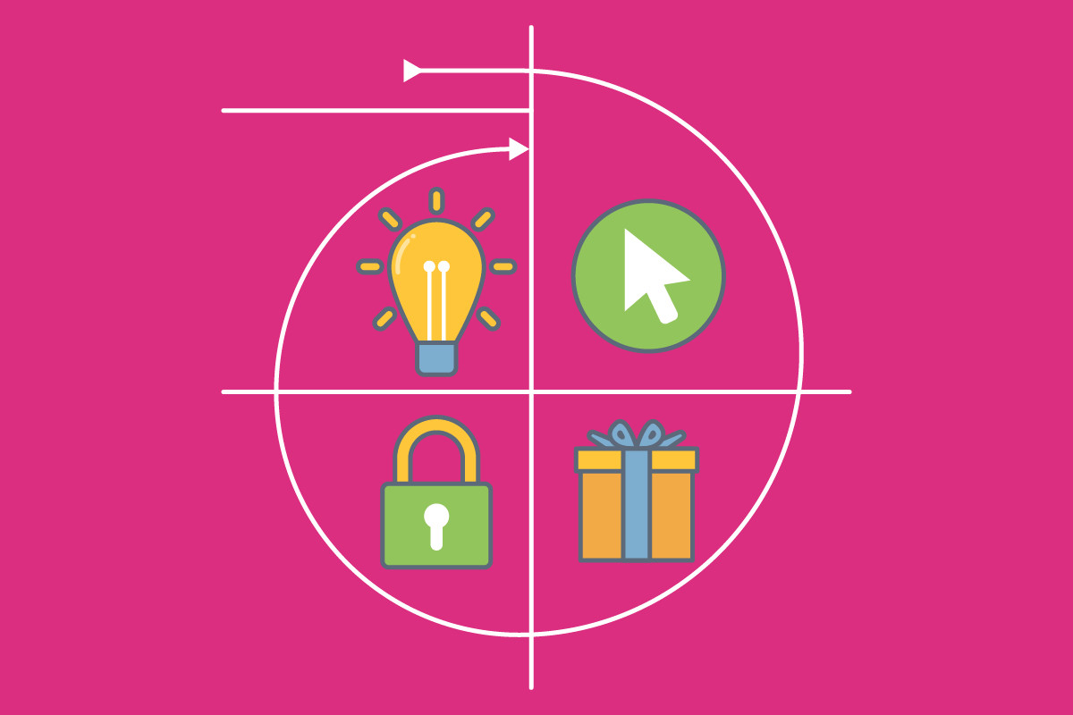
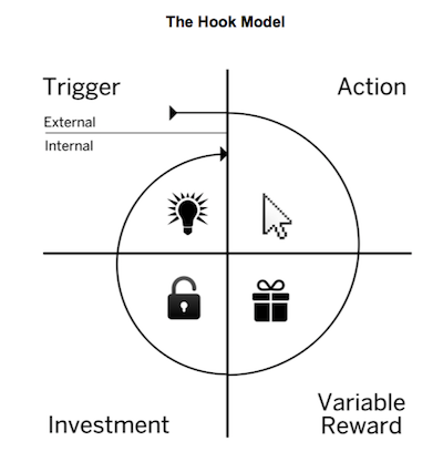
The basic components of this hook are: Trigger, Action, Reward, and Investment, which together form Eyal’s Hook Model.
To build a habit-forming product, you need to begin creating hooks from the user’s first experience, so in this post, we show you how to apply the Hook Model to your user onboarding.
##1. Find Trigger Moments 💡
The first step in the Hooked Model is Trigger, which is the origin of a behavior, something that gets users to take an action. Triggers can either be external or internal:
-
External trigger: instructions or cues (that we might see, hear, or touch) that guide us to take an action. This could be a CTA button driving you to purchase, Slack’s “knocking” sound reminding you that you have a new message or a colleague that tells you to try a new mobile app.
-
Internal trigger: a thought, feeling or emotion that drives us to take an action. When we’re feeling lonely we might open up Facebook. If we are bored we might watch YouTube videos. It’s the point when a user has a mental association with your product.
For example, when you get a push notification from Google Now telling you there's going to be inclement weather in your area, that's an external trigger. When you check Google Now of your own volition the moment you're curious about the weather, your lack of sureness is an internal trigger—and it's associated with Google Now.
When building products, you can use external triggers to create a Hook, and eventually build an emotional connection between the user and your product. This will lead to further internal triggers that you don’t have to initiate.
During user onboarding, you should nudge users towards key actions (to help them find their “aha” moments) using external triggers. As Stanford Professor, BJ Fogg outlines, triggers don’t work in isolation - they require sufficient motivation and ability to succeed. Therefore as part of your external triggers, you should aim to:
-
increase the user's ability: make the action as easy as possible. You can do this by eliminating points of friction in your product, always having a clear call-to-action and using product guidance to nudge users to key actions in your product.
-
increase the user's motivation: make the user want to do it. This can be done through using a strong value proposition in your copy, showing the end-state to motivate the user to get there.
Having a product that provides a lot of value is critical to retaining users but so is making sure that your users are able to find that value.
Let’s review three cases of external triggers that you can use during your user onboarding: empty states, product tours, and emails.
####Empty States Are Your Canvas
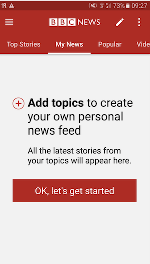
Empty states exist in almost every app and are an opportunity to trigger an action. Use empty states to motivate users by highlighting potential benefits and provide clear calls to action.
As shown below, the BBC News app does a killer job of filling the empty state with a benefits statement and a call to action. The copy explains both WHAT action the user should take and WHY the user should take that action. They also made it super easy for a user to complete the request by including one clear CTA 👏.
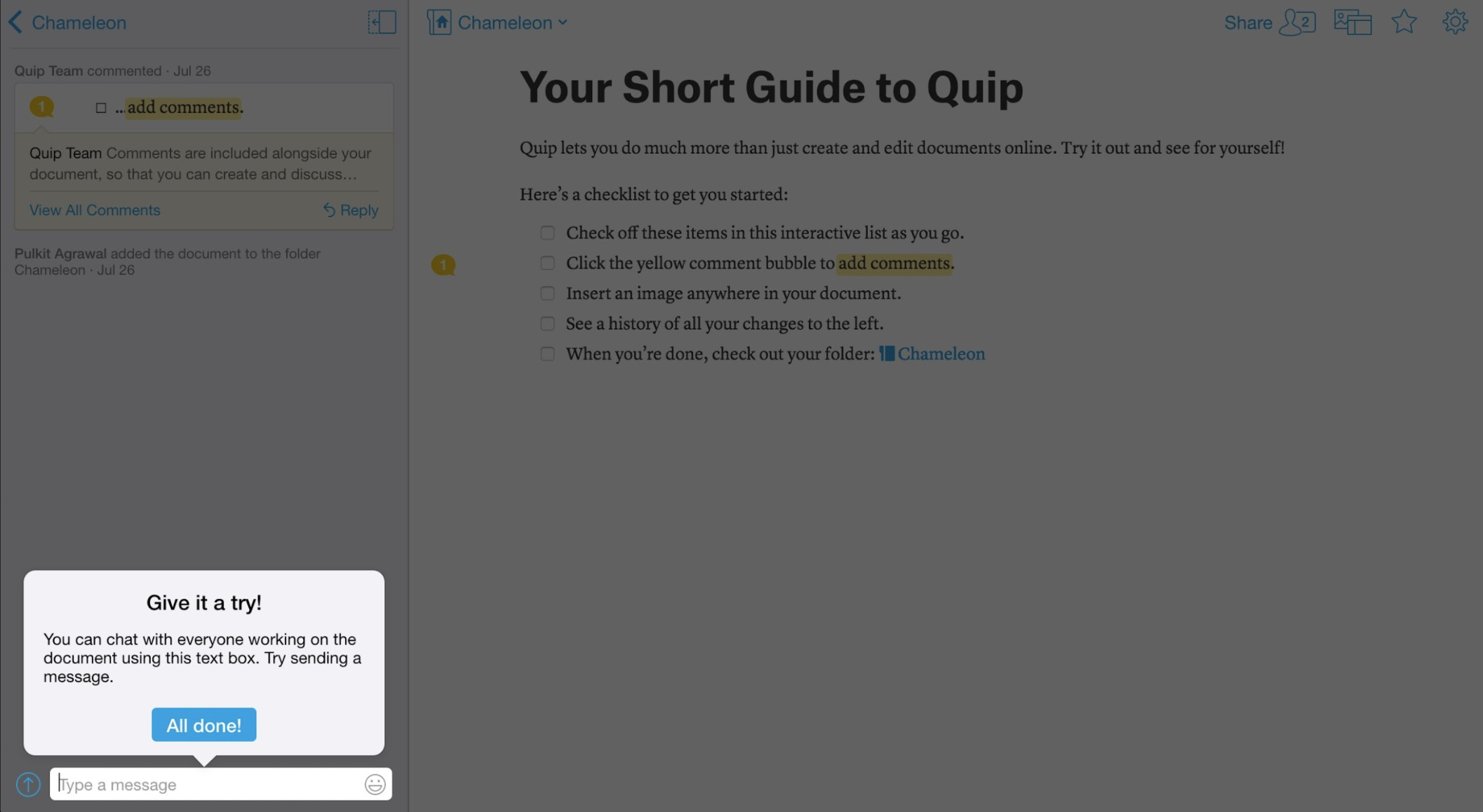
####Product Tours Create Contextual Prompts Product tours can be a powerful means to capture a user’s attention when they are in the product. This can be used to trigger them into taking a key action, especially when shown at the right time. For example, if a user has not discovered their “aha” moment, then redirecting their attention to a key feature can trigger the Hook, and prevent churn.
In the example below, Quip, a collaborative productivity software, uses a lightbox to highlight a key benefit of their platform: collaboration. It not only draws attention towards a core feature but also triggers a user to take an action and try it themselves.
####Emails Can Drive Users Back Into Your Product
Email is one of the best channels for interacting with users who are not using your product. You can use emails to highlight benefits, reduce anxiety or confusion, seed ideas and uses, and, encourage action.
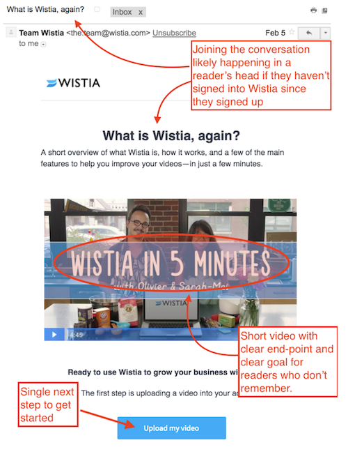
In many cases users sign up for your product but before they begin to use it, they may get pulled into a meeting or receive a phone call and totally lose momentum with your product. For users who haven’t taken the most critical action a few days after signing-up, send an email that outlines the next step to proceed.
These email should contain a concise but strong value proposition and a single, clear call-to-action.
Here is an example from Wistia, a video hosting platform, that did just that. Wistia sends users that have signed up but have not engaged with the product an email to remind them what the product is and deliver a clear CTA towards a key action: uploading a video.
2. Pick the Right, Repetitive Action 🔁
For the Hook to succeed, the trigger must lead to an action that is valuable and intuitive for a user. The action should be easy and repeatable so that it can lead to a behavior pattern, and eventually a habit.
It's no surprise that many of the most viral products have relied upon users being triggered to perform very simple actions:
- Google: type a search query
- Twitter: write a 280-character tweet
- YouTube: watch a video
YouTube uses various triggers to drive users to simply watch videos as frequently as possible. Auto-playing the next video or suggesting similar other videos are examples of this.
When designing your user onboarding, find the simple, repeatable actions in your product that will provide users value.
❗NOTE: Driving your users towards more difficult actions are also feasible, but this requires greater motivation.
####Try goal setting with your users
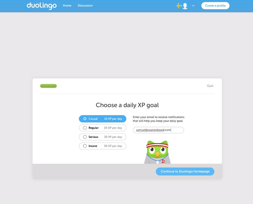
Another way to drive repeatable behaviors is by having your users set a goal they would like to accomplish as part of their new user onboarding. This is what Duolingo, a language learning app, does to keep users on track. A user-generated goal can also be used for emails that celebrate users as they achieve their goals, or encourage them when they fall behind.
##3. Provide Variable Rewards 🎁
It's not enough to simply trigger an action—you need to give your users something to increase their desire to return and perform the action again.
People are motivated by rewards, and more so by variable rewards. Nir Eyal uses the example of a constantly replenishing refrigerator to illustrate the idea:
"The predictable response of your fridge light turning on when you open the door doesn’t drive you to keep opening it again and again. However, add some variability to the mix—say a different treat that magically appears in your fridge every time you open it—and voila, intrigue is created."
Variable rewards create intrigue, and consequently, desire. The slot machine is one of the purest expressions of this idea. Every time you pull the lever, you get a different result. Sometimes you make a lot of money, but most of the time you don't.
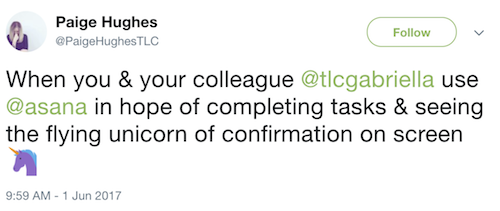
Another great example of this is from Asana, a project management tool, that made completing a task from your to-do list rewarding with a surprise flying unicorn that celebrates your accomplishment 🦄. The unicorn appears at limited and random completions, and thus brings intrigue and excitement into the experience.
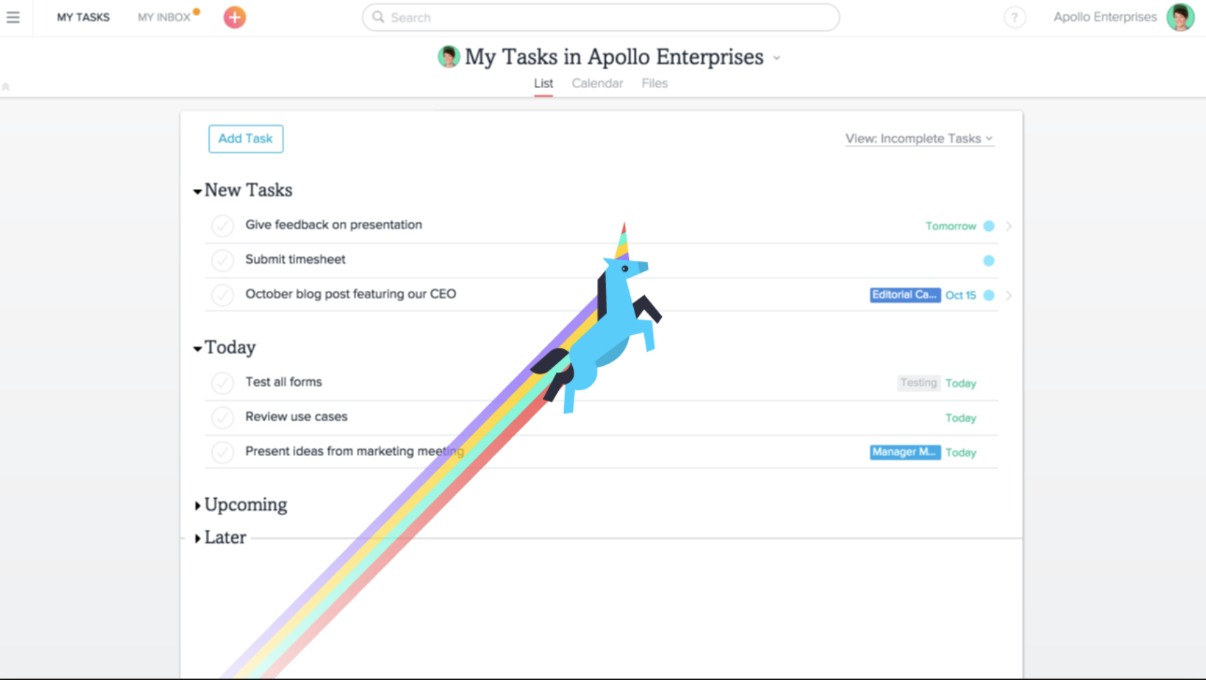
This simple delight feature created shareable excitement and also helped build a habit among users. Providing unexpected rewards generates emotional attachment, and this flying unicorn helped Asana drive virality during a product relaunch. People loved taking a screenshot of their unicorns and sharing it with their social networks.

Quickly getting users from trigger to reward is part of how Pokemon GO spread so quickly and achieved such incredible engagement last summer. With extremely low barriers to gameplay, users could fire up the app and be catching nearby Pokemon within moments.
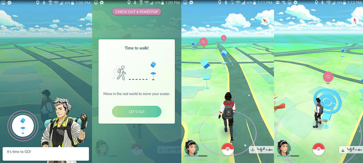
When you're onboarding new users, you want to get them to whatever the reward of your app is as quickly as possible. Ideally, your new users are triggered to pursue an action and receive a variable reward for taking that action within their first app use.
🌟 Pro tip: A simple congratulatory message can serve as a reward. You can easily build and manage these in-app congratulation messages with Chameleon.
##4. Create Opportunities to Invest 🏋️
Building a habit doesn't just end when you've triggered an action and given a reward. What comes next is a critical step: you need to bring your users to invest their time, effort, information, etc. into your product.
Yes, your users should work hard, because this creates ownership and attachment, which deepens their commitment to your product.
With music apps, a lot of time is spent in the beginning stages creating playlists. Once created, playlists serve a powerful purpose. Through further recommendations that embed you deeper into the app's ecosystem, they actually function as extremely strong motivators to stick around.
You've put time and effort into showing Spotify your preferences—why would you waste that time and switch to Apple Music now? Or vice versa.
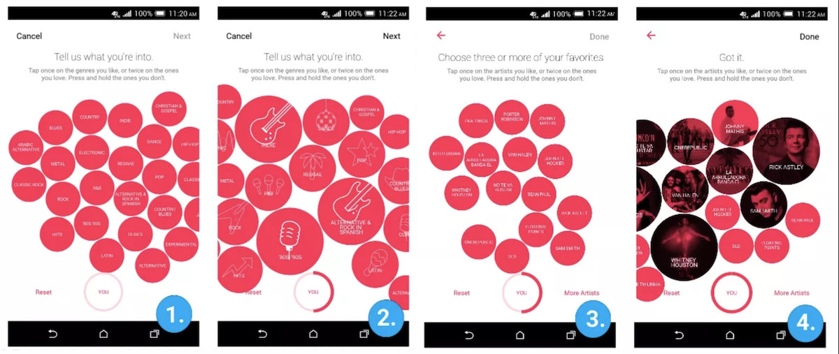
When you spend time telling Apple Music what artists and genres you like to listen to (as seen in the image below), you're making a small (and nearly imperceptible) investment of time and energy. It's still powerful:
Economist Dan Ariely's work on the IKEA effect is illustrative here.
The name of the effect is inspired by something Ariely observed among IKEA shoppers. He saw that even after the things people bought from IKEA started falling apart, even after years of usage and moves, people were unwilling to put them to the curb.
Through studies and research, he arrived at the IKEA effect—the theory that it was the upfront investment of time in building something that actually made it more valuable to people. Putting the pieces of a bed, end table, or desk together created a connection and a resulting “increase in valuation.”
Eyal cites “inviting friends, stating preferences, building virtual assets and learning to use new features” as other ways of getting users to invest their energy into your app. Done properly, these kinds of investments can improve the core experience of the app (by making it more social, for instance, or more personalized) and strengthen triggers. But you can't make a bunch of big asks all at once.
It’s both marketing and onboarding at the same time, and that means you need to strike a balance. Give your users value and request them to take action in return. Keep it reciprocal—ask your users for too much, and they'll start to ponder why they ever gave you anything in the first place.
##Creating Habits During User Onboarding
There are no magic bullets to behavior formation—but the Hook model serves as a great framework to help you create a virtuous system that drives incredible engagement.
Your best users are emotionally invested in your product and want to come back to it on a recurring basis.
As you work on making your product's onboarding stickier and more engaging, consider:
-
Changes should build on each other: The beauty of the Hooked Model is that improvements anywhere tend to strengthen the entire cycle. If the action on which your app hinges becomes much easier to perform, the trigger leading to it will be more effective. If you suddenly introduce an element of variable rewards, then users will be far more motivated to act.
-
Users are fickle—you need fans: It's easy to get short-term improvements to your metrics when you do things like remove screens from your signup flows or take out steps. However, for your product to successfully engage users and keep them around in the long-term, it's not enough to make using it convenient. You need to create commitment.
-
Balance your push and pull: Onboarding shouldn't feel like an onslaught of tooltips. Make sure that your help content is accessible for when users want to get it themselves and don't leave their screen looking like one big tooltip. Make full use of the channels provided to you—use email, experiment with videos, use in-app messaging.
-
Use your product’s core value: Habits should develop as a basis of product interaction, not just from emails and notifications. Do user research to find your product’s key “aha” moments and leverage these, instead of trying to synthesize artificial or untested points of value.
Have you applied any of these principles to your product UX? Please share any examples below and we’ll try to include them in an edited version later.


