Are users ghosting your app? In-app notifications could be the reason, and we’re about to show you how to fix them.
In-app notifications are a powerful tool for keeping users engaged and active. The trick is using them smartly. Send too many, and users will get annoyed. Send too few, and you’ll miss key opportunities to connect.
In this article, we explore how to use in-app notifications to boost user engagement, increase conversions, and reduce churn. We’ll discuss when to send them, what messages resonate best, and how to strike the perfect balance.
Let's start sending notifications worth smiling about!
In-app notifications are embedded messages designed to guide and engage users at the right moment without disrupting their flow.
There are nine different types of in-app notifications: tooltips, modals, banners, slideouts, product tours, product updates, microsurveys, notification bars, and hotspots—each tailored to specific engagement needs.
Some best practices for in-app notifications are personalizing notifications, keeping them clear and valuable, and aligning them with user behavior.
What are in-app notifications
In-app notifications or in-app alerts are embedded messages that appear directly within the app’s interface, delivering timely and relevant information to users. They’re designed to guide, inform, and engage users at the perfect moment—like when they need a little nudge to complete a task, discover a new feature, or stay on track.
The goal is to improve the user experience by delivering the right message at the right time and helping users get the most out of your app without disrupting their flow.
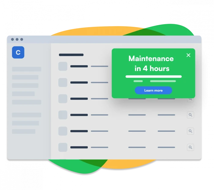
Here’s an example of what an in-app notification for a downtime alert would look like:
Now, let’s break down how they work to keep users engaged.
How do in-app notifications work?
In-app notifications work on a trigger-response system or alerts that react to user behaviors within the app. When a user performs (or fails to perform) a specific action—like completing a task, struggling with navigation, or missing key features—the app sends a contextual notification designed to assist, guide, or engage the user at the right moment.
These in-app notifications are like accessible in-app guides. Depending on the desired interaction, they can be as simple as a tooltip or as intrusive as a full-screen popup.
You can manually implement in-app notifications through custom-built systems or pre-built platforms—that’s us! Most apps use them to improve user onboarding, boost engagement, or promote new features while analyzing user responses to fine-tune future interactions.
Let’s take a look at why these little messages pack such a big punch.
Why are in-app notifications important for product marketers?
In-app notifications matter because they keep users active and drive action when it counts. They allow you to reach users right when they’re using your app.
Want to showcase a new feature, share an update, or offer a helpful tip without pulling users away from what they're doing? Connecting with them at the right moment encourages prompt actions like sign-ups or purchases and builds a stronger relationship with your users.
So, what can you gain from in-app push notifications if you’re applying product-led strategies?
In-app notifications enhance the user experience
In-app messaging makes your app more enjoyable by offering timely and relevant information to users. They help users discover new features, get helpful tips, and stay updated without searching around.
They allow you to test and optimize in-app flows
A/B testing helps you optimize your in-app notifications and find opportunities for improved communication flows. You can refine your messaging and boost user engagement by analyzing the results. Regular A/B tests ensure your notifications align with your product's evolution and user hurdles in reaching their goal.
Optimizing your notifications based on test results strengthens customer retention and drives purposeful user sessions. This increases long-term revenue by delivering value throughout the product lifecycle.
They push freemium conversions forward
When a user tries to use a feature only available in the premium plan, a simple notification could pop up saying, "Want full access? Upgrade now!"
This method works well because it catches users right when they realize what they're missing. It's timely and gives them a friendly nudge toward purchasing without being pushy.
They retain users and improve lifetime value (LTV)
In-app notifications that consistently deliver value are crucial in reducing user churn. Each relevant message you send helps users discover more features and benefits of your app, boosting product adoption, increasing usage, and eventually fostering loyalty.
But let's be real—not every notification gets the same warm welcome. Some, like push notifications, can be a bit more disruptive and might even annoy users if not timed right. Knowing which type of notification to use at the right time is key to achieving conversion success and keeping your users happy.
Let's dive into what makes in-app notifications stand out from push notifications. This way, you can reach your users at the perfect moment with just the right message, ensuring they welcome your communication with a smile.
In-app notifications vs. Push notifications
In-app notifications pop up right inside the app while users are actively using it. They're perfect for keeping both new and existing users engaged at different stages of their journey—from initial discovery to user adoption.
Push notifications, on the other hand, are sent to a user’s device even when they’re not using the app. These notifications show up on the lock screen or in the notification center, serving as a gentle nudge to draw users back into the app.
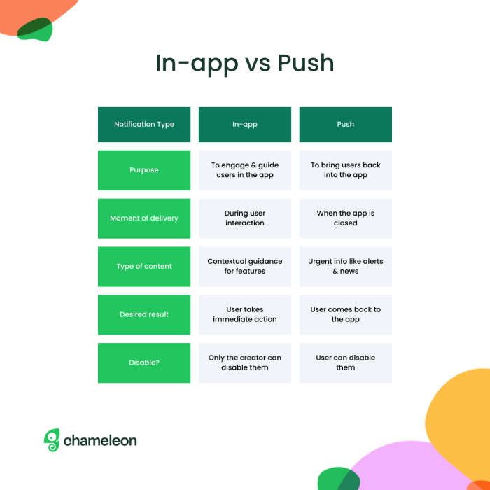
In-app notifications are all about making the current user session better, while push notifications are your trusty sidekick for getting users back into the app after they've wandered off. Check out this example from the popular restaurant reservation app: Ambl.

Now that we’ve clarified what in-app notifications are, let’s get into the fun part—exploring the different types you can use to keep your users engaged and happy to hear from you.
9 Different types of in-app notifications
This section will take you through the different types and show how companies use them to create real success stories. From practical tips to cool case studies, you'll see how these little pop-ups can make a big difference.
1. Tooltips
Tooltips are short, subtle in-app messages that appear when users interact with a specific element on a page or within an app. They’re an excellent aid for first-time users.
Tooltips are designed to be helpful and non-intrusive, offering users just enough information to keep them moving forward without overwhelming them.
See it in action with Mixpanel

Mixpanel, a leading product analytics company, used Chameleon’s tooltips to improve user onboarding and feature adoption. Faced with the challenge of communicating significant UI changes and new features to users, Mixpanel integrated tooltips into its onboarding process.
The result?
56% completion rate for product tours
4% increase in customer retention over a year
3x increase in their Net Promoter Score (NPS) within 16 months
These results prove that tooltips help users get the most out of your app and contribute to long-term customer loyalty.
“We saw a 4% increase in customer retention with Chameleon, which helped us 3X our NPS score!”
👉 Explore an interactive demo and see how to build Tooltips with Chameleon.
2. Modals

Modals are those bold pop-ups that you just can't miss—they take center stage in your app and often need a little user interaction before you can move on.
Whether you're making a big announcement on yourwelcome page, gathering feedback, or guiding users through an important action, modals are your go-to for making sure users pay attention.
🦎Tip: Want your modals to shine? Stick to the best modal UI design practices and design them in a way your users will love!
See it in action with Rankmi
Rankmi, a Human Capital Management platform, faced a challenge: they needed a better way to measure user satisfaction and gather in-app feedback to improve their customer experience. Their previous method of sending email surveys wasn’t cutting it—they weren’t getting enough responses to make informed decisions.
So, they turned to modals to prompt users for feedback when it mattered most.
The results?
500% increase in NPS response rate
Improvement in overall user satisfaction, thanks to targeted feedback that informed better product decisions

🦎Tip: See how the best products use subtle nudges, tooltips, and prompts to engage users. Check out our inspiration gallery!
3. In-line banners

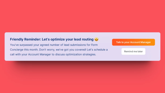
In-line banners are horizontal bars that run across the entire length of the screen. They can be either at the top or bottom of the page or between elements.
Banners are great for offering an in-app message without disrupting the user experience since they’re not as prominent on the user interface.
See it in action with Chili Piper
Chili Piper, a meeting automation platform, needed a better way to drive upsells and increase revenue without relying solely on email campaigns. With a little help from Chameleon, they turned to in-app banners!
The results?
$150K+ ARR generated from upsells in a few weeks
40+ meetings booked directly from the app using in-app banners
4. Slideouts

Slideouts are those smooth, side-panel notifications that glide in from the edge of your screen. They're perfect for sharing more detailed info without messing up the user's flow. Think of them as a way to dive deeper into content, almost like visiting another site but still staying connected to your main goal. Slideouts also come in handy for gathering feedback or collecting data right within your app.
See it in action with Vitally
Vitally, a customer success platform used slideouts to announce a new feature called "Goals." Their slideout offered users an interactive demo directly within the app.
The slideout includes a quick GIF to grab attention and value-driven copy that explains why users should try this new feature. Users could immediately start using "Goals" or launch a demo to explore more—all from within the slideout.

5. Product tours
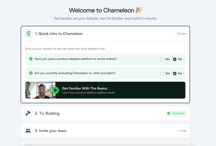
Product tours are interactive, step-by-step guides that walk users through your app’s key features or processes. They’re designed to help users quickly get up to speed, whether new to the platform or exploring a newly released feature. Product tours typically highlight specific areas of the app, providing clear instructions and context as users navigate through each step.
See it in action with AvidXchange
AvidXchange, a leader in accounts payable automation, wanted to reduce the burden on their support team while improving user experience. They implemented one-step product tours to alert users about system issues or to guide them through new features.
The results?
20,000 support tickets were deflected in just 12 months, significantly easing the load on their support team.
3x increase in registrants for educational events, thanks to in-app tours that effectively promoted these opportunities.
“Overall, Chameleon has paid itself multiple times over.”
Wondering how many steps should your product tour have? Here’s what our 2024 Benchmark Report found:
On average, users complete 5 launcher items. Be sure to prioritize the most essential steps to keep users engaged and within that 5-step limit.
Tours that users access through a checklist have a 64% completion rate.
There’s a 4.7% increase in completion rates when tours are optimized through A/B testing.
6. Product updates
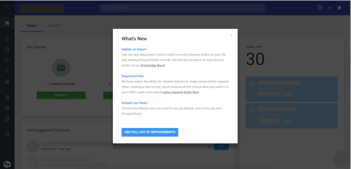
These are in-app messages related to showcasing your product development or progress–new feature announcements, design improvements, or release notes are some of the most common.
Don't overdo it with technical jargon in your product updates. Keep them easy to understand, frontload the benefits users will get from the change, and make sure the value is instantly clear!
Microsurveys
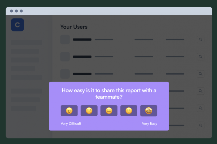
You can also leverage in-app messages to collect valuable feedback, and – with a dedicated tool like Chameleon – this type of notification can be created just as quickly as a tooltip.
You can build various forms of single-question Microsurveys to prompt simple user feedback such as NPS surveys, CSAT scores, and more.
See it in action with Lucy
Lucy®, an AI-powered knowledge management platform, aimed to improve its user feedback process and drive product adoption. Initially focused on custom onboarding flows, Lucy quickly saw the value of Chameleon’s Microsurveys in creating a robust feedback loop between their Customer Success and Product teams.
The results?
6x increase in NPS score for customers who interacted with Chameleon-built Microsurveys.
Users were 5x more likely to perform key actions when guided by in-app messages.

Notification bars are slim banners that sit at the top or bottom of your app, delivering important messages like system alerts, updates, or promotions without getting in the way of what users are doing. They stay put, so users can easily spot them and get the info they need quickly.
Unlike in-line banners that blend seamlessly into the app's content, notification bars stand out to make sure they get noticed. Positioned at the top or bottom of the screen, they're like the spotlight on stage—perfect for urgent updates or announcements that can't wait.
9. Hotspots

Hotspots are those glowing, pulsing icons hovering over key parts of your app, almost shouting, “Hey, check this out!” or “Psst, don’t miss this!” They’re designed to grab attention and guide users toward new features or actions they might otherwise skip over. Whether used in product tours, interactive demos, or as standalone hints, hotspots make sure important elements aren’t missed.
Knowing the different types of in-app notifications is just the beginning—how you use them makes all the difference. Let’s look at some best practices that will help you get the most out of your in-app notifications.
9 Best practices for in-app notifications
Like every tool, in-app notifications must be used in the right way if you want good results with them. So here are some of the best practices you and your team should keep in mind when planning to create an in-app notification.
1. Greet and educate new users
A basic walkthrough might prove effective when highlighting essential features (in context, pop-ups are very useful) so that users can feel confident when interacting for the first time with the app.
When done correctly, user onboarding should provide users with a brand new perspective of its capabilities and functionalities and increase customer lifetime value.
New users have to be encouraged to take action and begin their journey. You can align email messaging with in-app notifications to improve customer onboarding.
2. Segment different audiences
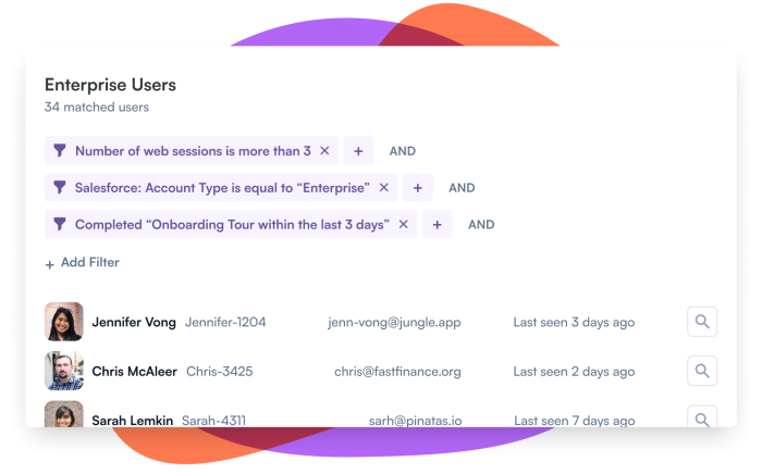
Talking about being in the right place at the right time, each user will come out with their own experience. And that’s why segmentation is important for in-app notifications.
If you can understand and group different users according to their behavior, demographics, and jobs to be done, you’ll be able to deliver personalized messages according to their specific needs. This will increase your chances of getting a favorable response and providing relevant information.
3. A/B test your in-app notifications
A/B testing involves creating two notification versions with slight variations—like different wording, design, or timing—and then testing them with the same user group.
Why is this important? A/B testing allows you to fine-tune your notifications based on real user behavior, leading to higher engagement rates, better user experiences, and, ultimately, more successful outcomes.
4. Be specific, but don't over-communicate
In-app messaging is about interrupting a user at a certain point in their journey. So make sure there's a good reason behind it!
Users might struggle with the product from time to time, so your message better be helpful and clearly showcase how it can help. And remember—KISS your users… no, not what you're thinking!
Keep It Simple, Stupid! Long, over-explained messages can do more harm than good. Say exactly what they need to hear, no more, no less. After all, effective communication is about providing value without overwhelming them.

5. Encourage users with a CTA
A solid call to action (CTA) tells users exactly what to do next. If you want users to take action, be straightforward and clear—don’t make them guess. When you're asking for permissions, like enabling notifications or accessing features, it's a great chance to build trust. A CTA like “Turn on notifications to stay in the loop” both informs and reassures them. Keep it simple, and you'll get better results!
6. Gather user feedback whenever possible
Whether it's a brief product survey or a commentary input you want to reach out for, you should constantly gather feedback from customers.
Analyzing how they're using the product will probably lead to the insight that might help improve the quality of your contextual messages. Collecting customer data according to the flow is vital in every UX scenario.
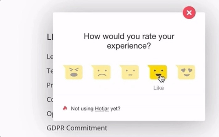
A Microsurvey goes a long way
7. Keep it relevant to the user's behavior
IContextual notifications assist and push users towards progress. Sending untimely messages will only cause confusion or even frustration.
Think of it from the user's POV—they want an in-app notification to help them overcome obstacles, not to be the obstacle to overcome.
When users struggle to perform a specific task, in-app notifications should step in to support them.
8. Make your notification easy for users to exit
No matter how much you try, some in-app notifications will fall flat, or your target user won’t have time to read them.
Make it easy for someone to navigate away from your notification. Make that 'X' as distinctive as possible, and let the user return to the same messages when they have more time.
With these best practices, you can make your in-app notifications more effective. Let’s combine everything and see how you can put these strategies into action with Chameleon!
Start sending relevant in-app notifications with Chameleon!
Product teams should use in-app messages as a line of communication to customers and think of the product as a valuable channel to help them provide relevant comms.
Consistent engagement is one of the most significant issues a product and marketing team faces. But Chameleon helps you tackle this problem head-on.
With Chameleon, you can create in-app notifications that guide users rather than interrupt them, boosting satisfaction and driving product adoption. Plus, with a healthy stack of customizable tools, you can send targeted messages that improve the user journey, give you metrics to improve on and keep users engaged throughout their time with you.
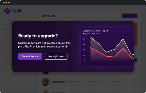
Nudge users towards conversion with seamless in-app experiences
With precise targeting and immaculate timing, Chameleon can turn user engagement into revenue.
