Are your users still missing in action (MIA)? Here's the problem: Building products in a vacuum is a recipe for disaster.
You need a way to understand your users' needs and frustrations. That's where in-app surveys come in. They're a powerful tool for product teams to discover those annoyances that drive users crazy, and how you can bridge the gap between what you offer and what they desire.
In-app surveys make your product truly user-centric. They help you step out of your shoes and see your product through the eyes of the people who matter most: your users.
In this article, we explore the benefits, survey types, and best practices for designing in-app surveys to build products that resonate with users.
TL;DR
In-app surveys are short, targeted questionnaires within your app for on-the-spot feedback
It helps gather quick feedback, improve product, understand users
Types include welcome surveys, NPS, CSAT, CES, feature request, churn surveys, and product-market fit surveys
AlwaysKeep surveys brief, targeted, timed well, and visually appealing
What are in-app surveys?
Ever wished you could peek into your users' minds and understand their experience with your app? In-app surveys are the next best thing!
In-app surveys are short, targeted questionnaires embedded directly within your app. Imagine mini pop-ups that appear at specific moments in the user journey, prompting users for quick feedback.
These surveys are designed to be:
Convenient: they take just a few minutes to complete, making it easy for users to share their thoughts on the go
Contextual: surveys appear at relevant moments within the app, ensuring questions are specific to the user's current action
Actionable: the data collected from in-app surveys provides valuable insights that can be used to improve the app and user experience
All in-app surveys are microsurveys, but not all microsurveys are necessarily in-app (they could be on a website). The key idea is that they are concise and focused on gathering feedback within the context of the user's experience with the app.
Microsurveys:
May emphasize being even shorter, often just 1-3 questions
Might be used for a very specific purpose, like gauging satisfaction after a feature is used
4 In-app survey benefits
Here's how in-app surveys can give you valuable info and make your app the best it can be:
1. Large-scale feedback collection: power in numbers
You can gather a large amount of data in a short period, leading to statistically stronger results. Let’s say you have 1000 users. A traditional survey might get 100 responses, but you're not sure who those 100 people are. They might be all new users or all heavy users.
An in-app survey with a 10% response rate would also get 100 responses. However, because it reaches a wider range of users within the app, those 100 responses are more likely to represent the opinions of all your users. A broader user base increases the likelihood of capturing diverse perspectives and reducing sampling bias.
2. Higher response rates: convenience is key
Users might silently struggle with minor glitches or unclear interfaces that can snowball into churn. In-app surveys placed strategically after key actions can unearth these hidden pain points.
For example, a quick survey after checkout could ask, "How easy was the checkout process?" with options like "Very Easy," "Easy," "Neutral," "Difficult," and "Very Difficult."
This allows users to flag issues they might not have explicitly mentioned otherwise. When your survey is immediately accessible and relevant, it boosts response rates, providing invaluable insights into the user journey.
This is far more convenient than receiving an email later and needing to search for the app again. The ease of in-app surveys translates to more users providing their feedback, giving you a clearer picture of the user experience.
3. Actionable data: turning feedback into action
In-app surveys provide specific data points that directly translate into actionable improvements. For example, if a survey reveals many users find a particular feature confusing, you can use that data to justify prioritizing a redesign of that feature.
This closes the feedback loop, showing users that their input is valued and leading to a more user-friendly app
4. Creates a feedback loop: building on user needs
When you create a continuous conversation between you and your app's users, you empower them to directly influence the app's development. The key to a strong feedback loop lies in "closing the circle."
This means informing your users about the changes you've made and how their feedback played a role. And once the changes are implemented, you can leverage in-app surveys again. This follow-up allows you to gauge user reaction to the updates and gather further insights on the modified features.
Want to create effective feedback loops for user-centric product development? Watch the webinar 👇
How to use in-app surveys to improve the customer experience
Strategically placing surveys throughout your user’s journey helps you collect both quantitative and qualitative data. This data pinpoints areas for improvement and tailors your app to better meet user needs.
Here's how:
Quantitative data for targeted improvements:
Rating Scales and NPS Scores: use rating scales (e.g., 1-5 stars) and Net Promoter Score (NPS) surveys to gauge overall user satisfaction with specific features or the app as a whole. Identify areas consistently receiving low ratings and prioritize improvements based on quantitative user sentiment (more on survey types later).
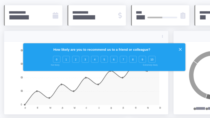
Here’s what an NPS survey delivered in-app might look like in Chameleon:
Clickstream analysis and heatmaps: combine in-app surveys with clickstream analysis or heatmap tools. This can reveal patterns in user behavior, like frequently abandoned steps in a process. Use this data to simplify workflows and eliminate friction points that might be frustrating users.
Actionable insights with qualitative data:
Open-ended questions: don't underestimate the power of open-ended questions like "What can we do to improve your experience?" These qualitative responses provide rich insights into user frustrations, needs, and suggestions for new features.
User comments and reviews: encourage users to leave comments within surveys or through in-app feedback options. Analyze these comments alongside quantitative data to gain a deeper understanding of user pain points and feature requests.
7 Types and in-app survey examples
Here are seven types of in-app surveys to consider, along with examples to get you started:
1. Welcome surveys
Welcome surveys are the perfect introduction for new users, giving them a chance to share their initial thoughts and helping you understand their needs from the get-go. Think of them as a friendly handshake at the door of your app.
These surveys typically appear after a user signs up or completes a basic onboarding process. They're short and sweet, aiming to gather quick insights that can personalize the user experience.
Here's what welcome surveys can do:
Gauge initial impressions: simple questions like "How familiar are you with our features?" help identify users who might need more guidance
Identify user goals: ask users, "What are you hoping to achieve with [app name]?" to understand their motivations and tailor content accordingly
Personalize the onboarding process: based on user responses, you can recommend relevant features or tutorials, ensuring a smooth and personalized first experience
Welcome survey example
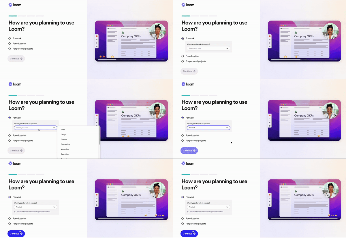
Loom uses a welcome survey to understand new users' goals and tailor the onboarding experience accordingly. The survey is presented to users shortly after they sign up, likely during their first interaction with the product. It includes a simple, focused question like "What will you use Loom for?" with predefined options. This survey provides tailored tips, features, and use cases relevant to that specific purpose.
Here’s what it looks like:
5 Welcome survey questions
Here are five questions to consider including in your welcome survey to spark user engagement from the get-go:
What are you hoping to achieve with [app name]? (Open-ended)
How familiar are you with [core app feature]? (Multiple Choice: Very Familiar / Somewhat Familiar / Not Familiar)
What are your interests related to [app topic]? (Multiple Choice with "Other" option)
Would you like to receive occasional tips to help you get the most out of [app name]? (Yes/No)
Is there anything else you'd like to tell us to improve your experience with [app name]? (Open-ended)
2. Net promoter score (NPS) surveys
Net Promoter Score (NPS) surveys are a powerful tool for measuring overall user loyalty with a single, focused question. Think of them as a quick way to take the temperature of your user base and identify areas where you might need to win hearts (and minds).
Here's how NPS surveys work:
The core question: users are asked, "On a scale of 0-10, how likely are you to recommend [app name] to a friend or colleague?"
NPS score calculation: Based on responses, users are categorized as Promoters (scores 9-10), Passives (scores 7-8), or Detractors (scores 0-6). Your NPS score is then calculated by subtracting the percentage of Detractors from the percentage of Promoters
NPS survey example
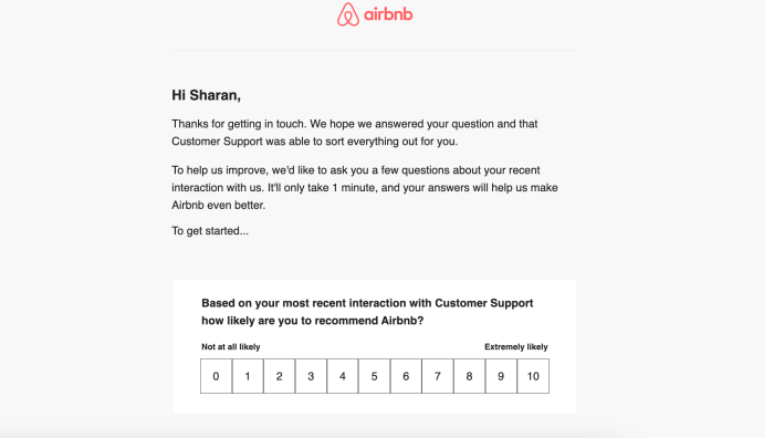
Airbnb sends NPS surveys to guests shortly after their stay is completed. This timing allows them to capture fresh impressions while the experience is still vivid in the guest's mind.
The platform also uses NPS surveys following customer support interactions. This helps them assess the effectiveness of their support team and address any issues promptly. The survey typically asks, "How likely are you to recommend Airbnb to a friend?" on a 0-10 scale.
Want to create NPS surveys for your products?
See how Chameleon can help you create NPS surveys in seconds!
NPS survey questions
NPS surveys rely on a single core question to gauge user loyalty. Here's that core question:
On a scale of 0-10, how likely are you to recommend [app name] to a friend or colleague? (0 = Not at all likely, 10 = Extremely likely)
However, to gain even richer insights from NPS surveys, you can consider including an optional follow-up question based on the user's score:
For promoters (scores 9-10): Why are you so likely to recommend [app name] to others? (Open-ended)
For passives (scores 7-8): What could we do to make you more likely to recommend [app name] to others? (Open-ended)
For detractors (scores 0-6): What can we do to improve your experience with [app name]? (Open-ended)

Make your NPS surveys count
Get highly relevant feedback by using Chameleon to send your surveys in-app
3. Customer satisfaction (CSAT) surveys
These surveys are quick satisfaction checks for specific moments within your app. They are like friendly taps on the shoulder after a user completes a task, like a purchase or using a new feature. These instant customer experience surveys help you understand how happy users are with specific interactions, in real-time.
Targeted timing: CSAT surveys pop up after key interactions, like finishing a purchase or contacting support
Simple & quick: they typically use a single question or a smiley scale (e.g., Very Satisfied / Somewhat Satisfied / Not Satisfied) to gauge user sentiment
Actionable feedback: you can identify areas where the app experience might be bumpy, allowing you to prioritize improvements and ensure a smooth ride throughout the user journey
CSAT survey example
Netflix uses a simple CSAT survey that asks users "What's it like so far?" with thumbs up or thumbs down options. This quick feedback mechanism helps Netflix gauge user satisfaction with the content they are currently watching, allowing them to suggest more relevant programs and films based on the user's preferences.

CSAT survey questions
How satisfied were you with the ease of completing your purchase today? (Smiley Scale: Very Satisfied / Somewhat Satisfied / Not Satisfied)
How helpful was our knowledge base article in resolving your issue? (Multiple Choice: Very Helpful / Somewhat Helpful / Not Helpful)
On a scale of 1-5, how easy was it to find the information you were looking for? (Scale of 1 = Very Difficult, 5 = Very Easy)
How satisfied are you with the speed and quality of our customer support response? (Multiple Choice: Very Satisfied / Somewhat Satisfied / Not Satisfied)
4. Customer effort score (CES) surveys
CES and CSAT surveys can seem very similar at first glance. Both aim to understand user experience, but there's a subtle difference in their focus.
CES measures the perceived effort required to reach that outcome. It asks questions like "How much effort did it take you to complete your purchase?" A CES survey focuses on the ease or difficulty of using a specific feature or completing an action.
CES survey example
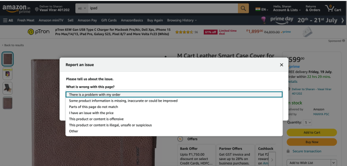
Amazon uses a CES survey to understand how easy it is for customers to resolve issues. The survey asks users to report an issue with their order, providing options like "There is a problem with my order," "Some product information is missing, inaccurate or could be improved," and other specific issues. This helps Amazon gauge the effort required by customers to address their problems.
CES survey questions
How much effort did it take you to find the information you were looking for today? (Scale of 1-5: 1 = Very Easy, 5 = Very Difficult)
How easy was it to complete your purchase today? (Smiley Scale: Very Easy / Somewhat Easy / Difficult)
How much effort did it take you to contact customer support? (Multiple Choice: Very Easy / Somewhat Easy / Difficult)
While CES surveys typically focus on closed-ended questions with a predefined scale, an optional open-ended follow-up question can provide valuable context from users:
If you selected 'Somewhat Difficult' or 'Difficult,' what information were you looking for that you couldn't find easily? (Open-ended text box)
5. Feature request surveys
Feature request surveys are essentially conversations with your users where you ask them what new functionalities they'd love to see in your product.
These surveys benefit you in a few ways. First, they help you identify areas where your product might be lacking. This gives you valuable clues on how to make your product more user-friendly and address their needs.
Second, these surveys help you prioritize what to build next. By understanding which features users crave the most, you can focus your development efforts on the things that will have the biggest impact on their satisfaction.
Feature request survey examples
Spotify gathers user feedback through a community board where users can submit feature suggestions and vote on others' ideas. When a suggestion gains enough votes, it is reviewed by the Spotify team. Users must be logged in to participate in submitting ideas or voting.

Feature request survey questions
What features would make your experience with [app name] even better? (Open-ended)
Imagine you could add one new feature to [app name]. What would it be and why? (Open-ended)
Is there anything missing from [app name] that makes it difficult for you to achieve your goals? (Open-ended)
What existing features in other apps do you wish [app name] had? (Open-ended)
What problem are you currently facing with [app name] that a new feature could help solve? (Open-ended)
6. Churn surveys
Churn surveys are like exit interviews for your app. They're conducted with users who have decided to stop using your app, aiming to understand the reasons behind their departure.
Creating effective churn surveys requires a balance between gathering valuable information and not being overly intrusive during a user's departure. Here's how to strike that balance:
Keep it short & sweet: users who are leaving are likely frustrated. A concise survey with a few key questions is more likely to be completed.
Focus on open-ended questions: instead of multiple-choice options, use open-ended questions like "What prompted you to stop using [app name]?"
Offer a way to reconnect: include an optional field where users can leave their email address if they'd be open to hearing about improvements or potential win-back offers in the future
Churn survey example
Netflix's churn survey collects feedback from users who have canceled their membership. It asks for reasons behind the cancellation, offering multiple-choice options such as lack of time, insufficient quality content, poor value for money, preference for other streaming services, and high cost.

Churn survey questions
What was the main reason you decided to stop using [app name]? (Open-ended)
Were there any specific features or functionalities that you found lacking in [app name]? (Open-ended)
How can we improve your experience with [app name] to make you consider coming back? (Open-ended)
Did you find another app that better meets your needs? If so, what was it and why? (Open-ended)
Is there anything else you'd like to share about your experience with [app name]? (Open-ended)
7. Product-market fit surveys
Product-market fit surveys ask about the value your product provides. They assess if it's essential to customers.
The goal is simple: see if your product is the party people crave.
You’d ideally want a high percentage (maybe over 40%) of users to say they'd be very disappointed without your app. This suggests you've achieved product-market fit—your product resonates deeply with your target audience.
Product-market fit survey example
Superhuman, an email client, used the Sean Ellis Test or the "40% Test" to measure product-market fit (PMF). They asked users how they would feel if they could no longer use the product, with options ranging from "very disappointed" to "not disappointed." Initially, only 22% of users said they would be "very disappointed," below the 40% benchmark.

By focusing on feedback from users who were "somewhat disappointed," they improved their product and eventually reached a 58% "very disappointed" rate, indicating strong PMF.
Superhuman sent a link to a Typeform survey asking users the following four questions:
1. How would you feel if you could no longer use Superhuman?
A) Very disappointed
B) Somewhat disappointed
C) Not disappointed
2. What type of people do you think would most benefit from Superhuman?
3. What is the main benefit you receive from Superhuman?
4. How can we improve Superhuman for you?
Product-market fit survey questions
In your own words, what problem were you hoping to solve by using [app name]? (Open-ended)
How likely are you to recommend [app name] to a friend or colleague? (Scale of 1-10: 1 = Not Likely, 10 = Extremely Likely)
What are the most valuable features of [app name] for you? (Open-ended)
Imagine you could change one thing about [app name]. What would it be and why? (Open-ended)
How can we improve your experience with [app name]? (Open-ended)
Simply throwing questions at users won't yield the best results. Let’s look at some best practices to help you gather meaningful feedback and turn it into actionable data.
7 In-app survey best practices
Get more from your users. These seven in-app survey best practices ensure a high response rate, and capture targeted feedback from your user base.
1. Set an objective before designing your in-app survey
Just like any product development process, creating in-app surveys requires a clear objective. Before you write a single question, define what you want to achieve with your survey. Are you trying to:
Measure user satisfaction with a new feature rollout?
Gauge the effectiveness of your app's onboarding process?
Identify pain points that users encounter during specific tasks?
A well-defined objective will guide the entire survey design process, from question formulation to data analysis.
2. Trigger surveys at user journey milestones
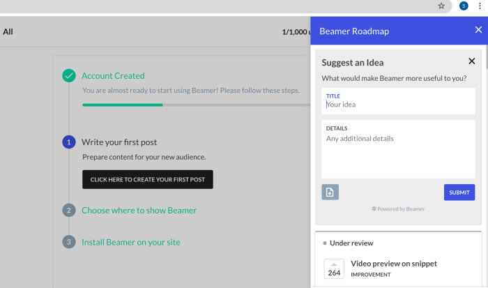
When you’re building an in-product user survey, you should consider your user's journey.. What user actions should trigger an in-product survey to appear? When does a user’s action indicate that they could provide valuable feedback on a specific feature?
One of the biggest mistakes we see with in-product user surveys is asking questions too early. If a micro survey appears immediately after a user decides to start using a specific product feature, how are they going to be able to provide usable feedback?
It’s all about catching the sweet spot. You want to give your users enough time to experience a particular feature before a microsurvey is instigated, asking for feedback on it. To ensure this, you should identify a specific action that a user must take within the product to trigger the survey’s appearance.
3. Keep surveys short and focused
When you limit the length and scope of your surveys, you're more likely to capture users' attention and maintain their engagement throughout the process. Short, focused surveys lead to improved completion rates as users are less likely to abandon the process midway.
Our benchmark report found that the optimal number of buttons to use for the best completion rate is three. On average, multi-button surveys with three options had a completion rate of 40.2%. In fact, users will leave you more feedback if you use a "Comments Step" after the initial question—and 59.7% of survey takers will!

Remember, shorter surveys reduce cognitive load on users, making it easier for them to participate without feeling overwhelmed or distracted from their primary task within the app. This is particularly important for mobile users, where screen space is limited and users may be on-the-go.
4. Use a progress bar to indicate completion rate
A progress bar is a visual UX element that taps into the human desire for completion. As users see the bar fill up, they feel a sense of accomplishment and are more likely to persevere through the remaining questions.
This is particularly useful for longer surveys where users might otherwise become discouraged or lose interest. Consider using color or animation to make the progress more visually appealing and engaging.
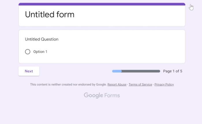
Having the ability to customize the layout and format of your in-product surveys can help you to ensure that they fit appropriately within the user interface.
Nobody wants their in-product user surveys to feel like they’re part of a third-party plugin. This is why we give you the tools to blend your surveys in with the rest of your product, making them feel both natural and native.
(Hint: Do you understand why we’re called Chameleon now?)
5. Ask a mix of open-ended and close-ended questions
Close-ended questions, like multiple choice or rating scales, are excellent for collecting specific, measurable data. They're quick for users to answer and straightforward to analyze, making them ideal for tracking trends or comparing responses across different user segments. However, they can sometimes limit the range of possible responses.
Open-ended questions, on the other hand, give users the freedom to express their thoughts in their own words. These questions can uncover unexpected insights, reveal user sentiment, and provide detailed feedback that might not be captured through pre-defined options. They're particularly valuable for understanding the 'why' behind user behaviors or preferences.
6. Target the right user segments for contextual feedback
User segmenting is an important factor to consider when writing questions. It begins with understanding the value proposition of your product: Who are you trying to help, and what problem do you solve for them?
If you can answer these questions, you will be able to create questions for your in-product survey that focus on your target market’s goals and objectives. From the feedback, your product team will be able to continue the development of new features to increase the value proposition for users.
7. Run tests before launching your in-app survey
Before rolling out your in-app survey to all users, you must conduct thorough testing. This step helps identify and resolve any issues that could potentially compromise the survey's effectiveness or negatively impact the user experience.
Start by having team members take the survey themselves, paying attention to the flow, clarity of questions, and overall user experience. This internal review can catch obvious issues and help fine-tune the survey's content. Next, consider running a pilot test with a small group of actual users. Pay close attention to technical aspects such as load times, mobile responsiveness, and proper data collection.
Build high-response, in-app surveys and gain user insight with Chameleon
By carefully considering audience, survey timing, question clarity, and incentives, your product team can create surveys that deliver actionable results.
Chameleon empowers you to rapidly deploy and optimize in-app microsurveys. You can select from a library of pre-built templates or design custom surveys using our intuitive, no-code editor.
Don't just build a product. Build a relationship.

Run product surveys with Chameleon
In-app Microsurveys allow you to capture important user feedback when it's most relevant
