When building a product, you’re equally building a reputation. And the success of one is dependent on the other.
Users judge your product with every interaction they have. So if you provide experiences that are ineffective, annoying, distracting, or irrelevant, users quickly stop seeing value and you start to lose your reputation. And with the array of tools on offer, users may stop using your product altogether, as they bypass yours for another.
So even if your product is the bees’ knees, if the user has bad experiences, they won’t come back.
Let’s hear what Chameleon’s CEO & Co-Founder, Pulkit Agrawal, had to say about this during a webinar we recently ran on the topic of how to launch engaging in-product experiences, featuring Ryan Koonce, CEO and Founder of Mammoth Growth.
So whether you’re starting to build in-product experiences from scratch, improving what you currently have, or trying something new—here’s our guide to help you better engage with your users, drive product success, and build that reputation that aligns with your product.
When should you engage with users?
Let’s start with why you’ll want to communicate with your users in the first place, and when is the right time to begin.
👋 User onboarding
Start from the very moment a new user enters your product for the first time. Craft a compelling, personalized onboarding flow to guide them through the first steps and help them find their way around.
But the onboarding doesn’t stop there. With product tours, onboarding checklists, and additional guides, you can help your existing users transition through upgrades and engage with new features.
Whether it's to activate new users or convert trial users to customers, great user onboarding drives product adoption.
Browse our articles on user onboarding to learn more.
🚀 Self-serve support & product-led growth
According to Statista, 88% of US customers expect brands and organizations to have an online self-service support portal.
As users increasingly want to learn tools and find their way to “aha” moments on their own, providing self-serve options that are clear, convenient, and timely is critical to achieving product-led growth.
🔔 Product marketing & feature engagement
Traditionally, product marketers focused on supporting sales teams with positioning and messaging collateral. However, we’ve seen a huge shift into taking ownership of feature engagement, adoption, and driving announcements in-product. For example, at Chameleon, we’ve seen many customers succeed using their product to drive webinar registrations.
💬 Continuous feedback
Whether you want to check the pulse on customer satisfaction, discover your NPS score, or gather users’ opinions on a new feature you just launched, continuous feedback is crucial for your product success.
You can use contextual Microsurveys to identify friction, drive conversational feedback at scale, and fuel your feedback loop. This will help you ask the right questions at the right time and start implementing changes backed by user insights.
Dive deeper into the topic of continuous feedback on our blog.
Best practices for in-product experiences
So how do we know what great in-product experiences look like? The proof is in the pudding.
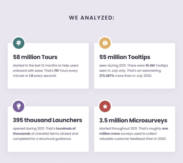
For our latest Benchmark Report on in-product experiences, we analyzed 300 million data points across Chameleon’s four products in 2021, to bring you insights into exactly how users interact with products, and show how others are successfully building in-product experiences.

Download the In-Product Experiences Benchmark Report
Improve your in-app messaging and scale self-serve success with data and insights from 300 million user interactions with Chameleon Experiences. We'll send the Report to your inbox!
Here’s a breakdown of the data we collected:

Let’s deep dive into the stats and best practices for each format of in-product experiences!
Tours
A poll that we run during our recent webinar with Mammoth Growth found that 90% of users will immediately close a tour if it appears when they first enter a product.
Why? Because most people want to try a product first themselves before they’re offered support. So it’s your job, albeit sometimes a tricky one, to figure out when the time is right to offer that support, and how exactly you’re going to do it.
Here are some key starting points:
1. Keep them short
Our data shows that 3-step tours have a 72% completion rate, closely followed by 4-step tours (45%) and 2-step tours (42%). Bear in mind, this is an average, and you’ll need to work out what works best for your users. This is where the next tip comes into play…
2. Experiment and optimize with data
“Everything comes down to benchmark, test, and optimize. The key is to get the data right,” believes Ryan Koonce. Let’s hear his thoughts on this.
Use good analytics tools in your product stack that give you access to critical data.
This enables you to better understand the customer journey, and make smart decisions that drive real value, based on evidence rather than guesswork. Chameleon has deep integrations with analytics tools like Heap, Mixpanel, Segment, and Amplitude to sync data across your tools, so you can test and optimize more effectively.
3. Include video
Video lengthens tour engagement by 30 seconds. Keep them short, and use them as a tool to motivate users to get excited about what you do. Use the right story with the right messaging to drive the action that you want the user to take next.
4. Cut, cut, cut copy
Steps with around 25 words are the most effective. Ensure you have scannable copy—two lines maximum—and a title that is relevant, valuable, teaches the user something, and provides enough information to keep them moving forward.
Tooltips
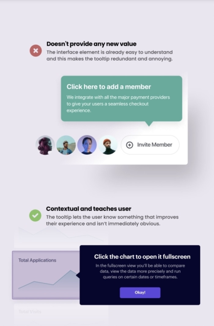
Tooltips are one of the most popular in-app messages built with Chameleon—45% of our customers use them. They’re simple to build and provide a good entryway to learning more.
Here are some pointers:
Use them to introduce a new feature or piece of content, or as an idea validation tool
Use hover on/off function so that they remain unobtrusive
Include a button with a link to where the user can easily get more information

Microsurveys
Microsurveys help you gather continuous feedback inside your product and keep track of health metrics throughout the user lifecycle. The average Microsurvey with Chameleon has a completion rate of around 60%. Keep these points in mind when building them:
1. Segment users to reduce noise
Once you’ve got your tooling set up, you can collect and use data to personalize content and target specific users. This helps keep the focus on specific subsets of users, reduce the fatigue around answering, and minimize the likelihood of irritation.
Let’s hear specific advice from Ryan:
Psst… with Chameleon, you can segment your users and use rate-limiting to set how frequently a user receives a message. You can also automatically turn off Microsurveys after you’ve received a certain number of responses, helping to minimize noise. Try it out yourself.
2. Only use Microsurveys when necessary
As Ryan puts it: “Ask yourself what the point of the survey is. Is the question you’re asking relevant to you growing your business? Ask whether you really need to ask your users this, or whether you can look at the data and figure it out.”
3. Experiment with reframing questions
If your completion rates are low, it’s worth revisiting to try and work out why. One reason could be that the questions aren’t resonating with users. Perhaps they don’t think they’re relevant, understand why you’re asking, or see any value for them.
So think about how you frame each question. You could try positioning it around how the feedback will help improve the product for them, or perhaps how it will help give more personalized resources.
4. Set up a Slack channel
Integrate your Microsurvey tool with Slack so that responses feed automatically into specific channels. This provides visibility across the team so that everyone can learn at the same time, without relying on a single person to relay important information.
Launchers
Launchers tick all of the self-serve boxes with a single in-product widget. People can choose what they want to learn and they’ll know where to go to get it.
Our top tips for effective Launchers:
Customize Launchers with your branding so they look and feel native.
Build different Launchers for different pages to target subsets of users with specific pieces of support (you can do this with Chameleon!)
Use a checklist to break them up in a way that’s easy and fun to complete.
Set expectations upfront by making them easily recognizable with an identifiable icon or text that triggers the Launcher to open.
Best of the best practices
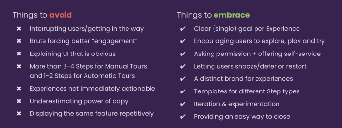
There are a lot of best practices, so don’t feel overwhelmed. Start small, and choose a few to focus on that will drive impact quickly.

Here’s some to get you started…
1. Avoid brute force
Pulkit advises: “With every experience you’re designing, ask yourself: Am I really providing useful information to a user? Or am I just trying to force engagement?”
Let’s say you’re designing a lightbox, but your users just aren’t clicking on it. It’s unlikely that you need to make it any more obvious than it already is. Instead, try putting yourself in the users’ shoes—perhaps they’re confused, anxious about what it will do, or simply too busy. Then use this information to help them overcome that friction point and drive conversion.
2. Embrace building a distinct brand
Establish brand guidelines around your in-product experiences, to help create consistency so users know what to expect.
“Particularly as companies get bigger, you have more and more people with their hands in the kitchen, and you want to have a consistent experience. Knowing that you're going to use certain colors, or certain types of interactions, can make a big difference in how the users perceive the value of those things,” suggests Ryan Koonce.
With Chameleon, you can set up templates and your custom CSS. Plus you can adjust permissions to restrict who can publish, ensuring that experiences are always on-brand.
3. Embrace letting users snooze and close
One of the main principles of good self-serve is timing—users need to receive help at a time that’s right for them. If they’re smack bang in the middle of something urgent, they’re never going to absorb any piece of guidance, no matter how helpful. By letting users snooze a message, they can defer learning to a time that’s right for them.
How to implement best practices effectively
Now you’ve got your key best practices, here’s how to put them into progress:
Don’t do everything at once; one goal at a time
Set your goals beforehand
Measure your in-product experiences effectively
Keep user experience top of mind; always add value
Collect the right data to help you improve
Create segmented audiences and personalize content
Providing dynamic in-product experiences helps users onboard and discover key features at a time it’s right for them.
If you want more advice from our pros – Pulkit and Ryan – tune in for our on-demand webinar! 👇

🎥 Webinar: How to launch engaging in-product experiences
Learn how to craft optimal in-product experiences throughout the user journey to increase activation, adoption, and retention.


