More design and styling options to drive attention to key features
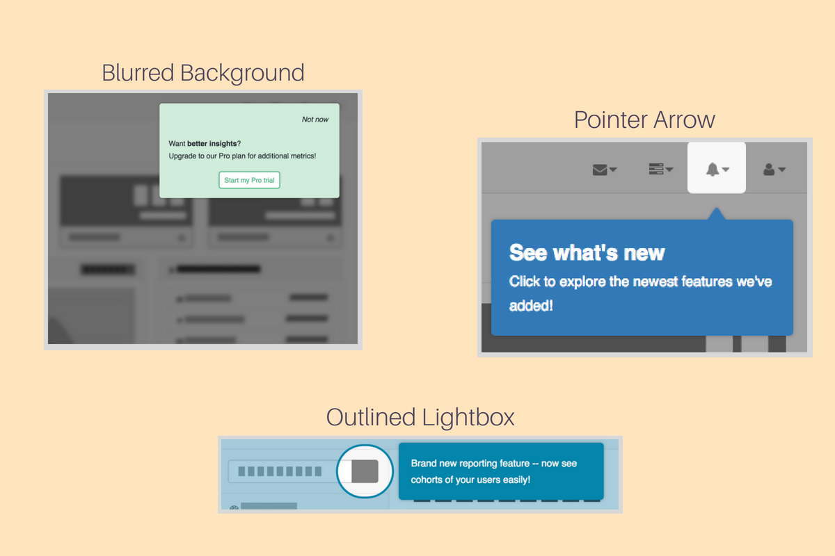
We just launched more design patterns you can use to highlight parts of your app and help create visual cues in the interface that tell users more about the elements they’re looking at.
Some of the new design patterns include:
- Pointer arrows
- Blurred backgrounds
- Outlined lightboxes
Let's break down each design pattern and discuss how and when to use them in your tours.
Pointer arrow
Point users to specific elements on your page by using a pointer arrow with your tooltips and make it clear what you are referencing in the app.
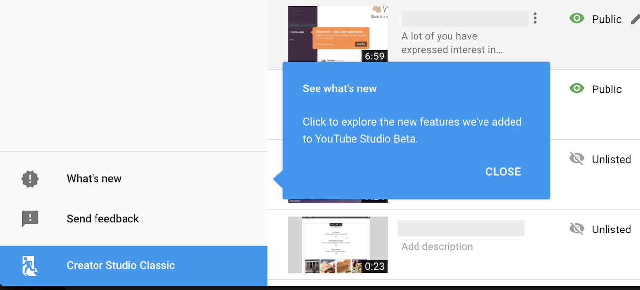
How to add in Chameleon To add a pointer arrow go to the Focus tab and select Point Toward Element = Yes.
Check out more tooltip examples and inspiration.
Blurred background
Adding a blurred background allows your users to focus on elements that are in focus and ignore elements that aren’t.
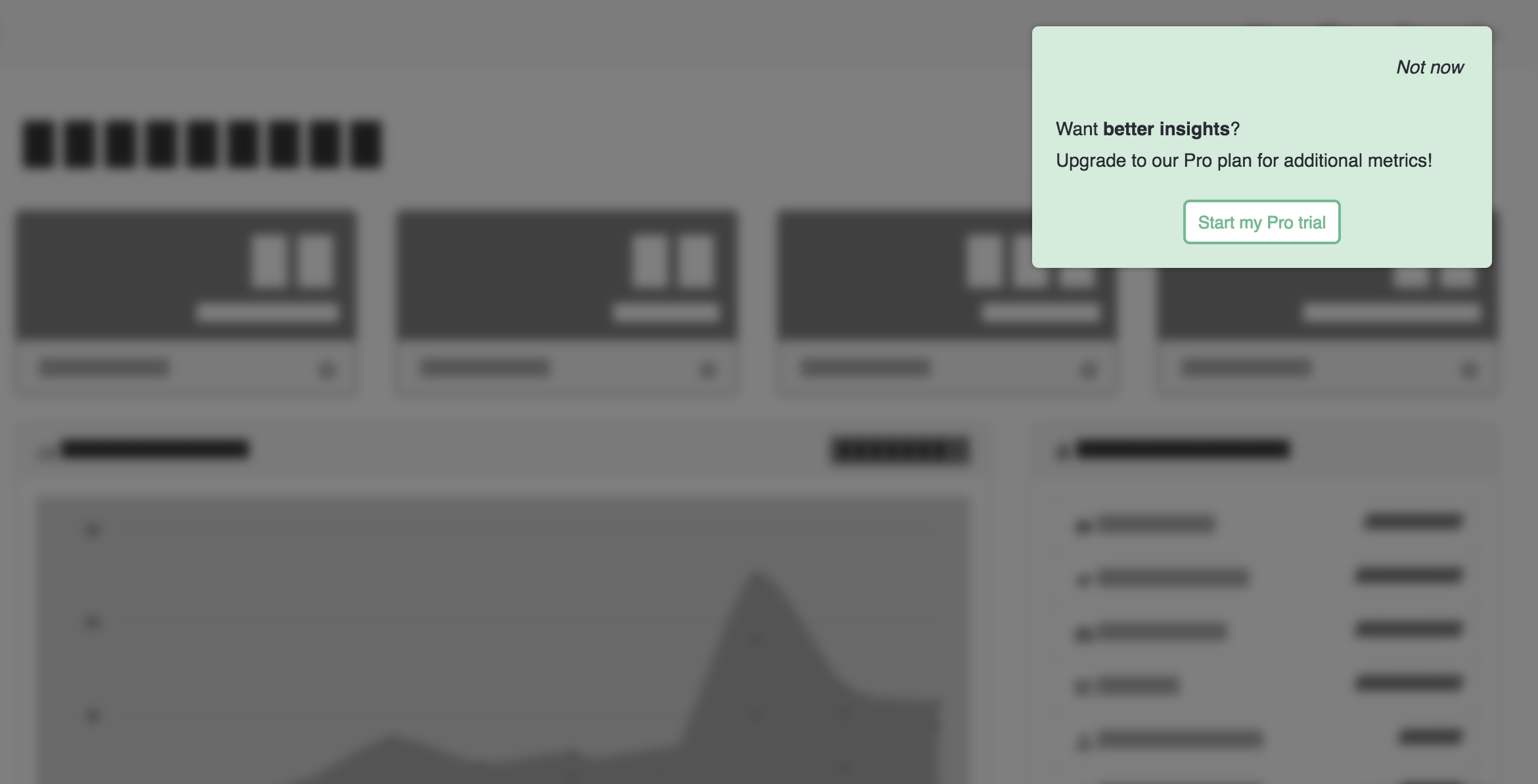
💡 Use case: For gated features create a modal with a blurred background that prompts users to upgrade or start a trial when they interact with a feature or page they don't currently have access to. Adding the blur leaves a little mystery and entices the user to want to discover what they might be missing.
How to add in Chameleon To add a blurred background go to the focus tab and select Add Page Overlay = Yes and adjust Blur value.
Outlined lightbox
Create an outline around an element when you want to make it very clear what you are referring to on the page.
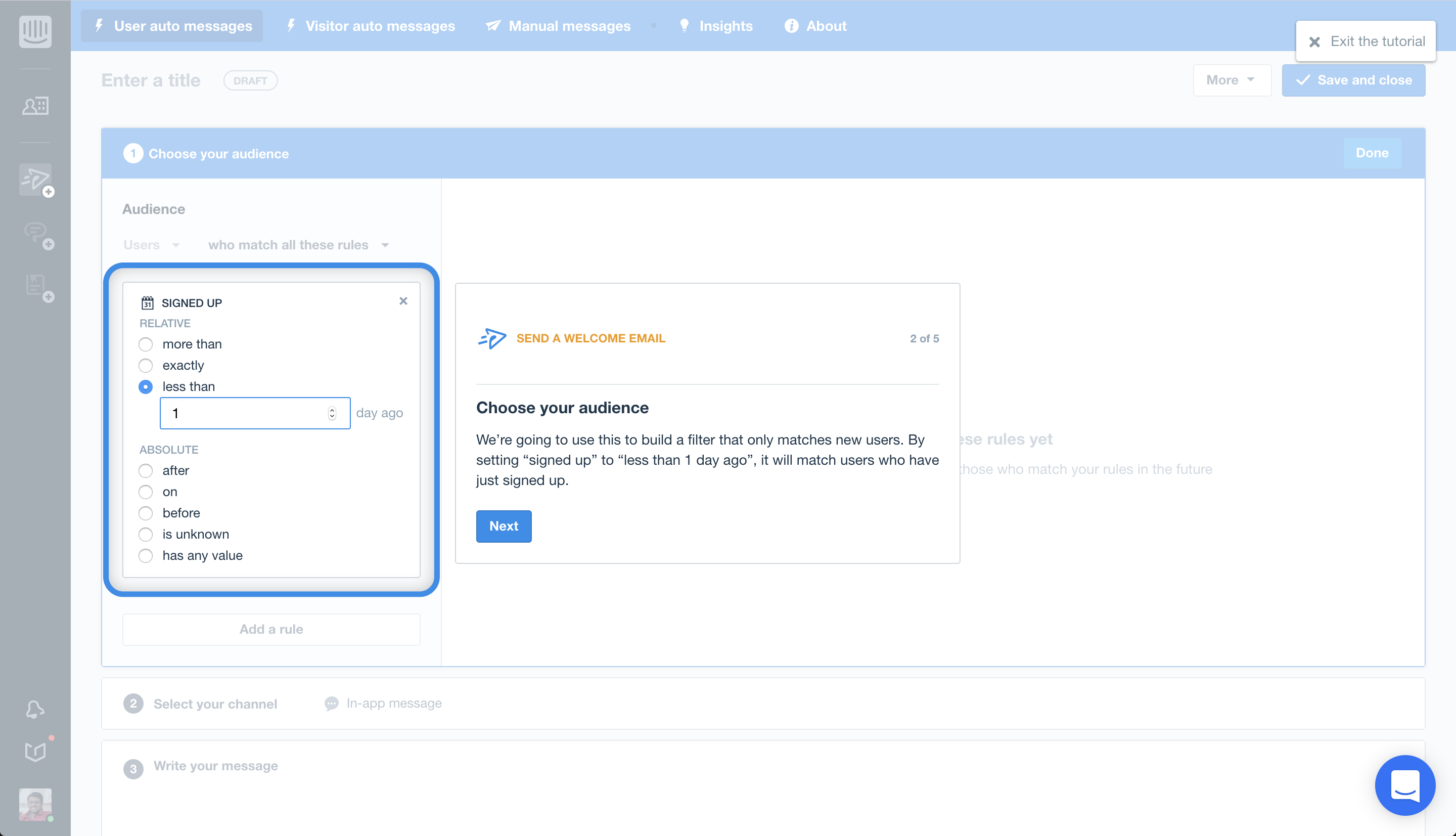
How to add in Chameleon To add an outline to your lightbox go to the focus tab and select Add Highlight = Lightbox then in configure highlight adjust the border width value to add an outline.
To learn how to configure these highlight options in Chameleon check out our help doc on how to add overlays and highlights to your page.


