Onboarding flows are the backbone of lowering customer churn and the secret behind customer success. They’re your product’s first impression on a new customer and can be pretty tricky to get right. They need to adapt to your users, thread through your user interface, and they’re not a one-time thing.
Look at this article as an onboarding flow to onboarding flows. We’ll guide you through what they are, how they differ, and what makes a great flow. We'll also share some of our favorite onboarding examples in the SaaS world.
By the end of this article, you’ll understand everything you need to know on the topic. Get ready; it’s meaty.
Onboarding flows are a way to introduce new users or current customers to a user interface or new feature.
The best onboarding flows typically combine a series of steps to convey the right message at the right time.
An onboarding flow doesn’t begin the moment someone logs on to your platform. It also doesn’t end when your onboarding tour ends. It's a continuous process spanning a user's lifecycle.
Define your onboarding goals and then use different methods to hit those goals. Some of the methods include using video, images, and GIFs, creating product tours, offering additional information with tooltips, or letting users learn by doing.
Remember, the best onboarding experiences put the user first and are goal-driven. Check out nine excellent examples from SaaS companies for inspiration.
Recap: what are user onboarding flows?
“Hey Siri, what’s an onboarding flow?”
Onboarding flows are a way to introduce new users or current customers to a user interface or new feature. Onboarding flows differ depending on the user’s platform. For example, a mobile user onboarding flow will look very different from a desktop user flow.
The best SaaS onboarding examples typically combine a series of screens to convey their message; these are called onboarding screens or modals.
Different users, different onboarding flows
There are often different goals behind a user onboarding flow. These goals largely depend on what your user has experienced in the marketing and sales process. User onboarding flow goals are:
“Aha!” moment-focused: If you’re aiming to fight churn with your onboarding flow, then flows focusing on product benefits are your way to go. Help users realize benefits, assure them why they are here, and keep them around long enough to reach their “aha!” moment.
Feature-focused: Onboarding flows don’t always revolve around product education for new users. They often help onboard new features to current users.
Success-focused: This type of onboarding flow is extremely tool-specific. It educates users on how to navigate the product interface and get the best out of the tool.
Account-focused: This flow type is largely product-dependent. If account creation is critical for user success, this type of flow is what you need.
🤫 Psst. A great onboarding example can and should be a combination of all the above…
🎬 Webinar: Onboarding with a Human Touch
Join Chameleon and Demio for a comprehensive look at how to personalize your user onboarding effectively, at scale, to empower and evangelize your customers.
The user onboarding flow journey
An onboarding flow doesn’t begin the moment someone logs on to your platform. It also doesn’t end when your onboarding tour ends. An onboarding flow is a lot longer than many think. It’s more a marathon than a sprint.
User sign-up: Winning onboarding examples start the moment someone signs up for your product, whether they’re signing up for a free trial or a paid plan. The user experience during sign-up and activation sets the tone for their entire experience. You can also use the sign-up process to highlight product benefits and nudge people to sign-up completion.
User log-in: This is the real meat of your onboarding flow. When someone first logs in to your product, you’ll need to guide them through your interface with onboarding screens. Show users around their new place. Don’t overwhelm them with information; provide a stellar welcome page, and make sure people are comfortable.
User lifecycle: Even the best of product teams tend to think new user onboarding ends at the end of a welcome journey. Uh-uh. Onboarding is a lifestyle. You'll constantly be onboarding even existing users to new features and tool evolutions throughout their customer lifecycle. That is how you not only drive activation, but also user retention.
Now we’ve covered the three phases of onboarding users, it’s time to look at some practical methods to build an onboarding flow that keeps users around for the long haul.
What makes a great user onboarding flow?
In short: a lot. You can use many methods to optimize your onboarding process and build a killer app intro and an overall user onboarding flow (we’ll look at some top onboarding examples using these shortly). How you prioritize these methods is dependent on the goal of your flow. So, before you get into them, ask yourself: what are you trying to achieve with onboarding?
If you’re ever unsure what you’re trying to achieve and can’t figure out why users are churning during the meat of user onboarding, use in-product surveys to get to the bottom of your quantitative data and ask users what’s pushing them away.
Define your onboarding goals and then use the following methods to hit those goals.
Use video, images, and GIFs
Studies show that people remember 65% of the information when learning via image and text combos compared to retaining only 10% of information via copy alone. Research also shows using visuals in content ups a user’s desire to engage with the content by 80%.
That being said, there’s still a lot of weight in the written word—case-in-point: you made it this far in the article. Keep your users on their toes with your onboarding screens and give them a visual treat throughout their onboarding flow.
For example, everyone loves tacos but eating the same taco every day gets tiresome—even for the best of us. We want nachos, we want quesadillas, we want tequeños. Keep users full and content with variety.
Try product tours
Product tours that combine banners, modals, hotspots, and more are the perfect way for users to navigate through an education onboarding.
Some of the best onboarding examples use tours that trigger upon the first launch of a product. They can manage expectations and can help you hit many different types of onboarding flows we discussed earlier.
💡 Pro Tip: Be conscious of the number of steps you include in your product tour. After three steps, our research shows completion rates dip from 72% to 45%.
Stay on brand
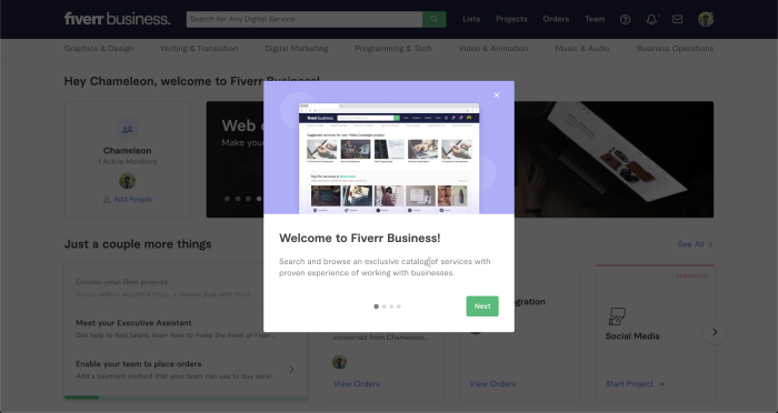
The best onboarding flows remember who they are. It’s important to take a holistic view of your onboarding lifecycle. Trust-building comes through consistency. Consistent branding has proven to increase revenue by 23%.
It may be the case that different teams are writing and publishing different onboarding screens depending on where in the lifecycle they’re needed. Make sure these flows are headed up or at least checked by one team/role. Product or marketing teams are usually best to do this and can help ensure your tone of voice, images, colors, and visual design are consistent.
Keep messaging clear
Your Guide To Onboarding Flows: Complete With Examples For 2024
Writing is hard, tricky. Giving directions is complicated tough, but manageable—as long as you keep things clear.
Think: writing for aliens. Avoid industry jargon, and presume nothing. Keep your onboarding flows short and sweet, and back your point up with images or videos if you’re struggling to convey your message succinctly with copy. Check out some onboarding examples that do this well.
Introduce tooltips
The customer lifecycle is long (hopefully), and you can’t expect people to consume all of your product information in one go. Tooltips are a great answer to this problem.
Feed your users small prompts and helpers throughout their onboarding flow experience with you to remind them of what something does and become a more successful user of your product.
Stay customer-centric
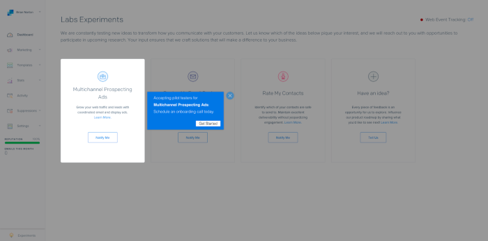
Customer-centric onboarding flows are successful ones. What goals does your user have, and how can you help them achieve that? People will need different things. It’s up to you to identify needs and create tailored onboarding flows to answer these needs.
It can be easy to want to showcase every feature that your product has in its toolkit. Hold some of your trump cards back, and direct users to key "aha!" moments in their journey. In time you can introduce more to encourage discovery and keep knocking their socks off—the user experience comes first.
Let users learn by doing
“Friction is a good thing.”
“Who said that? Off with their head!”
No, no, hear us out. A certain amount of friction can be a good thing; your users should be working hard. This method enables users to learn by doing and will set them up with more confidence when left to their own devices. This ties in with the IKEA effect. This theory dictates that:
“Invested labor leads to inflated product valuation”
You go through phases of excitement, frustration, and reflection while building your sofa bed, new workflow, or social queue until you reach the end goal, which is a finished product that you can look at and proudly say, "I made that and it's brilliant!”.
Keep the entire flow in mind
Remember what information users have already seen. It can be a pain to read the same message more than once and doesn’t look great on your brand. Simultaneously, if you bring a story-telling element to your onboarding experience, you can continue building off a theme or punny throughout the entire journey.
Communicate through all channels
Last but certainly not least, great onboarding flows are omnichannel.
Where are your users?
What communication tools are they using?
Are they using one communication method more than others?
Are they likely to use a channel more or less at certain points in their customer lifecycle?
Identify these points and build an onboarding flow that optimizes the channels you have available to you.
✅ Onboarding flow build methods are now checked off our list. Let’s get into some of those brands putting them into practice.
9 excellent user onboarding flow examples
Ready for some of our favorite onboarding examples? We’re not supposed to have favorites—we love all onboarding flows. However, these are top of the list, and with good reason. Find an onboarding example that resonates with you and adapt it to your flow.
1. Airtable focuses on their “aha!” moment
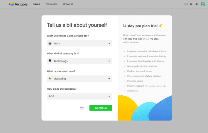
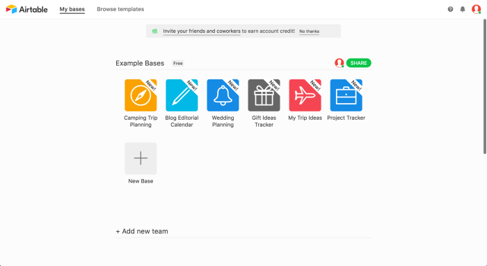
Airtable is on to a winner with this product onboarding example. The onboarding screen collects personal information so that they can customize every Airtable base to match user goals. This pushes users toward "aha!" moments and reduces the friction of creating airtables from scratch. Users can start gaining value from the get-go.
2. LinkTree provides a visual treat
(Source)
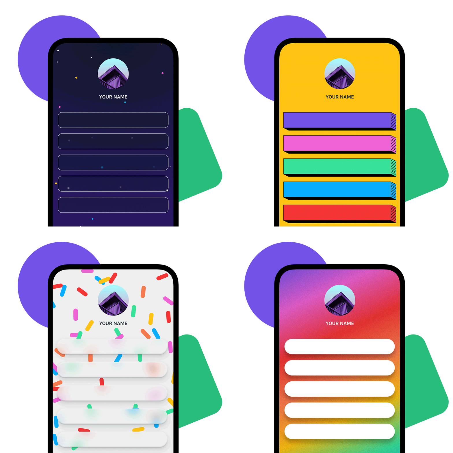
Onboarding flows from the link distribution platform LinkTree are hyper-aware of their audience. Their users are savvy, smart, and social. Their onboarding flows need to pop as much as they should on a social feed, and all of them do exactly that.
3. Zendesk manages expectations
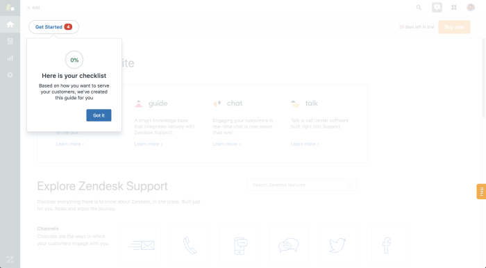
We are busy people; Zendesk is a tool for busy people. The product team at Zendesk introduced a progress bar to highlight how much more onboarding someone has to do and encourage them to finish. Best-in-class onboarding example!
4. Grammarly announces exciting features

Grammarly is constantly updating features and bringing the best service possible to its users. They introduce new features or upgrades using banners that you can explore, dismiss, or request to be reminded about at another time.
5. Joy highlights mobile capability
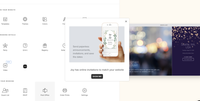
We’re a fan of the Joy onboarding flow for how they pack information into one modal. In this onboarding example, Joy lets their copy explain the app’s benefits, while their image lets desktop users know they can use it on mobile. Joy creates app onboarding that’s equal parts educational as it is affirmative.
6. Asana provides bitesize onboarding snacks
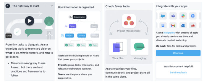
Asana tends to be very customer success orientated. If they want users to stay, they need to ensure they succeed with the tool. They have a permanent onboarding flow option on the left-hand side of the tool that delivers bitesize snippets of information, which become more advanced as your knowledge of the platform grows.
7. HubSpot uses tooltips for gradual onboarding
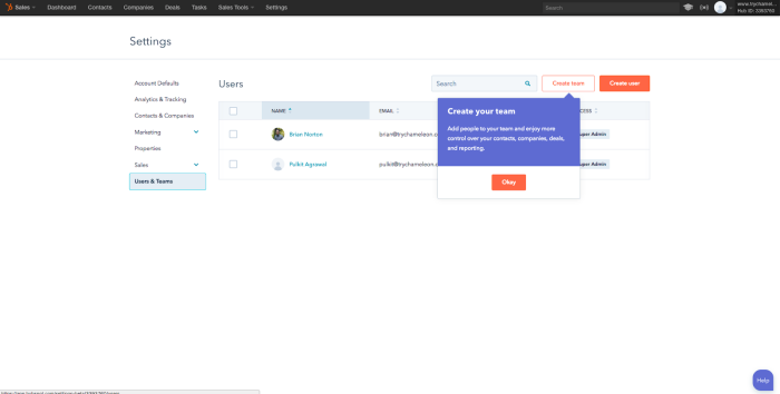
HubSpot provides a great onboarding example with its use of tooltips. They scatter tools and feature reminders throughout the platform, so users can continue to learn as they go without getting sidetracked from the task at hand.
8. DataCamp avoids unneccessary friction
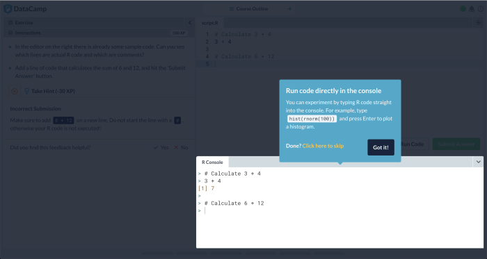
As we mentioned earlier, a certain amount of friction can be a great thing, and DataCamp sticks to that with this user onboarding example. They let their users learn by doing to complete the product onboarding flow.
9. Slack continually onboards
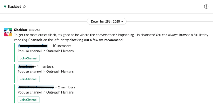
Slack is renowned for providing one of the best onboarding experiences out there, and here’s just one reason why.
The friendly Slackbot provides the story element to the entire customer lifecycle and onboarding flow. Users are constantly greeted with tips and tricks to succeed with the tool and can ask Slackbot for help if ever unsure. It’s like a company wiki within the app.
As you can imagine, we could be here all day sharing great onboarding examples. However, time waits for no one. So we’ll wrap things up here and hope these onboarding examples have inspired your onboarding flow efforts.
👉 If you’re still craving more, we’ve collected some top onboarding examples here.
It’s time to let your onboarding flow 💯
That’s a wrap – hopefully, you’ve got some cracking user onboarding examples to take on the road with you. Remember, the best onboarding experiences put the user first and are goal-driven.
Whether you’re onboarding first-time users with account creation flows or are updating current users on new features, you’re now ready to create an onboarding flow that works for all types of users. Keep it personal, keep it diverse, and give the people what they want!
Weekly advice to make your product stick 💌
Be the first to get the latest product best practices and resources

