Product redesigns are never easy: While your developers and designers are taking your product apart and putting it back together again, they're not building new features or fixing bugs. This can cost new and existing customers.
A common analogy for building a startup is: building the plane while trying to fly it. It's hard to continue to please existing customers who have the power to leave mid-flight and so the obvious motivation is to do whatever it takes to keep them engaged.
However, redesigning and rebuilding your product can be a necessary step in getting products from one stage of growth to another. And the best time to experiment to find the global maximum is early on; it only gets harder further down the road.
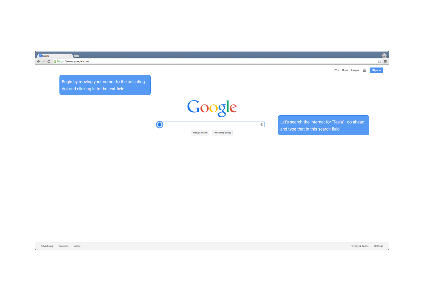
We've done several full teardowns of our product en route to building a more design-centric product as we've grown from a side project to a seed-funded company, and here is our story and learnings.
Building the first prototype
When we first started Chameleon, it was a side project. We'd seen that startups treated onboarding basically as a “set it and forget it” aspect of the product.
A/B testing websites, releasing new features and iterating on design were common practices, but sophisticated and dynamic user experience was hard to do. Engineers were too busy with core functionality and those responsible for user engagement (product managers, customer success managers, designers) did not have the tools to make quick edits on the live product.
After tens of research interviews, we saw the opportunity to build a product that made creating, testing and iterating in-app prompts without code possible (and easy).
Our big goal, early on, was to build a prototype that:
- would be functional for customers
- could be abstracted/generalized into a system
We worked with some early customers, including Mesosphere and Amplitude, to understand their requirements and build a customized version of the product for them.
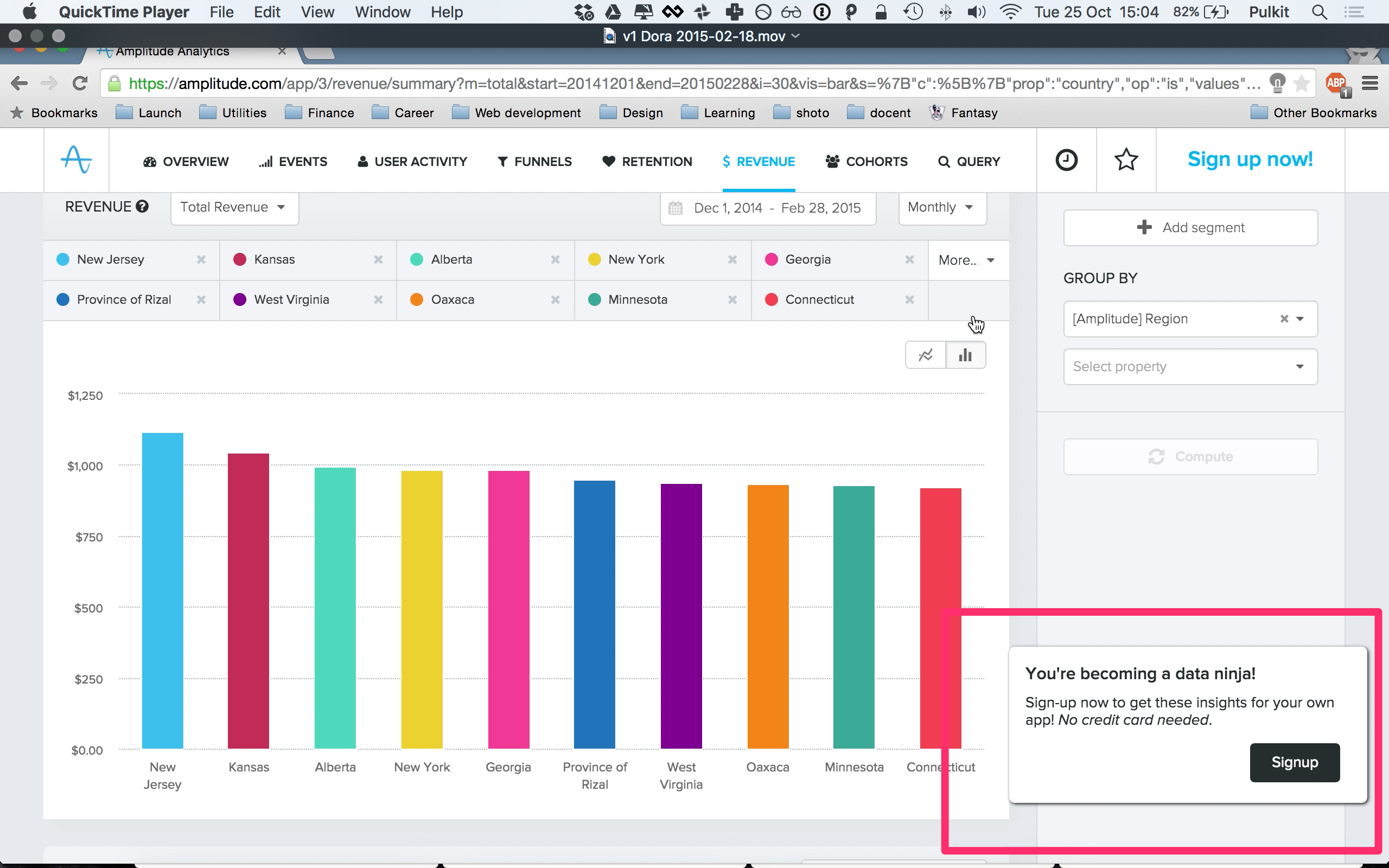
We focussed on the end user experience, and built a simple web app for the editing / controlling of tours. We used a simple jQuery library, bought a cheap Bootstrap theme, and built out the basic functionality we needed to let users create and edit tours:
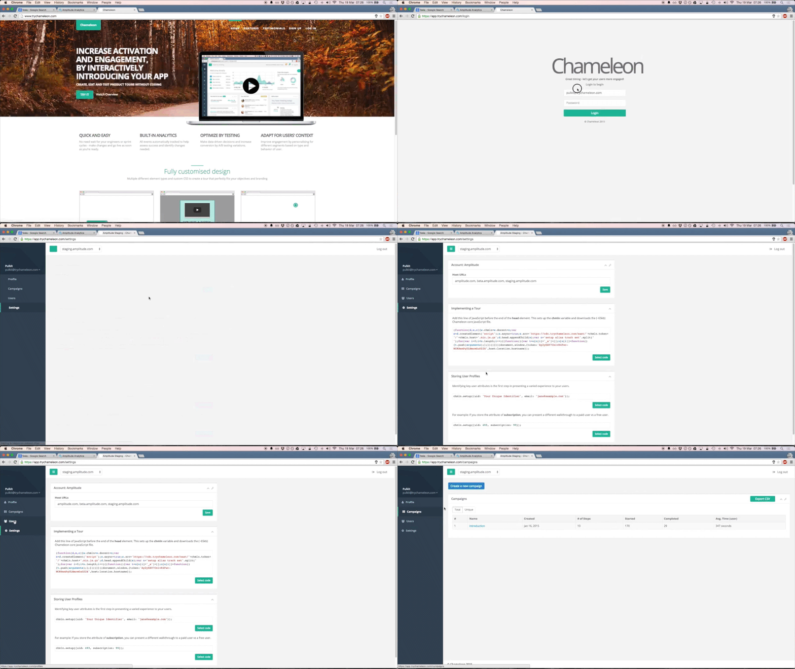
It was basic, but it got (some of) the job done. However building this quickly and getting real actionable feedback from our early customers was extemely valuable.
The prototype also helped us demonstrate early boostrapped progress, which helped us raise our $1.9m seed round.
How Squarespace inspired our product redesign
By the time we raised our seed round, we had competition in the space (which validated our approach). There was significant pressure on us to get our product out to market. We could have continued to build out our web-app and add functionality, but we were worried that we would lock-in to a sub-optimal framework.
We had not been able to dedicate enough energy into thinking about the design holistically or getting input from experts. However, the prototyping had taught us a lot and now our "intuition" was well-aligned to what our customers wanted.
We knew that it was important to provide a WYSIWYG experience, and give customers easy access to edit and update their tours.
One big inspiration for us at the time was Squarespace. In many ways it was analagous to our goal of providing a simple editing interface for building product tours. It also marketed itself as “the site maker that cared about design”.
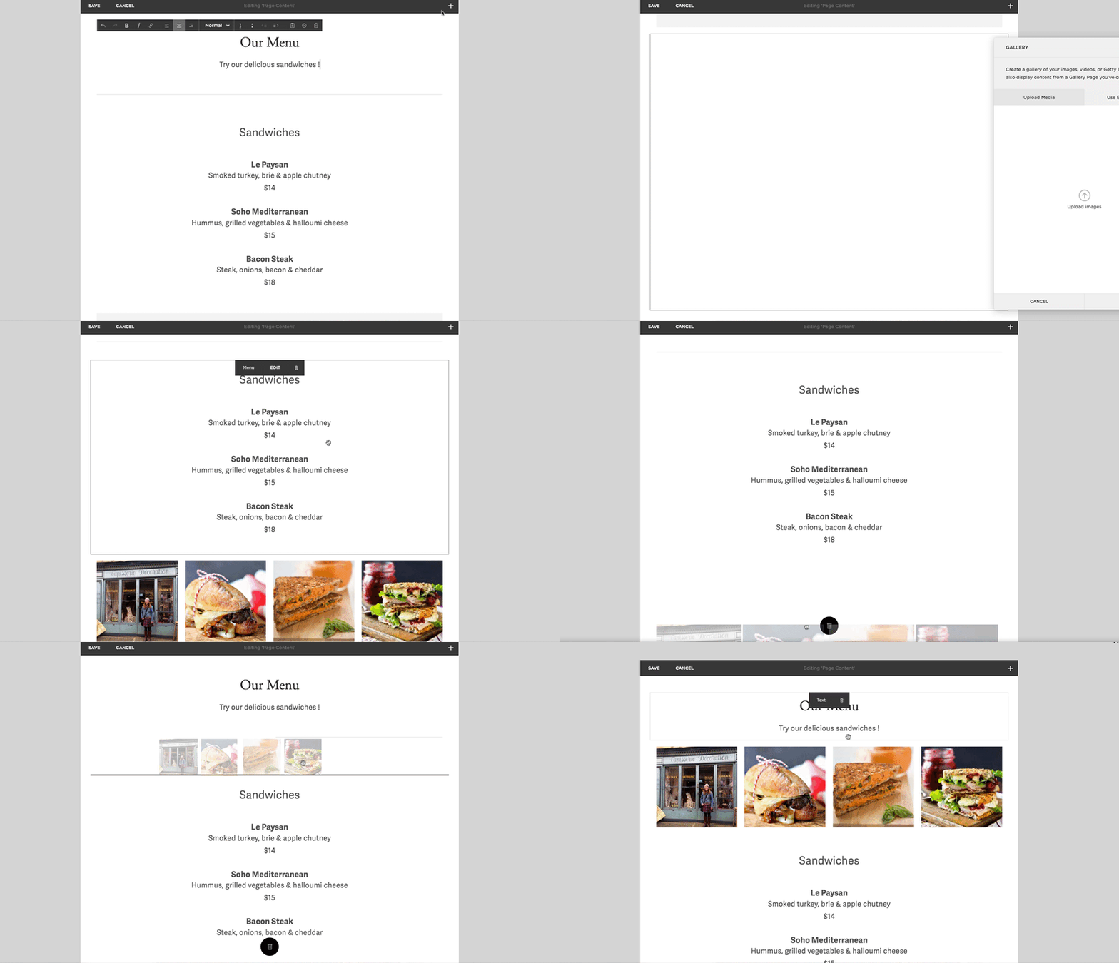
We loved how you could edit and preview in the same exact window, at the same exact time. While Squarespace had full control of the experience, Chameleon worked as a thin, reflexive layer of tooltips and prompts over the underlying product / site.
So armed with all this thinking, we hired a designer (we finally had money for one) and ran a design sprint. This included problem and solution brainstorming, rapid prototyping and customer interviews.
This is what we came up with -- a product that lived over the target app and allowed live previews.
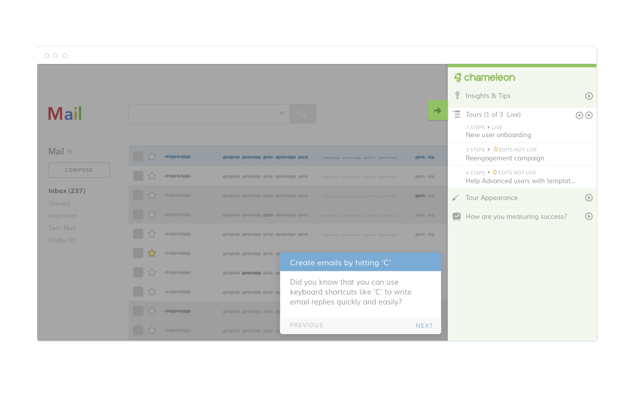
We believed this also had a major advantage: our customers were much much more likely to use Chameleon if they didn't have to remember to navigate to our separate app each time. This provided us with the potential to create a far more engaging and valuable product.
This was a big bet. We had to pretty much start building the product over and this would take months.
Leading up to launch
It took us 3 months before we delivered the first version of the new Chameleon to our customers, and another 3 to 4 before we were ready to launch it. That meant that almost 7 months passed between us beginning work on Chameleon v2 and finishing it.
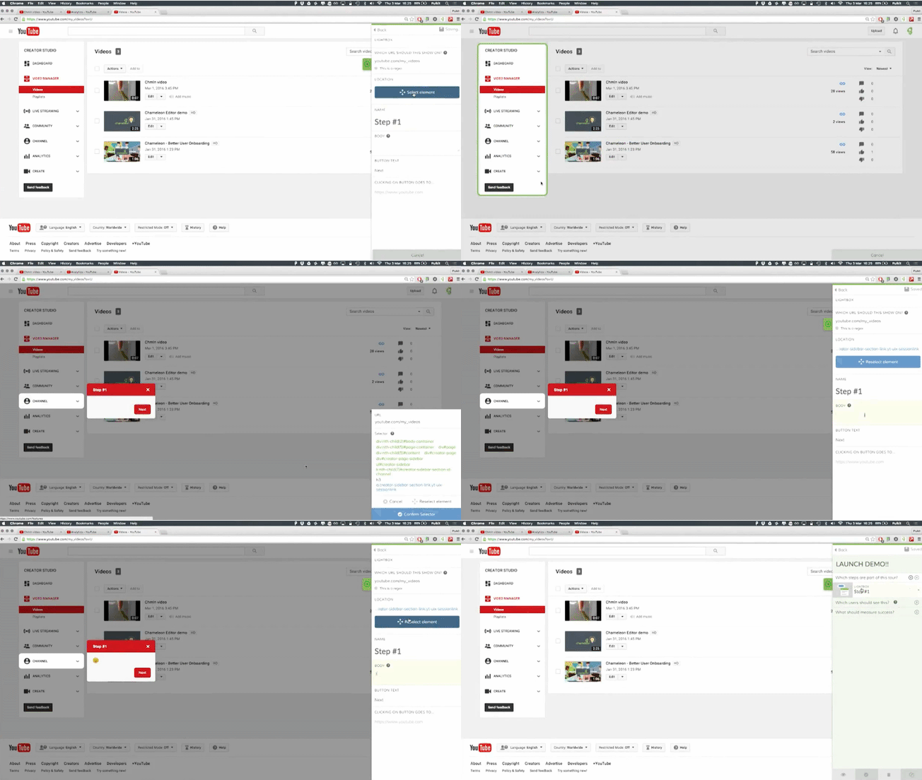
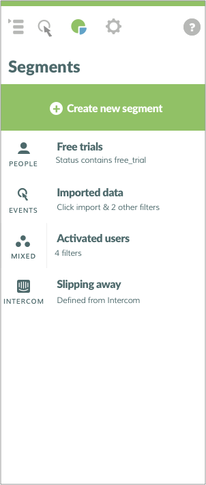
But the second version of Chameleon brought in some crucial new features, like an admin overlay view for editing tours and viewing user details. It was designed to be powerful, yet simple enough for anyone on a team to use it to create a tour, define a user segment, or set success metrics.
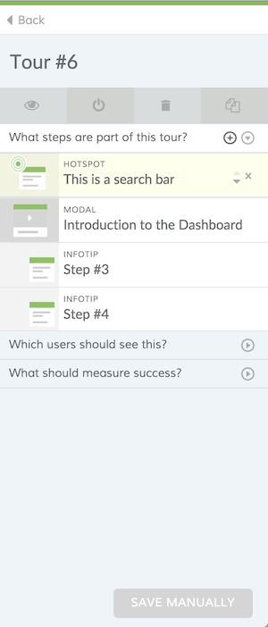
However product redesigns always reset the polish of the product. This polish comes from all the incremental usability improvements that need to be made after customers begin using the new interface.
After launching we began rapidly working on these, and adding new features, to keep pace with our customers' demands and the market. Since our launch in March last year, we've added features that include event-based triggers, saved audiences, data integrations, custom CSS and many other improvements.
Seeking product/market fit
Product redesigns require a lot of contextual knowledge, of existing problems, broader vision, market trends and customer usage. It's hard to be quantitative in making decisions, so it's important that (a) you spend a lot of time in qualitative research with your customers and (b) everyone on the team has a chance to contribute.
Since our redesign, we haven't stopped iterating, and now have an even newer version of the Chameleon editor, that both solves some of the challenges of the Sidebar, but also provides opportunity to expand the product footprint substantially.
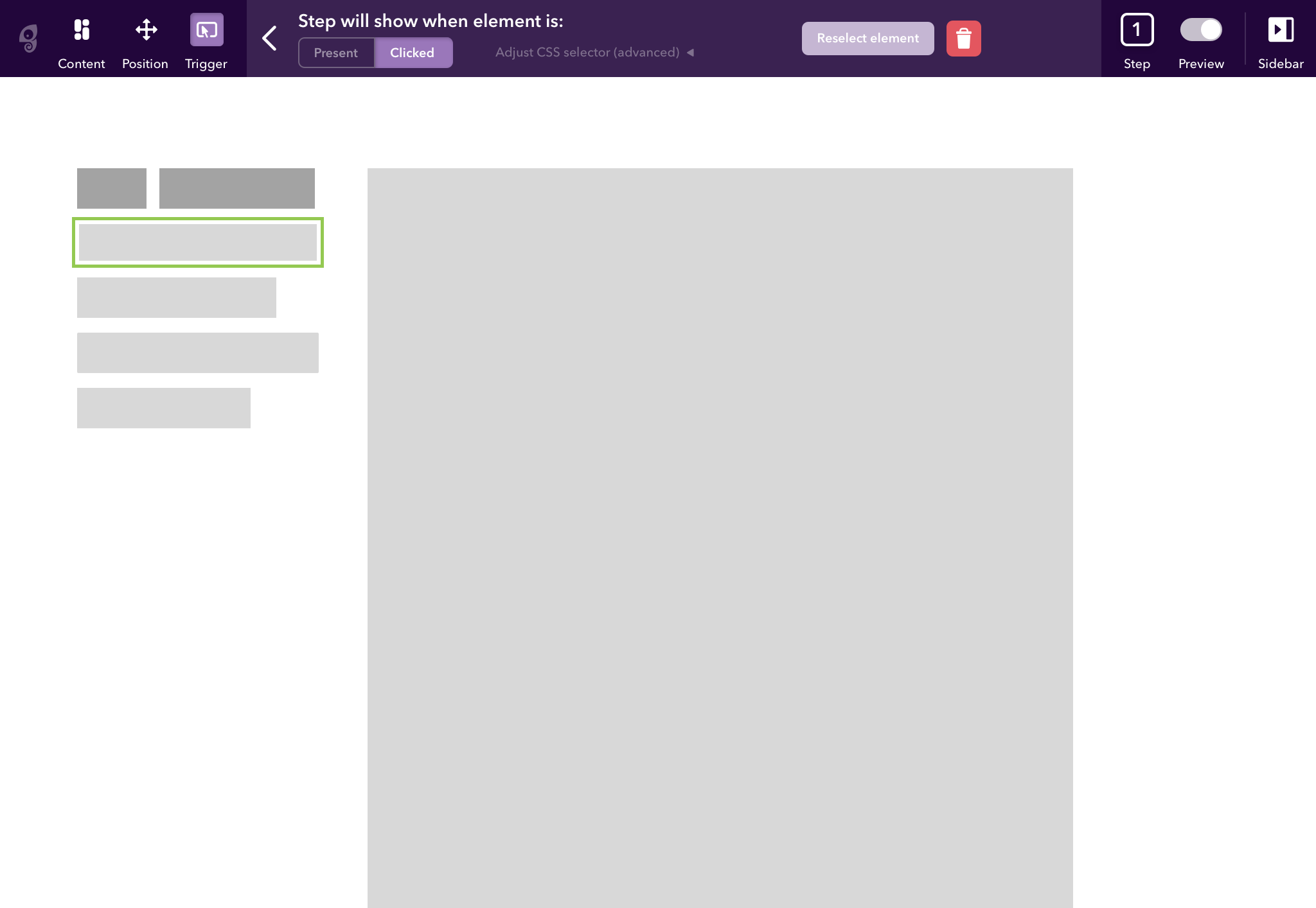
We're continuing to build a product that we believe will be differentiated and achieve the true potential of giving our customers the product control they need to create effective contextual guidance to help their users succeed.
Our key takeaways for product redesigns
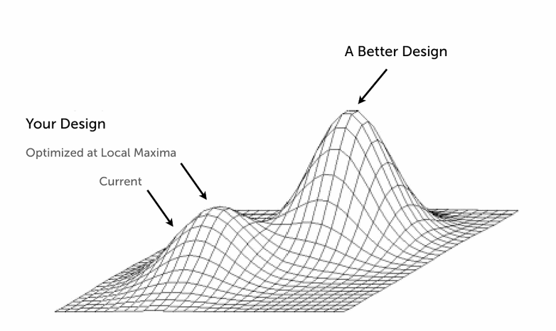
(Diagram by Joshua Porter)
-
Make broad changes early. It gets harder to make design pivots later and this is your best chance for finding a truly global maximum for your product.
-
Expect user churn. This is a cost of investing in product development, and you have to accept that not all of your customers will be able to accept this. Learn from them and know that they can return in future.
-
Customer relationships are key in reducing churn. If they are invested in the changes then they are likely to be excited and willing to test and give feedback. Communicate clearly and off-board as necessary.
-
Involve the whole team in brainstorming the problems and possible solutions. You want as broad an outlook as possible to allow you the best chance to reach that global maximum.
-
Expect to take a step back in polish with each product redesign. Spend the next sprints working on usability improvements and release these rapidly to reduce customer dissatisfaction (small issues can cause big annoyance).
If you have any other suggestions on how to execute product redesigns and enable product-led growth well then please leave a comment below!
