The COVID-19 outbreak has brought loss, anxiety, panic buying, and an uncertain economic climate. Many businesses may be at risk and in times like this feel the need for a closer connection with their customers. Unfortunately this has often meant a customer communication firehose, leading to bad UX.
To the irritation of LinkedIn members, redditors and the twittersphere, "every corporation I've ever given my email to" is making reassuring announcements that they're operating as usual via blog posts, tweets, and emails. In cases where it doesn't concern the buyer, like a distant hotel or online-only bank, this is generally seen as a little crass.
Unnecessary communication actually has a counter-intentioned effect: pushing customers and users further from the company and its brand.
There's a lot of noise out there, and plenty of SaaS products doing a thoughtful, genuinely helpful job too. An event of this magnitude brings forgotten companies back to mind, but not everyone has a valid reason to grab attention.
Equally as important as the message is the communication medium. The urge to help or make loud reassuring noises is strong and can cause subtlety to go out the window - but when should that be resisted, and when is it useful to communicate?
🎬 COVID-19 Framework for SaaS
Subscribe to watch the 45-minute webinar with Q&A and get our other COVID resources
COVID-19 Reveals How SaaS Products Respond in Crisis Mode
In this article, we’ll review examples of how companies are approaching this problem from a UX perspective.
COVID response: choosing your framework
In times like this it is important to communicate clearly to customers to add confidence and trust to your service. You must decide:
- What information is worth taking a user's attention?
- How important is it that they have this information?
- What is the right time to deliver this information?
In certain cases, a simple blog post might suffice; this lets those who care most discover it. Your fans and loyalists will likely read your blog and maybe you'll share it amidst your social channels.
Many SaaS companies have published a COVID-related blog post by now (this one is our obligatory entry) and are sticking to this type of "Pull" communication (letting users pull more information at their own convenience.)
Don't choose email by default
The opposite is "Push" communication, such as emails or other forms where a user receives an unprompted notification or communication.
This can be in the form of email, but that is the noisiest channel, and can be considered spammy. It's valuable because it's ubiquitous and may be the only way to reach users not active in your platform or product. However if you don't need to desperately reach those users then it's the wrong channel to focus on!
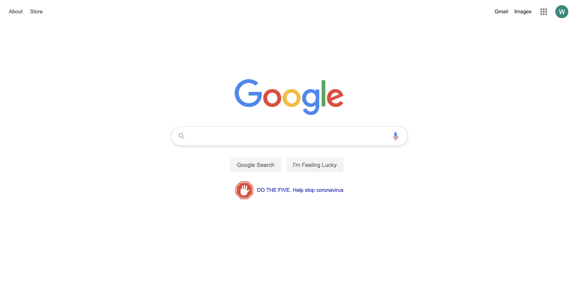
Google, for example, overrides its usual search UX to display a long list of resources targeted at the persona of someone trying to stay safe or worried they might be infected.
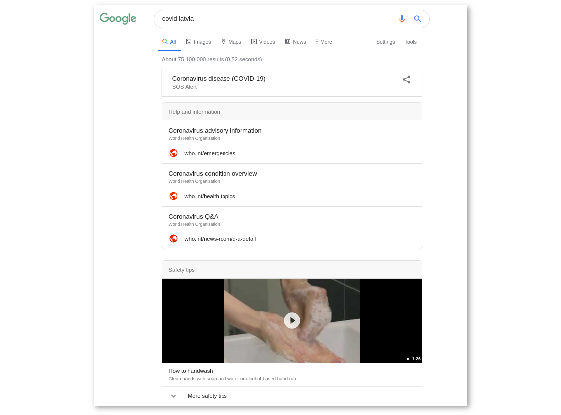
Like Google's search ranking shuffle, good emergency response user experiences target only active or affected users. This is far more helpful and engaging than yet another generic email.
The right information delivered in the right place at the right time is what great UX is all about. Rarely does a service like Google Search send emails to its users, because it can instead leverage it's product surface instead.
Read more about how to decide which between email and in-product channels here.
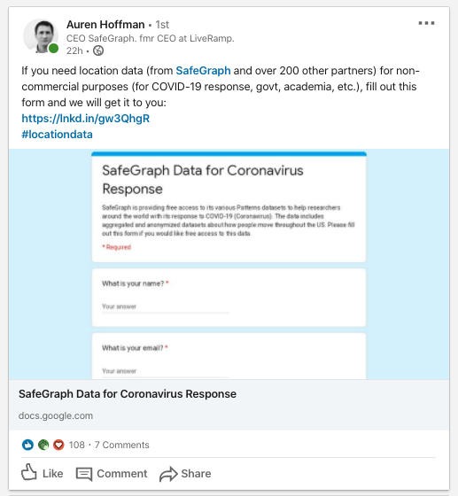
Of course, if you're looking to use this as an opportunity to share your product or service more broadly, and possibly acquire new users then you should also rely on non-email and non-product mediums, such as social media. Below is an offer from Safegraph for certain types of users:
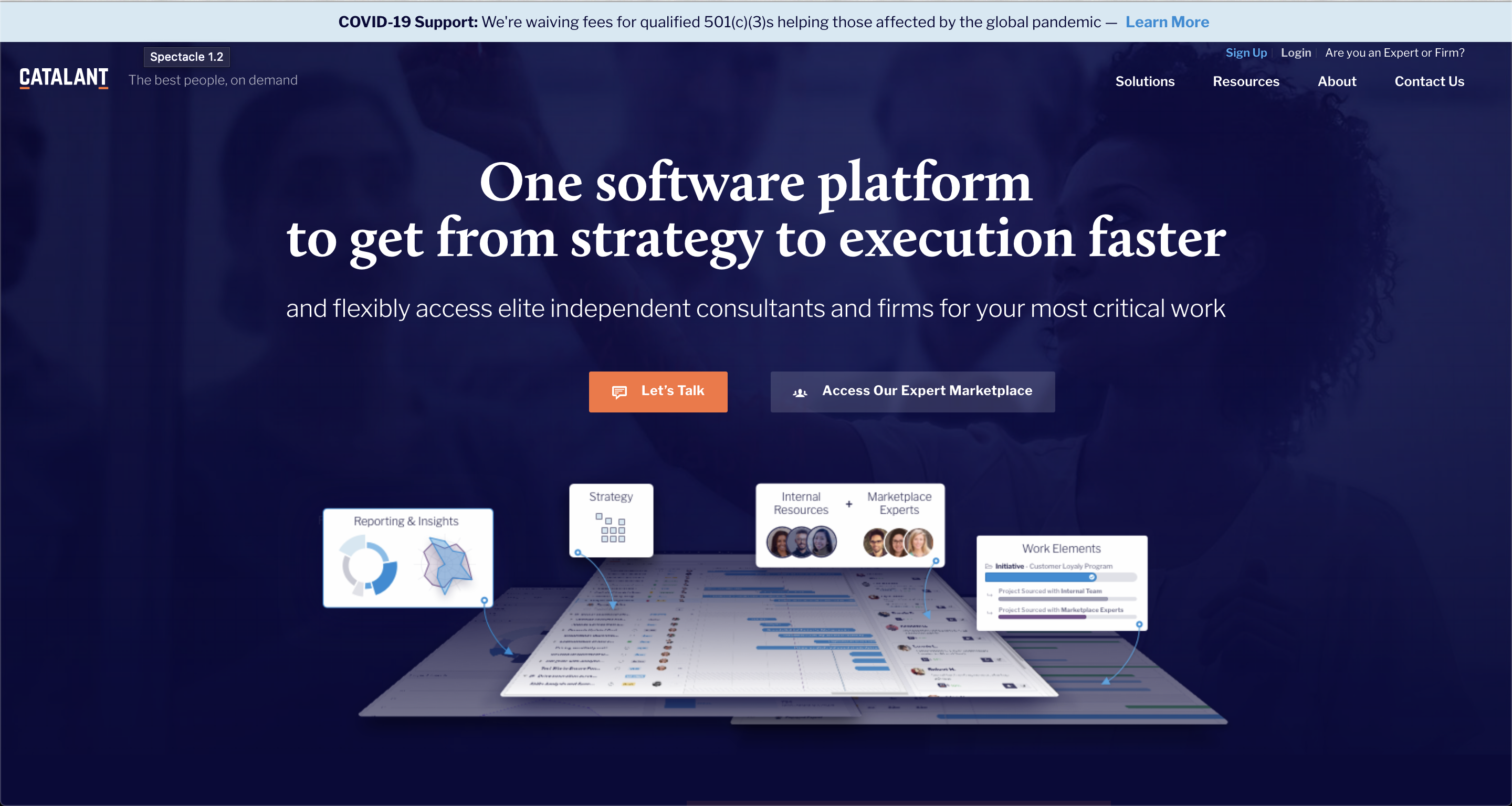
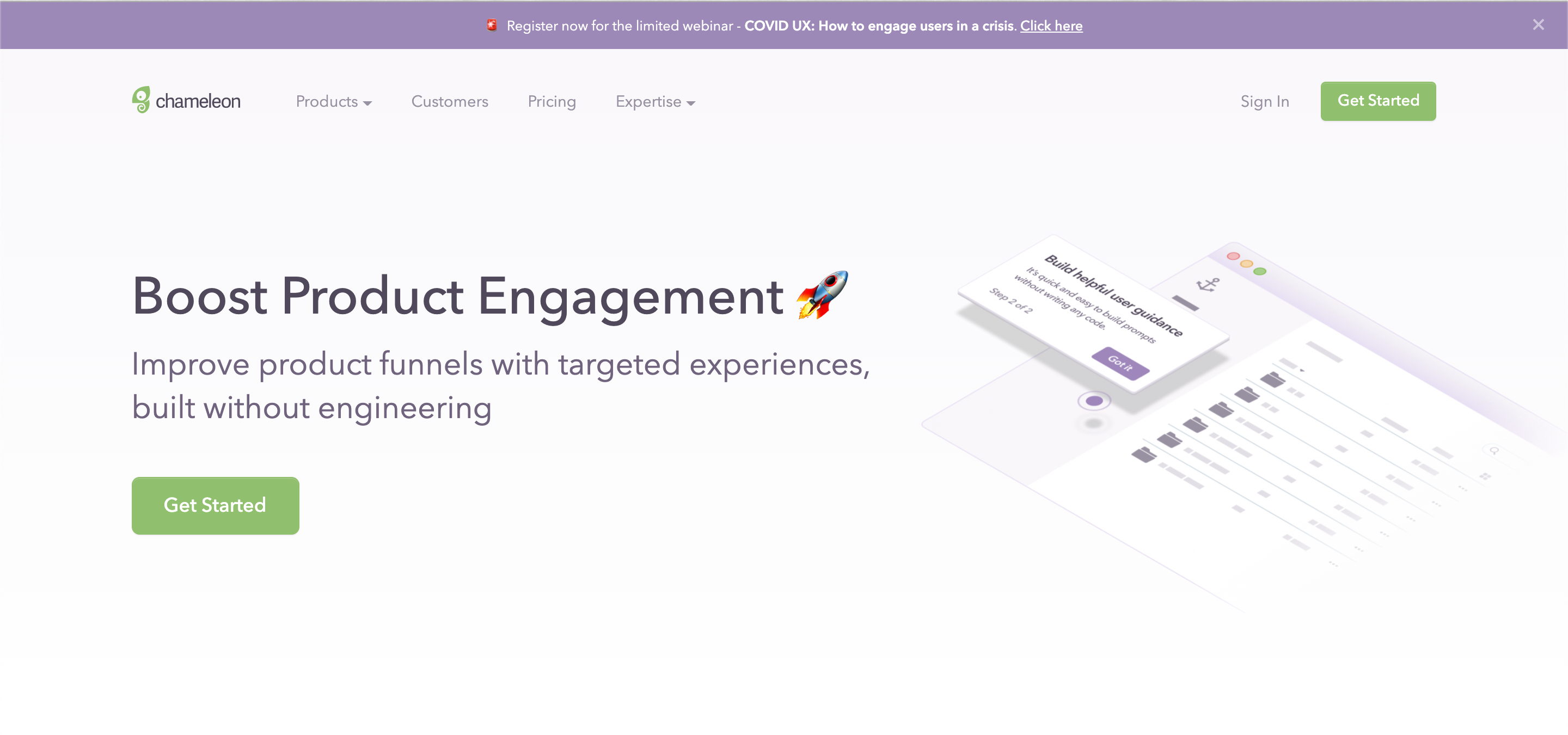
Or if you think your prospects are continuing to visit your site, you can add a simple banner to help educate them about any offers you have available. Here are two examples, one from Catalant, offering a free option to non-profits, and from Chameleon, offering an educational webinar on how to adapt your UX in light of the pandemic:
Reach active users in-product
If the main target of your information is your current users, then there is no better place to reach them than inside your product interface. When they are here, they are in your context; more ready to listen to you and able to act on what you have to suggest.
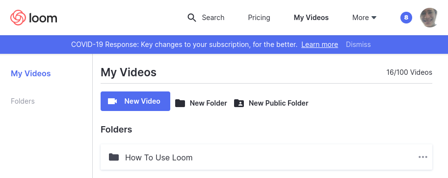
Loom, for example, is doing a great job at responding in a relevant and contextual way. The company made headlines in March for expanding its free offering in response to increased traffic from users who are working or studying at home more than usual.
With this widely useful announcement based on what they'd seen in analytics trends, Loom emailed the relevant portion of its userbase and added in-product messaging to aid visibility. The email serves to re-engage users who have a fresh need for asynchronous/remote communication and the in-product prompt extends a helping hand to active users on the free plan - the offer's most relevant audience.
Zoom has also reacted to the remote work boom by lifting its 40 minute limit on group meetings for users in China. Unlike some businesses, Zoom's acquisition rate is up 3.5x.
As part of this pandemic, the US government (along with those of other countries) are establishing economic support packages for small businesses. These regulatory changes are being pushed through at breakneck speed and it's imperative that business owners that are suffering know about it.
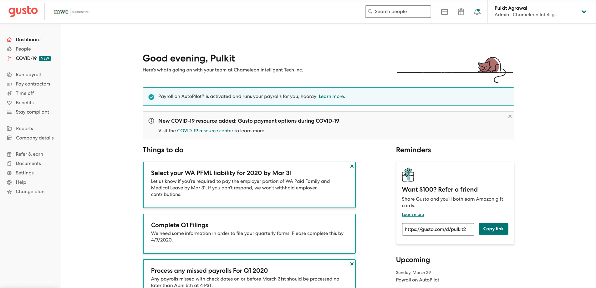
Gusto, a payroll and benefits manager, has many such users, that rely on its platform for their payroll and regulatory needs. Therefore it's absolutely critical that Gusto support the dissemination of this information; so much so that it now has a special COVID-19 dashboard. Because it's so critical, they use very intrusive UI to bring it to their users' attention:
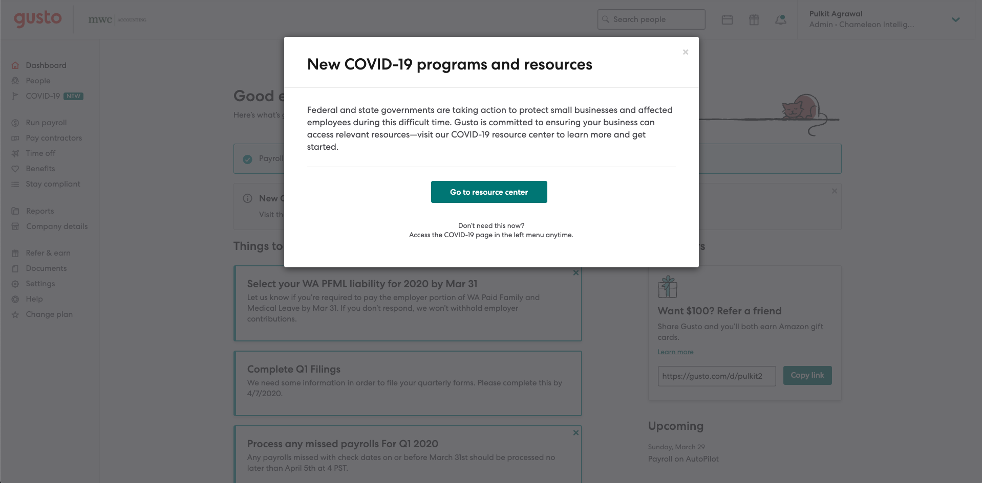
However many users will dismiss modals such as these, because they have other goals or are in a rush. That's why Gusto persists with an in-line banner, and a "New" label in the navigation. This is a great example of self-serve help to lead to feature discovery and adoption.
When emailing make it hyper-targeted
However, in some cases, your users will not be logging into your platform, yet still rely on your services. If you don't have an interface to engage your users, then leveraging emails (such as transactional emails) can offer a good user experience.
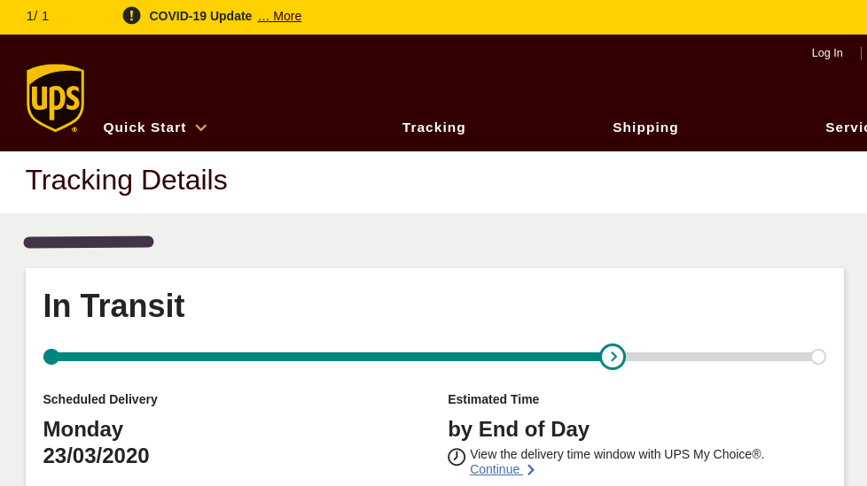
One example from personal experience is UPS, who notified me recently about a delayed parcel. I don't have any other generic COVID emails from UPS in my inbox, just announcements that affect me about packages that I ordered. Clicking through, I see the updated delivery date and a gold banner leading to a more detailed announcement that explains the delay.
How to reach users in a crisis
While some businesses seem to be leveraging these grim times for an excuse to market, others have taken a break from business-as-usual.
"We paused our Buffer queue, as what seemed like great and timely posts a few days ago, now felt a little irrelevant", Buffer's editorial director wrote on March 19.
In uncertain times, it's important to handle customer communication with extra care. Think of it as pre-emptively addressing the concerns of certain user segments rather than adding a new concern to the pile.
Examples from the Chameleon family
College alumni network PeopleGrove is targeting relevant users with Chameleon Microsurveys in response to COVID in an effort to shape product direction.
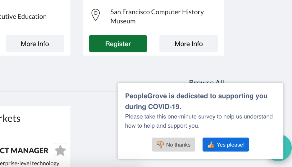
"We needed prioritize our engineering team and build sprints around our COVID-19 response, and Chameleon is there as a resource for us - to be able to survey users and ask them what they need right now and what we should build to help, without engaging engineers" - Tori Funkhouser, VP of Product @ PeopleGrove
With so many instances of companies bombaring users with information, this is a refreshing approach from the PeopleGrove team; asking users to share their perspective.
It's critical for all product teams to close the loop and hear directly from their users, especially in times of need. We recommend implementing a continuous feedback loop using targeted in-product microsurveys.
Another customer, food subscription service Thistle is using Chameleon to show a COVID webinar signup prompt and informational banner to its concerned users.
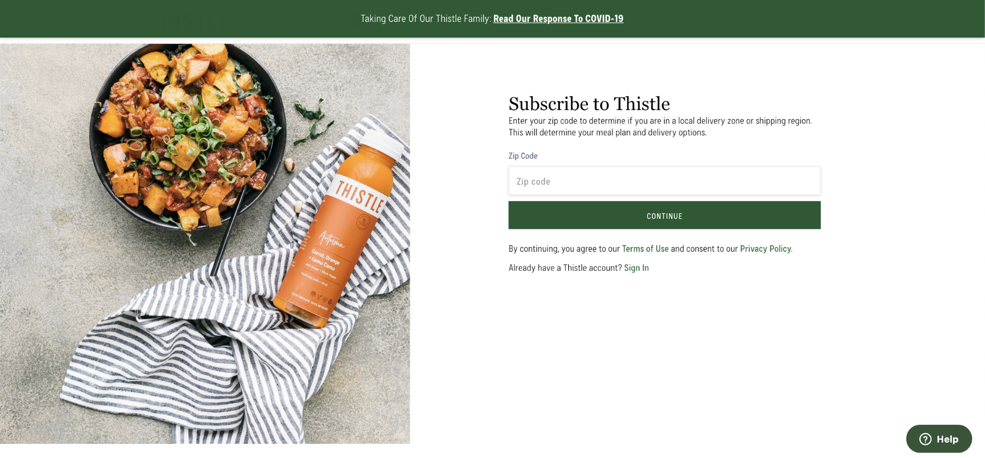
This banner is another great example of appropriate UX; it does not obstruct a user completing their flow but provides them a visible signpost to more information should they decide they are intersted.
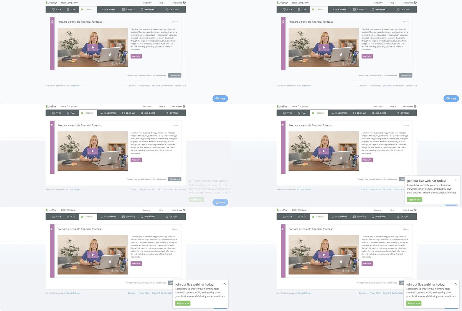
Another UI pattern you can leverage is a slide-out that helps bring more attention to the information you are conveying. Here, Palo Alto Software uses Chameleon to offer a training webinar on how users can react to COVID-19 in their business planning; very timely, relevant and useful.
Larger platforms are leveraging their UX for COVID info
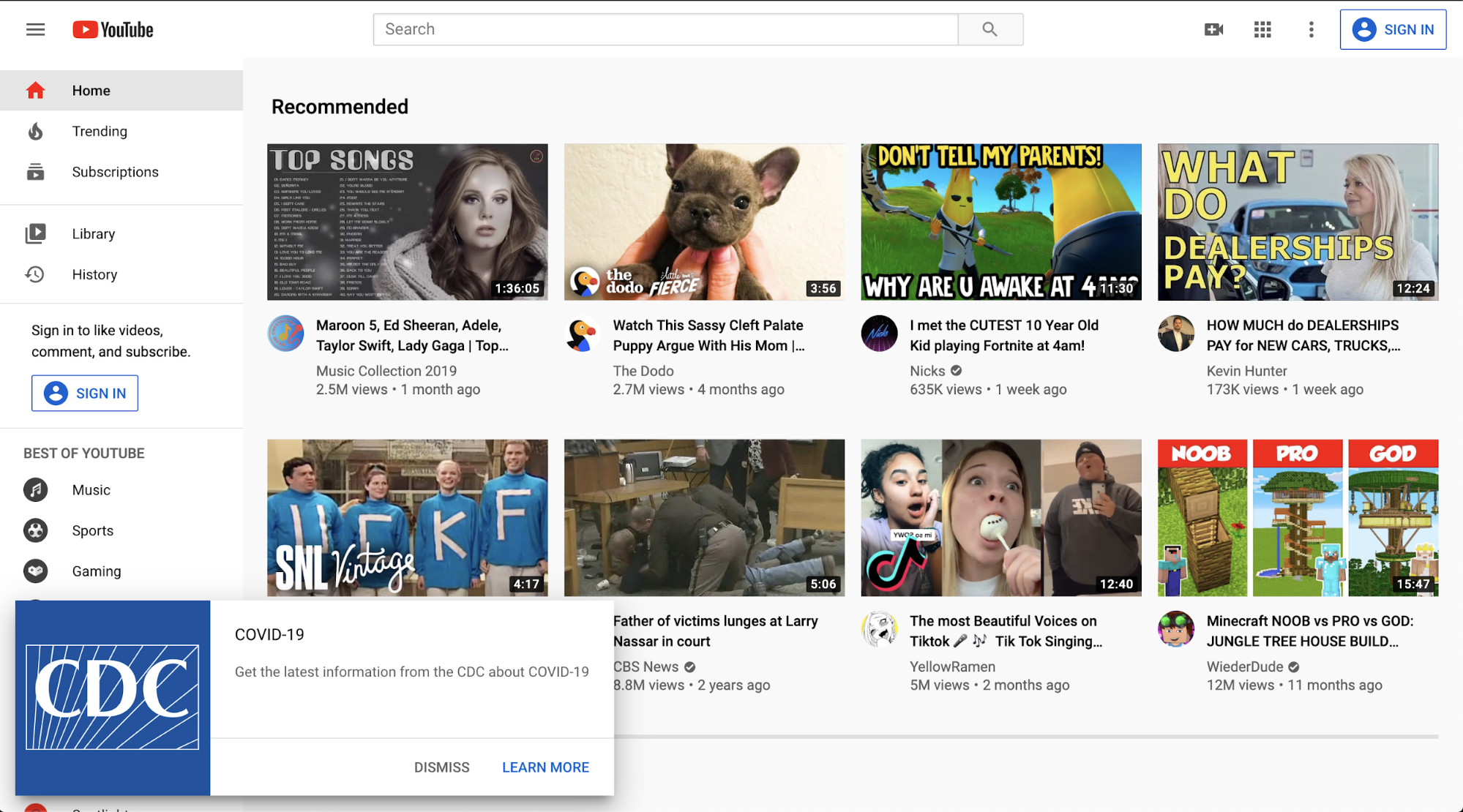
We have seen Google adopt in-product tooltips and experiences heavily, and in the example below, YouTube shows a slideout on it's homepage to help users learn more about COVID generally:
In another example, Twitter has opted to use its platform to share important advice from the WHO about how to mitigate spread of COVID-19, with their “Do the five” campaign:
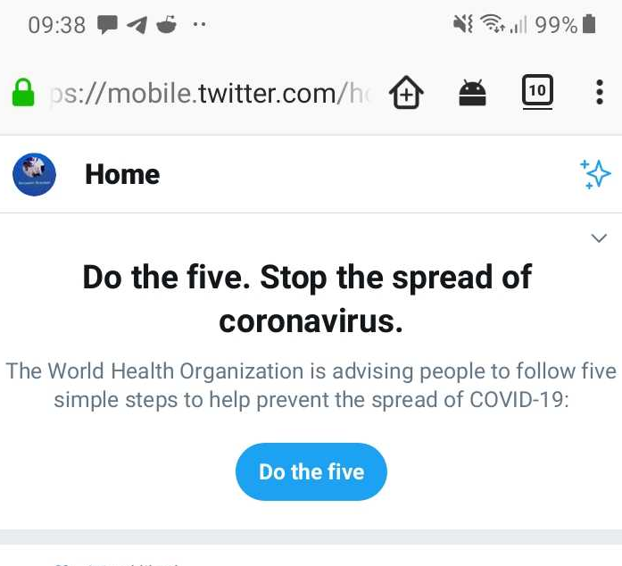
In this case, Twitter is acknowledging its position (and arguably, its duty) as one of the world’s largest social media networks to spread COVID awareness.
It’s relatively un-intrusive, and can easily be dismissed with a quick drop-down selection. Here Twitter is acknowledging that the information is important to many users by placing it at the forefront of the news feed, while remaining respectfully quick and simple to dismiss.
Here you can see Google has taken a similar approach:
Large platforms like Twitter, Google, and YouTube are perhaps outliers; their response is not about how product features or functionality may be impacted. Twitter’s response is more like a public service broadcast than anything.
For most SaaS products that need to be delivering in-product announcements, we're seeing more UX-for-emergencies being hacked together and deployed quickly.
This probably represents the fastest way to ship these changes, which is key. However at times of rapid change, this is also a time to consider investing in capabilities to allow this to be better next time around.
We've seen how South Korea has dealt with testing and quarantine management, and this has been successful because of the measures that country's authorities implemented during the time of the MERS outbreak.
Best practice principles for your user-facing COVID response
Firstly, your response to COVID should be carefully considered. Think before you act and don’t feel obliged to push irrelevant information into the normal workflow of your users.
Focus on informing users of how they might be affected, and stick to best practice principles for in-product notifications:
- Tailor each message to specific user segments
- Don’t interrupt workflows with obnoxious popups
- Offer users the option to update themselves with “pull notifications”
- Don’t be insensitive; focus on providing relevant information
Users may very well appreciate a general update about how things are running smoothly at your company - and with good UX design you can provide them with the tools to find the information they need the most.
Just make sure you aren’t overwhelming your users when you should be focusing on delivering crucial information that helps to reassure them in the face of an unprecedented global crisis.
Finally think about how to invest in your core capabilities to deliver emergency UX so that you can strengthen during this crisis and be more prepared to proactively respond in the future.

🎬 COVID-19 Framework for SaaS
Subscribe to watch the 45-minute webinar with Q&A and get our other COVID resources


