Your product and marketing team can help drive up new user activation and retention.

Often it is assumed that user onboarding is the designer's job. This might make sense if you believe that good onboarding is only about design. But, as we've explained before, just because your product is easy-to-use does not mean people will use it!
The first step to great user onboarding is understanding that it takes more than visual design to solve the problem of user engagement. To do this, experts recommend having clear responsibility and accountability for managing onboarding and engagement across your product and company.
Even if your designer will be responsible for user onboarding, use the following advice to help ensure a holistic approach that will lead to higher activation, retention and engagement with your product or feature.
What Is (and Isn't) Your Designer's Job
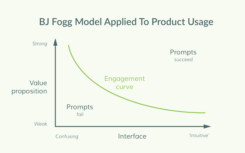
The best way to explain the relationship between user onboarding, user engagement, and product design is through the BJ Fogg Model. BJ Fogg, behavioral scientist and founder of the Persuasive Technology lab at Stanford, discovered that the combination of three factors determines behavior.
- Ease of use (someone's capability to perform a behavior)
- Value proposition (someone's motivation to perform that behavior)
- Prompts (triggers/nudges for them to perform that behavior)
The balance of these three elements can determine whether or not users engage with your product. Here's a visual representation of his model, applied to product usage, designed in collaboration with Chameleon and BJ Fogg. Disengaged product users fall on the “fail” side of the curve, while engaged users fall on the “succeed” side.

The Interface axis (how easy your product is to use) is your designer's primary responsibility. But because these three factors model together, designing an easy-to-use interface alone isn't enough to make a user engage.
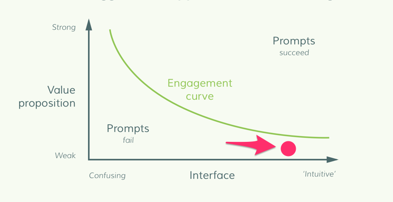
It's very plausible to have an intuitive interface that falls on the wrong side of the engagement curve, because value proposition is low:

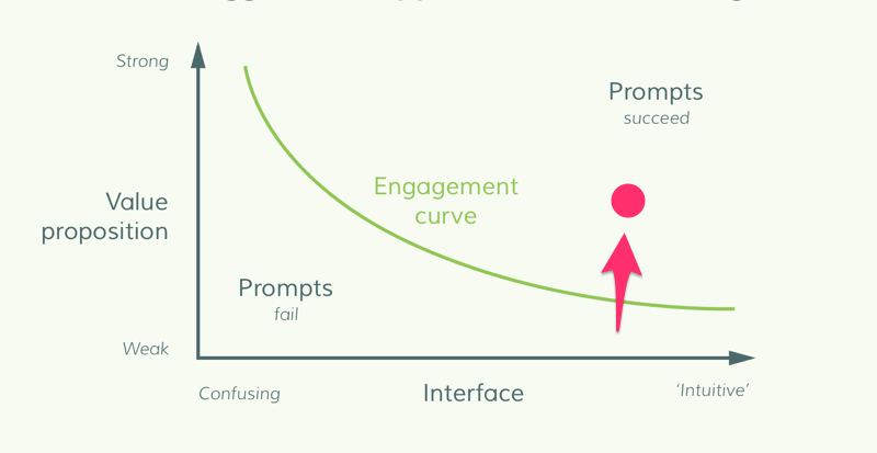
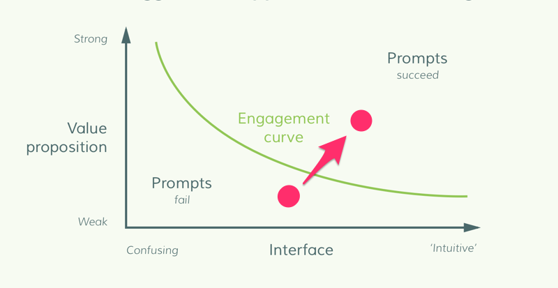
To win on engagement you need a combination of strong value proposition, intuitive design and effective prompts.
Your Core Product Team Creates Your Value Proposition
Let's consider two aspects of value proposition: the strategic and the tactical.
Value proposition is the reason people start companies. Uber wanted to create an easier, sleeker taxi system; Grubhub wanted to make a one-stop shop for food delivery. Therefore part of your success depends on the fundamentals of your company or product mission and how well that matches the market needs. This is the strategic aspect, which requires the founders or executive team to decide and refine. If this is not working then you may see a company pivot.
The tactical part is how you communicate this value proposition to your users such that they “get it”. This is a critical component of user onboarding, because it supplies the motivation for users to TRY your product and features, both at sign-up and over the course of their lifecycle. Are you communicating your core value proposition to them again and again until they internalize it?

As the market evolves your strategic value proposition should too. For example, Netflix announced “airplane mode” to give users offline viewing privileges, which fundamentally deepens the service it offers its users.
As this changes and as you continue to grow, your product team is responsible for delivering your tactical value proposition. Figuring out how to communicate it, through which channels, at what time, to which users, requires input beyond just your designers.
Your Marketing Team Creates Your Prompts
Prompts — what we traditionally think of as onboarding — are both reminders that users should be taking advantage of your product, and instructions on how to. A little prompting can make all the difference in engaging a user who might not know about (or know they're interested in) a certain feature.
Nudging your users at the right time, in the right channel, and with the right information can drive them over the edge into the “success” zone on the BJ Fogg model.

Onboarding efforts, like product tutorials, aren't merely instructional—they're marketing tools. Marketing used to be the process of convincing a customer to try a product—a marketer's work was done when the customer downloaded the app.
But now, where it takes so little effort to try out an app, the primary marketing challenge isn't convincing a customer to start using it; it's convincing a customer to keep using it. A good chunk of that convincing should take place inside your app, through prompting.
Until recently, these onboarding efforts *couldn't *be taken up by the marketing team because they required such a high level of technical knowledge. But Chameleon makes building and managing these prompts accessible to non-technical team members, and so easy to incorporate into your marketing strategy.
That You Delegate Matters More Than How You Delegate
Each element of the BJ Fogg model — interface, value proposition, and prompting — is integral to engaging your users. While most teams prioritize UI, the other two elements shouldn't be an afterthought. Shaping your value proposition should occur every day on the product team, and your marketers should focus on how to prompt your users to engage.
It's necessary to prioritize all three of these elements. But if you overload them on your designer, all three will suffer.
We've given you guidelines for delegating them, but there's no perfect system for doing so that applies to every team. Delegating each element of your user engagement will make sure each gets the attention that it deserves—and keep your business thriving.


