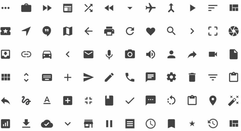
Icons from Google’s design language ‘Material Design’ that aim to provide a more consistent UI across applications
Onboarding and first-user experience are critical components of any product’s user flow; they should be designed thoughtfully and continually improved / updated. The onboarding experience should reflect the use case, product functionality and context, not whether the service is B2C or B2B.
Users are similar
Not all users are the same, but the same users use both B2C and B2B products, and so the same psychological factors impact user behaviours when marketing to B2B or B2C.
According to the Fogg Behavior Model there are three universal characteristics that persuade behaviour:
- Necessary motivation
- Sufficient ability
- Effective triggers
All three of these need to be present for the desired behaviour to occur, and all three can be affected by the onboarding flow.
 (source)
A user can become more motivated by various factors, including status, affiliation, justice and understanding. Making the user successful (giving status), demonstrating they are part of a community they aspire towards (providing affiliation), satisfying their expectations (doing justice) and helping them learn (increasing understanding) will equip them with the motivation they need to engage in your product.
Sufficient ability is a combination of a user’s intuition (i.e. their previous experience of similar design patterns) and the appropriateness of the product interface. Therefore using common behaviour patterns during onboarding is more effective than trying to get the user to jump through new hoops. This also means that onboarding flows should evolve — something that successful applications don’t forget.
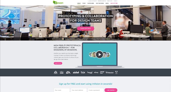
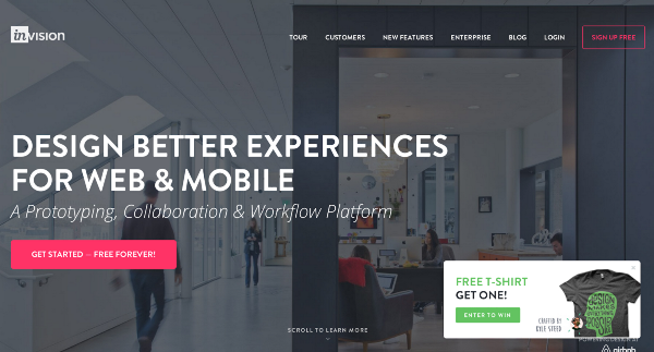
InVision’s landing page in November 2013 (left) and 2014 (right). This is the first step in onboarding and has changed to match updated design standards.
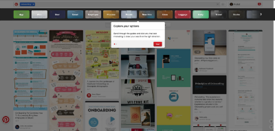
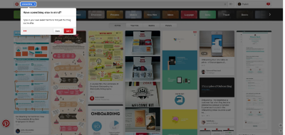
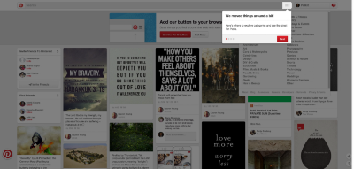
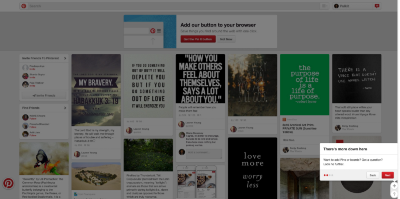
The last component is triggers — specific components that nudge or direct a user to take the appropriate behaviour. These are surprisingly lacking for many apps, which rely on video tutorials or simply land users onto a dashboard or blank state.
In response to Anji’s thoughts on B2B services requiring more complex onboarding flows than B2C services:
The key factor in building the best onboarding flow is the functionality provided by the product. The objective has to be getting the user to the ‘aha’ moment where they internalize the value the product is providing and how it improves their lives.
Sometimes this is really quick and obvious (e.g. Airbnb) and other times it’s actually somewhat complicated (e.g. Asana). We can maybe generalize the diferences between B2B vs. B2C apps:
- More complexity / deeper functionality for B2B
- Higher user motivation for B2B (your boss told you to use it vs. trying a friend’s passing recommendation)
But there are definitely exceptions (Facebook is extremely complex and Trello is fairly easy for a new user) and the key thing is to figure out the specifics: the path to ‘aha’ and requirements to persuade behaviour (as outlined above). Simple onboarding for B2C and complex for B2B is a (potentially dangerous) simplification of the general case. There are plenty of examples of exceptions.
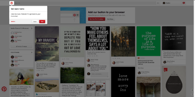
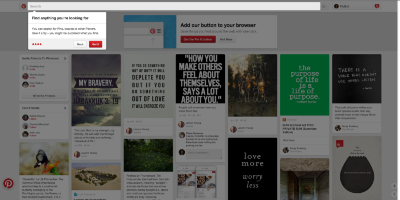
Qualified leads are definitely important, especially for SaaS or freemium products, where conversion to paying is the ultimate objective. There is some precedence for using the onboarding flow to refine the quality of leads, and Lumosity argued that increased friction helped increase quality (although conceding that it did reduce sign-ups).
However the friction in Lumosity’s case was extremely well-designed and used to improve the actual product by learning more about the users (which might have been the actual cause for greater engagement). The takeaways were that more education and personalization helped create more engaged users. Onboarding can be a source for this, but so can better sales / marketing techniques and tools such as free trials.
Designing an effective onboarding flow
Onboarding and first user experience is crucial for any product, and teams should arrive at acceptable activation rates before optimizing / refining other features. It should also be something undergoing constant evaluation and iteration.
If you’re considering or reconsidering your product’s flow then the following questions may help to frame your thoughts:
- Do you know your target user and their motivation?
- Are you clear about the main benefit your users find from your product?
- Can you demonstrate value before requesting work from a user?
- Do you request only the most critical information needed from a user?
- Is there a clear, structured path for users to use your product?
- Are you teaching your users without overwhelming or boring them?
- Is your teaching contextual and actionable?
- Do users know what success looks like?
- Do you engage users via other channels?
- Are you refining and optimizing the process?
I’d be super interested in hearing your perspectives on user learning and onboarding and would be more than happy to discuss and provide feedback on the flow for your product.


