🤔 Challenge: How can a B2B2C SaaS solution onboard thousands of thousands of users to a new product design while getting continuous feedback, without interrupting the learning experience?
💡 Solution: Product tours that highlight critical changes and Microsurveys that provide a continuous stream of data to Degreed.
🏆 Outcome: A 280% increase of beta platform opt-ins and actionable feedback that helps drive the beta product forward and influences new product feature decisions.
Creating the best platform for continuous learning
Degreed started out in 2012 with one mission: jailbreak the degree.
The founding team believes the diploma or resume isn’t purely indicative of what a person is capable of. We are always learning—from a variety of modalities. And until Degreed, there was no system of record to capture those new and improving skills.
Degreed is a platform that works in two ways. Firstly, it allows companies to improve the usually fragmented learning experience by centralizing all Learning and Development resources to one access point, then through their platform, employees are able to add their skills and receive ratings from peers and managers. Companies get visibility into the skills their employees have so they know if they have the capabilities needed to align with the business strategy. That’s the B2B side.
On the B2C side, a person can record their lifelong learning achievements, rate their skills, and continue to grow on a professional level. They can gain new capabilities in the skills of their choice to become ready for whatever’s next!
In both the B2B and B2C experience, Degreed’s Home page is central, where users can find hundreds of resources like courses, articles, podcasts, and even people to help multiply their skillset.
Degreed wanted to adopt a UI that was more in line with the primary value of their business, which is helping users to more easily discover and consume learning resources. They made the decision to move from a feed-themed to a section-based design. They made this decision by listening to and constantly engaging with user feedback. Previously, users sometimes felt unclear about their learning recommendations—a cleaner, more focused UI helped present the personalized content more clearly.

Our CS and Support teams received feedback that the knowledge center wasn’t super accessible to find and often got basic questions like ‘what are the best practices?’
Onboarding 50,000 users to a beta redesign
After months of hard work, it was time for Degreed to onboard users to their beta version of the newly designed homepage.
Degreed ran a closed-beta allowing participating customers to identify which users would receive early access. At a later stage, Degreed then let users choose for themselves if they wanted to trial the beta design of the Learner Home page and gradually phased a proportion of their users onto it.
So why roll it out to 50,000 and not their base of millions of users at once? Degreed wanted to roll out their design iteratively so that they could test assumptions and get user feedback early in the process. This allowed them to uncover any confusing aspects of the new Home page as well as find any bugs with an active but smaller audience of early-adopters.
Users always want the shortest path to meet their goals, and don't often have time to explore every new feature or update. Therefore they need to be shown the value of the changes quickly and seamlessly, so they become open to adopting a new UI.
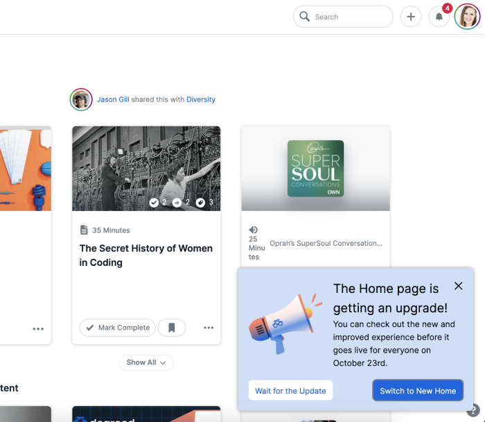
By using Product Tours, Degreed is able to show customers where all their old favorite features were, as well as showing them new and exciting improvements. They use Chameleon to create a whole new onboarding experience for users.

By using Chameleon, we can create an embedded experience for users. It helps to build customers’ product knowledge over time and incentivizes people to want to come back, which is huge for us.
As Degreed prepared to move over a million of its users onto the new design, they allowed users to opt-in to the new view using a simple Chameleon Microsurvey during the transitional period, which helped with change management and increased user adoption from the get-go.

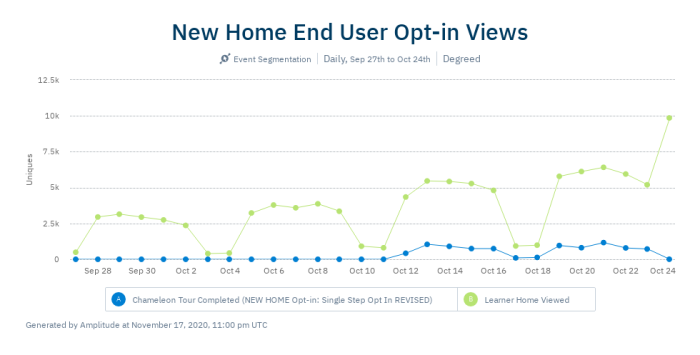
New users on the Home page increased by over 10%. It also helped avoid any customer friction and reduced the pressure on their Support team—as users weren’t shocked when they were met with a new platform. Users were given the option to switch over to the new view in the weeks prior to general availability. During that transition period, they also had the option to switch back to the old view, but everyone decided to stick with the new Home page.

The Degreed opt-in Microsurvey increased the number of views to the new Learner Home by over 280%.
💡 Chameleon Tip: When you give users the opportunity to opt-in to product changes, they’ll be much more open-minded to learning—meaning they’re more committed to succeeding. Try it out next time you make a big update.
Creating a continuous feedback loop with customers
When you launch a new product or redesign, involving your customers in the launch is a priority. If user feedback isn’t included in your design process, you’re setting yourself up for failure.
Previously, Degreed used email as a way of asking for feedback but found that engagement was low and that people didn’t read their blasts. In SaaS industries, the average email is read by only 22% of all recipients with a click-through rate of 2.5%.
On top of the low open rates, Degreed ended up with a very narrow range of feedback and usually only heard back from product admins—not from the end-users whose opinion they needed to hear most.
💡 Chameleon Tip: Using Microsurveys to ask for feedback in-product is much more effective than asking for feedback via email. The average Microsurvey completion rate is 60%.
Throughout the redesign, Degreed incorporated end-user feedback into the process with Chameleon’s tool stack to get a holistic view of how people are feeling. There is always one Chameleon Launcher live that is there for open feedback that goes straight to the Product team through a feedback Microsurvey.

Being able to quickly reach out to users to tell them what new features we have and what’s different, or whether that’s asking them for their opinions, we couldn’t do that in-app before—and that’s where we touch the most people
On top of using Chameleon Microsurveys to get an on-the-pulse idea of how users are feeling about design changes, Degreed actively invites users to give them feedback qualitatively too.
Degreed invites users to book a short interview with Product Managers through a Chameleon Microsurvey. If they’re willing to help with giving feedback, the next step lets users book a slot in seconds within the app, as the Launcher is integrated with Calendly. They use up to 5 of these at a time—but don’t show them to every single user. Degreed uses Segments to target different cohorts of users.
For users who want to give feedback on prototype designs that are in the works, Degreed uses another Microsurvey which invites users to visit a prototype testing page, powered by Maze, where customers can leave feedback and see how the new designs work.
By incorporating user feedback into the design process, Degreed is able to launch changes to their Learner Home with more confidence that what they’re doing is what users want to see.
Planning new features and improvements
Getting feedback isn’t only about work in progress—you can speak to users when you first have an idea or hunch about a new feature and leverage this feedback when prioritizing your roadmap.
Degreed is using Chameleon to validate their experiment ideas while keeping the process lean and saving money on engineering resources.

Chameleon is much more contextual and flexible which I really appreciate—I think we can be more experimental with onboarding and I’ve been recommending PMs to use Chameleon as a way of testing and validating assumptions before building any functionality
💡 Chameleon Tip: Using a framework such as RICE can help you plan experiments and new feature launches in a lean fashion.
As well as planning new features, Degreed uses Chameleon when it deploys changes to let users know if there are any hiccups in product releases. Degreed notifies users with Chameleon to let them know that certain features are a work in progress—and that’s something they’ll continue doing with their Support team, in case there are any widespread issues.
One Tooltip, in particular, launched when the team found a minor bug, reduced the number of Support tickets from over 100 a day to zero. It allowed Degreed to inform users the error was being fixed—and turn user frustration into user delight.

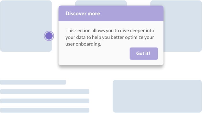
An example of what a Tooltip triggered by a hotspot looks like with Chameleon. You can use them to let users know about in-app issues, new features, or use them to encourage discoverability of premium features.
Discovering the “Chameleon factor”
When you subscribe to Chameleon's Growth Plan, you can take advantage of customized onboarding to the product and personalized check-ins.
If your product is used by larger companies and enterprise customers, there’s a lot of things to consider, like security requirements—which can seem daunting. But with regular check-ins, the Chameleon team can help you set up the right requirements so that you don’t run into any problems. The team is on hand to make sure you get the best results.

It was really helpful working with the team. It’s really hands-on at the beginning with best practices and reviewing functionality, plus the team are very responsive to questions—that really set us up for success
Degreed considered other platforms in their search for a product success tool but found them limited in customization and analytics. They loved how Chameleon is totally configurable and blends in with the product perfectly.
With Chameleon, they integrated with Amplitude for their product analytics, as it gives them “the best of both worlds”—design customization and in-depth insights into their users’ actions in-product.
Paving the way to Product Success
The Degreed Home redesign is now available to all of their users and by using Chameleon, the Product team felt confident in the changes and improvements made. They moved all users over, using a phased-launch approach which was fuelled by user feedback and in-app support.

We were able to feel more confident with the change management and not have any delays with customer adoption because of the Tours we had live.
Now that it’s launched, Degreed is finding more uses for Chameleon throughout their site. While they mainly use it for feedback and showing users around their Learner Home, they’ve got more plans in the pipeline.

We just keep finding more and more use cases for Chameleon!
They’ve been drumming up ideas for using Chameleon Microsurveys on their login pages to help the marketing team get more insights, as well as using Tooltips in their product to further users’ product learning without hard-coding these golden snippets of information.
User research continues to be a priority for Degreed so they can provide the best possible user experience. With Chameleon, they can keep getting user feedback on new prototypes, product launches, and feature rollouts and always put their users first.

I’d definitely recommend looking into Chameleon and using it as a solution.
