You don't want your new product users to go through their first-time user experience thinking: "What is this? Am I doing it right? Oh, this is so confusing. Okay, that's enough. I'm giving up!"
When users abandon a product before they even get the chance to dive deeper and reach the “aha!” moment, that’s typically one of the main reasons for a high churn rate. Having more people leaving than staying may become a major business problem in the long term.
The solution: A carefully crafted user onboarding flow.
Here, we’ll explain why new users’ experience matters so much, how to create an effective onboarding strategy, and which best practices for SaaS brands you can apply to your business.
Let’s dive right in.
First-time user experience (FTUE or FTUX) encompasses all aspects of your user’s experience when interacting with your product for the first time; what do they think, feel and understand until they reach that “aha!” moment?
FTUE is as powerful as love at first sight: an exceptional first experience can go a long way in keeping your users around for the long haul (retention, retention, retention!).
You can start optimizing your FTUE by following 5 essential steps that connect you with your users are every stage of their onboarding journey.
A data-backed strategy is the backbone of FTUE. From getting to know your user persona to A/B testing different onboarding flows; data guides SaaS products towards important decisions.
What is the first-time user experience?
First-time user experience (FTUE or FTUX) is not a single element of the user onboarding process. FTUE is a comprehensive set of thoughts, feelings, and understandings that your users experience while interacting with your product for the first time.
It can be during a demo tour, a free trial, or a first-time interaction with a paid version. And it involves anything that can lead users to their “aha!” moment.
The “Aha!” moment refers to the “moment of truth” within your product – the moment of insight, revelation, or a game-changing experience that users go through while interacting with it – including everything that makes them understand the real value and encourages them to be even more engaged, interested, and immersed in your product.
To learn more about the concept of “aha!” moments, watch how Chameleon’s co-founder and CEO Pulkit Agrawal explains it in this short video.
Learn how “aha!” moment can help you design a better onboarding flow
What does FTUE include?
Typically, the first-time user experience includes (but is not limited to):
The very first impression your new users have: Are your users delighted from the get-go? Do they feel driven by your product? Remember, sometimes it takes only 50 milliseconds to assess the visual appeal of a website or a product design.
The understanding of your product functionalities: Is everything clear and logical? Is it easy to use? Is the language in your product copy immediately understandable? Does the onboarding flow feel intuitive? Is your product accessible to everyone?
The level of engagement needed/expected from users: Do you offer self-service onboarding? Or, is there an in-product tour? How long is it? Remember, our latest benchmark report revealed that one-step product tours have a 75% completion rate, while tours with five and more steps don’t pass the 50% completion rate benchmark.
The overall user experience you provide: Does the first-time interaction with your product feel like an unpleasant ride on a bumpy road? Or is it like a silky smooth sailing trip on a luxurious yacht with an all-inclusive service? And, yes, the feel of that smooth sailing experience would be the ultimate goal for any product development team.
The definitive list will depend on your business and product type, as well as the specific onboarding flow you create.
Why is the FTUE so important for user retention rate?
First, let us explain what the user retention rate is. It refers to the percentage of users who use an app or product at least once a day during a certain time after they install it. And did you know that you can gain more than a 25% increase in profit by increasing a retention rate by only 5%?
To keep the number of engaged users larger than the number of those who are not active or who completely quit the product, you need to excel in FTUE. Why? Because making the experience delightful can be the factor that makes or breaks the retention rate.
That’s exactly what Aarron Walter talks about in his book Design for Emotion when he says:
“Why do we settle for usable interfaces, when we can make them both usable and pleasurable?”
– Aarron Walter
In other words, don’t make products simply functional. Make them exceptional. Instead of simply helping your user get their job done, make them do it with a smile on their face.
As Alan Klement writes in his book When Coffee and Kale Compete – which sheds new light on the Jobs to be Done (JTBD) theory in the context of product development:
“JTBD immunes us with the idea that organizations grow when they offer a growth opportunity to existing and potential customers. No one wants to solve their problems only, we want someone to also give us new and better ways to improve our life situations in meaningful ways.”
– Alan Klement
If your product doesn’t improve the lives of your users in a meaningful way, they may consider leaving it for the one that does.
For example, let’s say you’re developing project management software. It’s an oversaturated market, so you need to find a unique way to stand out from competitors. If you over-promise yet underdeliver, you risk losing the hard-earned trust of your customers. But, if you offer never-before-seen features that actually change project management officers' everyday work – by helping them save time, communicate better with a team, or be more organized – then you could set the ground for success and keep users engaged.
🎬 Webinar: Using Jobs to be Done to Improve User Onboarding
Learn how to customize onboarding experiences at scale, and help steer users to key "aha!" moments.
5 steps to improve your first-time user experience
When you create an effective onboarding strategy, you can increase adoption and retention rates more easily, and help users quickly discover the real value of your product.
Here are the five essential steps of building a thoughtful, data-backed strategy.
Step #1: Know your users and their expectations
You may think that you already know who your users are. But do you really know them?
If you don’t have a clearly defined target audience yet, start with audience research to avoid making assumptions.
Start with these questions:
Who is your ideal user(s)?
Are there several audience groups you serve?
How do your users typically behave with digital products?
Do you have research data to back that image up?
How can you personalize the experience for each audience group?
Which users’ problems is your product solving?
How can your product improve their lives?
Include your existing and potential users in surveys, focus groups, or one-on-one interviews to learn as much as possible about their needs, wants, challenges, habits, behaviors, opinions, biases, and expectations.
Shape your insights into a user persona as an avatar of your ideal customer for each of the audience groups you target. This will also help your Marketing team to apply the right marketing strategies and create content and in-app messages that fit your users' needs.
Once you have a persona, proceed with mapping out the touchpoints they will encounter when they start using your product. That brings us to the next step – journey mapping.
Step #2: Create journey maps for different scenarios
This is where you use storytelling, storyboarding, and data visualization to paint a picture of possible scenarios that your new users may go through from the moment they start a journey with your product.
Nielsen Norman Group puts it this way:
“Journey mapping starts by compiling a series of user goals and actions into a timeline skeleton. Next, the skeleton is fleshed out with user thoughts and emotions to create a narrative. Finally, that narrative is condensed into a visualization used to communicate insights that will inform design processes.”
This visualization can be in the form of a table sheet, diagram, template, or storyboard that shows users’ scenarios in comic-book-like quadrants.
For example, some of the possible scenarios may be as the following:
Scenario #1: A single user has come across your ad while scrolling through an Instagram feed on their phone and immediately felt driven to your web app. It seems to be exactly what she was looking for, so she decided to start a free trial. She created an account and activated it through a confirmation email. What is her next move? Does she need to switch to a desktop to use the app? Could that be a deal-breaker? Will she lose interest? How can you prevent that? What is the best way to keep her engaged?
Scenario #2: A whole team from a major tech enterprise has just signed up for your product. Their executives instructed them to do so because the whole company is making a switch. They need to move quickly and learn how to use it as they go. Not to mention they need to make a mind-shift from the previous app (your competitor) and adjust their daily habits to your product. How can you make the onboarding as smooth as possible? Do they need to install both desktop and mobile apps? Will these apps sync automatically? How much time will the account setup take? Are there any shortcuts? How can they integrate your app with other apps? Do they need to read sheets of text in help documents or do you offer a quick product tour?
Of course, the actual use cases and journey maps will depend on your target audience and your product. But, whatever the scenario, stay focused on users.
Step #3: Design user-centered onboarding flow
This includes UI design, UX design, and UX writing (or content design) with a focus on users' needs, actions, mental and emotional states, worries, problems, needs, and expectations at every point of their journey.
To do that, follow this simple three-question formula for each of the onboarding elements you design:
What do users need to know at this point?
What do you want them to feel at this point?
What do you want them to do next?
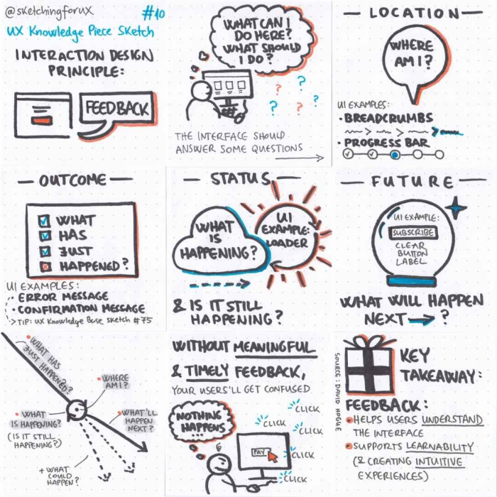
These are the essential questions. However, Krisztina Szerovay expanded those in her UX Knowledge Sketch by saying that, at every point of their journey, every user needs to know answers to these questions:
Where am I now?
What has just happened?
What is happening now?
Is it still happening?
What could happen?
What is happening next?
To make the most of your onboarding experience, use elements like error messages, confirmation messages, breadcrumbs, progress bars, status notifications, CTA buttons, and timely feedback to convey clear messages, meet users where they are, and exceed their expectations.
(Source)
Step #4: Use tooltips to ease friction
Wherever you see a need for further explanations, additional information, or form field expansions, you can use tooltips to add another layer of context and clarity. Tooltips provide in-line help to users and they are an excellent way to keep them going without friction.
While creating tooltips, keep these best practices in mind:
Keep them as simple as possible
Make them clear and understandable
Use them only where necessary
Make them instantly visible
Keep them accessible to everyone
You can easily build, optimize and manage tooltips using Chameleon’s editor, without a need for coding. You can customize elements, keep everything on-brand, and update them anytime.
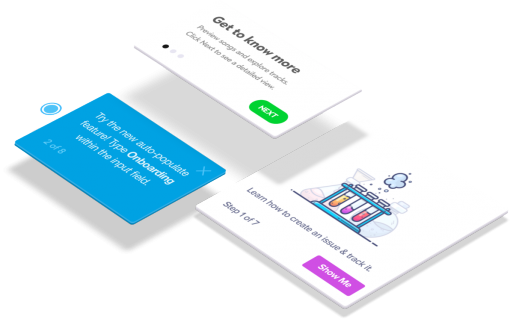
Don't waste time building Tooltips from scratch
Chameleon lets you design and change tooltips on the fly, without code.
Step #5: Gather feedback in-product
If you already have a cohort of first-time users, you can engage them with in-product Microsurveys to get real-time feedback and optimize the onboarding even more.
These are some of the questions you may want to ask through the widgets:
Was this step easy for you?
How easy was it on a 1-10 scale?
Was this product tour too complicated?
Is there anything you didn’t expect at this point?
Were you pleasantly or unpleasantly surprised?
How satisfying was this onboarding process?
Will you recommend our product to your friends?
The questions will depend on the context, but the point is that you can use Microsurveys to perform targeted in-product research to gather quantitative data. Plus, don’t forget that you should also include qualitative research whenever you can. That will help you provide a holistic experience.
And, again, keep in mind that you can create on-brand Microsurveys with Chameleon to build continuous feedback into your product and start nurturing long-term relationships with your users from the start.
Best practices in onboarding first-time users for SaaS brands
Now, let’s go through some of the best FTUE practices and examples of good product design and effective onboarding flows.
7 best practices for first-time user experiences:
Create with a specific user persona in mind
Do your research and create ideal customer personas before you start creating onboarding flows. The more insights you gain about your users’ needs, expectations, and behaviors, the more capable you’d be to make data-backed decisions about their journeys towards discovering your product. Then, ensure that the onboarding experience matches each of the user journeys.
Customize the experience for each of your personas
Multiple users, many Jobs to be Done. Create different onboarding flows for different personas. An account admin might want to get straight into viewing usage, but a designer needs to know where they can add brand themes. Ask questions in your signup flow – then show the right users the right paths to “aha!”
Use conversational onboarding tools to inspire "aha!" moments
Help users discover the real value of your product quickly and effortlessly. Continue to engage them with product walkthroughs, whether you choose to do it with bite-sized snippets of information in tooltips or with a tour consisting of modals, banners, and hotspots. Don’t forget to add Microsurveys for instant feedback, as well.
Write clear and concise product copy every step of the way
For every in-product message you want to convey, make sure it’s instantly understandable to your users. Keep their mental state and cognitive load in mind to adjust the format, style, tone of voice, and other elements of the copy. Remember, users should always know where they are, what is happening and what to do next.
Meet your users where they are and gently guide them through
Don’t drop an information-overload bomb on your users the second they start using your product for the first time. Instead, assess the important touchpoints for each of the onboarding journeys and make sure to deliver the right message at the right time. Help your users easily find their way around.
Run A/B tests to gather information about user behavior
Experiment with different message formats and various user onboarding tools to learn how users interact with your product. This will lead you to the discovery of the most desirable (and the most effective!) way to deepen engagement and increase feature adoption rates. An increase of retention rates will follow.
Use analytics to evaluate and further optimize the flow
User onboarding is not a “set and forget” practice. More likely, it’s an ever-evolving game. Set clear goals for each of the flows and start analyzing their performance. The findings will help you decide on further iterations. It’s all about continuous improvement.
And here are some of the best SaaS onboarding examples:
Looking for inspiration on how to create an effective onboarding experience? Learning from others is a great way to see what works in action. Here are some of the best SaaS onboarding examples that showcase how to engage new users, highlight key features, and drive long-term adoption.
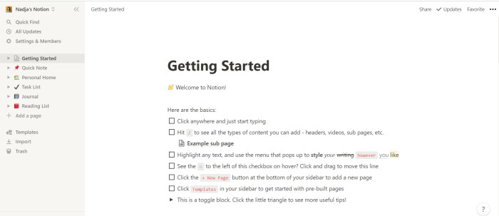
Notion’s learn-by-doing onboarding: Notion offers a lightweight FTUE by introducing the core features with a quick tutorial. Plus, it leads the users towards an editable Getting Started page where they can try the commands on their own or start using templates.
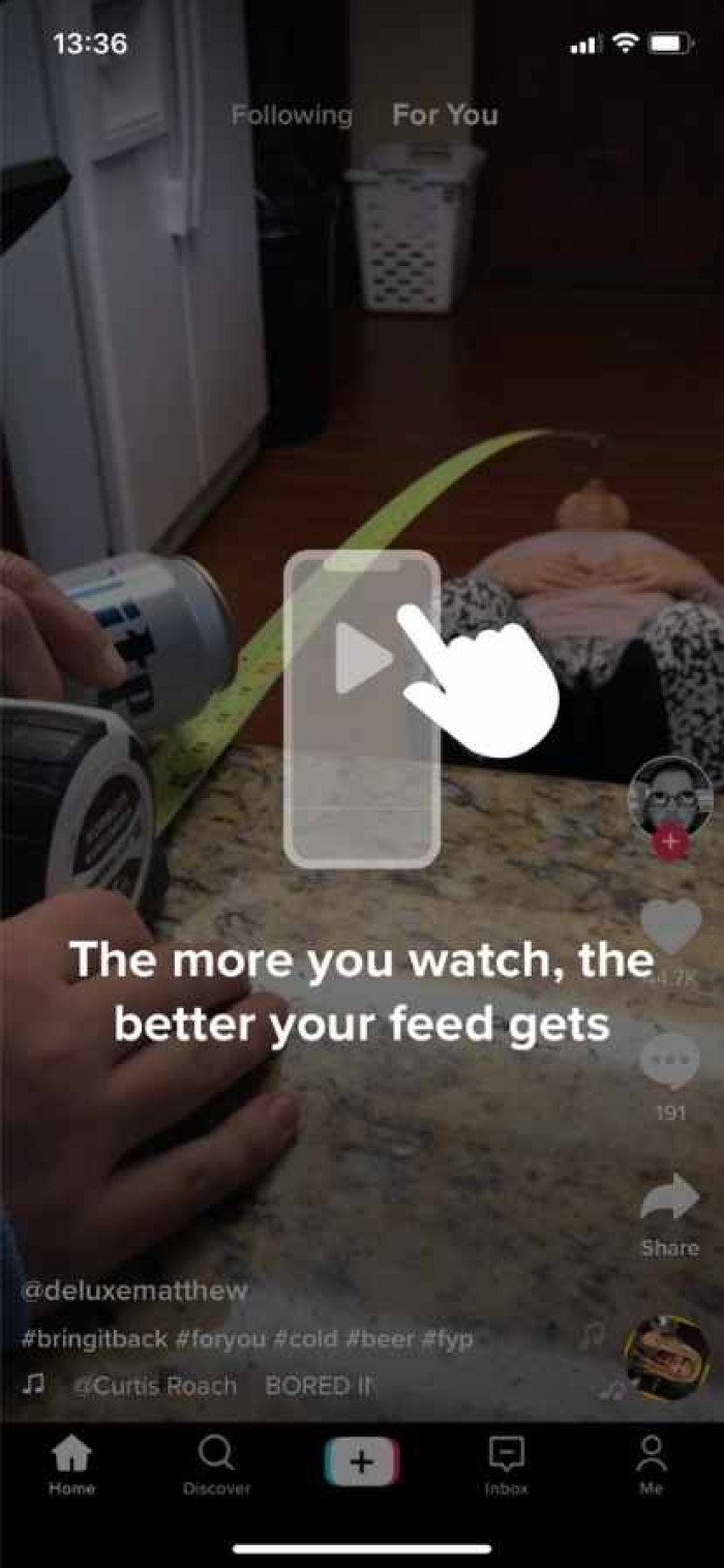
TikTok’s activation-focused onboarding: From the moment they sign up, TikTok informs first-time users that their feed will get more personalized as they scroll through it more often. This activates users and drives them to the “aha!” moment early on.
(Source)
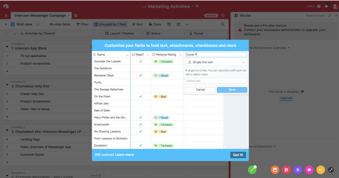
Airtable’s functionality-based onboarding: This SaaS business used the product tour modal (made with Chameleon) to help its users better understand the flexibility, scalability, and customizability of a core feature.
(Source)
Final thoughts on the importance of the first-time user experience
When you excel in the first-time user experience, your users will feel more engaged and empowered to dive in, explore, and start using your product regularly.
And all that while thinking: "Wow, this is exactly what I was looking for. It's a game-changer and a life-saver! Can't wait to share this with my team. Oooh, they're gonna love it, too!"
If you want to delight your new users (who doesn't?!) and if you’re looking to learn more about in-product marketing and product-led growth, sign up for our newsletter. Get tips, tricks, and insights delivered to your inbox, and start growing your base of happy users.

Weekly advice to make your product stick 💌
Be the first to get the latest product best practices and resources


