Intercom is a modern messaging platform which allows companies to engage prospects and customers through chat, emails, and self-serve help articles.
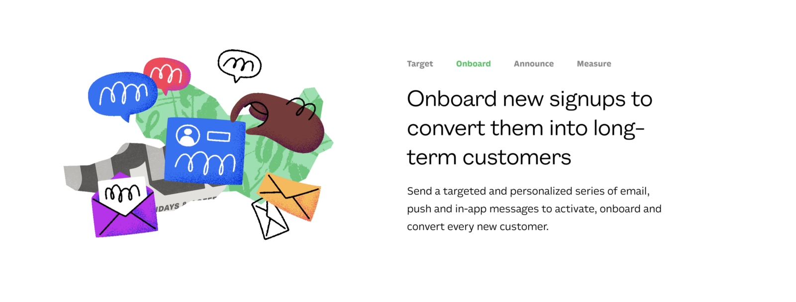
One of its strong value propositions is user onboarding. Intercom references this use case on its site, blog content, and even Google ads:
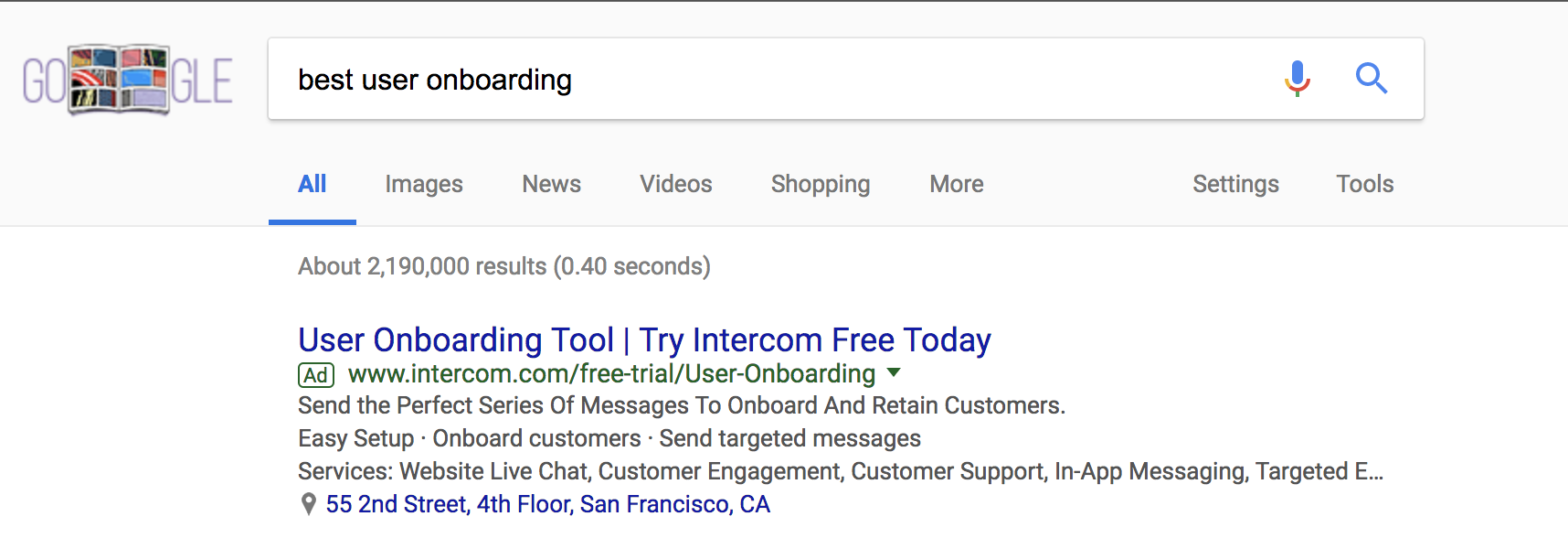
And Intercom can be very useful for this! Even we, at Chameleon, use Intercom to send triggered email campaigns and in-app messages to our customers after they sign-up.
BUT when it comes to onboarding customers, Intercom knows that engaging their users just through messaging isn’t sufficient in helping them find the “Aha!” moment.
The User Onboarding Patterns that Intercom Uses
Onboarding is not just part of Intercom's value proposition, it is also something they spend a lot of time improving in their own product. Intercom knows the value of helping users quickly understand the product is key to them becoming successful.
If you go through Intercom's onboarding you'll notice that they use a range of patterns and channels, including custom setup modals, effective product tours, tooltips, videos, chat, emails, and help documentation.
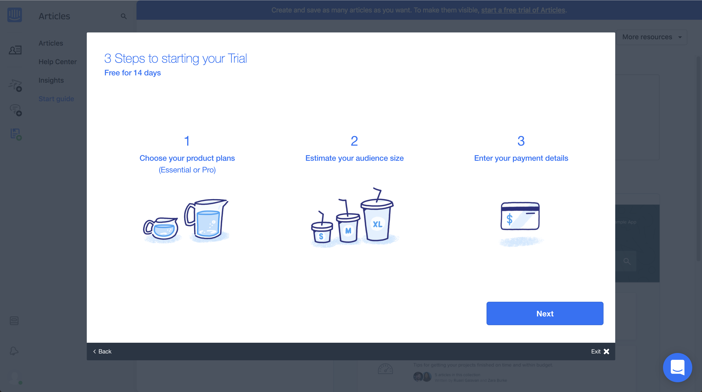
We are huge advocates of using multiple channels for user onboarding as each channel has its strengths and weaknesses and has specific cases in which it's most effective.
How Intercom onboards users inside its product
When setting up Intercom there are a multitude of product tours available to interactively teach users how to find value within the interface.
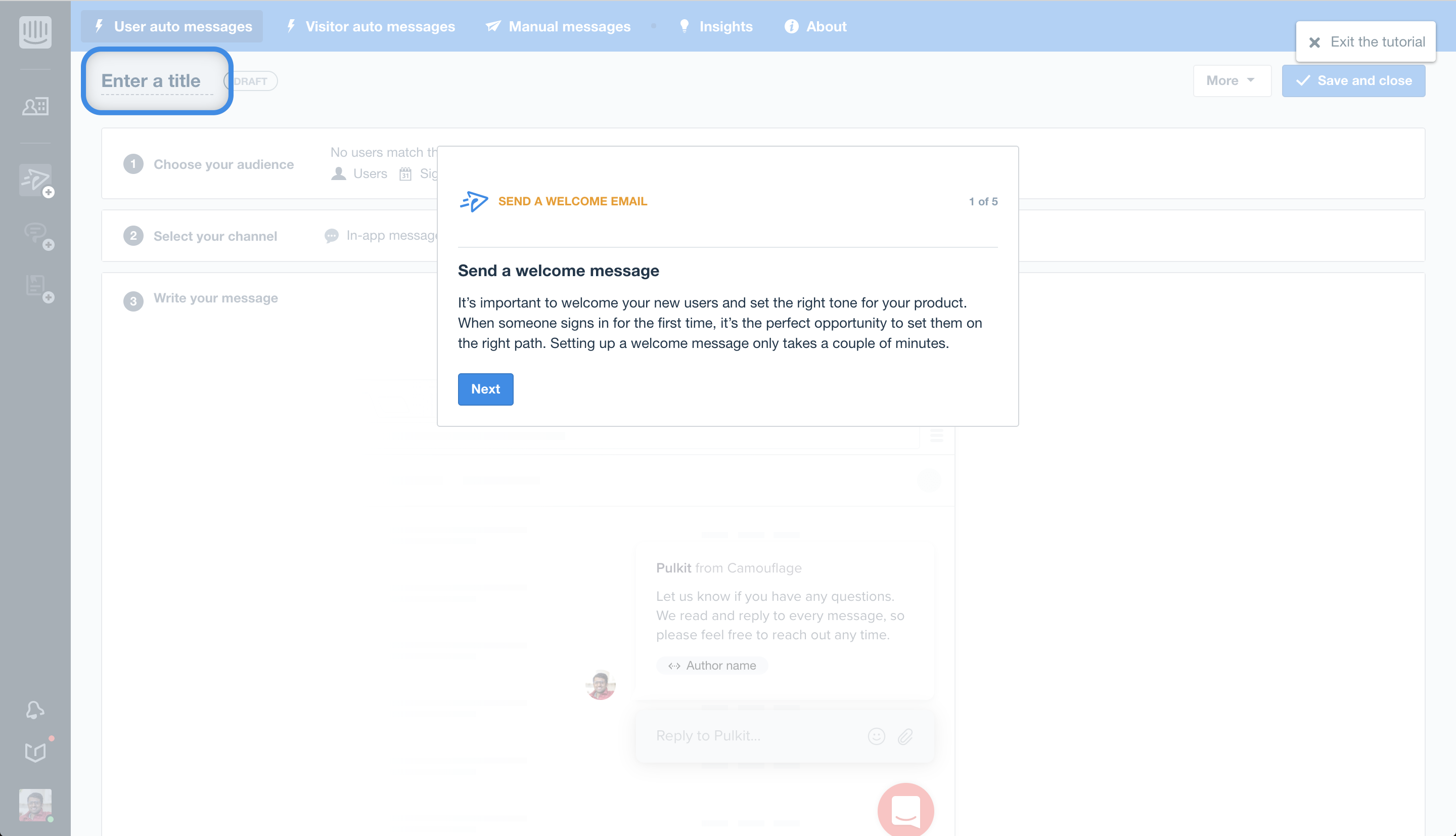
These tutorials are available from a very distinctly labeled "Tutorials" section within the Intercom Start Guide. This enables users to easily discover and take these product tours to help them get to know the Intercom UI.
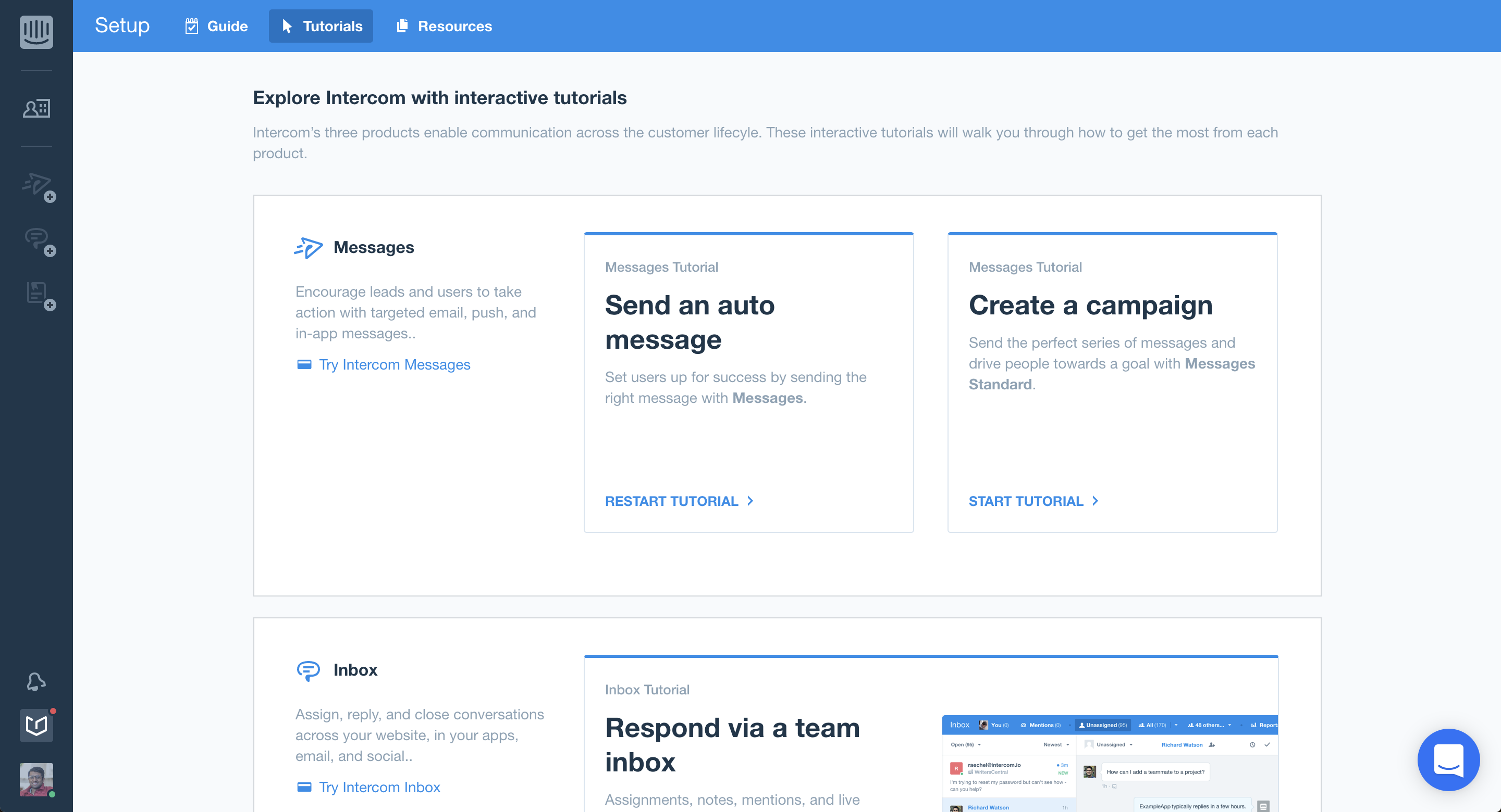
In addition to these product tours for new users, Intercom also uses in-product guidance for other use cases, such as upselling and onboarding existing users to new features and design.
Intercom just recently announced a brand new visual design for its products. To drive awareness of the new UI changes and get their users to update to the new version, they used a banner at the top of their app: 👇
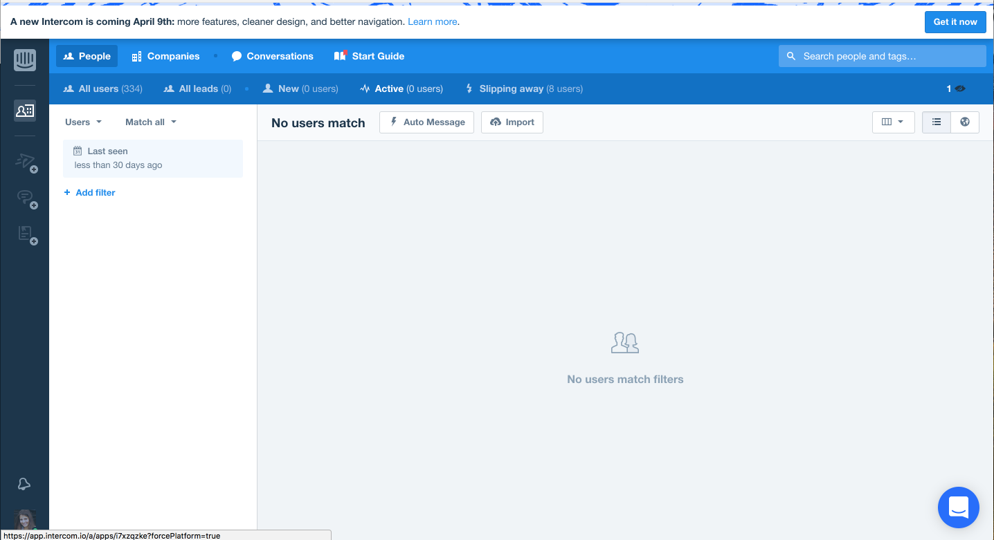
This is effective because it enables users to learn about the changes and act on them while still in context. If Intercom had instead used just an email, then a user may not have read this on mobile or quickly glanced at it, without having the time to fully explore.
The best way for a user to learn is by interactively DOING.
Once a user switches to the new interface, then Intercom uses another pattern - Tooltips - to point out some of the key differences in the new version. Note that the copy is simple and drives users to act because that is how users will effectively adopt the changes.
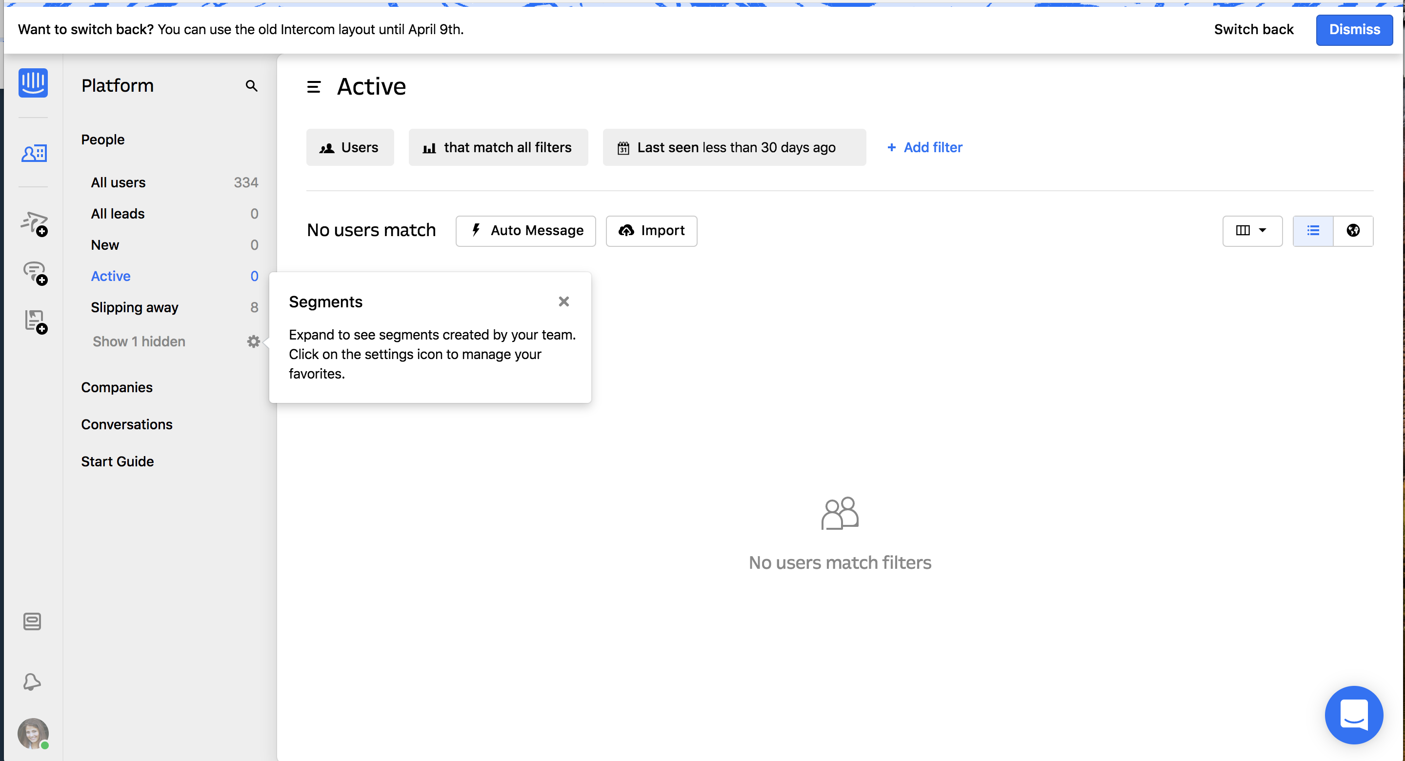
Intercom also uses hover tooltips to provide a more subtle way for users to learn; these are great to avoid being pushy and to embrace the curiosity and interest that users will naturally have if they are interested in a product.
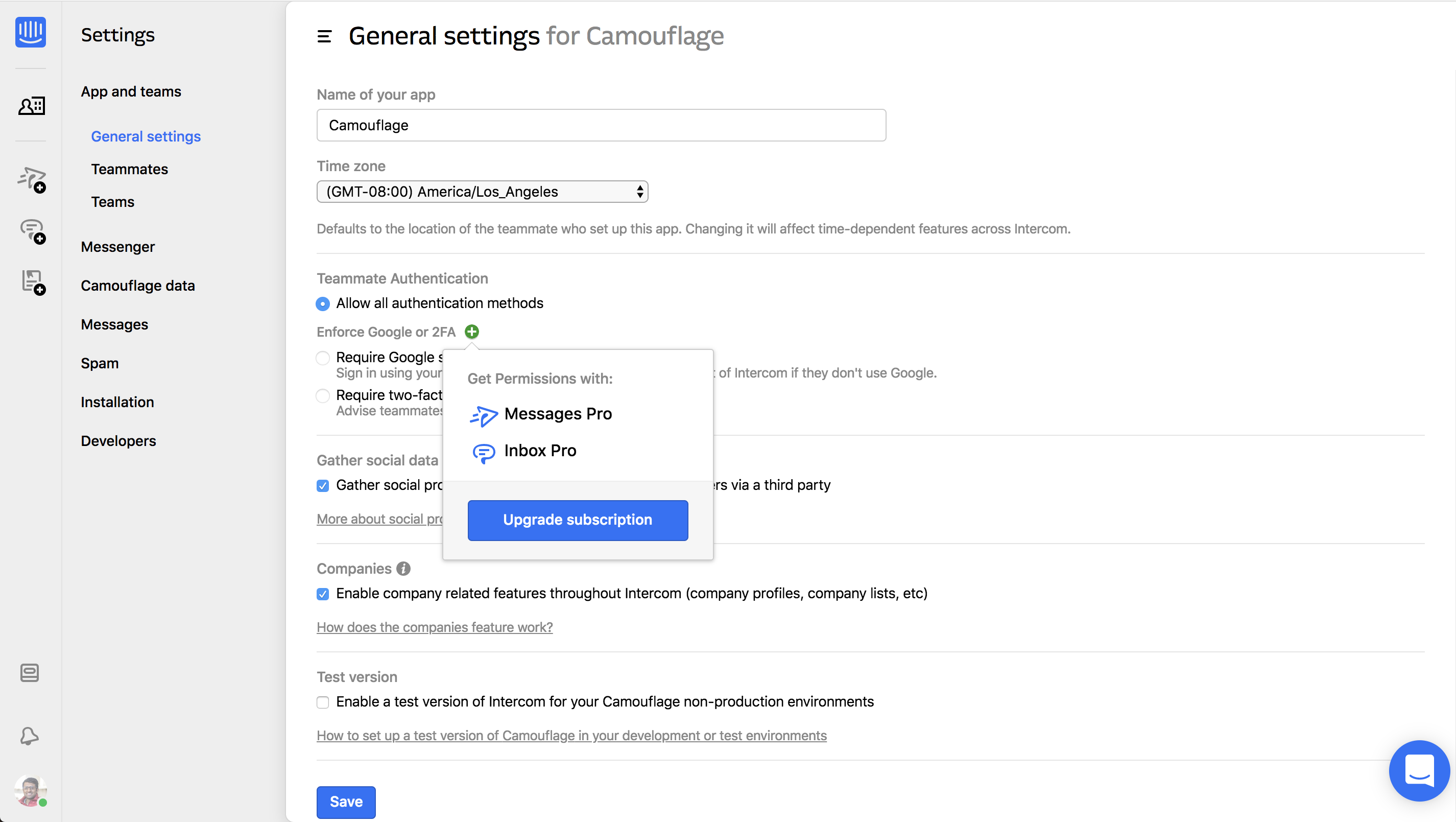
These different in-app UX patterns, including product tours and tooltips (automatic and hover) are the best way to teach users about sophisticated software and interfaces. That’s why Intercom uses product tours to help onboard users.
Intercom recognizes that it needs to supplement emails, chat, and videos with this in-product guidance and has many product, engineering, design, content people working on these crucial parts of the product.
How your product can also do what Intercom does
We've seen Intercom using a variety of patterns, such as product tours, tooltips, modals, etc. to help teach and guide their users. If you're interested in adding these to your product, then you have two main options:
1. Code your own: possible if you have engineering and design bandwidth to create and optimize these. Great for very custom and controlled experiences.
2. Use a SaaS platform: such as Chameleon (we even have a deep Intercom integration that allows you to leverage your Intercom data!) -- very quick way to get started with in-product experiences, without coding.
Building in-product guidance can seem overwhelming, so start by keeping a very narrow scope. Start with a very clear goal: is it drive adoption of an upcoming big feature; is it to improve activation amongst new users; is it to increase conversion of free trialers to demos etc?
Once you have a goal, then understand what the blocker is: is it a lack of motivation; or users not knowing what to do next; or a mismatch in expectations?
You can then begin to address these with a product tour or modal to help boost motivation, signpost what users should be doing or better managing what they should expect. To see how other companies are doing this, check out our Inspiration Gallery which contains examples from around the web.


