In-app patterns are evolving to accommodate changing user expectations and to enable more passive and less intrusive approaches to nudging, educating, and guiding users
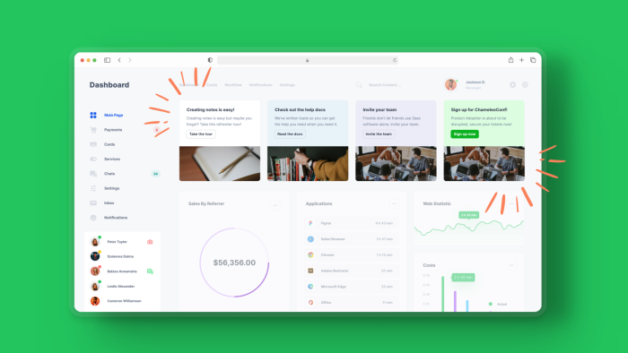
Chameleon is introducing a new product line: Embeddables. These are in-line components placed within pages without coding that feel more native, are less intrusive, and better reflect what users want.
Embeddables types include “Banners” and “Cards” (single or multiple) that can be customized and targeted to offer more native, on-brand callouts within your application
Use cases include user onboarding, feature adoption, upsells, event and customer marketing, and self-serve troubleshooting. Existing customers are already finding great success, and we’re excited to roll this out publicly.
Chameleon continues to innovate to become the best-in-class digital adoption platform built for modern SaaS teams that care deeply about design. Follow Pulkit on LinkedIn to stay updated on progress, or book a live customized demo for your team
In-app patterns are evolving
Product-led Growth (PLG) is now firmly established as a crucial channel for SaaS companies to drive greater growth.
Foundational to an effective PLG motion is improving the user experience to be more self-service and running targeted and contextual in-app campaigns to nudge/prompt users to take key actions or engage with sales.
As more applications run these in-app campaigns, they can become noisy, and need smarter design to avoid interrupting users or creating a source of friction.
Chameleon has been working on this and offers multiple ways to enable users to opt-in (e.g., via checklists or “on-page icons”) and smarter ways to avoid interruptions (e.g., using “smart delay” to wait until a user has paused and not taking other actions on the page).
Learn more about what works and doesn’t work from our Annual Benchmarks Report (using data from hundreds of millions of interactions).
However, we can now do something that was impossible before without engineering: add content directly to your page and have it sit alongside/in-line with components built by your engineering team.
We call these new patterns “Embeddables” and you can build these Embeddables (such as in-line Banners and Cards) in Chameleon today. We been impressed by the uptake amongst our customers and excited about the potential these have!

“It's nice to embed things contextually in different parts of the product. We've been experimenting more with that and seeing many good results and feedback.”
Using these “embedded” experiences (instead of overlays) means we avoid the risk of being intrusive or blocking usage of your product while offering an eye-catching and convenient way for users to engage with your campaigns.
Chameleon’s mission is to enable more personalized products without coding, which is better for end-users and product builders. To meet this mission, we are always evolving the UX patterns available to drive in-app user engagement so that they are modern, match current best practices, and delight your users.
Companies like Figma, Notion, Slack, and others have shifted user expectations on what to expect from a well-crafted product that prioritizes user experience. People now expect a higher standard across all the tools they use. Product tours and walkthroughs are no longer novel, and although they have become crucial in guiding and coaching users, we need to continue to innovate to stay fresh and engage users.
What exactly are Embeddables?
Embeddables are in-line patterns (such as Banners, Cards, Empty States etc.) that sit within your existing page. This means they don’t block any of your existing page content and feel like a more native part of the underlying application.
You can position these using Chameleon’s point-and-click Builder, without any engineering help, and your page will automatically be adjusted to create the space needed for your Embeddable.

Embeddable Cards blend in to your product
This differs from other Chameleon Experiences (such as Product Tours, Tooltips, Checklists, etc.) in that Embeddables do not sit above/over the application but within it.
While there are many use cases where it’s relevant to actively capture a user’s attention via a modal/slideout etc. that sits above the existing UI, Embeddables allow users to engage with your prompt/content more passively. This can significantly improve user experience and satisfaction and is relevant for various use cases (see below).
Embeddables have all the benefits of other Chameleon Experiences: they can be targeted based on any user data; they can be styled to seem native and on-brand; they can be displayed based on page URL and content rules; they can contain powerful CTAs to launch other in-app experiences (including via our integration extensions); and they can be analyzed to measure success.
These are available for all Chameleon customers and accounts today, so try them now or check out the interactive demo on how to build Cards 👇
Use cases for Embeddables
Here are a few great ways to leverage Embeddables:
User onboarding: Kick off a walkthrough from a banner. Instead of automatically displaying a product tour that provides an overview to the user, show a dismissable/snoozable banner on the top of the page to let users learn more whenever they are ready. This allows them to explore on their own (critical for a sense of accomplishment) and seek to learn more when ready.
Feature adoption: Teach people how to use the feature. Include an in-line banner on a feature page (especially for new or underused features) with a CTA that launches an in-app video modal (using our integration with Loom / YouTube / Wistia, etc.) to provide users with a more detailed and in-depth view of the feature and some associated best practices.
Upsells: Book a call with the sales team. A single card at the bottom of a left-hand navigation menu prompts users to unlock the next usage tier or get a demo of locked features by booking a call (using our integrations with HubSpot, Chili Piper, or Calendly).
Event marketing: Promote your conference or webinar. Add a tile amongst other tiles on your page but use this to promote an upcoming webinar or other event, so users are encouraged to connect with you live. Use our integration with Livestorm for one-click registration without users needing to fill out any forms.
Customer marketing: Collect G2 reviews. Add a set of Cards that enable users to engage with your brand by leaving a G2 review, recording a video testimonial, jumping on a feedback call, participating in user research, etc. Target this row of Cards only to accounts that have found success in your product or show an alternative version based on lifecycle stage.
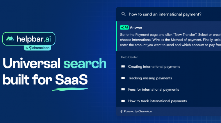
Self-serve troubleshooting: Options for users to get help. Present a menu of cards on a dedicated help/support page in-app to showcase the variety of resources available to users, for example knowledge base, developer documentation, in-app chat etc. You can launch in-app chat via our integrations with Zendesk, Intercom, Help Scout etc. You can also launch Chameleon’s HelpBar to allow users to get AI-summarized answers from existing help documentation!
Chili Piper used Banners to generate $150,000 ARR from upsells in two weeks 🤩
What’s next at Chameleon?
Chameleon’s goal is to be the platform of choice to drive product adoption and PLG for modern SaaS teams and to accomplish that by providing depth and innovation that leads to more control, customizability, and coherence for in-app experiences.
We will continue to expand our Embeddables offering. Next will be “Stacks,” where you can create multiple Cards that rotate and use the same in-app real estate. This will help you share more relevant content using a pattern users are familiar with, all without needing any engineering.
Beyond our Embeddables work, we’ve recently made the following improvements:
Upgraded the default styles of Experiences so they match modern standards and look much better out-of-the-box
Offer “Composable Audiences” so you can construct a target audience using a combination of saved user segments/groups to make it easier to retain a source of truth for user segments and still quickly get sophisticated in your targeting
Automatic history for the HelpBar: now users will automatically (and without any additional engineering implementation) see recently visited pages when they open the HelpBar, making it even faster and easier for them to navigate
We continue to ship at a rapid pace and enjoy working closely with hundreds of customers, ranging from startups like Writer, Vitally, and Shortcut to enterprises such as Braze, Twilio, and S&P Global.
Follow me on LinkedIn to stay updated on our progress or book a live demo to see how we compare to others.


