Chromium, the open-source project that feeds into Google Chrome releases, announced a change on the 7th of January that will impact how Chrome handles notifications. For many, myself included, this tweak will be a huge quality of life improvement.
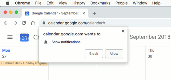
Example Google Chrome browser notification opt-in prompt.
Instead of a notification prompt stealing focus, forcing a decision, and causing interruptions, Chrome's new UX will shift notification priming to the background, politely and quietly giving users the choice to opt-in.
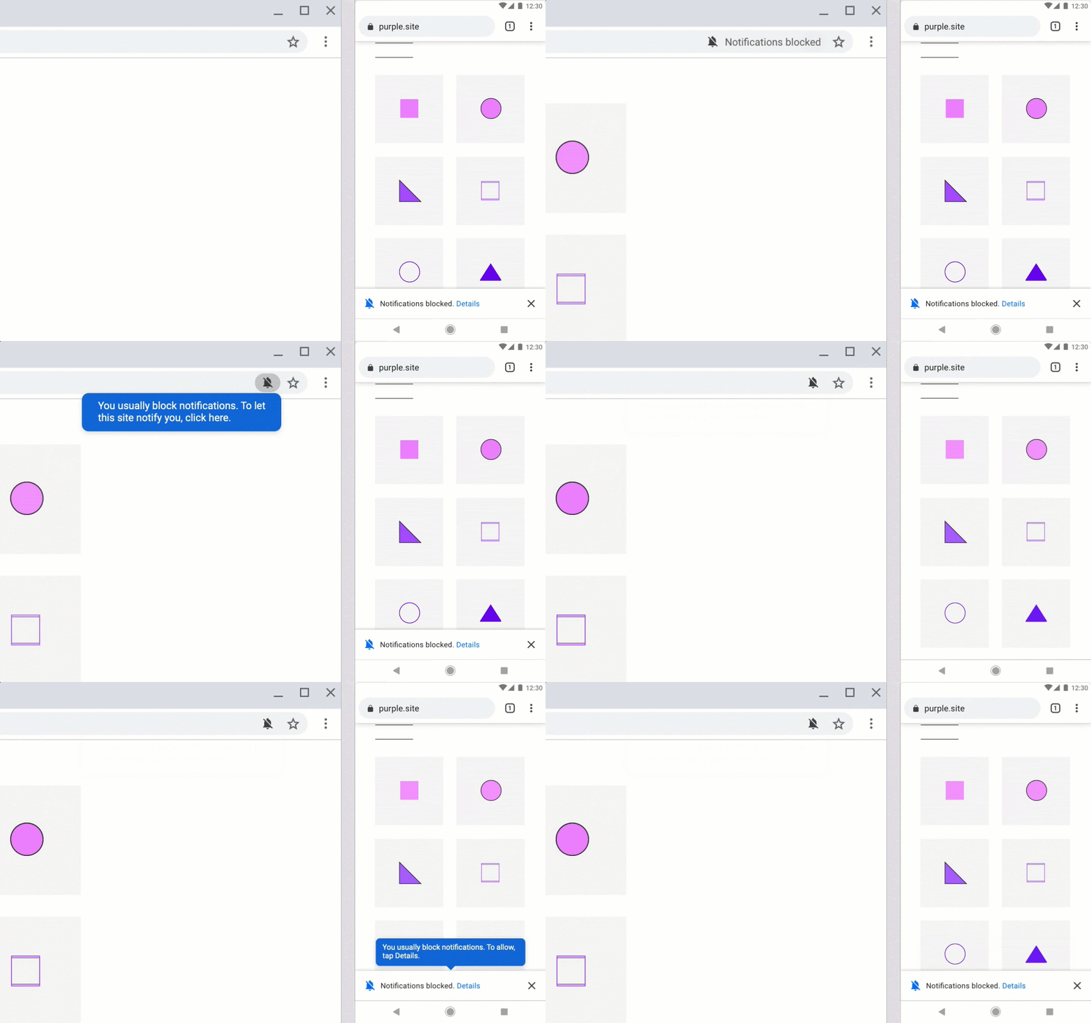
An alternative to aggressive permission priming. Source: Chromium Blog
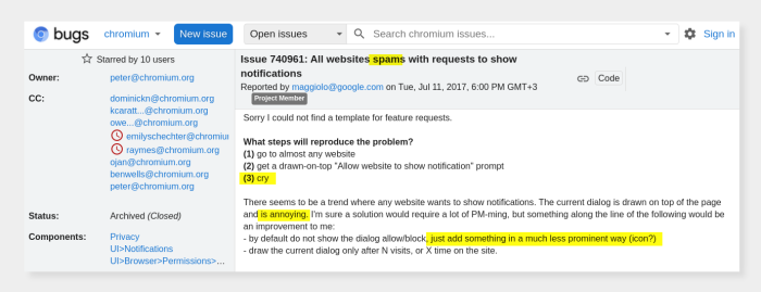
This is a hotly-requested tweak stemming from a widely-frustrating issue:
The release of Chrome 80 will help us all as users within the Chrome ecosystem, but also teach some leading principles of good UX design, especially with regards to notifications and in-product user experiences.
Chrome supports browser notifications, which sites can use to show dynamic messages to users, akin to mobile app notifications. Websites and SaaS web apps also have “notifications” that show within the product and can take a variety of UX patterns, such as onboarding flows, product tours/walkthroughs, in-app guides, feature announcement modals, etc.
⚠️ If these product experiences are unprompted, then they are essentially in-product notifications and should follow notifications' best practices to be successful.

A welcome page modal (that you can build with Chameleon) should be considered similar to notification and should take inspiration from Google’s recent user-centric changes.
Google will now, in certain cases, prevent websites from asking you permission for enabling notifications. Instead, it will turn these off by default, but allow you to change this. (<sup>†</sup>this will initially only apply “under two conditions: first, for users who typically block notification permission requests and second, on sites with very low opt-in rates.”)

The reasoning for this is that notifications are a common complaint because websites request permission out of context and this interrupts a user’s workflow.
There is already some great advice out there on when and how to ask for notifications permissions (aka permission priming) for mobile apps:
Ask when relevant: Only ask for the permissions necessary and right when they are needed. This follows the principle of “just-in-time” for any work needed from the user.
Educate before asking: make sure users understand why and prevent them from being surprised by your ask
Double opt-in: Check if a user is open to giving permission before launching the platform notification request. You only get one chance on most platforms so you can delay asking until the user is ready.
Reward with value: Once the user has done the work of giving permission, provide them some instant gratification or value.
These principles apply when showing users any in-product experiences; for example, don’t give new users a tour of features that are not immediately relevant in them finding the aha moment.
The changes that Google has introduced provide three specific lessons:
1. Adapt defaults to the best specific (not general) case
Google is switching the default state to Notifications = off for some users and some sites. It’s not applying this change to all users or all sites. This is not about A/B testing what the best overall (general) version is, but personalizing it to what’s best for each user.
Google’s version may use sophisticated machine-learning methods to better understand users and sites, but you can apply the same principles for your in-product experiences, by proxying this with other more easily available data, e.g.:
Role (maybe “admins” are more interested in detailed information vs. “team members”)
Satisfaction (maybe less happy users need more help; you can use Chameleon to create customer satisfaction [microsurveys](/assets/blog/user-surveys) inside your product, and use these to target other experiences)
Platform (show different notification/experiences on the web vs. mobile or maybe Chrome vs. Firefox, if it’s relevant)
2. Offer one-time UX to help users learn new patterns
Google made the default different but needed to teach users about this change. It did it in a subtle, yet friendly way using the blue tooltips:

This is an example of how to use tooltips. Products that use tooltips badly create a negative reputation for these teaching aids, which puts users at risk of confusion and churn. Read how to create a great tooltip design here.
Some simple takeaways:
Use tooltips or other one-time user experiences for teaching users one-off items. This doesn’t need to clutter your interface indefinitely, so a tooltip is a good pattern to use.
The copy should not repeat anything that’s obvious from the interface and should truly teach users something new and valuable
The design should stand out so that users are aware that this tooltip is not a normal part of the interface and that they should pay attention to this first before moving on. It can match your product’s brand but should not be the same as the underlying app color.
If you’d like to build and manage all your tooltips without needing help from engineering, then you can use Chameleon. You’ll also get analytics on how they’re performing and can edit them at any time.
3. Avoid interrupting user flows - use self-serve UI
Google made this change to the Chrome permissions behavior because too many websites were interrupting a user’s experience with a notifications request. As users, this is one of the most frustrating experiences.
Most of us now have the instinctive reaction to close out any dialog automatically that appears during our usage of the software.
If you’re one of the people behind interruptive UX, please stop! This includes modals, lightboxes, and shrouds -- even things Chameleon offers.
⚠️ Modals and attention-grabbing effects are often abused with the assumption that forcing a user to deal directly with a prompt is more likely to encourage them to take action. It actually backfires more often than not!
There is a place for interruptive UX; where the notification is critical to a user’s success and must be dealt with immediately before proceeding. Or if there is such a major change that a user will happily break their flow to learn more. Both of these cases are rare.
Instead consider using more subtle UI patterns to help notify users; such as banners, or slideouts, that let a continue with their workflow and take action when ready.
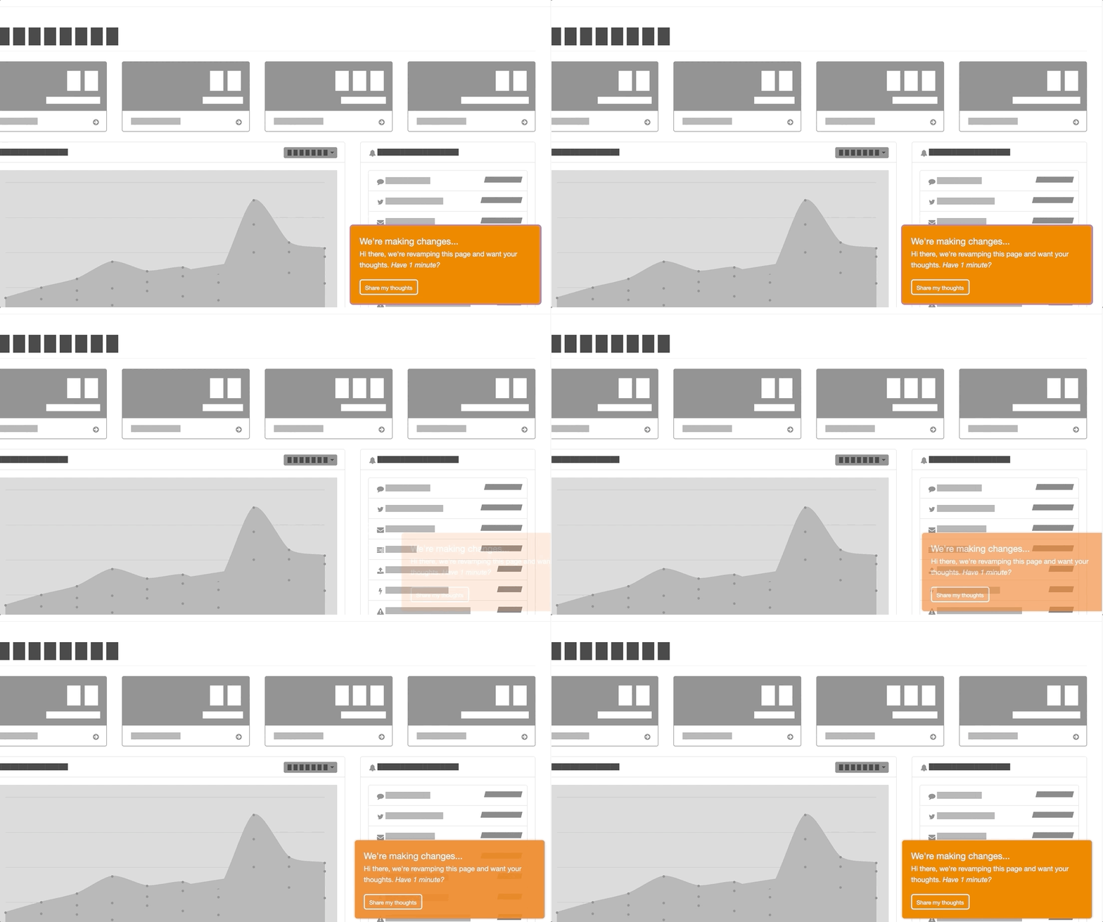
In-product slideout notification built with Chameleon
Alternatively, you can [use a widget or element](/launchers) on your page to let users access more information when they are ready. Clearly signposting more help will let users learn more at their convenience- and, you don't run the risk of interrupting their flow and facing their ire.
Apply notifications best practices to your UX
Google’s recent changes around how notification permissions are handled offer a great introduction to good UX practices when engaging users. Designers, PMs, and PMMs should look to apply similar principles for an in-product messaging to establish a positive relationship between users and this “in-product channel”.
Read more about growth design, user psychology, and product UX on the Chameleon blog.
💡 Learn more about how users interact with in-product prompts in our report, packed with original data:
Download: Product Tour Benchmarks & Best Practices
Build better tours with insight from 15 million user interactions

