We share best practices to deflect SaaS product cancellations in a special webinar with ProfitWell. Watch the trailer below and subscribe to get the slides and recording 👇
Reduce product cancellations: get the webinar recording and slides
Learn how great products like Zoom and Harvest deflect cancellations 📈
Everyone is struggling right now. For SaaS companies, one of the biggest challenges is how to reduce customer churn and deflect product cancellations.
Be warned! Reducing customer churn isn’t just about quick hacks like emergency price reductions or hiding the cancellation button. Tactics like that will hurt your retention in the long run. For your target persona, the best way to reduce customer churn in a crisis like this is to help your users see your product as an asset, not just an expense.
In this article we’ll look at how some top SaaS companies are deflecting user cancellations and keeping churn rates in the green, as well as how you can implement intelligent UX to deflect product cancellations. We’ll start with some examples, and then unpack some of the theory and best practices to understand how and why SaaS companies implement these flows.
How to Reduce Customer Churn: SaaS Crisis Survival Guide
How to Reduce Customer Churn: SaaS Crisis Survival Guide
Examples: How SaaS companies are reducing churn in crisis mode
Zoom
Zoom’s cancellation flow pulls in attributes from the user's account to show them precisely what they could lose by cancelling rather than giving general benefits.
In the screenshot below it indicates that the customer will lose access to 475 cloud recordings; that directly reminds a user of the value they are already getting from Zoom.
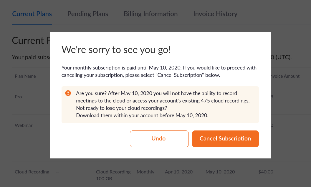
However, Zoom also offers a soft-landing by letting a user know they can download all the recordings and still have access. If Zoom hadn’t offered this, it might have led to strong resentment and annoyance. It’s important to avoid generating ill-will during cancellation to avoid burning bridges for a future return.
It’s also worth noting: These flows are designed to be high friction and multistep. Kind of like the opposite of UX best practices; UX for the only feature you don't want customers to use.
Algolia
Algolia is a powerful search solution delivered via a SaaS model. Here we can see how they’ve build their cancellation flow:
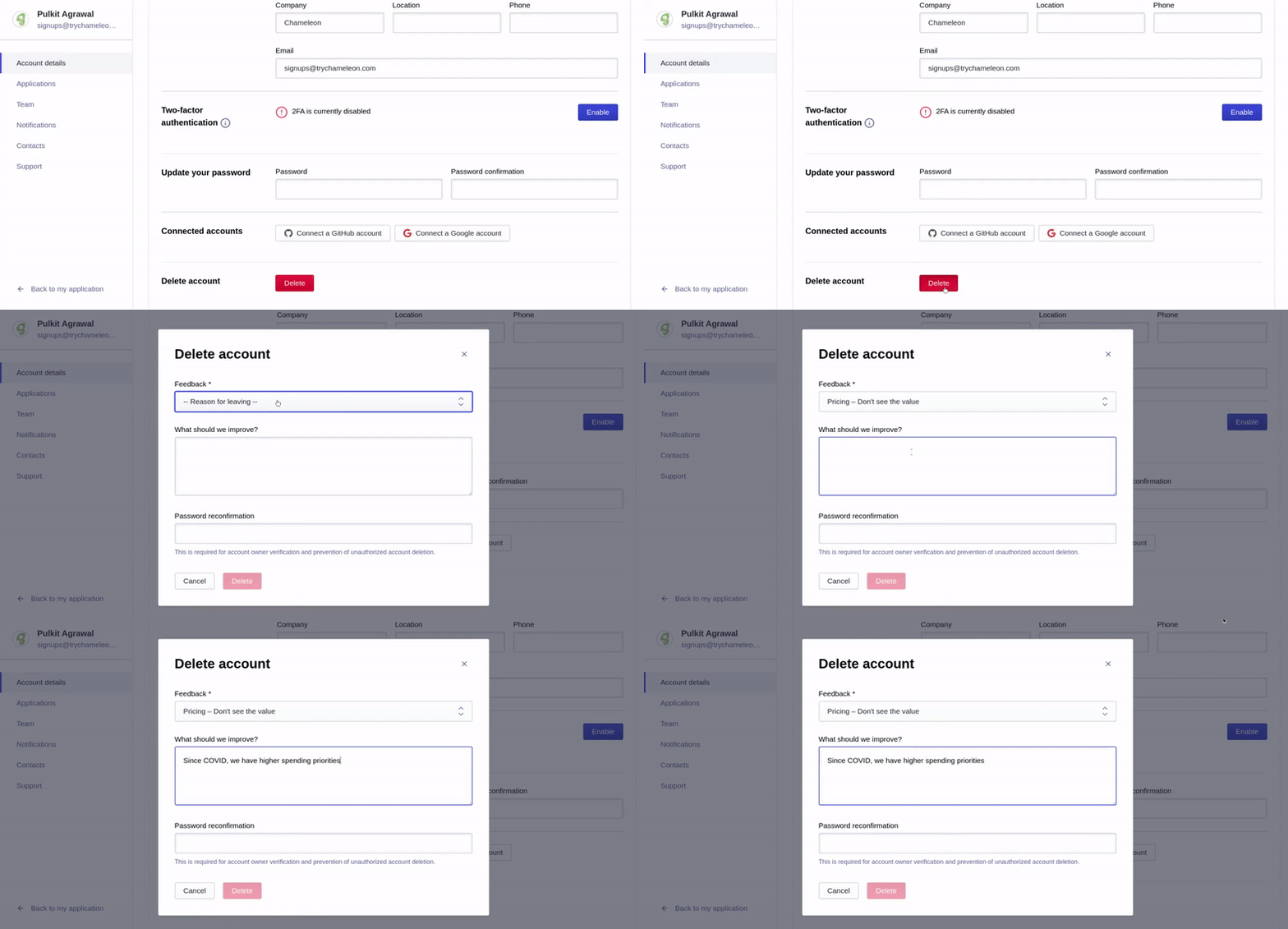
Feedback collection is the focus here, with the goal of preventing future churn. The feedback dropdown is a required field and the Delete button is disabled until this is completed.
If you’re making any form fields required or have other necessary conditions, it’s better to make this clear to the user up front, rather than unexpectedly throwing an error or refusal after they complete and submit the form.
There’s also an element of intentional friction in the form of password reconfirmation. Of course, this might also be a security measure, but another reason might be to reduce cancellations, especially in shared account scenarios.
Harvest
Here’s a simple two-step flow with a quick survey and clear copy from time tracking tool Harvest.
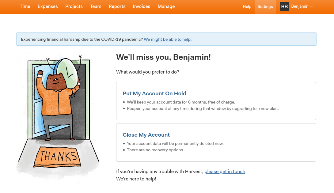
Immediately, you’re presented with an alternative to cancelling: Freezing your account.
An alternative “Pause” option is a great strategy to deflect cancellations. It fulfils the customer need of saving money, without forcing their hand with a cancellation. Remember for most SaaS companies customer lifetime value is much greater than average spend over a few months, so it’s probably worth foregoing a few months of revenue if you can save the account.
Harvest doesn’t advertise this option, but does present it once a user has indicated intent to cancel. The Pause option is first to let a user discover that before they proceed with a cancellation. There is also some helpful explainer text to indicate the benefits of pausing and the costs of cancelling.
You can also see a relevant COVID-19 banner at the top of the screen, reassuring users that the company is willing to go above and beyond to provide extra value.
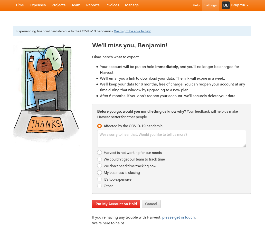
Harvest has clearly spent time building out this flow, and they have been careful to highlight the value loss and additional friction that cancellation will incur for the user.
Pigeon
Dominique from Baremetrics spoke to Pigeon founder Pat Walls to understand their churn deflection techniques.
Here’s what Pat has to say about deflecting churn:
“But here’s the secret to finding out why they are cancelling: build a relationship with them before they cancel.”
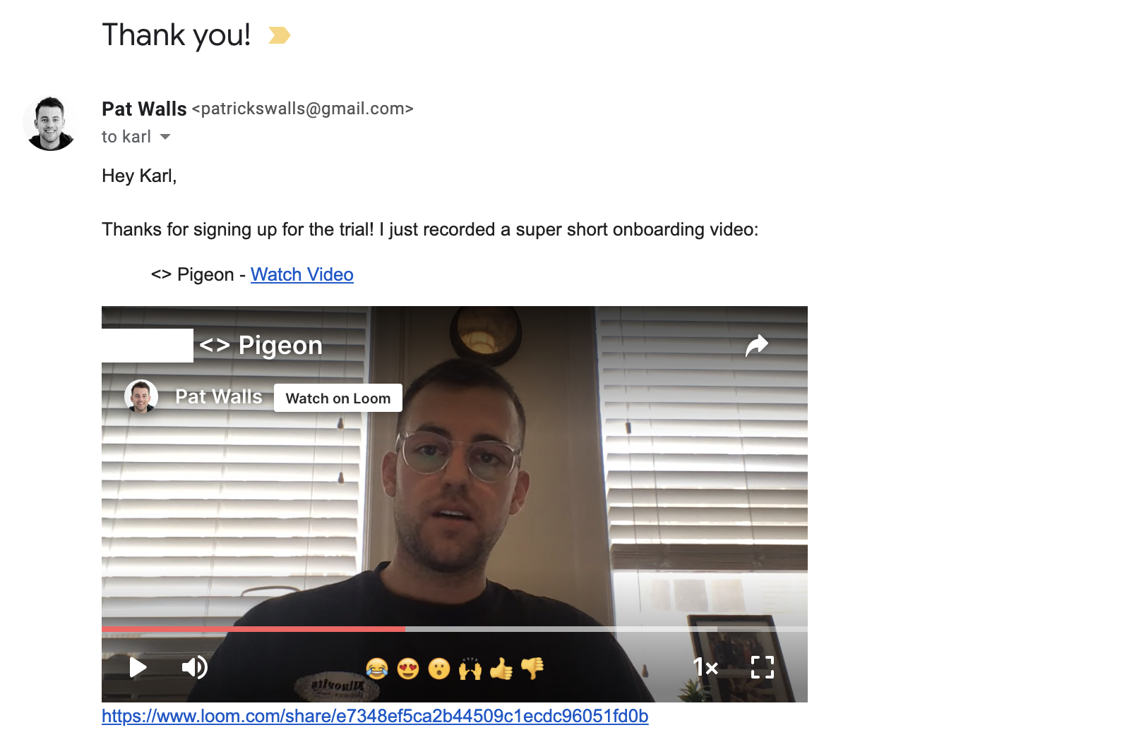
Pat is essentially saying that building a personal relationship off the bat can help form a kind of ward against churn. This is a great example of the importance of user onboarding best practices.
Customers will have a human point-of-reference and be more willing to share feedback. This will help you understand why churn is happening and prevent it in future.
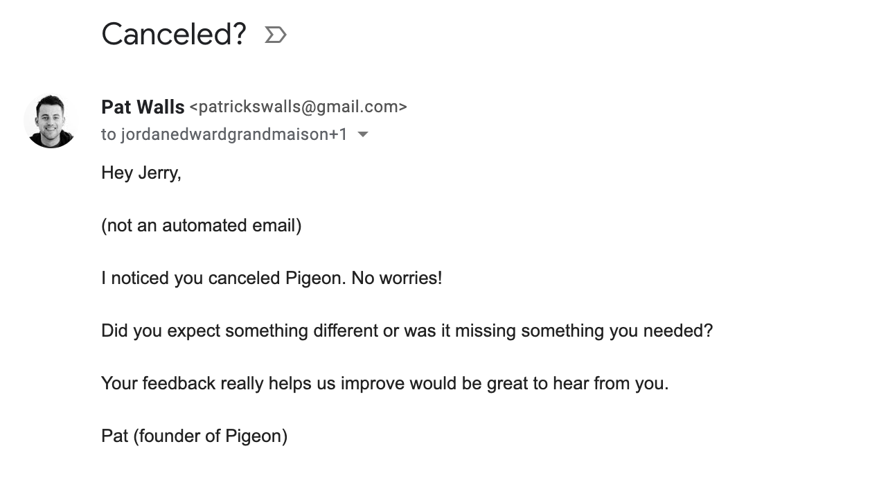
An email from a founder that first addresses an objection (“this is just an automated email”) can be a powerful way to start a conversation with a customer. Obviously this doesn’t scale but for important accounts you can log an alert and send a short personalized email. You can even use a keyboard shortcut to insert template text to make the process quick and easy.
Zapier
Integration giant Zapier uses a modal triggered by a click to downgrade to free:
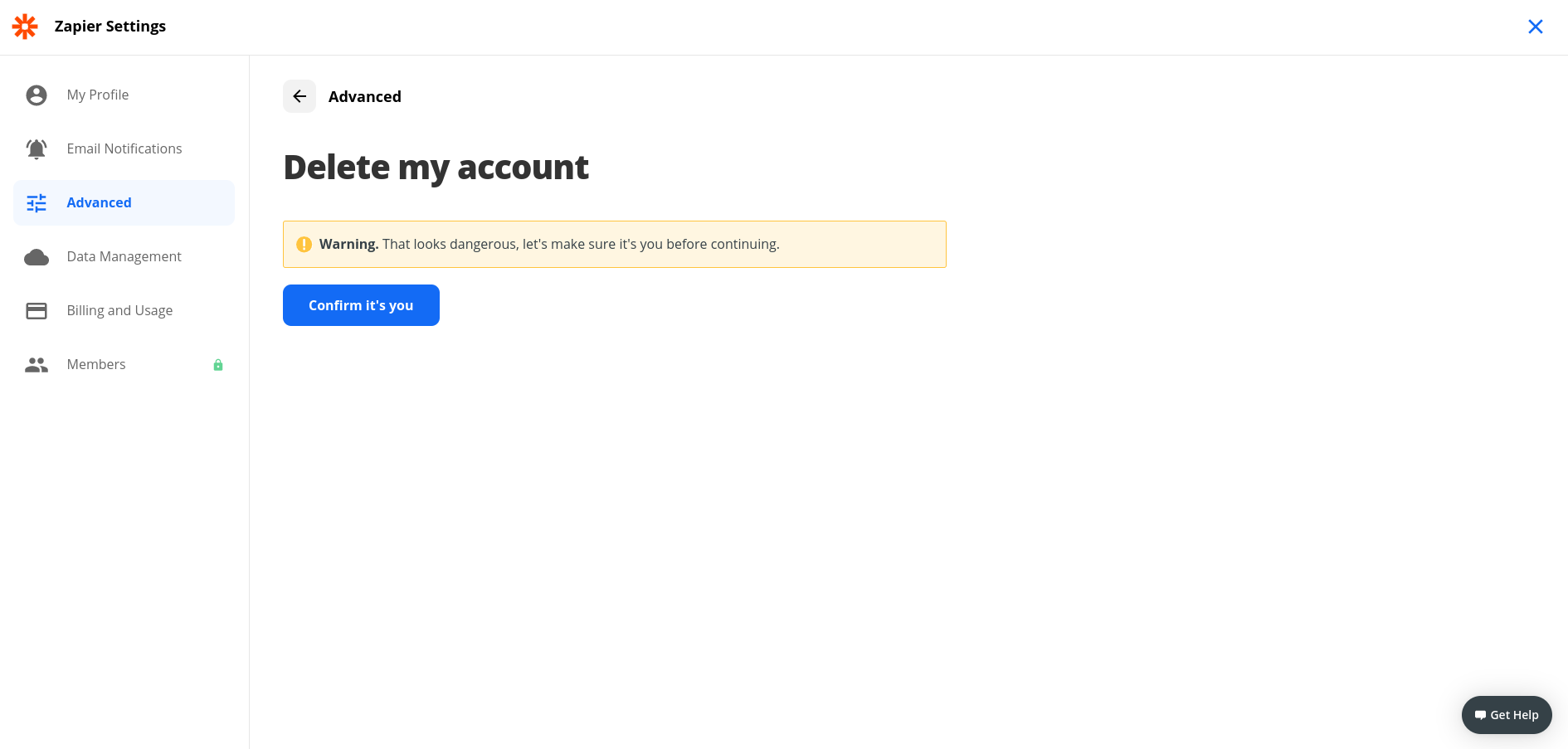
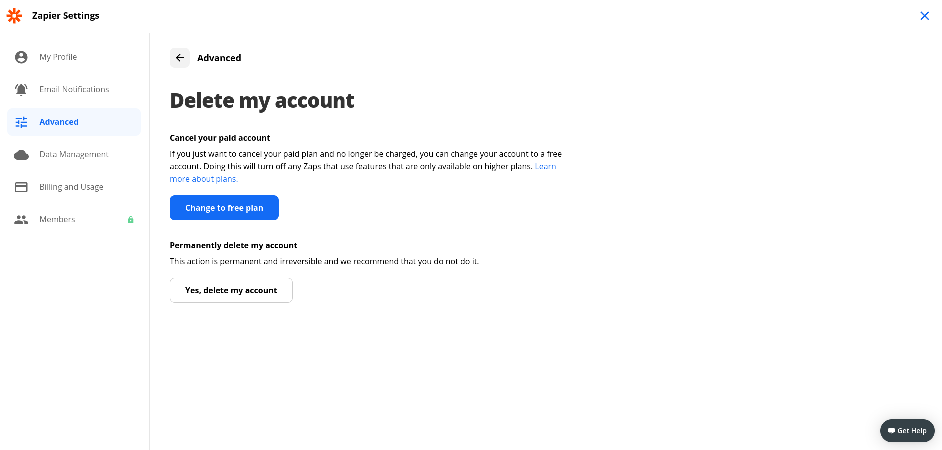
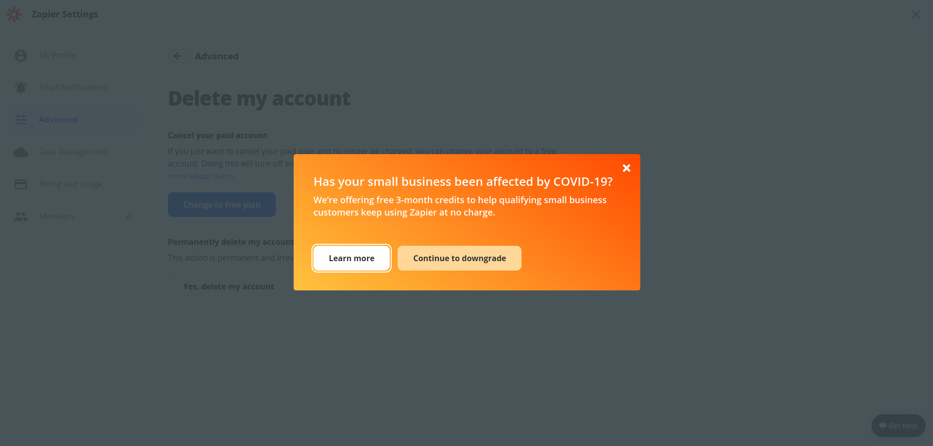
The strong contrast of this modal to the underlying app, including the shroud, means a user is forced to engage and make an active decision. It seems to be a simple choice to continue to use Zapier for free, but unfortunately Zapier’s CTA of “Learn more” is a little weak. However maybe they are running an AB test around this.
If you’d like to quickly build a cancellation modal and A/B test variations, you can do so with Chameleon. Get started here.
Delighted
Delighted's cancellation page has an in-app message widget which encourages churning users to work out a custom solution with Sales rather than cancelling outright.
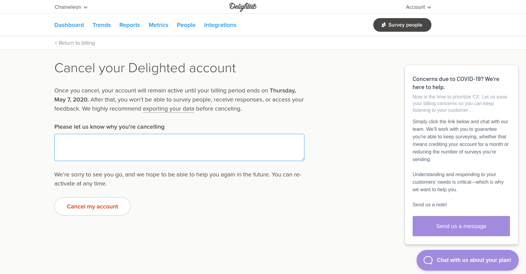
The widget, on the right, opens a "Send Message" button to a new blank message to Sales inside the widget.
Engaging users in conversation on the cancellation page through a bot or real-time chat can be an effective technique in reducing cancellations. This might be higher cost if you are staffing someone to respond so you may want to focus this kind of chat message only at higher value accounts or customers.
Ahrefs
Ahrefs makes the process harder with two required checkboxes:
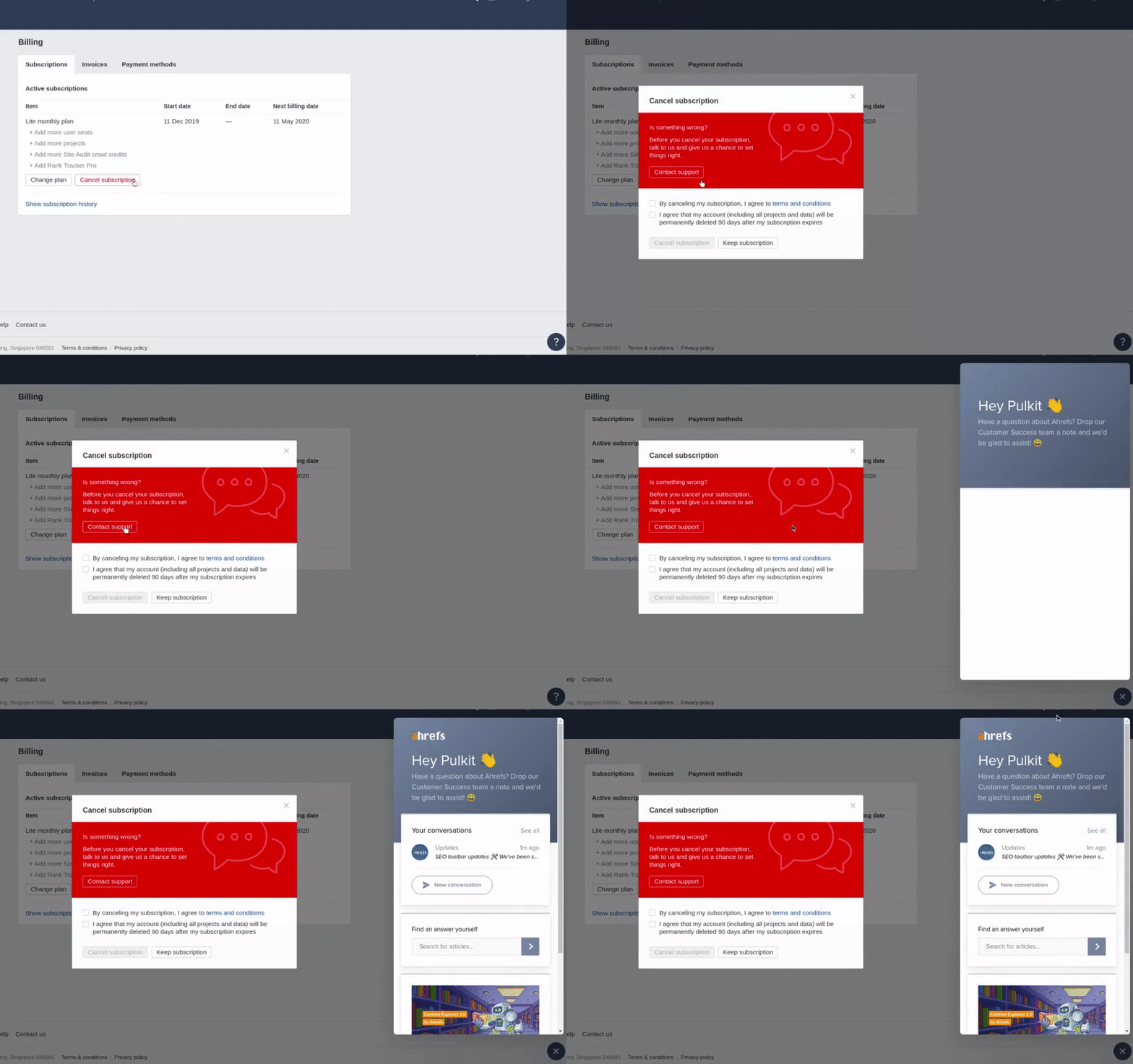
There is the option to “Contact support”, which triggers the Intercom Messenger home to open.
There are some improvements that could be made here:
- The “Contact support” button is hidden -- the fill color of the button should be contrasting from the background. This probably means most users miss it.
- The button itself loads the Intercom Messenger but then the user has to initiate a conversation; and it’s not clear what the user should say. Initiating a new conversation with a pre-filled message would be better.
Buffer
Buffer’s cancellation flow is COVID-related, and leads to a landing page designed to get new business and retain existing customers via discounts.

It’s triggered in the app billing page, and directs the user to https://buffer.com/covid19, which is also shown on a banner on their homepage.
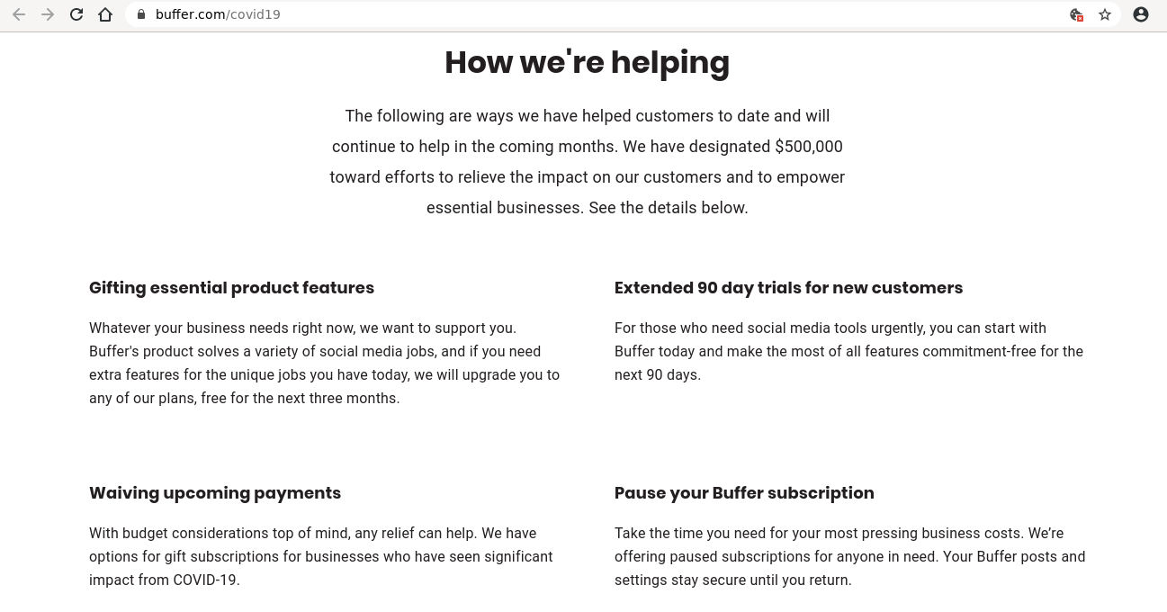
Seeing all the ways Buffer is helping customers affected by COVID also appeals to a user’s emotional decision making. It enforces a perspective that Buffer is helpful and caring, which might make it more difficult to cancel.
Relating to your users as people and indicating humanness and empathy (in a genuine manner) is a difficult but rewarding challenge in UX design. A greater emotional connection with users will lead to more loyalty and virality.
Postable
Postable doesn’t have a self-serve cancellation flow at all and manages it manually for users who reach out over email:
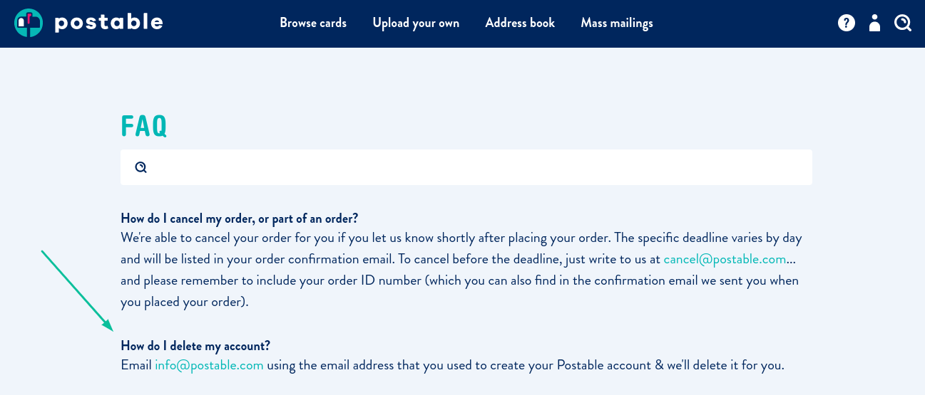
This is typically not an ideal flow, because it is slower for the user and requires more manual processing. However if you have high value customers or your product is not self-service then it can be acceptable to require an email and conversation before cancellation.
At least the FAQs clearly state that once the email is sent the Postable team will delete the account. Making the steps in the process clear will reduce anxiety and frustration for users.
Gusto
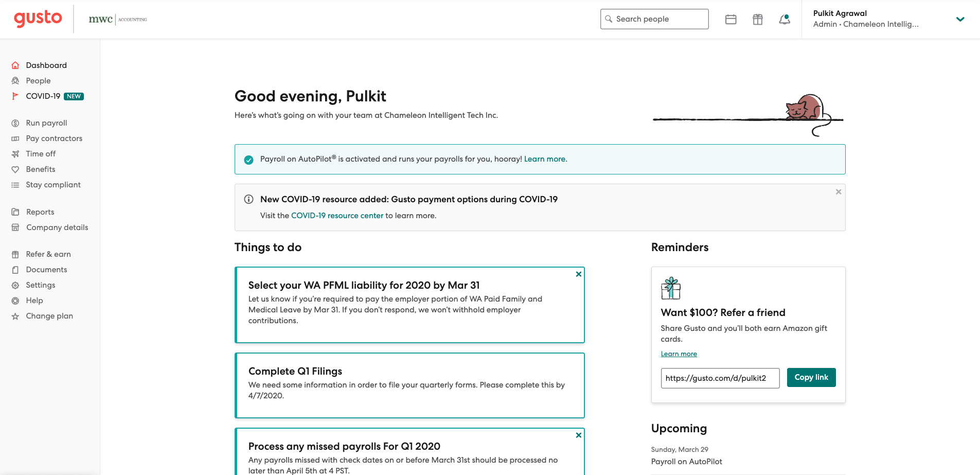
Gusto are proactively offering deferrals during this crisis, as seen below in the “New COVID-19 resources added: Gusto payment options during COVID-19” modal.
Explore product cancellation flows in-depth
Get the webinar recording - we tear down cancellation flow examples and share how top SaaS companies stay afloat 📈
How to Reduce Customer Churn: SaaS Crisis Survival Guide
💡 Tip: Optimize your cancellation flow with Chameleon
You can quickly and easily build a Chameleon Experience to deflect cancellations, collect churn feedback, and offer customers an emergency crisis package to quash their anxiety.
Here’s an example of what that might look like:
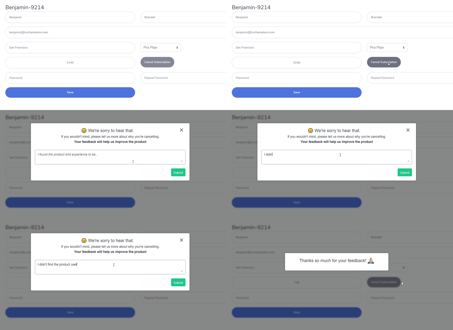
This takes about two minutes to set up as a Chameleon Microsurvey.
Sign up for a free trial of Chameleon to test out some Tour examples for yourself!
A quick survey of the SaaS crisis landscape
Zuora’s study of subscription businesses impacted by COVID-19 uncovers some interesting statistics about survivability in certain industries.
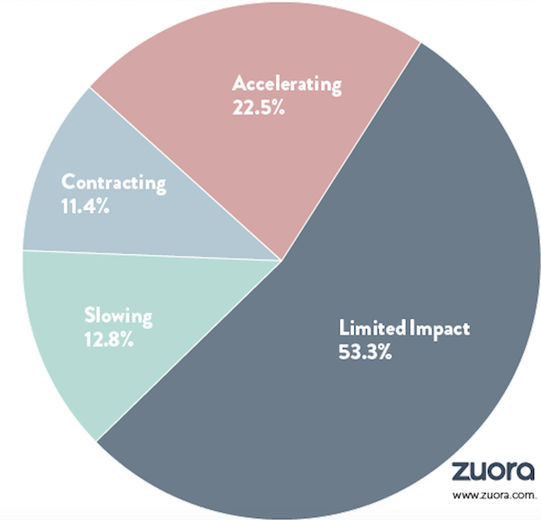
Key takeaways:
- Small business software (aside from comms/telco) signup rates down by half.
- Accelerated SaaS growth at this time is seen in a few key industries - OTT video streaming (Netflix, Hulu), digital news and media, e-learning, telco, and communication software.
- Major slowdowns - IoT is growing at 33-50% of last year's rate.
- Travel, hospitality, and sports industries are the worst hit.
We can’t avoid this reality, but as product managers our responsibility is to ensure we’re designing proactive UX as a ward against cancellations, rather than a reactive stop-gap, or even worse - a catalyst.
Let’s simplify this into the two most important elements:
- Customer love: If customers love your product, this loyalty you have earned will be a contributing factor in their decision to stick with you - or cut you off.
- Intelligent UX design: Derive insight from product analytics and session replay to build an impactful and intelligent UX, making it possible to take corrective action and curb churn before it happens.
_“With data and UX design principles, companies can use their churn rate as a rallying cry to vastly improve their customer’s experience and strengthen their product offerings”. _ - Telepathy
Of course, some churn is normal. Conventional wisdom states that 2-3% monthly churn is healthy, but this will rely on many different factors.
Baremetrics' Open Benchmarks (a study of over 800 startups) shows that companies with $15,600 MRR had an average of 9% monthly user churn alongside 10.5% revenue churn, at a median CLV of $386.
The fact is, companies should expect increased churn in the coming months as their customers tighten up their budgets.
Churn prepping: How to shore up against churn
In a crisis like this, it’s important to understand what’s motivating your users to take drastic action. Start from their basic needs, and consider why they’re using your product in the first place.
Here are some actionable steps you can take to be proactive in preventing and reducing user churn.
Understand user motivation
In an economic downturn, companies will have to rethink their approach to the following:
- Prioritizing engineering time
- Tooling: Buying new tooling & cancelling existing tooling
- Budgeting: Marketing, UX, Product, etc.
- User retention and acquisition
- Pricing plan
- Market segmentation & targeting
- Buy vs build
So, some questions you can ask to better understand how your customers might behave:
- Who are our clients? How is their business affected by the crisis?
- What are their main business goals?
- What kind of problems might they be facing in this crisis?
- How can we help?
From here, you can determine:
- Are we helping them succeed?
- Are we an essential asset?
- Is it a good fit? If not, does it make sense to adapt?
- Is this just bad timing?
- Is the user getting sufficient support?
- What’s blocking our customers from success?
Step into the shoes of the customer: What are the alternatives?
Try and look at the situation from the perspective of your potential customer. In the context of their specific problem, what kind of solutions are available? How does your solution win out against the competition?
If your value isn’t clear, then your customer will see you as a financial burden. Customers who don’t understand your product are destined to churn.
Typically there will be pros and cons for each provider, and you need to be sure that the value of your product is crystal clear. How can your product save them money? Why is your product superior to competitors?
Build a customer journey & pinpoint churn triggers
Spend time defining a roadmap or customer journey for your users. If you build a decent customer journey map, you can identify the vital points of interaction, and thus puts you in a better position to remedy churn.
It also helps you create a better onboarding experience. Onboarding new users is all about guiding them to their own aha! moments. If your users can reach the point where they say “Yes, this is useful!”, you’ve essentially crossed the first “churn checkpoint”. These kinds of users are less likely to churn.
Building a customer journey map will also help you pinpoint churn triggers, so you’ll have a clear focus for optimization and improvement.
According to Mixpanel, you should pay attention to the following different warnings inside your product’s customer journey:
- Visitors to the account cancellation page
- Repetitive actions (where there shouldn’t necessarily be)
- Excessive “undo” actions
- Excessive refreshing
- Abnormally frequent visits to the menu
- Long click-strings before users arrive at value
- Drop-offs mid-action
Pay attention! Don’t serve up cancellation triggers on a plate to your users.
Use microsurveys to screen customer health
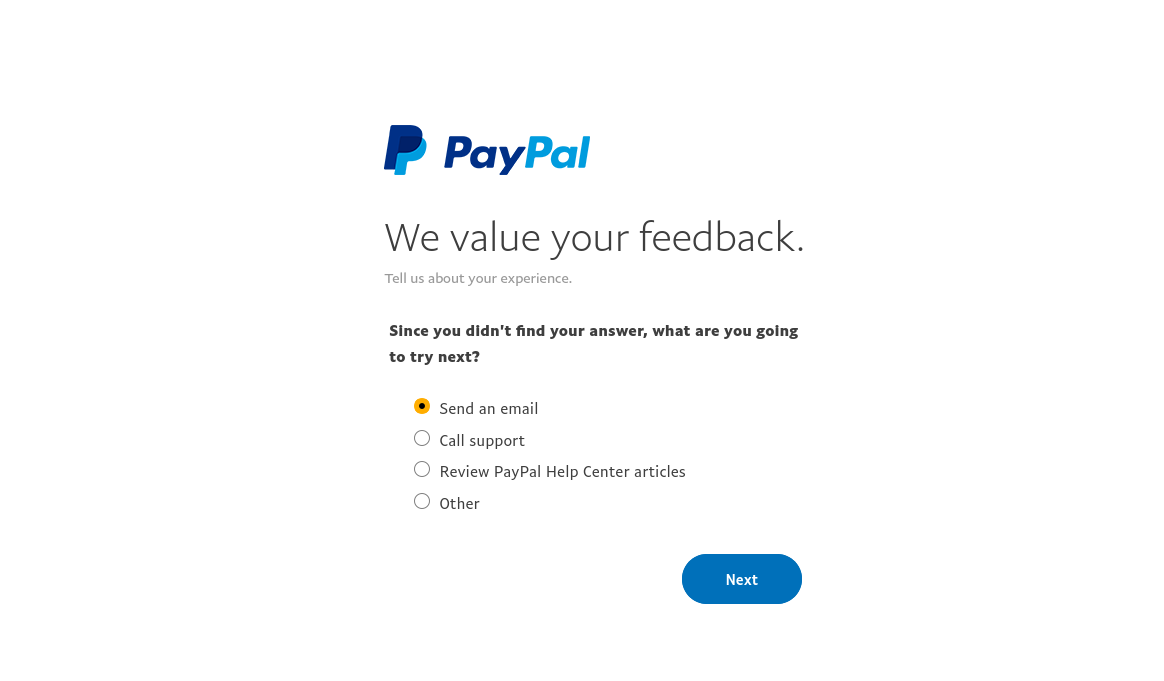
View the rest of this PayPal flow in the Inspiration Gallery
Collecting user feedback is vital for building a clear picture of their health, and ultimately preventing churn. How you collect feedback also has an impact on churn. Feedback collection shouldn’t be obnoxious and it should only happen when it’s relevant.
That’s why using microsurveys is preferable for churn prevention. A microsurvey is essentially a short, one-or-two action survey that happens in-product, within the same user flow that the feedback gathered is contextually relevant to.
For example, you might want to gather information about a specific feature. You can trigger a nonintrusive microsurvey to gather highly relevant information immediately after customers were using the feature in question.
Analyzing feedback to assess churn potential allows you to set up preventative measures, like cancellation deflection flows. Lack of feedback and lack of behavioral analysis leads to users dropping off in silence.
Microsurveys will help you segment and profile users, and identify at-risk groups as well as those most valuable.
Remember: Cancellations happen. You can’t prevent that. What you can do is learn from your cancellations, and understand how to do a better job next time.
According to research by thinkJar, 25 out of 26 customers churn silently without complaining. Most users aren’t going to tell you why they cancelled unless you ask them, which is why user feedback is important.
In short, if you’re already observing higher-than-typical churn, don’t forget to ask your customers why.
Microsurveys for churn detection
Understanding patterns of user behavior leading up to the point of attrition is key to preventing churn. This is the first step. Why are your users churning?
What is smart UX?
Smart UX refers to insight-driven UX design that accounts for various states of user journey and flow, with the intention of guiding them towards product success.
You can leverage smart UX design at critical moments to better understand why churn is happening. A simple step like a microsurvey after users cancel their subscription will help you gather feedback that’s immediately relevant, which gives you a better chance of properly understanding why they cancelled in the first place.
Here’s an example of smart UX using Chameleon to gather feedback on a cancellation:

This is preferable to sending a survey in an email or as part of a separate campaign, because the momentum and flow will have already been weakened.
That’s just one example.
Once you understand some of the factors driving churn, you can take steps to improve retention. Smart UX design will be an ally to deflect cancellations during a crisis.
Agility is important in a crisis
Apart from perhaps luck, agility is surely the determining factor of the survival of your company; in a crisis, the needs and priorities of your customers will be shifting constantly. Survivability depends on your ability to adapt to these shifting needs and priorities.
Once you have found exactly what your customers want via microsurvey feedback, you’ll be able to build features before competitors make jumping ship attractive or your product loses utility.
Focus on staying competitive and retain loyalty, by working on your new a-ha moments, specifically designed for the current crisis period.
Once you have worked on your a-ha moments and built only relevant and useful features, educate your clients on them. Provide free webinars, training, and tutorials. You can also take advantage of these resources to collect information with in-product surveys.
Consider your different customer budgets and segments. Learn about customer buying behavior. Review your business model and your payment structure with this in mind.
Focus on building habit-driven engagement
The best possible way to make sure your clients will not quit is creating a habit for them, as natural that they won't ever question it, not even during difficult times like the pandemic.
“Your biggest competitor for your subscription business is not the rival service; it is your customer’s inertia in not using your service.” - John Warrillow, author of The Automatic Customer
Your goal should be focusing on getting your customers to interact with your product as much as possible, to create a habit as well as a relationship with your brand, to make them “sticky” as Neil Patel says.
How can you work on this relationship during a crisis?
Best practices for reducing customer churn during times of crisis
Be proactive in encouraging user feedback
Encourage users to provide feedback from the onset. Part of this can be baked into your UX design with features like microsurveys, but the principle of encouraging customer communication should permeate all points of contact.
The other side of this is utilizing the feedback you’ve collected to make intelligent UX decisions.
Offer users advice when they most need it, and send them behavior-based messages. Showcase all the ways in which your product can help them weather the storm.
Offer incentives and rewards
Provide your clients with a reason to keep using and paying for your product. In a difficult situation like this one, part of that reasoning will involve weighing costs against perceived benefits.
It may be savvy to offer some form of discount to certain customers, or at least provide them with some sense that crisis circumstances are being accounted for.
Just be sure to test a range of discount offers and determine which one is feasible. And remember, flexibility and adaptability is key. How long will this discount last? Will a free period now help users form habits around the applied value of your product?
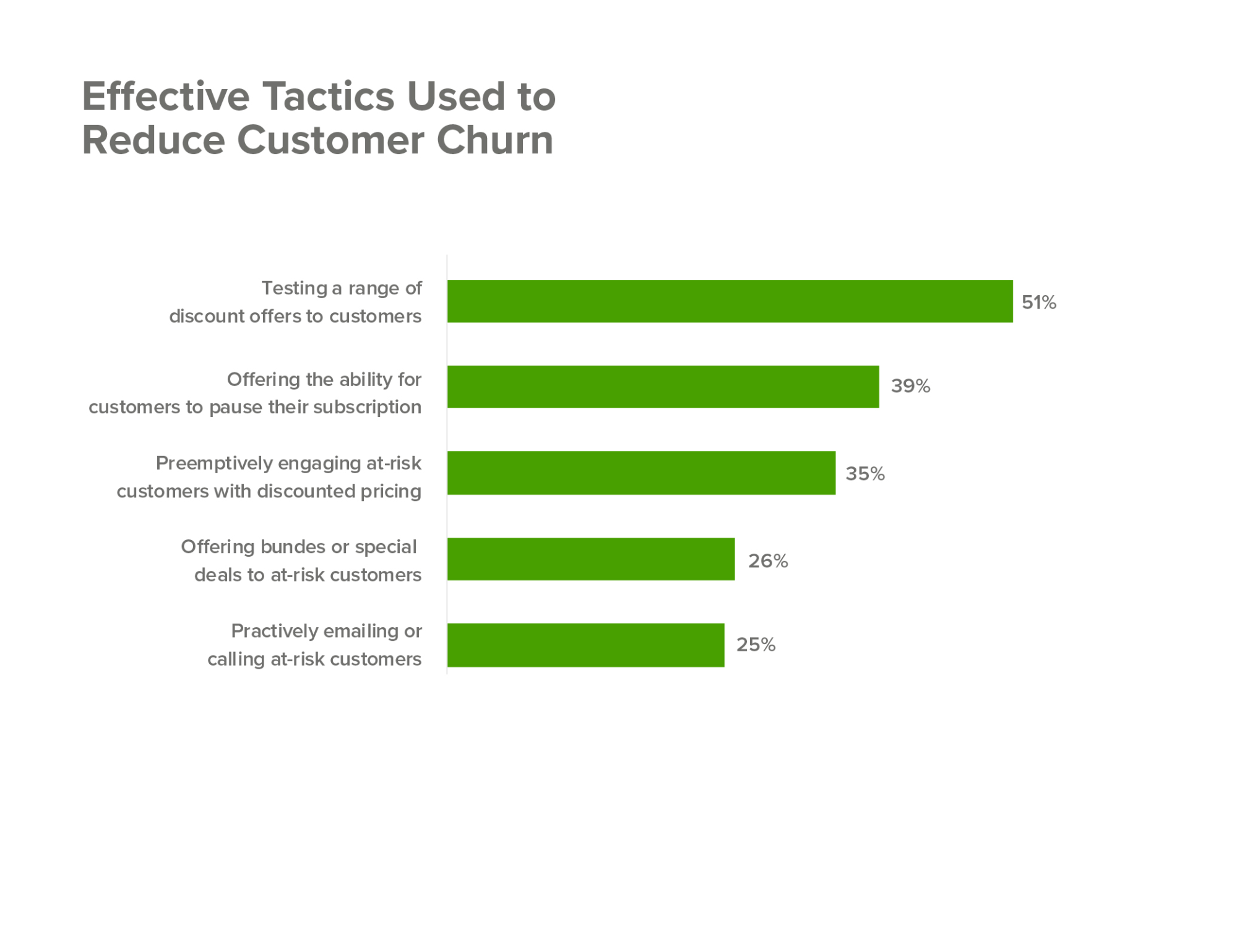
Source: Superoffice.com
Go above and beyond in providing value
Another way of adapting to a crisis is to review how you are presenting different features and price plans. Adapting what you include in your free plan and placing more focus on customer education and onboarding can help protect against churn.
For example, you can:
- Offer more features freely.
- Provide additional customer support and leverage self-serve support.
- Identify target accounts and give them extra coaching
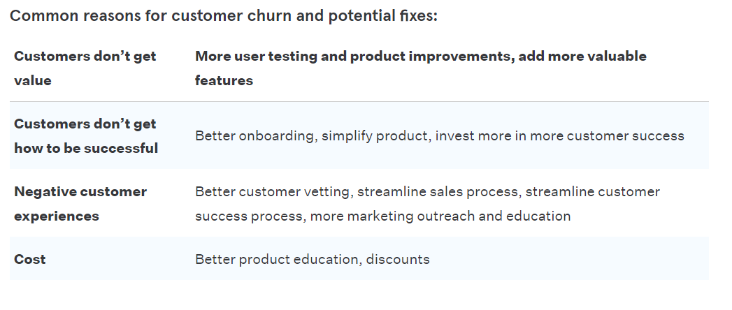
Here’s a great table from Mixpanel outlining some of the most common reasons for customer churn, which lists “Customers don’t get value” as the top reason:
Consider: How do you measure success?
How are you placing your churn goal posts? What data points are informing your understanding of “healthy” versus “unhealthy” churn?
Some points to consider:
- What metrics are you going to track?
- What can you define as a success?
- Do you need to shift goal posts in the context of a crisis situation?
Think about what you will define as churn. Then define a time period, and do the math:
(Customers lost during period / Total number of customers at the start of period) x 100 = customer churn
Ex. 16 / 100 = 16% customer churn
Churn diagnostics are relative. Firm churn objectives will help you understand when, and how to act.
Key takeaways for sustainable churn reduction
- Build a clear profile of your most at-risk customers, and use microsurveys to collect information to inform your next steps.
- Build a customer journey map to differentiate segment risk and identify churn triggers.
- Apply smart UX to educate customers, drive feature adoption and offer incentives for cancellation deflection.
- Measure the results and the cost-benefits of your cancellation deflection plan. Evaluate the cost of making all of the changes. Is your solution sustainable?
- Try to use low-code solutions to ease the burden on engineering.
Times are tough, and SaaS companies need to adapt. Being proactive and working on a strategy of product success will help you avoid a churn nightmare.
Build your own version of any cancellation flow example in this post with Chameleon. To try it for yourself, reach out for a demo.
🎬 On-demand webinar
Learn how great products like Zoom and Harvest deflect cancellations


