Make your user onboarding emails stand out with these best practices
Your marketing team has done a great job and you're getting a bunch of new users signing up for your product... but you can't celebrate just yet, because many of them don't return. 😩
A lot of hard work goes into finding interested users, but after signing up many don’t find the value they were seeking before they get distracted by life’s surroundings.
So how do you help keep users motivated until they discover the Aha moment?
To prevent churn at this sensitive stage of the user lifecycle and create loyal customers you must nail your user onboarding.
After someone signs up, your goal should be to quickly show them how to be successful in your product. Your user onboarding emails play a vital role here.
A strong email onboarding strategy can be the difference between getting your new users to become deeply invested in your product or losing them forever. 🚶
In this post, we will help you uncover how to write great user onboarding emails that improve your product's adoption and new user retention. Just by reading this and taking away a few simple lessons, you can prevent interested users turning away and start creating happy customers.
Emails are a core component of user onboarding
User onboarding is "a system of actively guiding users to find new value" in your product. When onboarding new users, your goal is to get them to key Aha moments (when they understand and internalize the value) in your product as quickly as possible.
Your user onboarding should leverage all the channels available to you, including email marketing, chat, webinars, product tours and documentation. Email is an essential part of this system because:
- It's ubiquitous; it's the one platform accessible and standardized for all your users
- It's understood and expected; users require low cognitive effort to engage with it
- It's accessible; there are so many great SaaS tools to make it easy to create, target and deliver emails
However, these reasons also mean that people treat email very casually and this is both a risk but an opportunity for you. There is so much noise in the email ecosystem that if you can craft outstanding user onboarding emails then you can have an outsized return on your investment.
If your user onboarding emails are uninspiring and pedestrian then that is the impression users will get of your product. So how do you create the best user onboarding emails?
You need to have a strategy and that begins with a goal
You will not be able to succeed if you are not clear on your objective. Before you write any content or plan out your campaign, you MUST write down specific goals during the user onboarding phase.
First, you must discover and test your product's Aha moments. These will become your micro-goals, allowing you to work backwards to the content you need to send via email.
For each goal, you should identify the main bottlenecks that prevent the user reaching that milestone. This could be because they are not sufficiently motivated, or because they don't know how to proceed. Although emails are not great at teaching users HOW to do something, they can be very valuable for teaching users WHY they should do it. This can increase their motivation and help them proceed further along the user onboarding flow.
💡 Tip: Since each user type or persona will have unique friction points that obstruct them from reaching their own Aha moment, your product may have multiple user onboarding flows based on specific user behaviors. However, we recommend to always start with a single path and add sophistication to your user onboarding flow over time.
Let’s take a look at different types of emails you should send and what these emails should contain.
Components of the best user onboarding emails
Three components separate good onboarding emails from great ones. Include these to increase the likelihood that your user onboarding emails succeed in helping users reach the next goal:
- Clear value proposition
- Positive affirmation
- Context / behavior-based triggers
Here is why you need to include these elements in your user onboarding emails:
1. A strong value proposition reminds people of their original intentions
Users will get to the Aha moment more quickly if they know WHY they should use your product. This means that user onboarding emails should focus on the problems and solutions, and not just on the features.
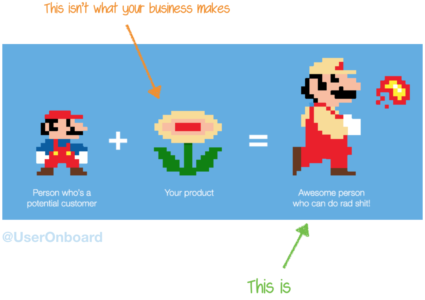
People don't buy products; they buy better versions of themselves. When you're trying to win customers, are you listing the attributes of the flower or describing how awesome it is to throw fireballs? - Samuel Hulick
You can reference both the benefits of using your product and also the risks of not using it. To find the most important benefits, you can talk to current customers, or review the messaging on your marketing site (chances are your marketing team has already got this right). Don't be afraid of repeating your value proposition; we all need constant reminding before we truly internalize it.
💡 Tip: Tailor the value proposition in your onboarding emails to the needs of that specific user persona or job-to-be-done. Each persona or job will have a different use case and outcome. For example, a marketer may care about a completely different feature set than an engineer.
2. Positive affirmation releases chemicals that improve motivation
Motivation is clearly a core component for driving users to value and one simple way to increase it is by providing positive affirmation. We are hardwired to seek out rewards; dopamine is a chemical that is released in anticipation of us being successful and can provide the boost of energy needed to re-engage or take further actions in your product.
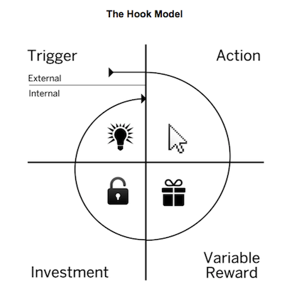
Nir Eyal, in The Hook Model, explains that to help build habits, users must be rewarded after completing an action and before they are asked to invest more resources into the next step.
Therefore you should congratulate users when they successfully reach their goals and encourage them to take the next step to discover further value, and deepen their engagement with your product.
3. Behavior-triggered emails are the most relevant and least noisy
Not all user journeys are the same. One person could sign up for your product, get distracted by a phone call and not engage again. Others might sign up, play around with a few core features and not convert right away.
Sending emails with content that relates to a user's specific progress (like a welcome email on signup) means helps keep a users attention as oppose to becoming de-sensitized to your emails because they are not relevant. Using behavior-triggered emails also means that each email has the potential to help take users further on their journey, and not risk repeating information they already know, or is too far ahead.
Before you can initiate any triggered emails it’s important to remind yourself of the Aha moments / goals you identified earlier. You can then ensure that emails contain one clear call-to-action that drive users to the key action they have not yet completed.
💡 Tip: To create behavior-based emails you’ll need to send your product data to your marketing automation or email platform. We use Segment to send user data to all our SaaS tools, including Intercom, where we then build targeted triggered emails.
Examples of 3 essential user onboarding emails
1. The Welcome Email
The Welcome Email is the first contact that you have with your customers after they sign up for your product. This should include all the relevant elements of a welcome email, but not too much information because you want to focus on quickly establishing rapport without distractions. So keep it simple and highlight your product’s value proposition and direct the user to the first Aha moment.
Here is an example from Playbuzz, a platform for creating and distributing interactive stories.
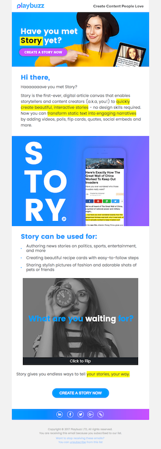
👍 What it does right: PlayBuzz does a great job establishing their brand and providing users with a clear CTA at the end of the email. They do a good job showcasing the value proposition clearly (“no design skills required”) that seems to speak to their audience.
😈 What it could improve: The email is not easily scannable, because of the numerous colors and styles. This also means that their CTAs get lost a little amidst the banners and cards. They could retain a very clear, distinctive color for the buttons to help separate these from the graphics and other content.
2. The Motivational Email
Sometimes new users need a little motivation to continue to explore your product, and this is where the Motivational Email comes in handy. This type of email can be used as a way to reward your users for taking action because it makes them feel good about using your product. This is also a great tactic to build momentum and move users to the next step in the user onboarding process.
Here is an example from Soapbox, a Chrome Extension from Wistia, that allows you to record and share videos.
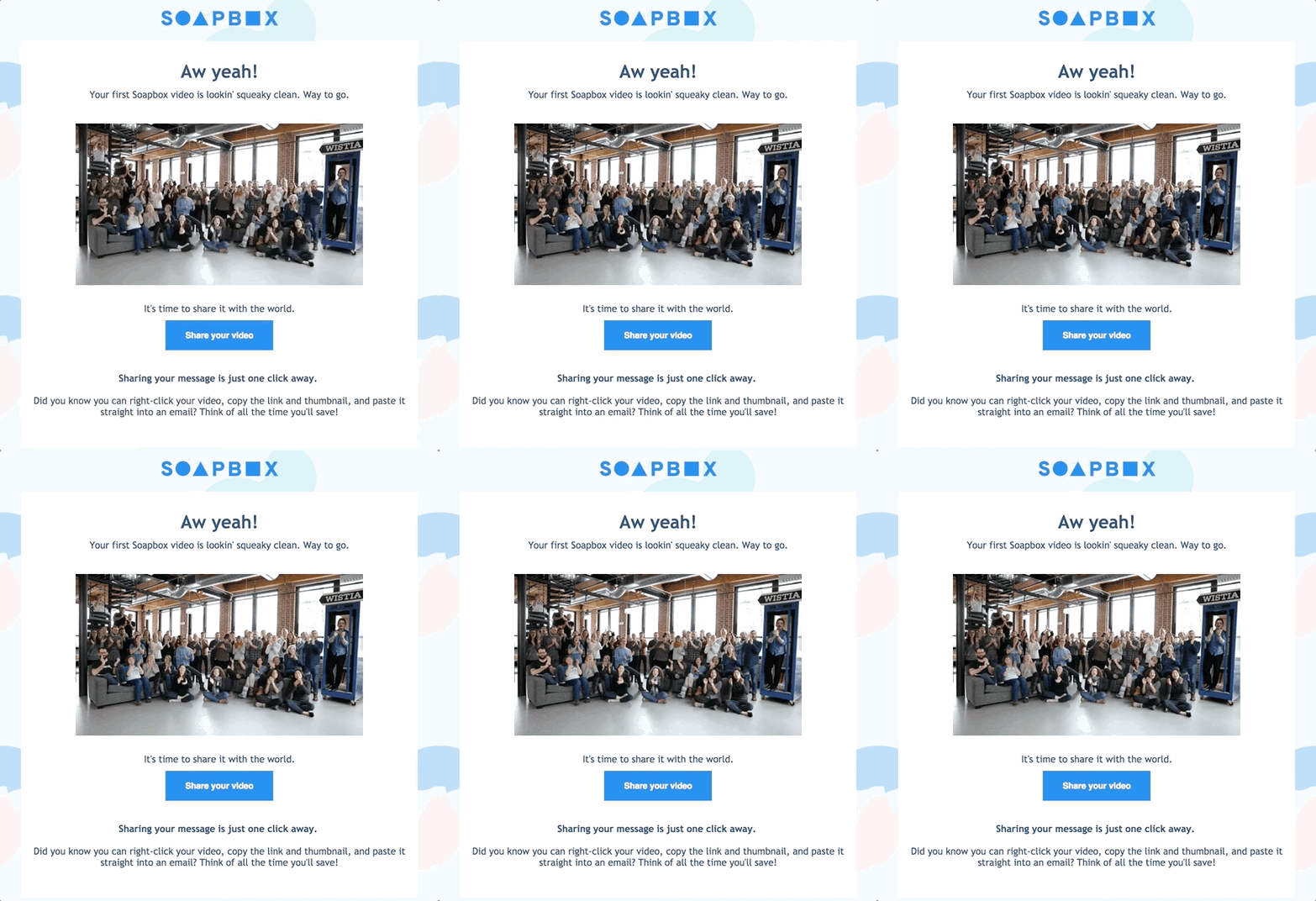
👍 What it does right: Soapbox does a great job celebrating the first user milestone with this super fun email. The email showcases Wistia’s brand (style and copy) and builds a more human connection by presenting the people behind the brand. You can’t help but smile and get excited about taking the next step - which they made very clear by having a single CTA in this email.
😈 What it could improve: Although this email is seeking to be personable, it doesn't actually contain any personal information, which makes it less credible. If Soapbox included my name or my video title in the email, then I might be more convinced that this email really was meant for me, rather than just replicated for every one of their users. We all want to feel special 😇
3. The Proactive Help Email
Some users can get lost or overwhelmed with a new product, which can be especially true for complicated products or services (often the case for B2B companies). A Proactive Help Email (for example, listing FAQs) can help move users past points of friction within a product by addressing common questions and concerns, without users having to seek help.
The best way to proactively engage with your users is to review data from the user onboarding process to determine at which points your users get stuck or dropped-off. These friction points can help you identify users that attempted to take a key action but failed, and you can then address this step / goal / action.
Here is an example from Webflow, a tool to design and build responsive websites without writing any code.

👍 What it does right: Webflow has an active community of passionate users, but it is a complex product. It has identified that connecting new users with existing experts will help them overcome key barriers to Aha, and so sends this proactive email to make it quick and easy way to find an expert. They also let users know it is okay to be confused with a new product, reducing anxiety and risk that users believe this product is a bad fit for them.
😈 What it could improve: Although Webflow offers expert advice and help, it's hard to know whether it would be effective. To increase credibility they could have included a real user testimonial or even just some real faces of experts (instead of illustrations) to help readers believe in the validity of the help they are offering.
Leverage Great User Onboarding Emails To Build The Customer Journey
The goal of user onboarding is to help your users reach the Aha moment so they find the value they were seeking and succeed in using your product. User onboarding emails are a great way to help users achieve this goal, but you will need to have defined goals as the basis of a coherent strategy and to measure progress.
Be sure to identify and measure the friction points preventing users reaching these goals, so you can tackle these as part of your user onboarding emails. If possible, make the emails contextual and personalized, to help them stand out from the noise, and help you connect with your users.
You should measure both email success (Open and Click-Through Rates) but also whether users met the goals defined for them. Use this guide to start improving your user onboarding emails today and help guide users toward success!
Are your user onboarding emails great and worth showing off? Or have you made some awesome changes based on this article? Please post an example in the comments below and we'll include them in an update to this post 😎


