An elusive sentiment of product engagement can be hard to measure. But it’s not impossible. That’s why keeping track of the breadth, depth, and frequency of interactions your users have with your product is essential.
Do users think of your product as easy-to-use? Do they keep coming back? How often do they interact with advanced features? Is the onboarding flow streamlined and oh-so-delightful?
These are only some of the questions you should keep asking to be able to assess product engagement and measure the Product Engagement Score (PES). It’s a SaaS metric that’s been picking up steam lately, and it’s measured by how often your customers are using your product, at what scale, and how motivated and invested they are.
Managing product engagement the right way can lead to a complete transformation of a company’s fortunes. Doing it wrong can also result in a complete change of fortunes – but in the opposite direction.
So, how can you improve your product engagement? Start by avoiding these eight mistakes.
Mistake #1: Delaying the “aha!” moment
Never keep customers waiting too long for the value of your product to kick in. Be sure to guide them to the “aha!” moment as quickly as possible. This emotional epiphany is what makes users find satisfaction with products.
But if your customers don't get there soon enough, they may become frustrated and never return to using your product again. To ensure that your users don't lose interest, you need to provide them with value right away.
Why is the “aha!” moment so important?
You know that feeling when you finally understand how something works? The “aha!” moment is the first time that the product value and purpose become apparent to your users.
It’s the instantaneous feeling of excitement and accomplishment that makes your customers want to continue using your product. This clarity and understanding of what the product does and how it will add value to their life are essential for sustained engagement.
How to get a user to the “aha!” moment without wasting time
There is no such thing as a universal “aha!” moment. All products and their value propositions, users, and contexts are different. But, there are specific strategies you can implement to assist your users in reaching that epiphany quicker:
Provide a buttery-smooth onboarding experience: Make sure to eliminate points of friction for new users and efficiently guide them towards the moment of discovery – when they finally connect with your product and see its true potential.
Simplify the learning curve: If your first-time users have to climb through too many steps before their eureka moment, they may never get there. Help them get to value quickly by offering self-serve support. This will let users learn at their own pace and find exactly what they need more easily.
Avoid placing a checkpoint before the “aha!” moment: Gateways, such as asking for credit card information, or login credentials, can halt a user's progress. It would be ideal if you could get your customers to have their “aha!” moment before these steps. This way, you can vouch for your product right away and create a rapport.
For example, let’s take a look at Canva's effortless onboarding flow and how it’s helping first-time users understand the value of its product without compromising user experience.
All a user needs to do is fill in the search bar with the type of design they want to create and dive right into making. There’s no need to sign up for the product unless they wish to save their designs. This makes it easy to try out the product and then create an account if it's the right fit.
(Source)
Mistake #2: Providing inadequate customer support
Lax customer support is one of the worst things that can happen to a product. No matter how perfect a product is, it will have flaws. And when those flaws do crop up, it's essential to give users the support they need to help them resolve the issue.
Why is poor support so destructive to product engagement?
If your customers can't find the answers they need, they'll jump ship at the first opportunity. Providing clear answers and accessible solutions to their problems is the only way you can keep them interested in your product and, eventually, increase customer retention.
However, that doesn’t mean that you should throw dozens of pop-ups asking them to “try this” and “do this” the minute they create an account. Helping users find success in your product requires careful management to avoid overwhelming them.
How to provide the right level of support
To cater to the needs of your customers, you should be able to meet them where they are, to offer the help they need, when they need it.
That’s why the abovementioned self-serve support is of the essence. In other words, you should provide product guidance where you consider it necessary and allow users to learn on their own where they feel it’s necessary.
You can also implement additional support channels, like a real-time chat, right into your product. That way, a user can contact you at the exact moment they encounter a problem with your app. Plus, as the Superoffice study shows, using live chat provides the fastest response rate.
(Source)
Mistake #3: Not showing, just telling
In general, customers don't care about your product or service until they've had a taste of it. You can do all the bragging you want, but the customers will believe it only after they’ve experienced it themselves.
If you haven't guessed already, this is where product walkthroughs and tours come in. You can use a product tour for the onboarding flow, or to explain how to use specific features, and showcase what kind of results users can get. After clearly understanding the value proposition, customers will be more likely to stick with you after that initial click.
Why are product tours important?
A power user might zoom through clunky product guides like others skim terms and conditions, but the rest of your customer base might not be so adept.
Product tours help new users easily familiarize themselves with the main features or new updates of your product or service without you having to bore them with long-winded explanations.
Well-designed product tours speed up the path to value, reduce the rate of product abandonment, decrease the time it takes for users to take action or get started with your product, and increase customer engagement and revenue retention.
The latest Chameleon Benchmark Report shows that user engagement with Tours jumped 33% in 2021. Users of today expect a self-service experience, and the Benchmark Report reveals how to ensure UX is delightful.
Download the In-Product Experiences Benchmark Report
Improve your in-app messaging and scale self-serve success with data and insights from 300 million user interactions with Chameleon Experiences. We'll send the Report to your inbox!
How to create engaging product tours
Good product tours should provide speed, value, and enjoyment. Here are some tips on how to get product tours right:
Keep the tour short and sweet: As the Chameleon Benchmark Report shows, tours with three steps have the highest completion rate – 72%. After all, you don't want to overwhelm your customer with too much information at once.
Make the tour interactive: You can use trigger-based tooltips, hotspots, or animations to make it easy for users to understand the process.
Follow a logical progression: Ensure that each tour step covers a single function or action to reduce the confusion new users may feel when trying to navigate your interface.
Present opportunities for action: The tour should clearly explain the next step a user should take, and make it easy for them to do so.
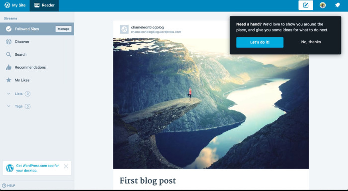
A good example of this is an interactive tour from WordPress. An interactive product tour helps users make it through the initial learning curve and get acquainted with the software in small, digestible chunks.
Mistake #4: Disregarding the freemium model
If a customer is considering purchasing your product, they want to feel confident that they are making a wise investment.
By offering a free trial or doling out a portion of your product for free within a freemium plan, you allow customers to interact with your product without having to put their money on the line. It’s a great way to reduce customer hesitation and make them interested in your product.
How can a freemium model benefit you?
The freemium model serves as an entry point for potential customers into the ecosystem of your brand. It’s a chance for businesses to build wavering trust, close the gap between purchase intent and actual conversion, and win over new subscribers.
Even if not all of your free users become paying customers, providing them with a rich base of free features will keep you on their minds when they begin looking for a more expansive solution. Because prospects are already engaged with your free product, they'll be far more likely to choose you as their long-term partner.
How to make your freemium model work
When introducing a freemium plan, it's critical to create the right balance of value and limitations. With the right strategy, your freemium model can boost sales and engagement without detracting from your product's core appeal.
But beware, if you come out too strong with your freemium policy, it can deter potential customers from purchasing your product or service, regardless of how great it may be. You need to find that sweet spot that will leave your customers wanting more, but not so much that they don't perceive the attraction of your product.
For example, Zapier’s freemium model offers curious users a taste of the product functionality without compromising the chief attraction of advanced plans.
(Source)
Mistake #5: Ignoring user feedback
Listening to and understanding customer feedback is crucial if you want to build a product that they'll come to love and rely on. Customers are more likely to be invested in your company when they know you care about their opinions.
When product management teams fail to listen to the people they're building their products for, they're liable to deliver low-quality solutions.
Why is listening to your customers crucial?
A good product is formed from an open and honest conversation between the product teams and the users they serve. With consistent collection and processing of feedback from users, you can actively learn more about their needs, wants, and expectations.
By incorporating customer feedback into every product decision you make, you can develop solutions that hit home with customers, create loyalty, and enhance the bottom line.
How to get meaningful user feedback
A few of the best ways to gather valuable customer feedback are with:
Contextual in-app surveys
Live chat for instant feedback
Behavioral analytics
Social media listening
You can use a social media management tool to help you with understanding the impressions you're leaving on your social media channels. Remember to also scan for feedback in forums, comment sections, and review pages as well.
Listening to user feedback is a beneficial endeavor, but it's also important to keep in mind that capturing feedback from customers while they’re interacting with your product can give the most meaningful results. You can run Microsurveys to increase response rates, get better quality feedback, and improve UX.

Do users love your product?
Deploy a feedback survey in minutes and find out!
Mistake #6: Holding on to ineffective features
If you keep constantly adding new features without rethinking or removing redundant ones, you risk developing a bulky and potentially confusing-to-use product. At every step of your product lifecycle, you need to find a way to simplify the experience for your users. So, keep what's working and cut what isn't.
Why should you cut underused features out of your product?
Pruning away unnecessary features from a product makes the whole experience more streamlined and engaging. It also helps in reducing product upkeep. Every feature takes resources to maintain, so those that aren't worth the maintenance costs should be retired.
And if you are developing a new product, adopting an Agile methodology will help keep it lean and ensure every feature packs a value-added punch for users as it evolves without the bloat.
How to know which features to discard
Product engagement managers need to observe customer behavior and leverage behavioral analytics to uncover trends in user sentiment. To determine if removing a feature is a good idea, try to gauge the level of frustration it's causing among the users. If a feature is causing more harm than good, it might be time to ditch it.
It's also important to get real-time information about how customers are engaging with specific features. For this purpose, you can run contextual in-app surveys to collect user feedback while they are interacting with your product. The insights you gain will help you decide whether some features should be modified or removed completely.
Get the Right Features on Your Product Roadmap
Discover how to gather specific feedback that guides your roadmap with microsurveys—check out our on-demand webinar.
Mistake #7: Unannounced or abrupt addition of new features
The new feature you're about to launch might seem to you like the most obvious addition, but remember that your users don’t necessarily have the same level of product knowledge as your team does.
So, if you don't inform customers about it, they might never get the chance to experience the glory of the new feature. If your new feature is good enough to be implemented, it's good enough to be talked about.
Why is it necessary to announce new features?
Adding new features to your app should be a no-brainer – but only if you're communicating the benefits of your updates to your users. Keeping them up-to-date on what's new and how that new feature will benefit them improves the overall product experience.
How to introduce new features the right way
While having an email marketing strategy is a great way to announce and push product features, nothing is more effective than in-app notifications for helping users learn about those features.
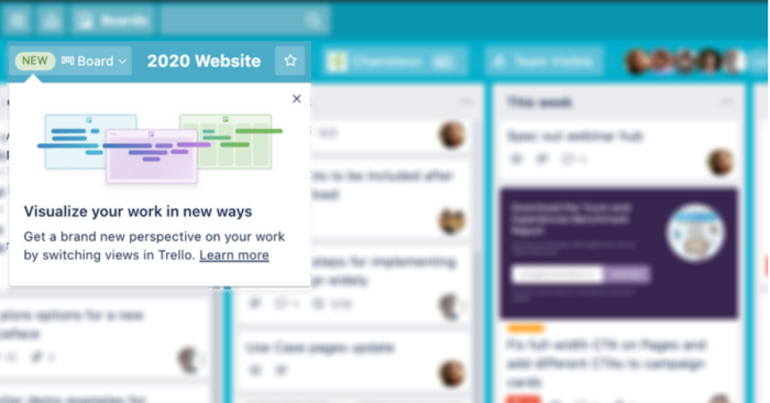
For an excellent example of how to announce new features in a way that excites customers, take a look at Trello's announcement. They included an attention-grabbing tooltip to let users take a sneak peek at what's ahead. There’s also a link to their announcement post for a more detailed preview.
Mistake #8: Not using UX writing to your advantage
It is vital to provide your customers with product copy and microcopy that enables them to use and enjoy your product. Poorly written or misplaced phrases can confuse users, causing them to abandon your app. When a potential customer steps into your product, their decision to stay in is based largely on how the product communicates.
Why does messaging need to be on point?
The words you choose for your product copy and microcopy can have profound effects on the usage. For example, a CTA button that says "Try now" could bring in more customers than one that says "Learn more", simply due to the fact that it’s based on the action verb.
Thoughtfully written product copy can also bridge the gap between technical jargon and everyday language, allowing you to go into depth about your product without overwhelming or confusing potential customers.
How to write impactful product copy
It can be hard to get it right, but applying UX writing techniques throughout your product will help your copy mimic the way you’d talk with your customers in person.
Technical details and user stories should sound conversational and easily comprehensible. Also, make sure to use plain language to convey clear, easy-to-understand messages, and avoid technical jargon wherever possible.
For example, take a look at how Grammarly uses copy to connect with prospective customers. Their message is crisp, appealing to their ideal user, and easily digestible. Plus, besides their "Add to Chrome" CTA, they include a line about how the extension is free.
(Source)
The bottom line: A product that engages is a product that sells
When you don't stay on top of your customer-product interactions, you risk doing irreparable harm to your business. In other words, customers will remain loyal to your product as long as they feel they're getting the real value out of it. If they can't interact with it easily, having as little friction as possible, they will move on to the next best offer.
That’s why one of the core responsibilities of a product team should be keeping product engagement on the right track to ensure customers are delighted at every touchpoint. On the other hand, making engagement mistakes shouldn’t be part of the equation.
While getting into the nitty-gritty details of the product development process is vital for sustainable growth, it's equally important to maintain a high level of product engagement and align it with your long-term goals.

Weekly advice to make your product stick 💌
Be the first to get the latest product best practices and resources
This article is written by Ahmad Benny, creator of Bengu and a digital marketing specialist with a knack for technology. He’s on to learning, researching, and curating valuable nuggets of knowledge to save you time and help you achieve your goals.

